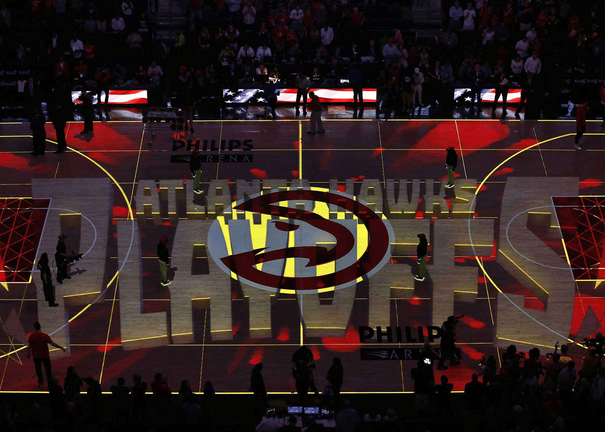
Atlanta Hawks
Apparel Design, Brand Positioning & Strategy, Branding, Court/Field Design, Custom Typography, Identity System Design, Logo Design, Uniform Design,OVERVIEW
Dynamic brand overhaul for one of the NBA’s most determined and innovative teams.

The color palette is a bold declaration of Atlanta’s personality. Torch Red announces their fierce independence, resurgent spirit, and fiery passion. Volt Green proves an electric and unmistakable calling card on the court, speaking to the fearless innovation and vibrancy Atlanta is known for. Georgia Granite, with its deep, strong character is reminiscent of the surrounding Georgia stone. True White hints at the Southern charm and hospitality still present in the backdrop the city.

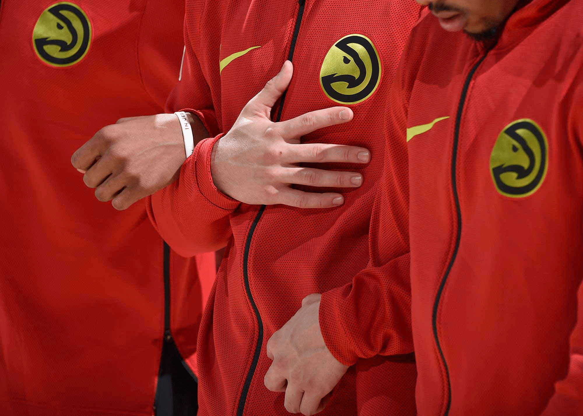
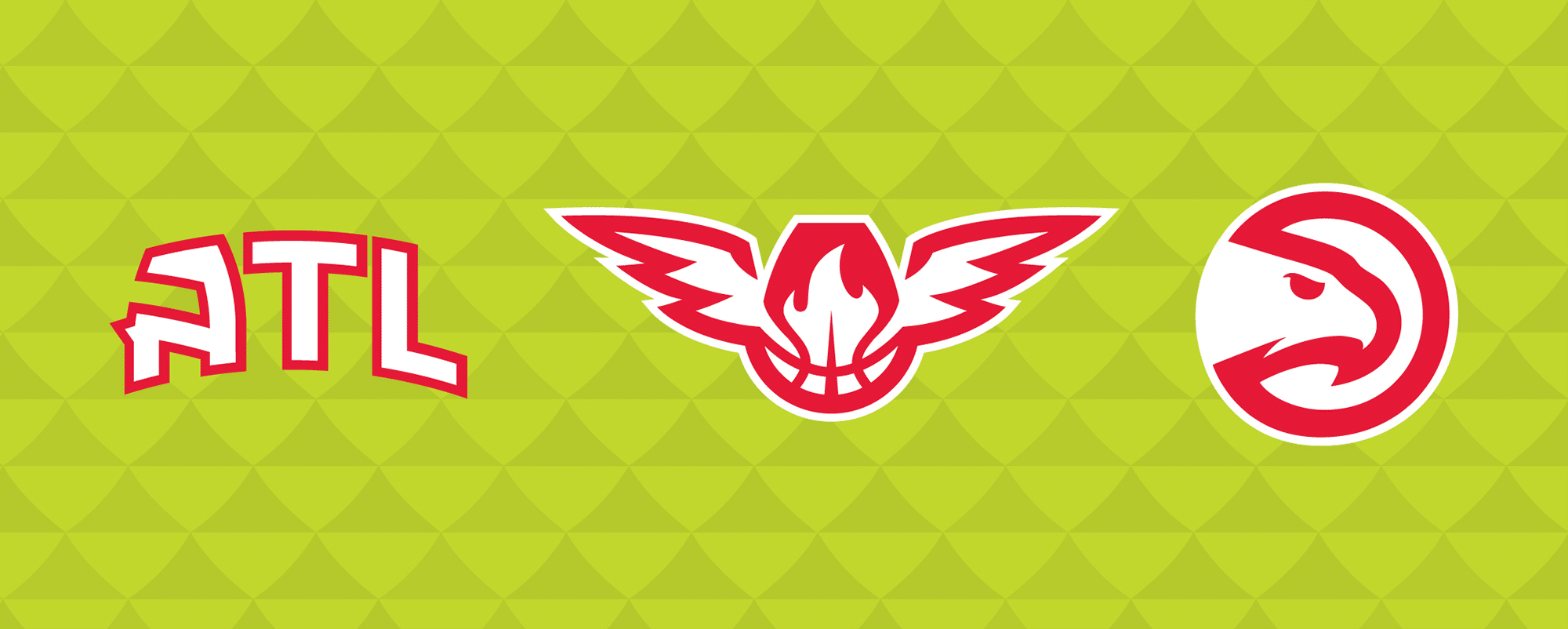
The new primary logo boasts first-of-its-kind language incorporating the word “Club” in the roundel – a tribute to the many different parts that make up the organization.
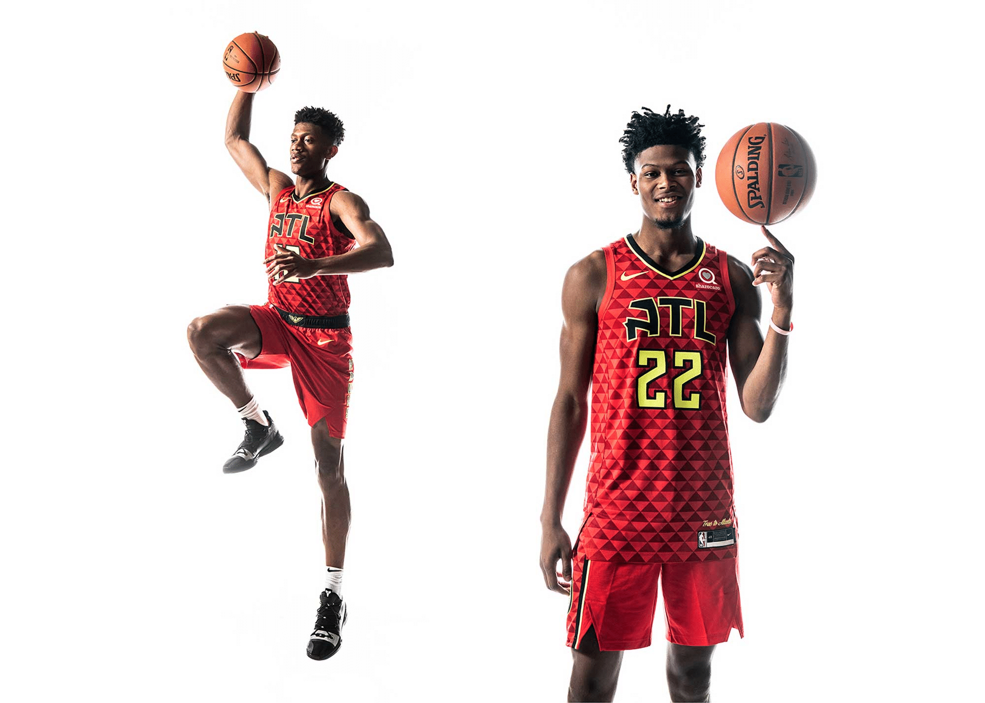
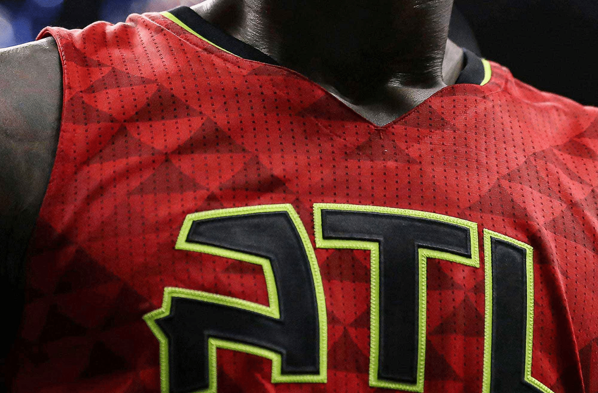
The new system also paves the way in uniform design. A feather pattern integrated into the jerseys and shorts, and carried throughout the brand architecture, engrains the brand deep into the fabric of the team.