LIV Golf
Athletic Branding, Brand Guidelines, Branding, Custom Typography, Digital and Print Design, Identity System Design, Logo Design, Social Media Design,OVERVIEW
Putting our fingerprints on The World’s Golf League.
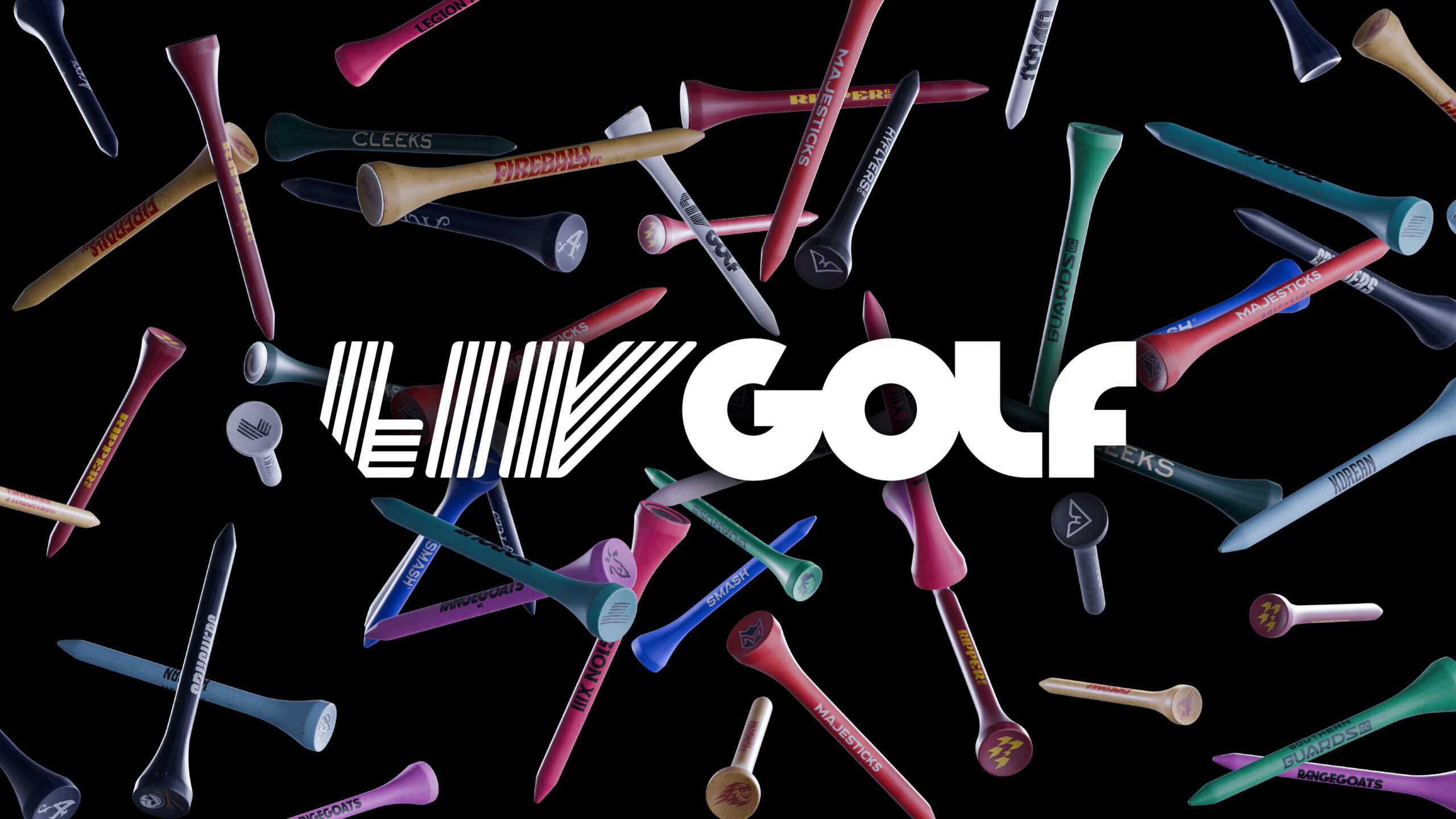
In 2025, LIV Golf explored ways in which it could increase its connection to fans. As the World’s Golf League, its primary position was set. With each of its teams now geared towards generating individual notoriety, it realized that some of its teams lacked visual consistency that aligned with audiences. Our team saw this as an opportunity to increase the strength and breadth of visual marks to create a system of resonant visuals that could be expressed across all forms of application.
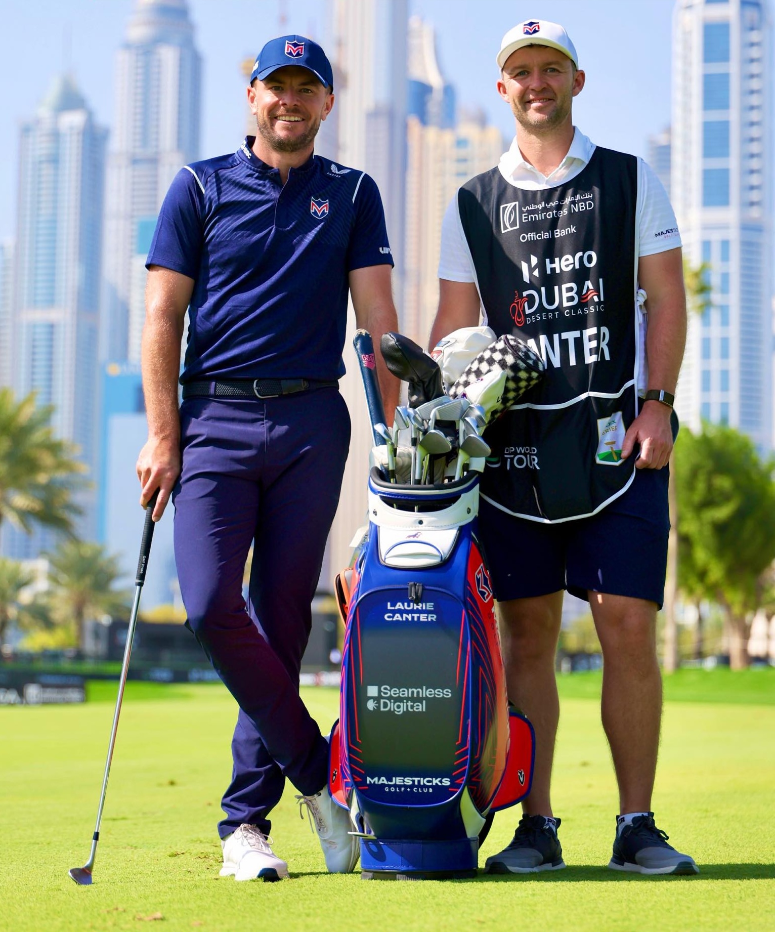
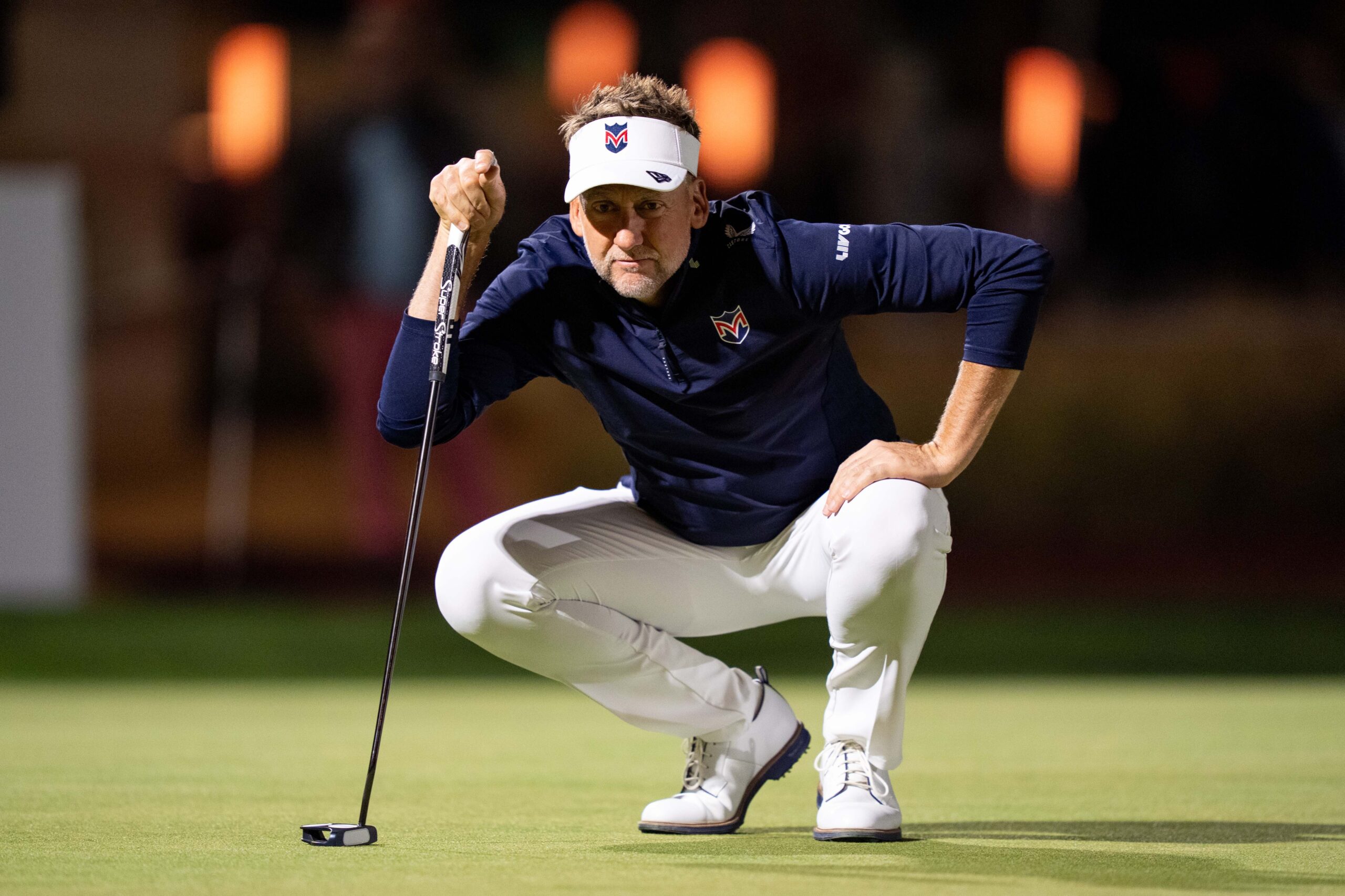
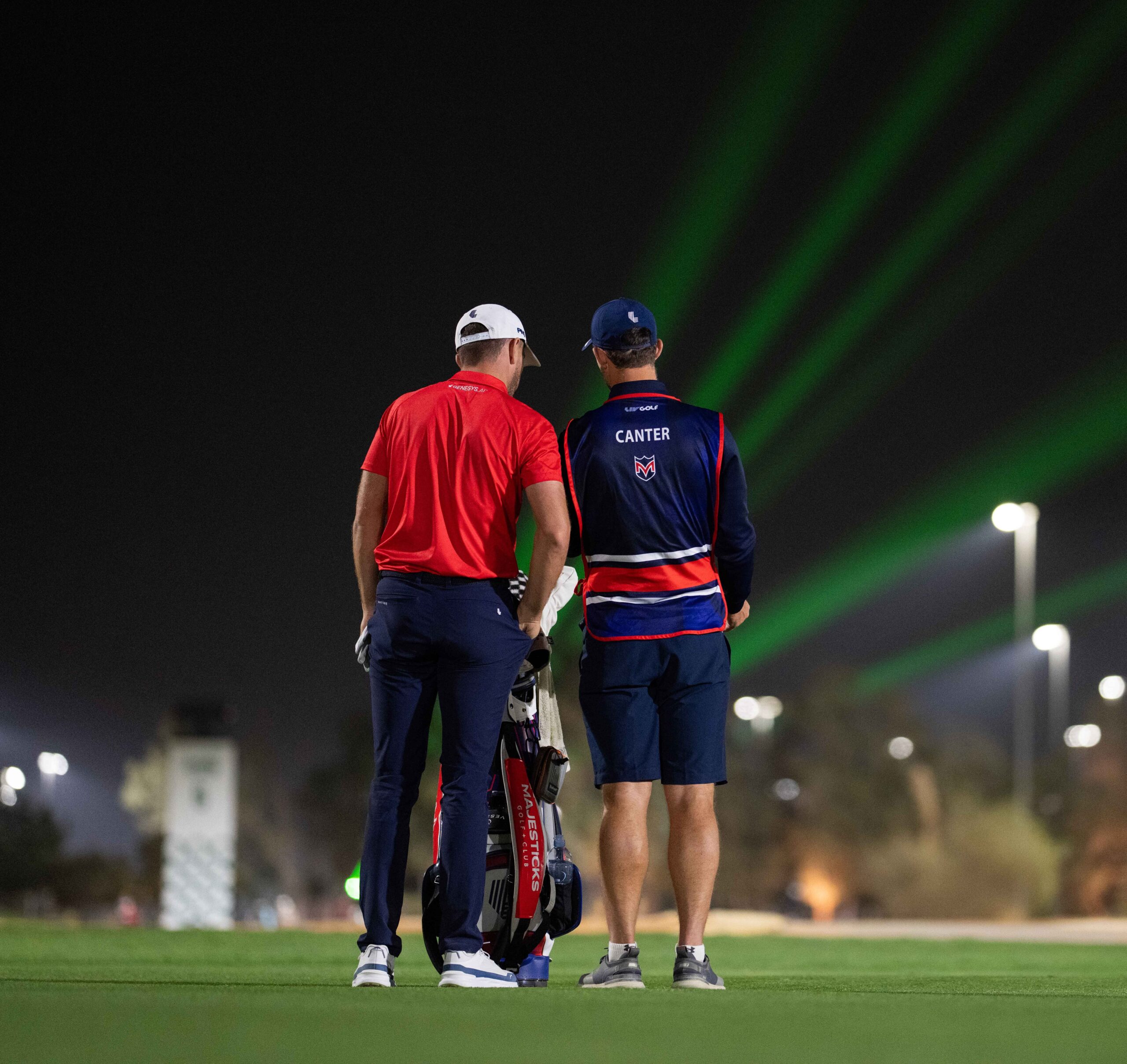
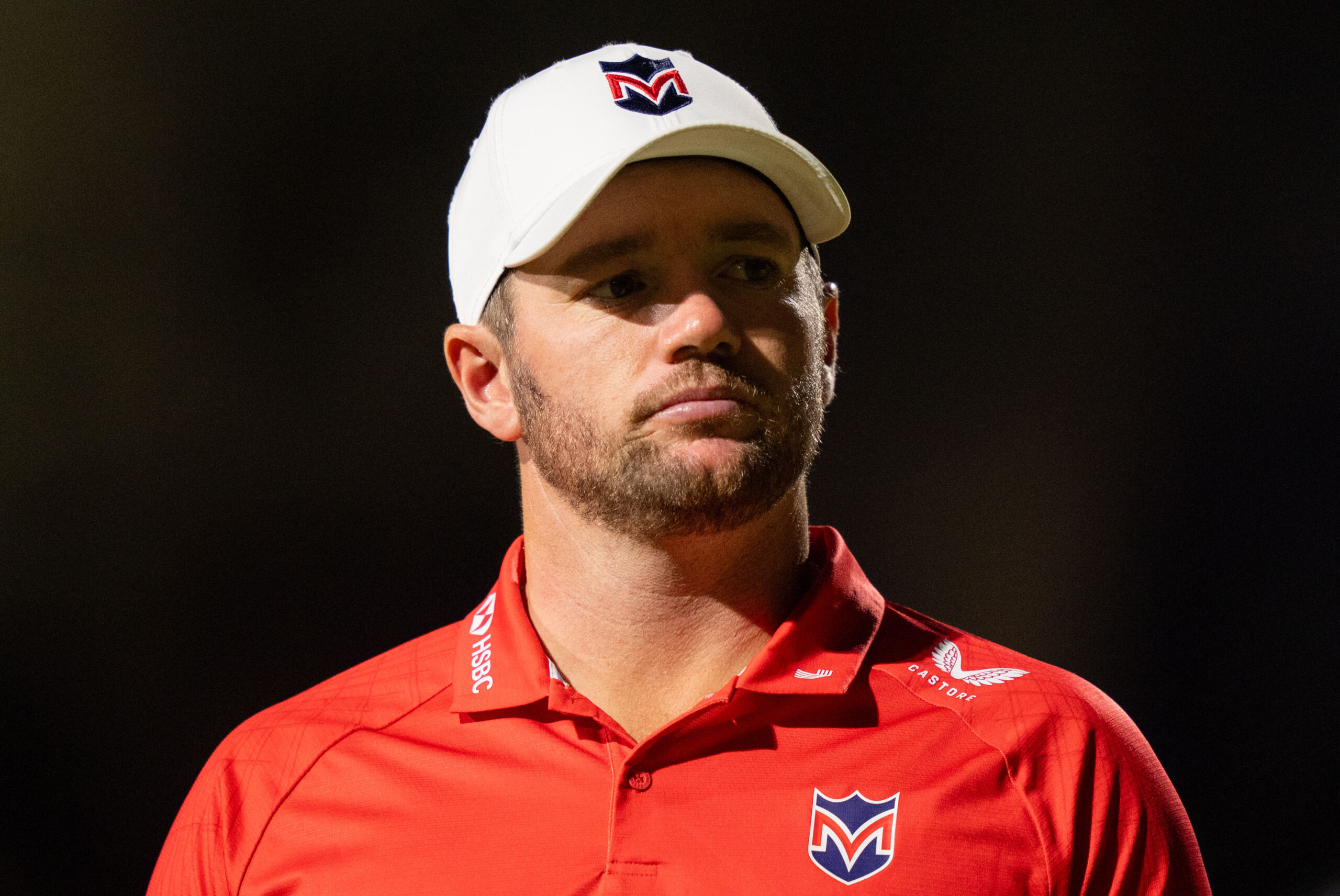
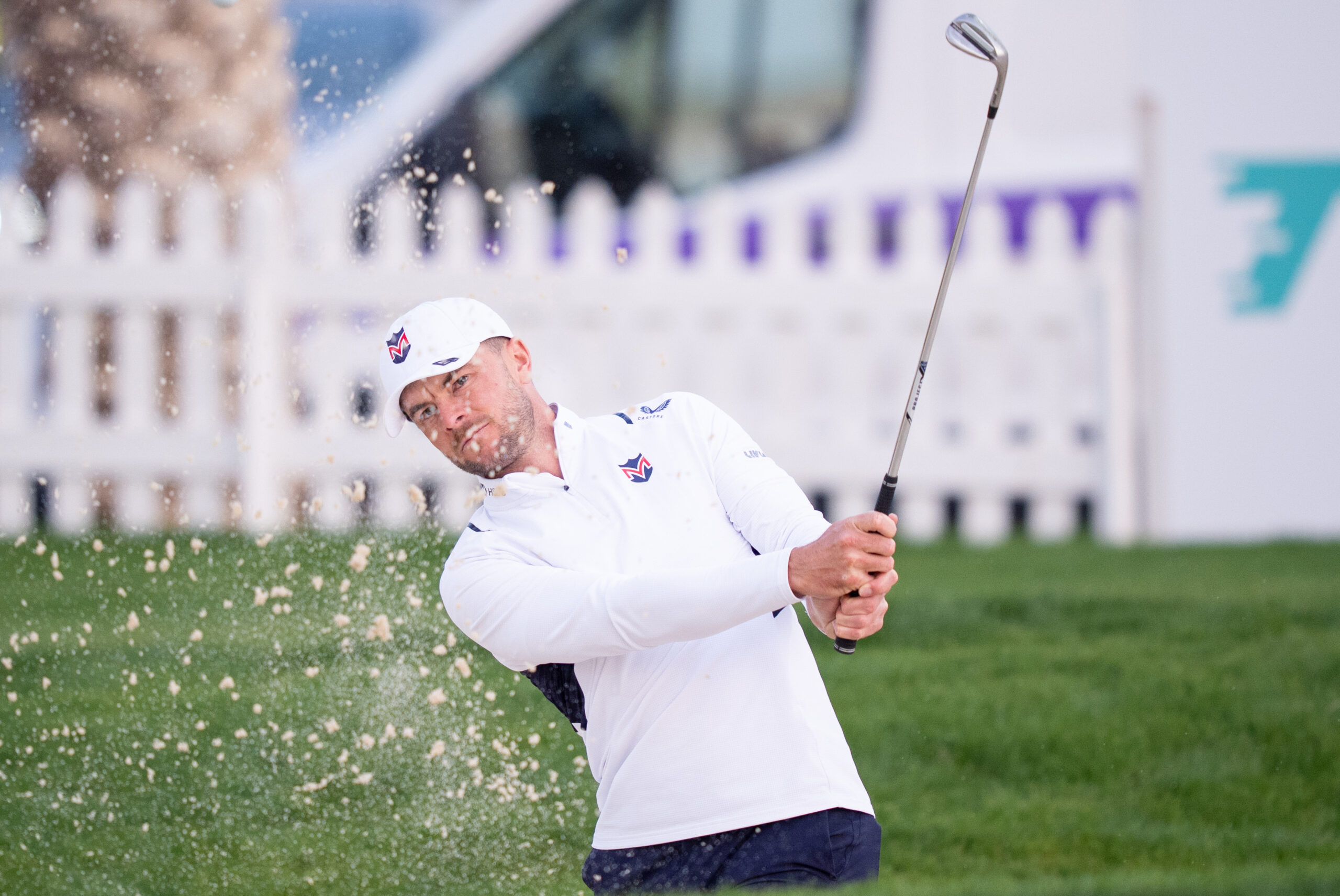
Majesticks Golf Club
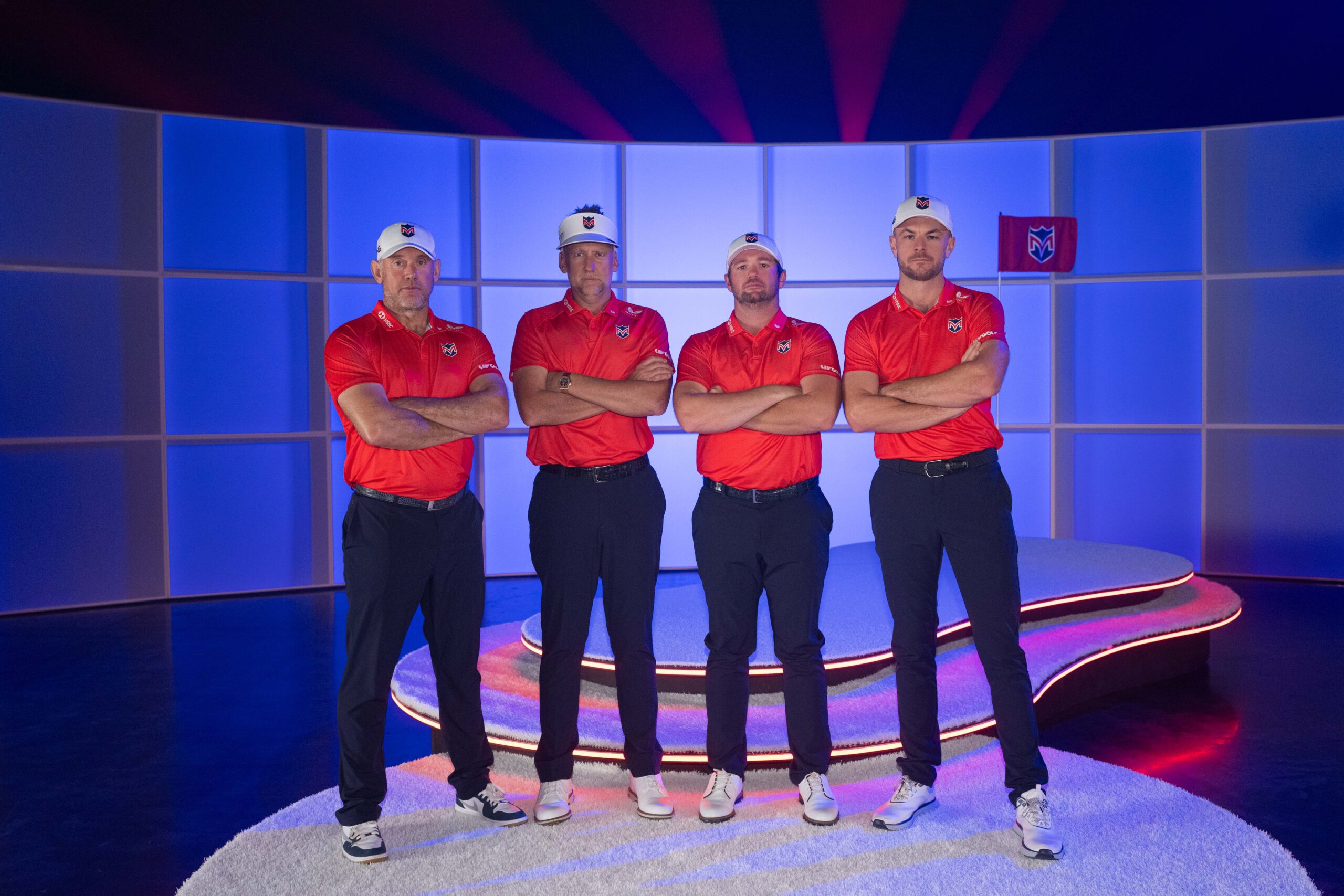
Photo: LIV Golf
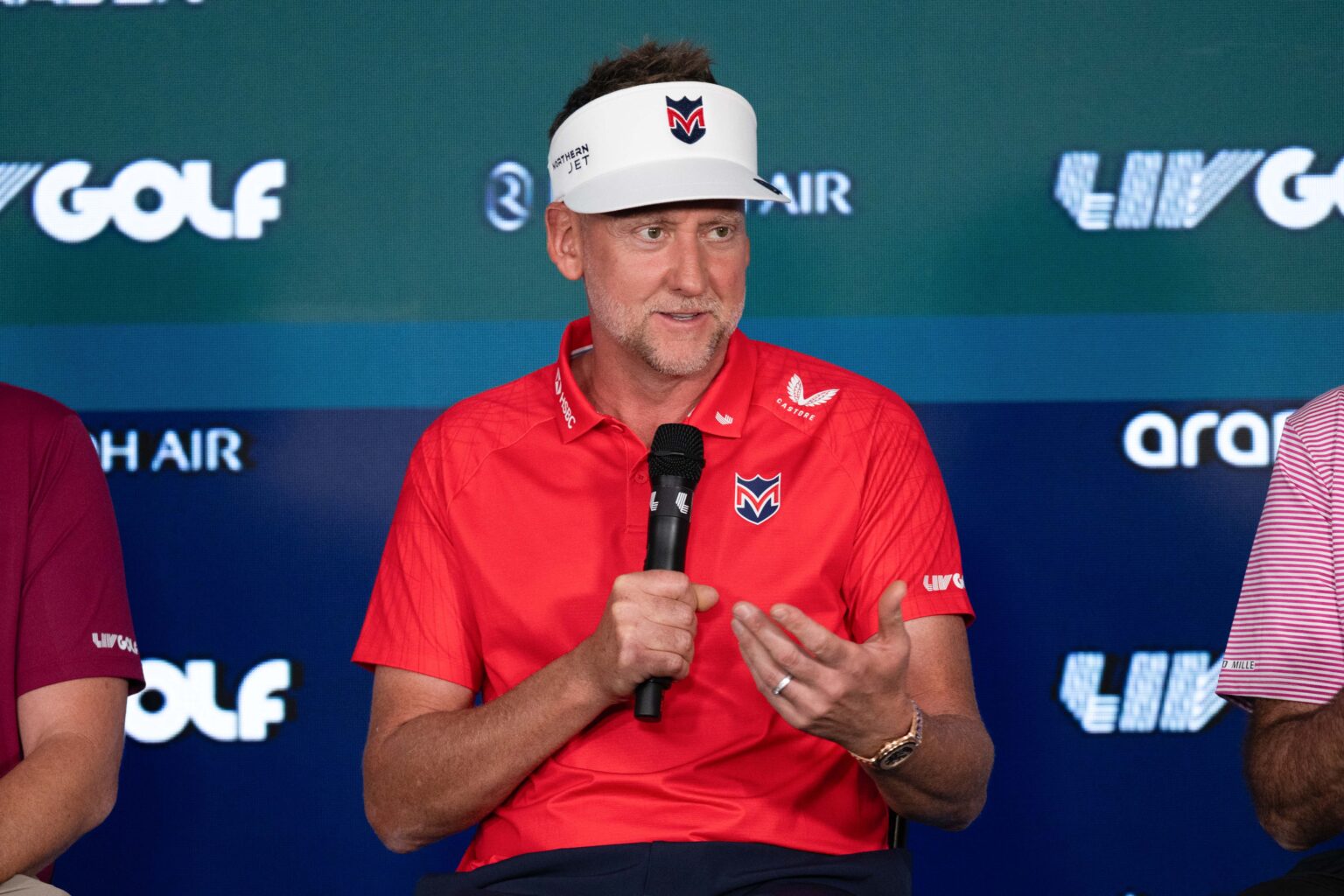
Harnessing the emotion of Britain’s resilient team that never quits and applying the influence of a deeply rooted heritage led to an exceptional product. Birthed from an environment of collaboration, the final result was one rooted in deep heritage and cultural connection. Designed to unite its British fan base and empower the team on a worldwide stage
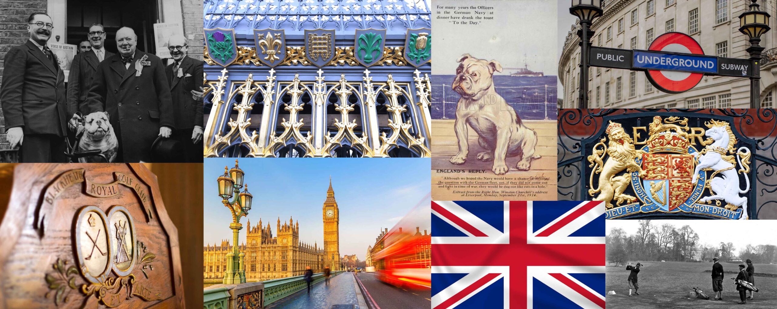
The United Kingdom is built on resilience, resolve, and a deep sense of who it is. That character became the starting point for everything we created, using the game of golf as a way to express a pride that feels both foundational and enduring. We looked closely at the symbols people here live with every day, from the quiet authority of Big Ben to the beautifully ordered chaos of the London Underground, and found a visual language already written into the fabric of the UK. Our job was not to invent something new, but to listen, refine, and bring that story to the surface in a way that feels unmistakably British.
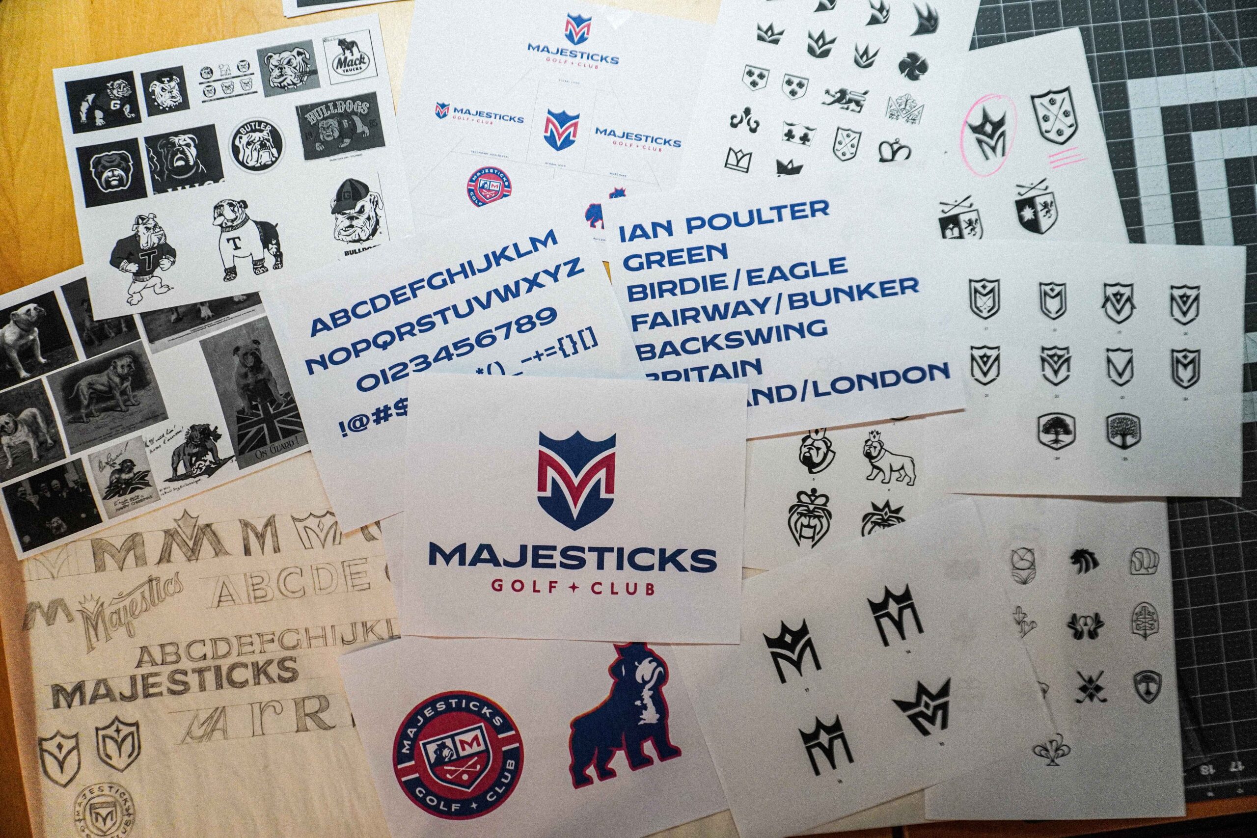
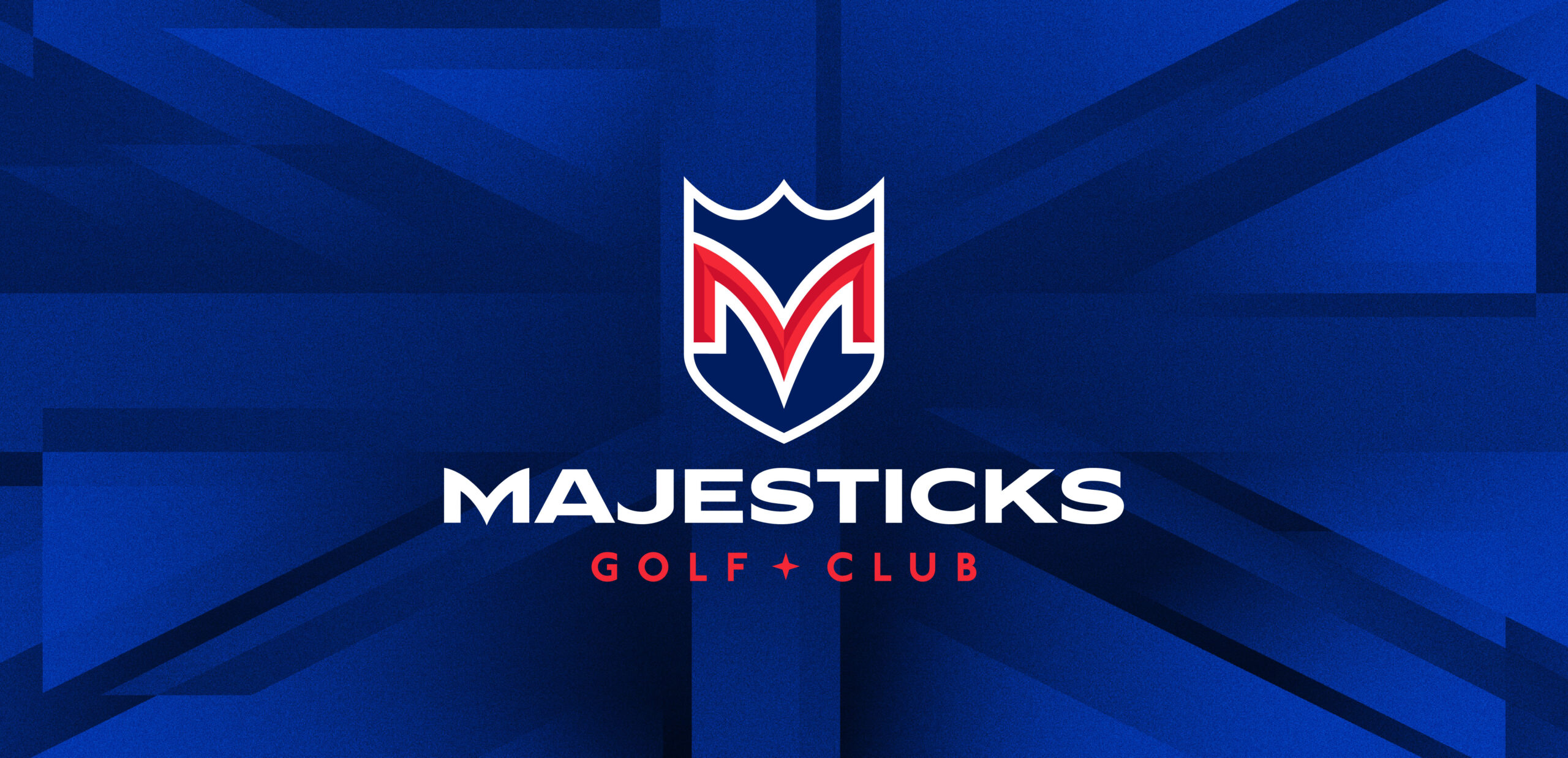
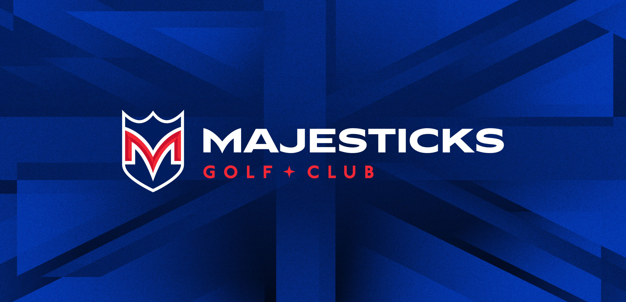
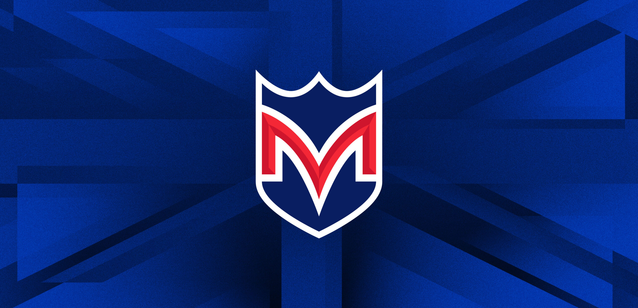
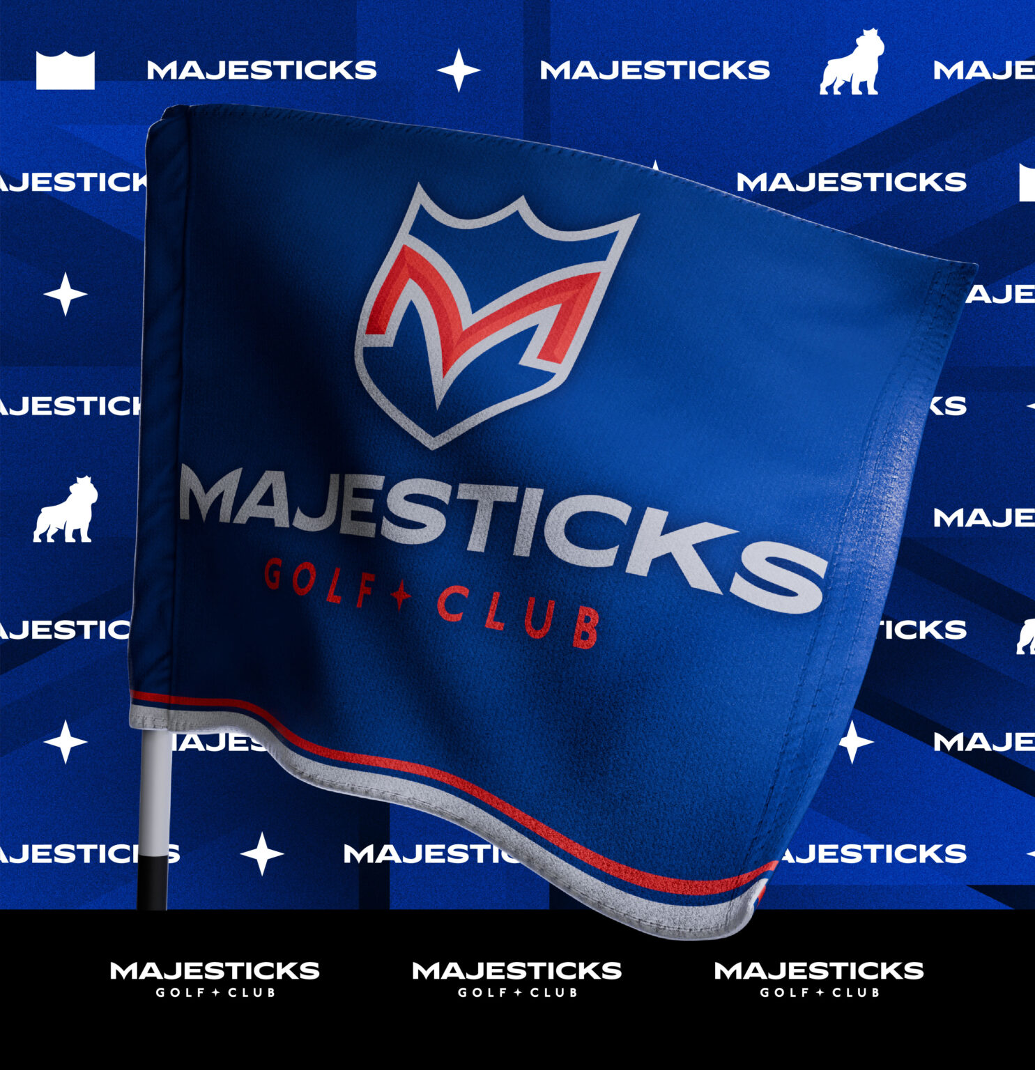
The Majesticks Global Icon is a shield that embodies the team’s strength, resilience, and fighting spirit. It directly enforces the team’s brand one word – Brave – capturing the resolve of a club that stands firm under pressure.
The crown element at the top of the shield draws from the enduring iconography of the British monarchy. Its presence signals a team rooted in tradition yet driven to uphold a standard worthy of royalty.
The red M outlined in white and set against a navy blue field is an intentional nod to the Union Jack, creating an immediate connection to British identity.
The star within the Wordmark is a nod to the team’s past identity, anchoring the logo to Majesticks history and celebrating the legacy that continues to drive the club forward.
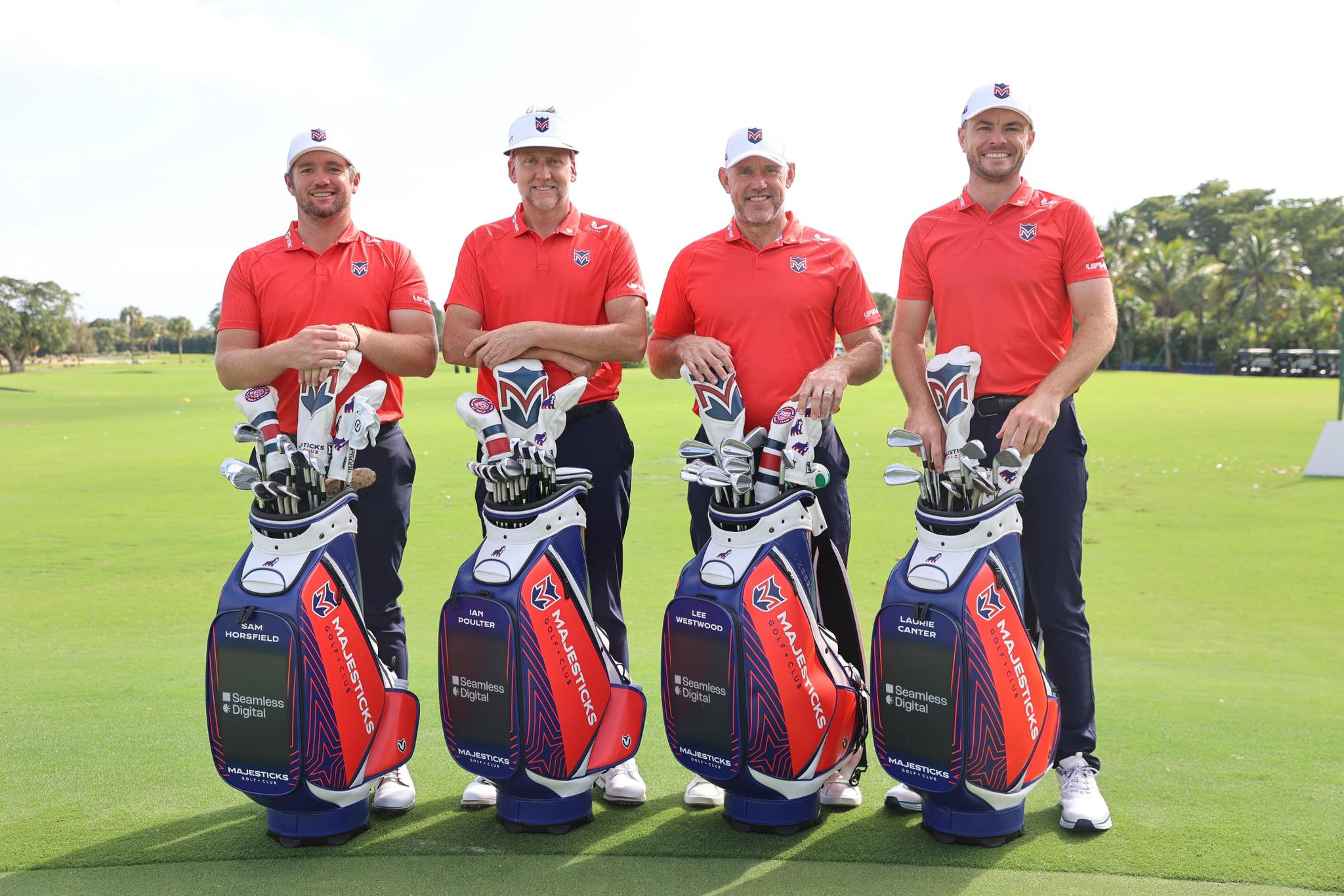
Photo: LIV Golf
Photos: LIV Golf
Photo: LIV Golf
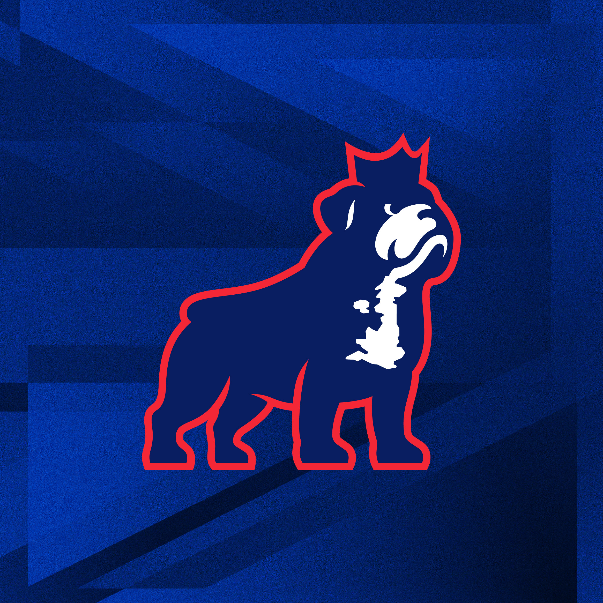
The Bulldog reflects a classic symbol of stoic resilience. The white shape on its chest forms the outline of the UK, tying the mark directly to the team’s national roots.
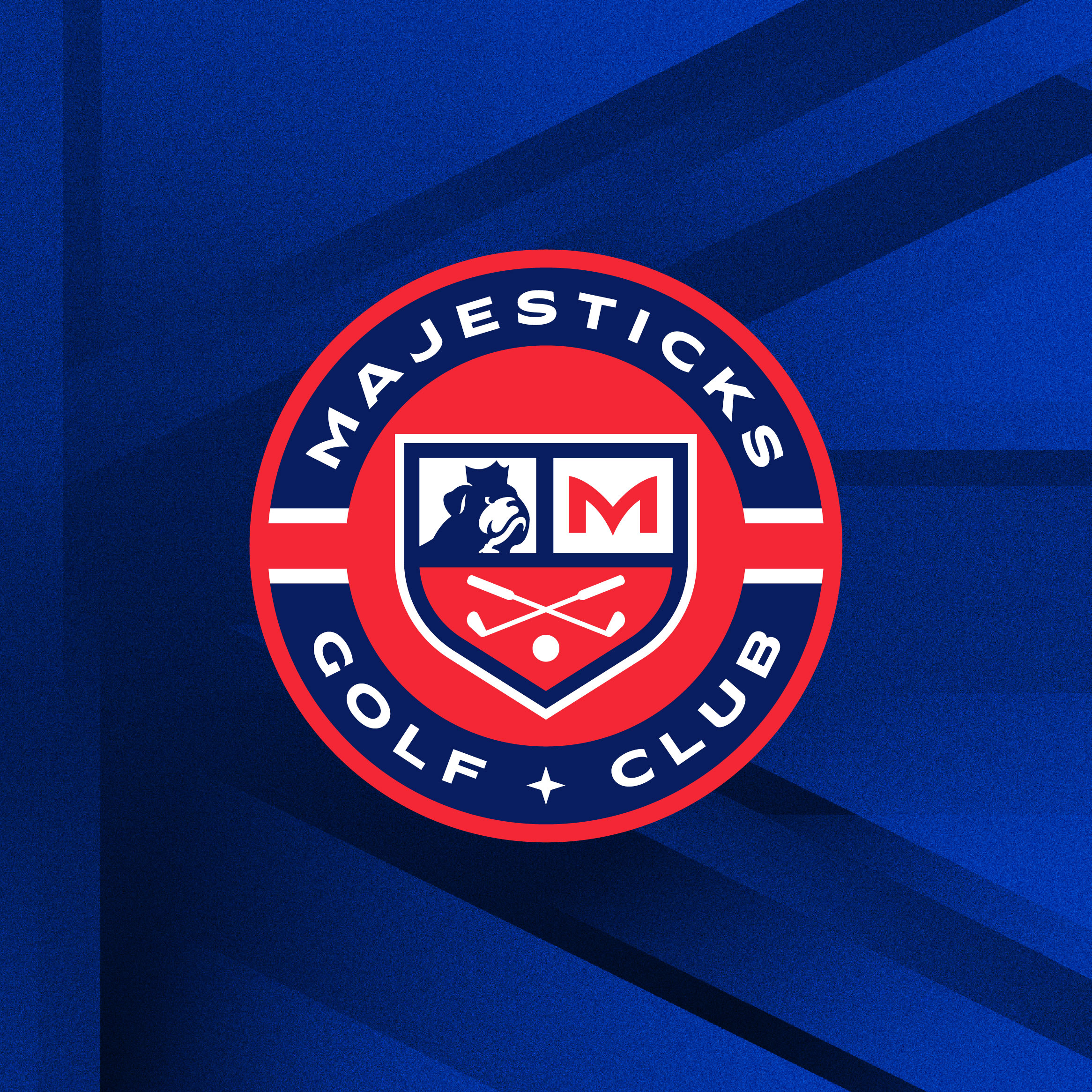
The Roundel functions as a modern coat of arms, bringing together key Majesticks elements in one unified mark. It creates a bold, authoritative symbol that represents the team’s heritage and identity.
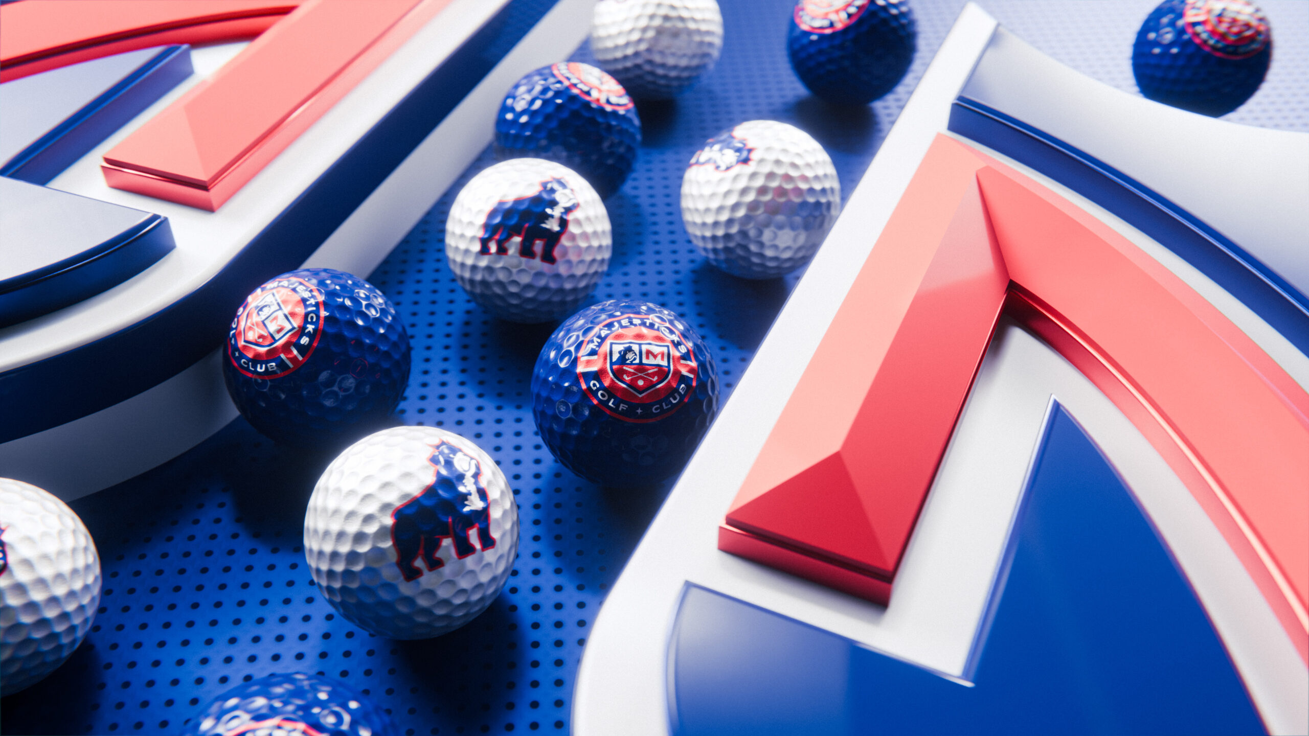
Photo: LIV Golf
Photos: LIV Golf
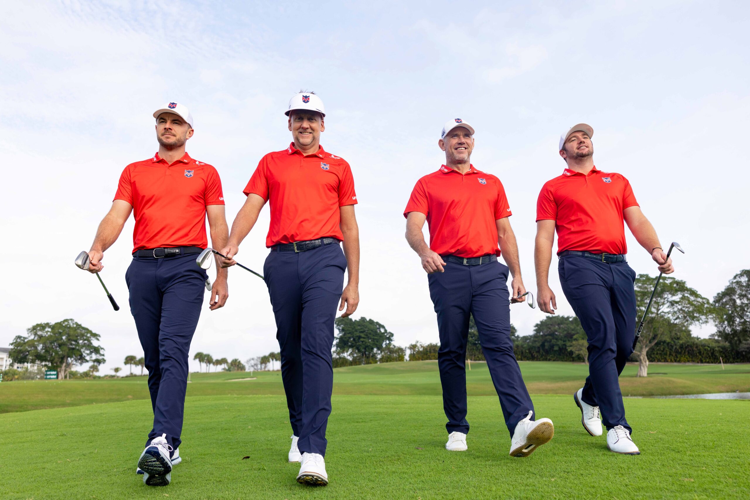
Photo: LIV Golf
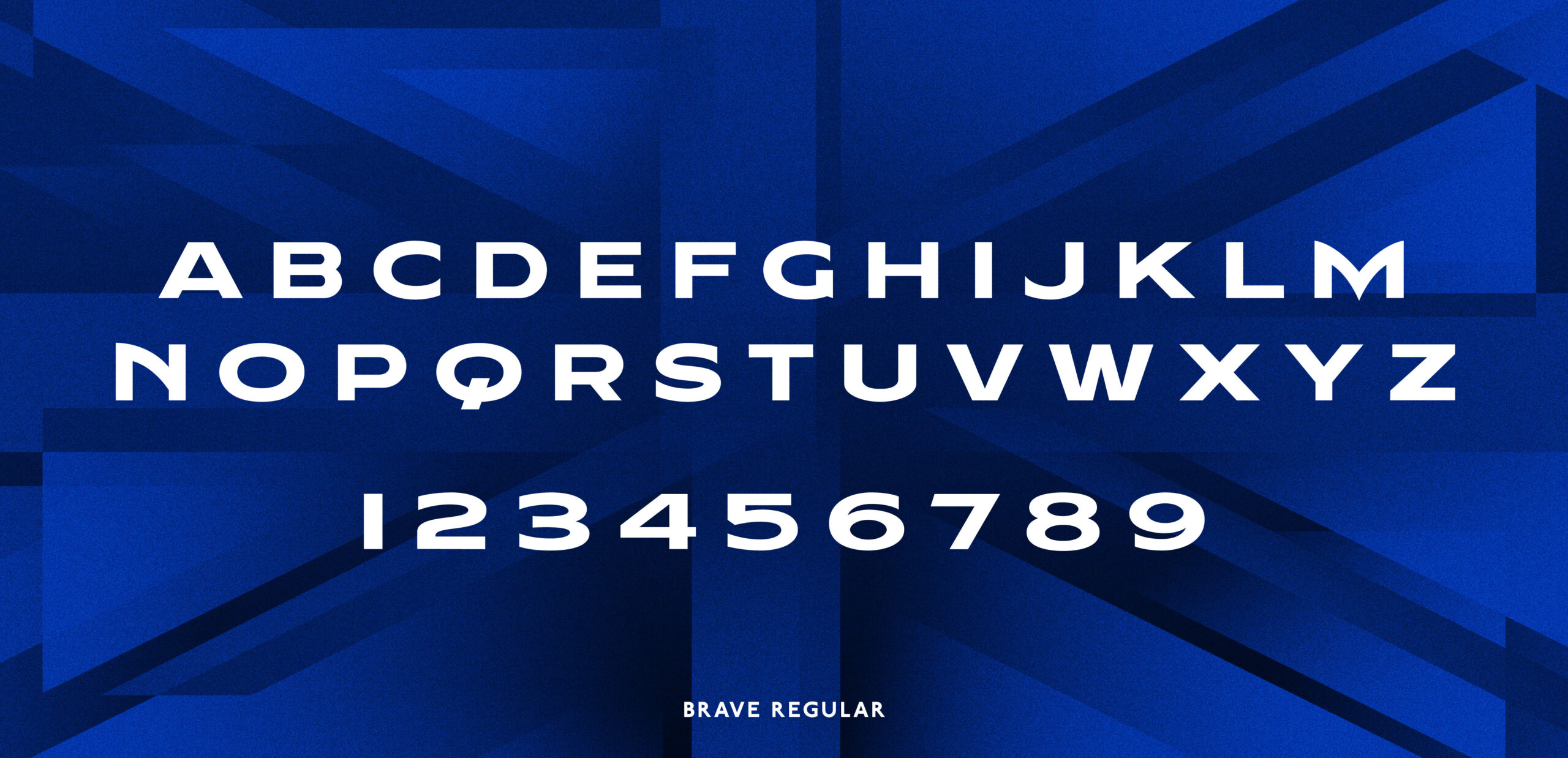
Brave Regular was designed to carry the spirit of the Majesticks in every letterform. Bold, resilient, and unmistakably British, its wide stance and grounded presence give it a sense of quiet power, not flamboyant or overstated. Each curve and flare was shaped to hold weight and conviction, allowing the type to command attention in the biggest moments and the smallest details. It is not just a tool for headlines and pull quotes, but a voice that speaks with pride, confidence, lasting, and enduring impact.
Photos: LIV Golf
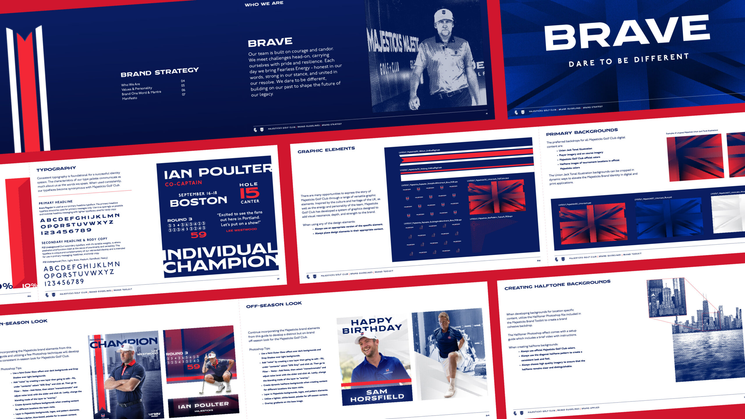
As we built the new brand identity and system for the Majesticks, we focused on giving their team the tools needed to bring the brand to life with confidence and consistency. We created a complete set of brand assets including patterns, elements, color ratios, and image styling guidelines so their internal marketing teams could activate the brand across every touchpoint in a way that feels elevated, cohesive, and true to who the team is.
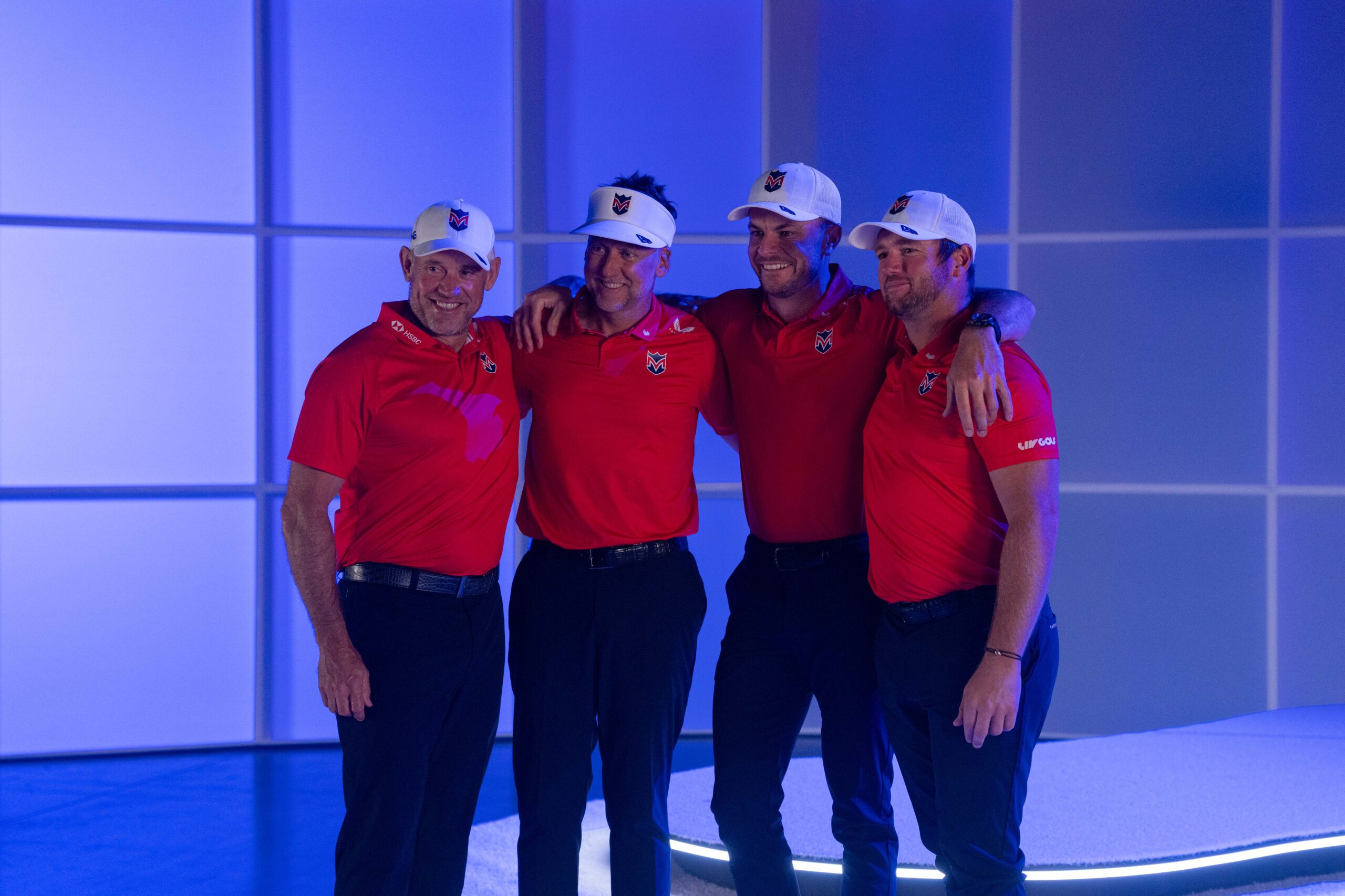
Photo: LIV Golf
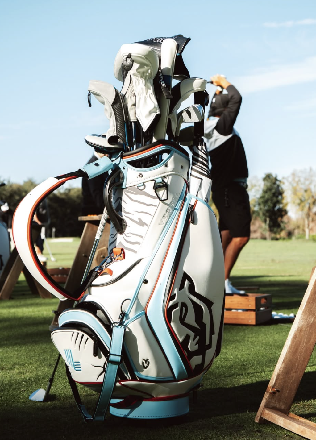
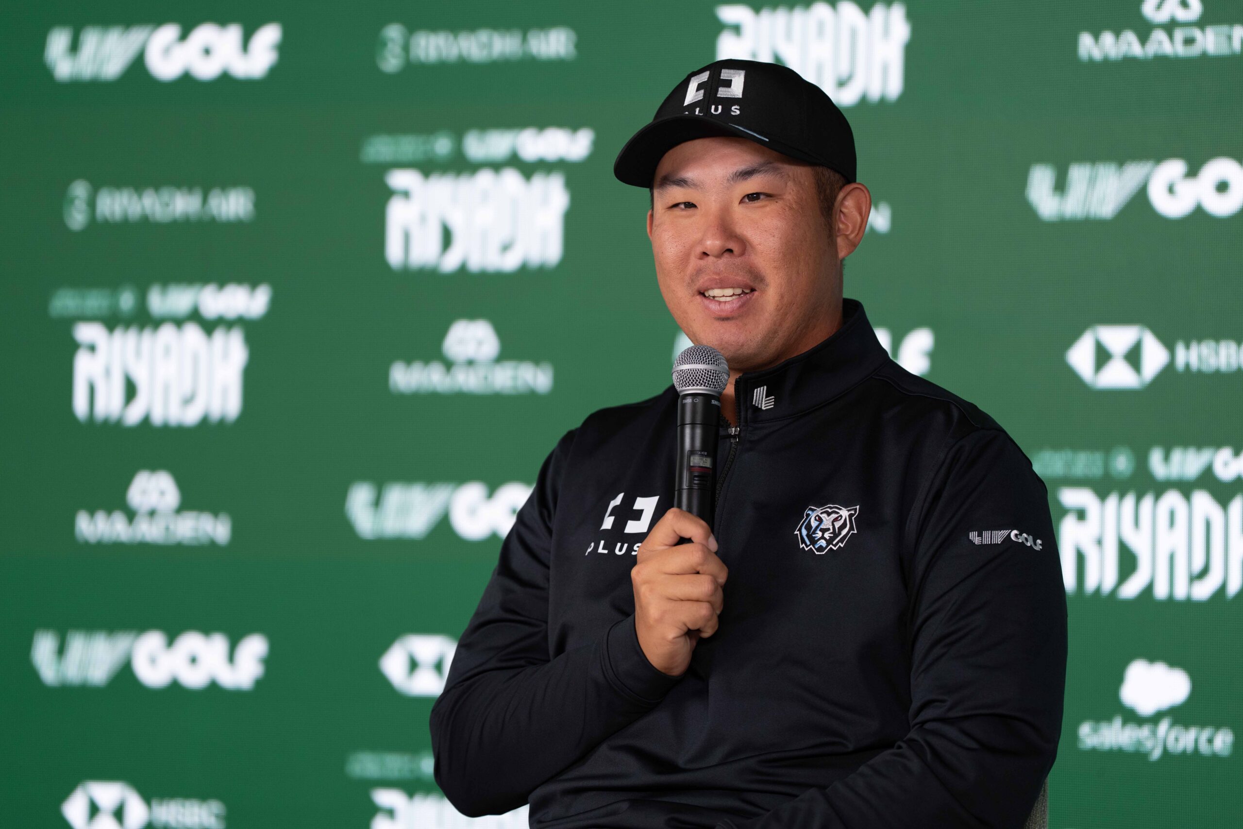
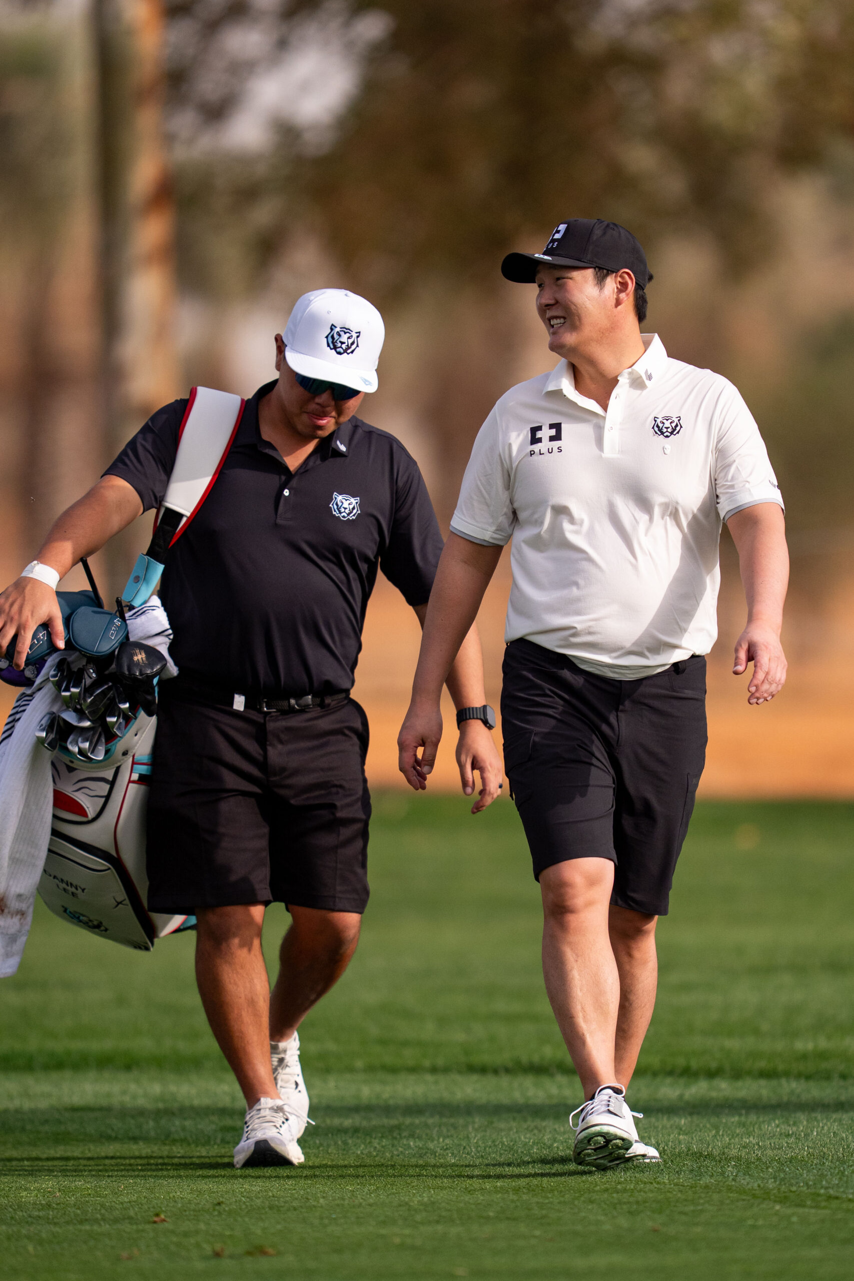
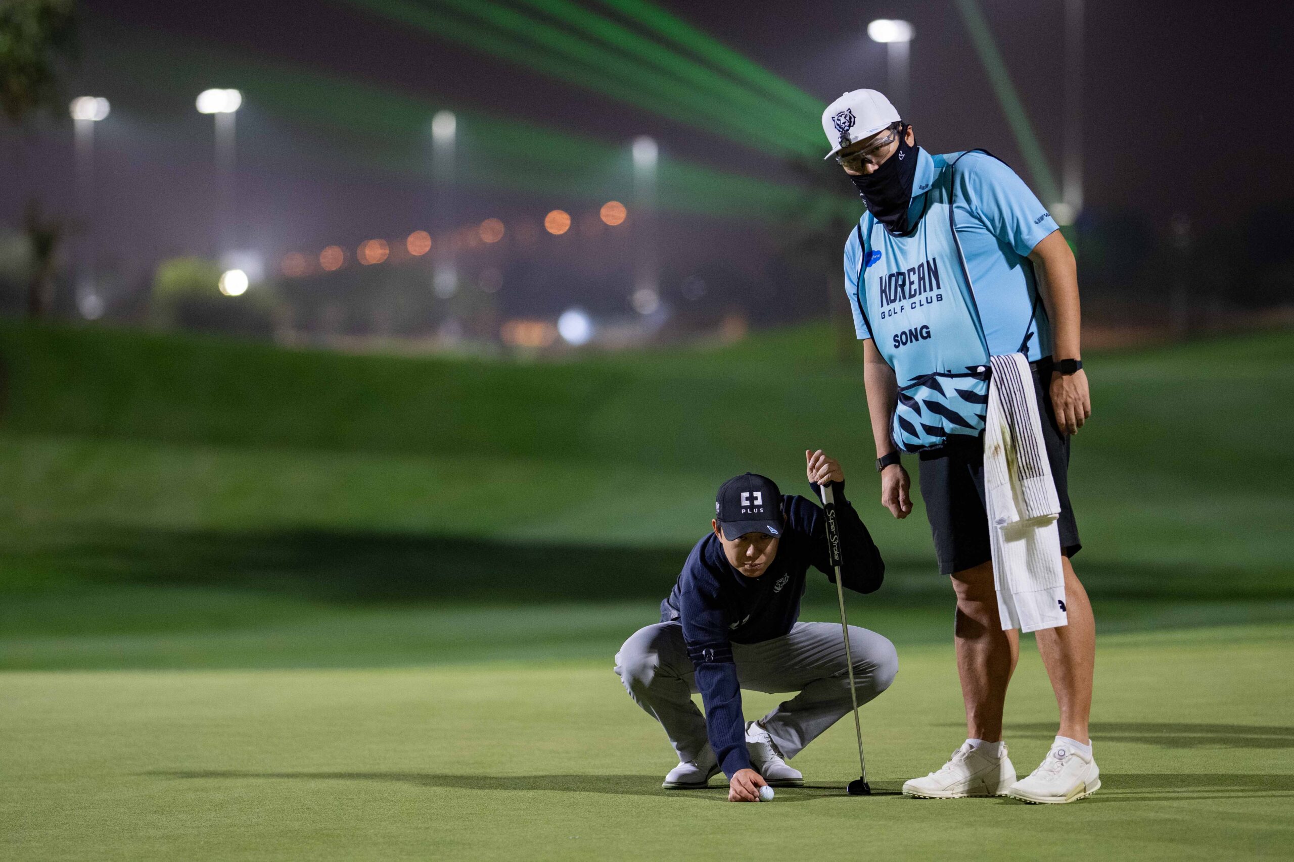
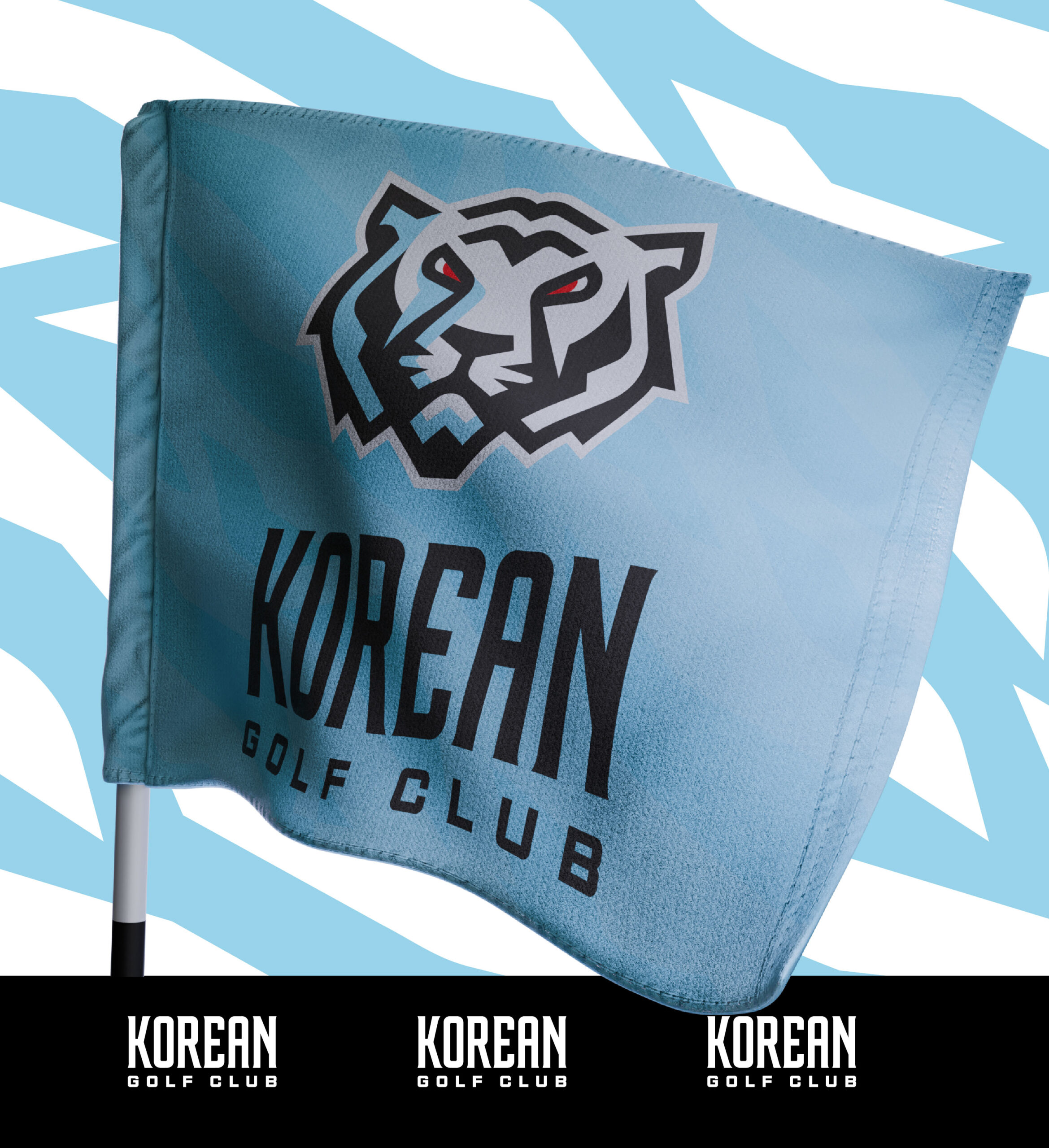
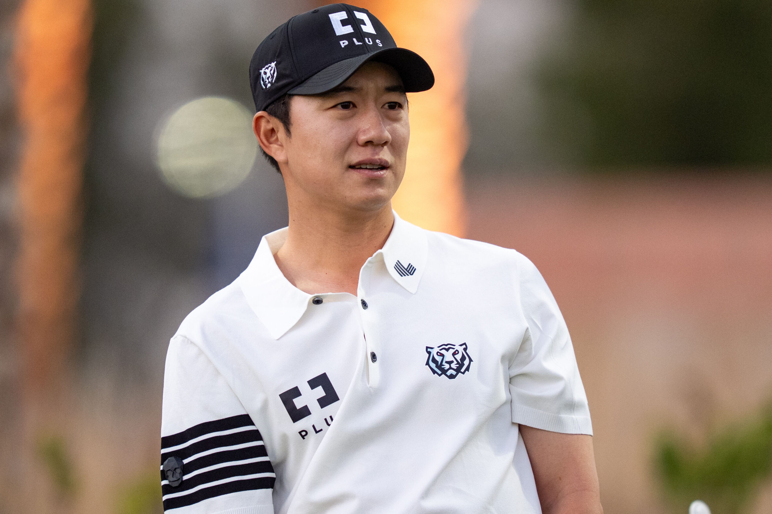
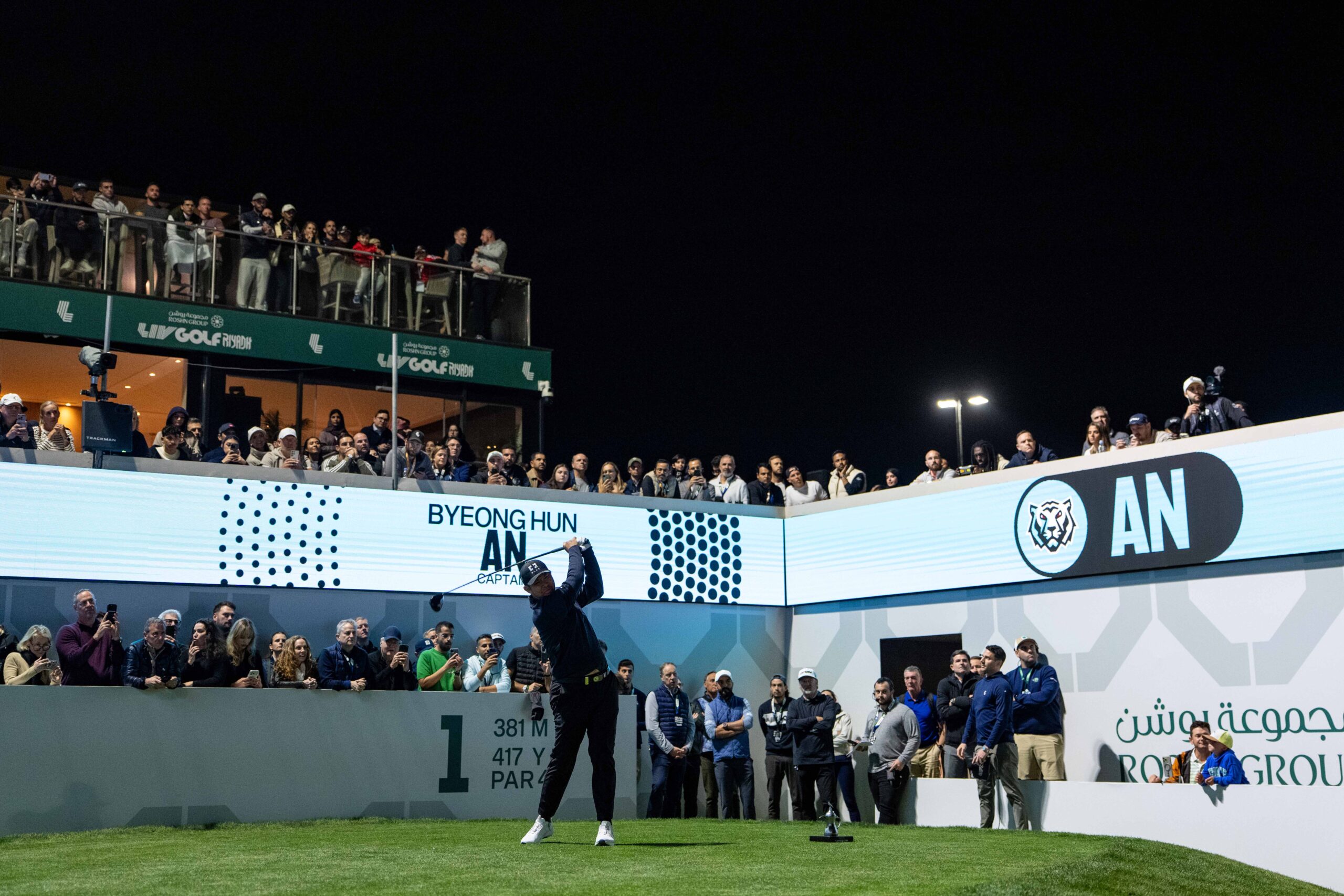
Korean Golf Club
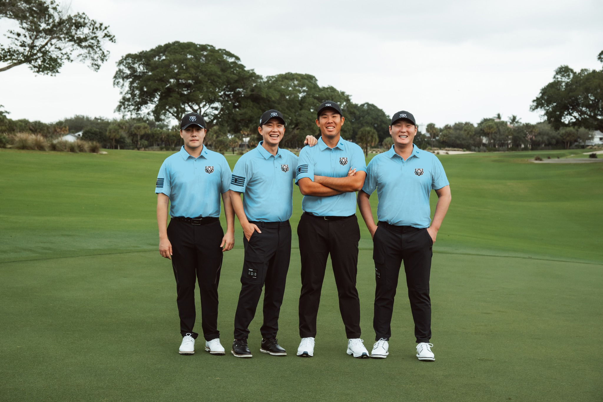
Photo: LIV Golf
An effort aimed at defining the future of the world of gold in Korea. An elevation of team golf that unifies a nation around its collective pride and commitment to the intersection of traditional golf and K-Culture.
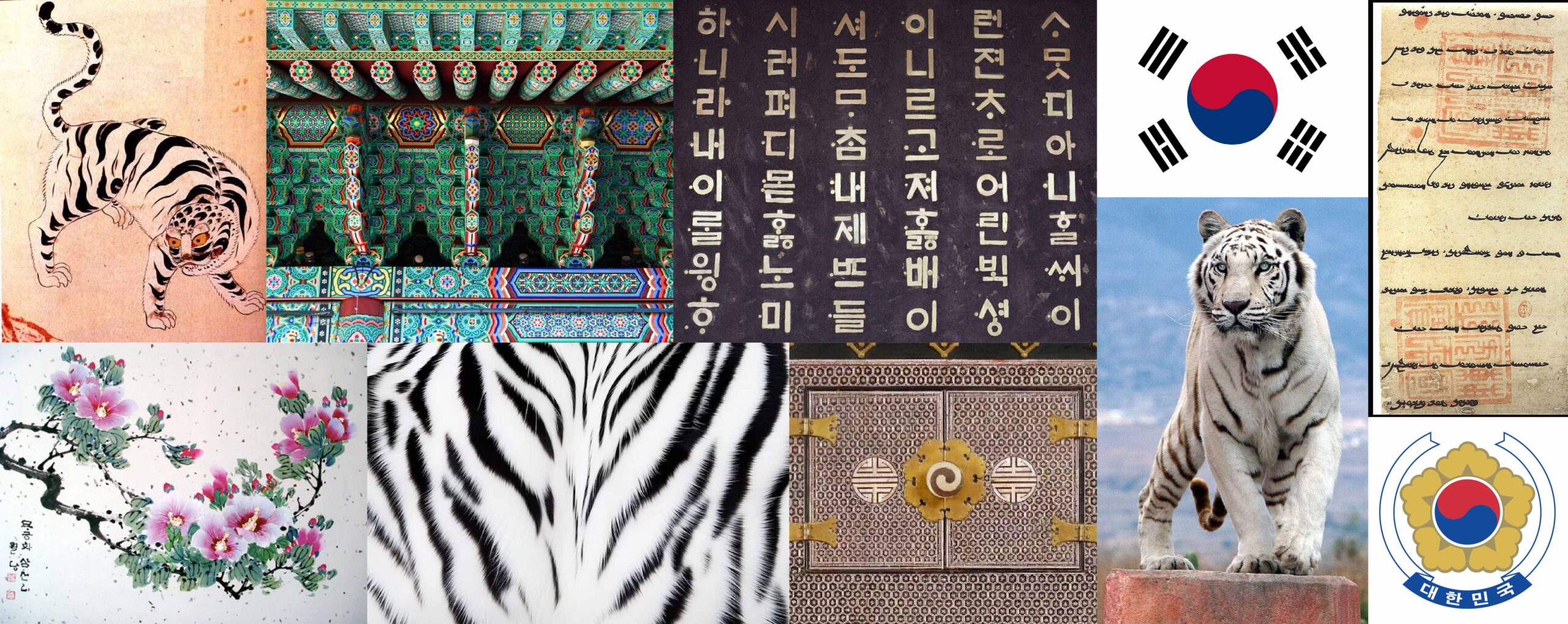
When we were asked to shape a new identity for Iron Heads GC, we started by listening. To the history of South Korea, to its cultural depth, and to the way it carries itself on the global stage. That understanding became the backbone of our process, paired with the forward momentum of LIV Golf and the emerging language of “K-Golf”. The result is a visual system that feels rooted and progressive at the same time, honoring where the game lives today in Korea while opening the door to where it is headed next.
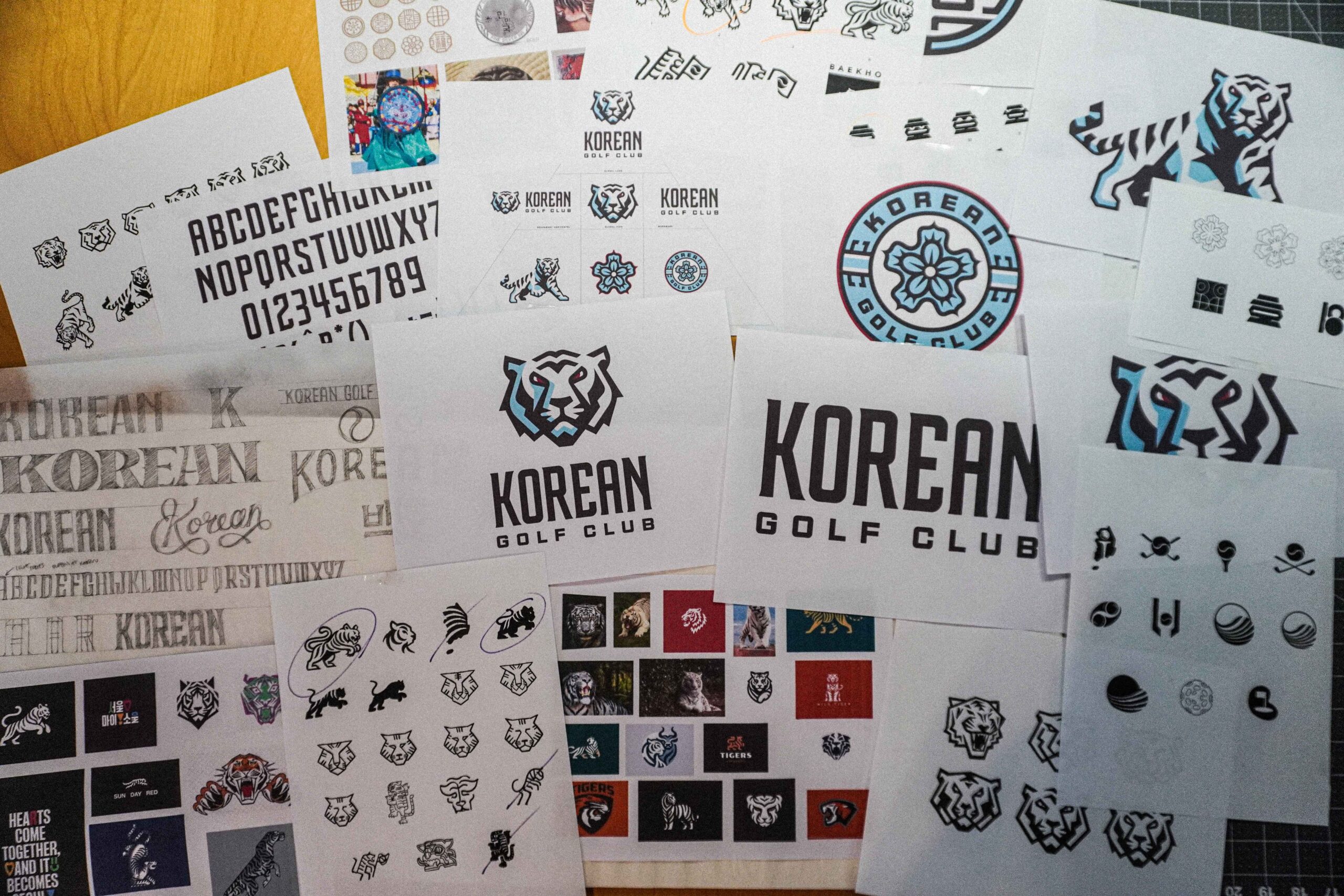
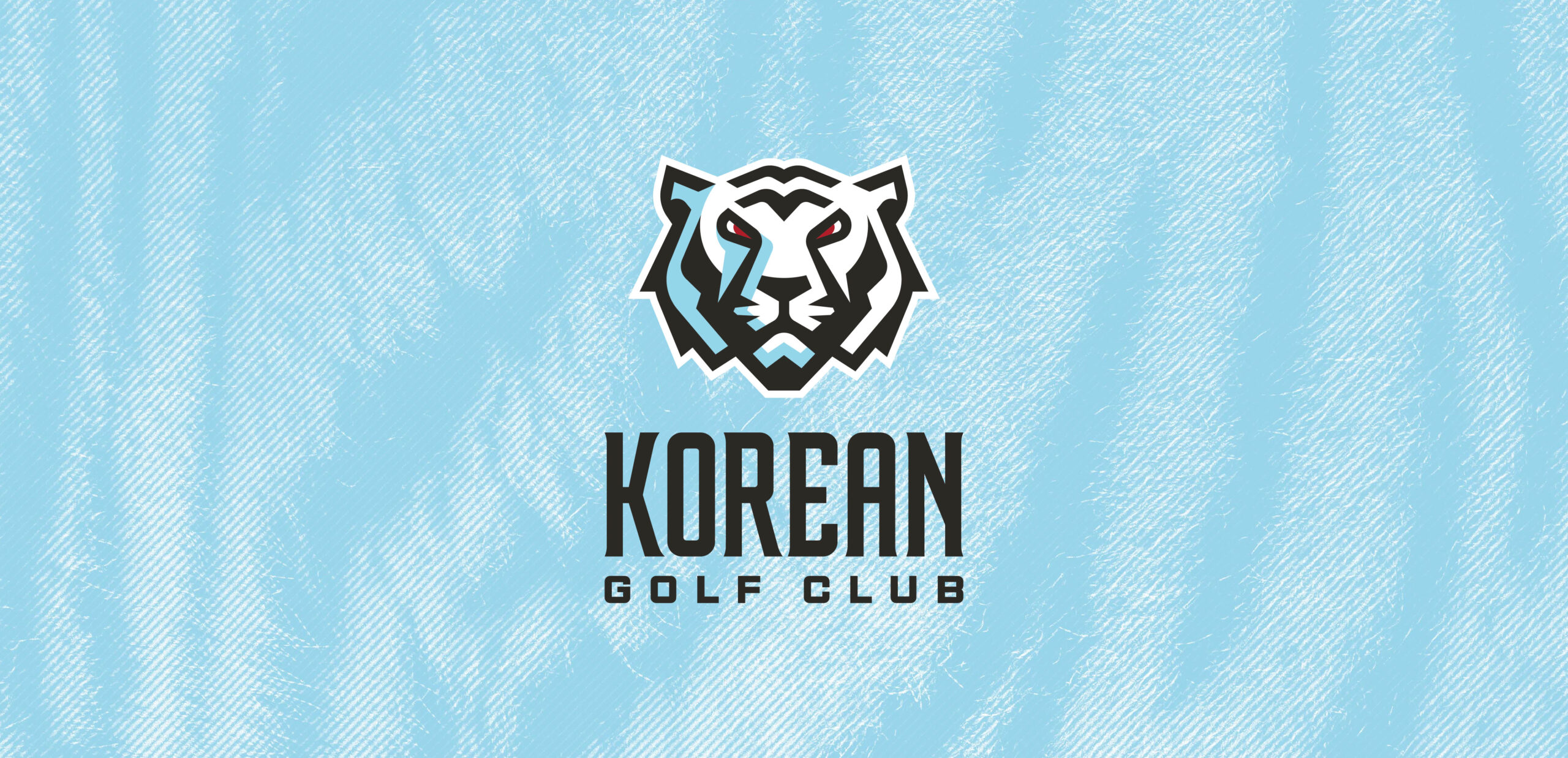
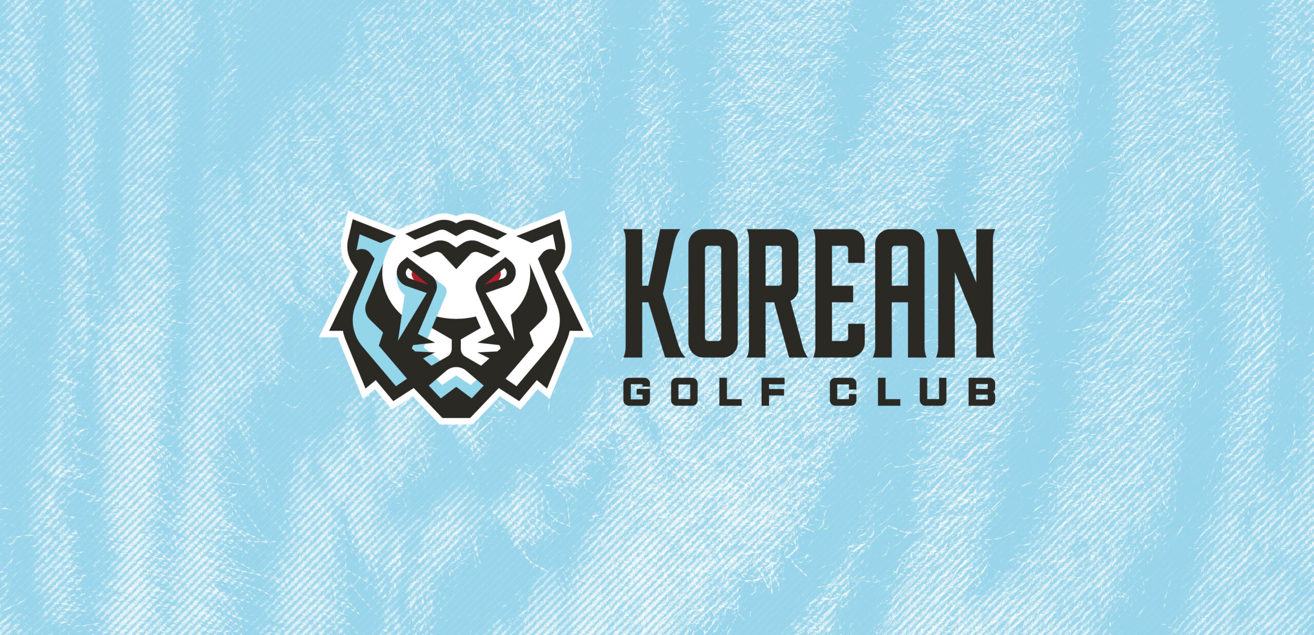
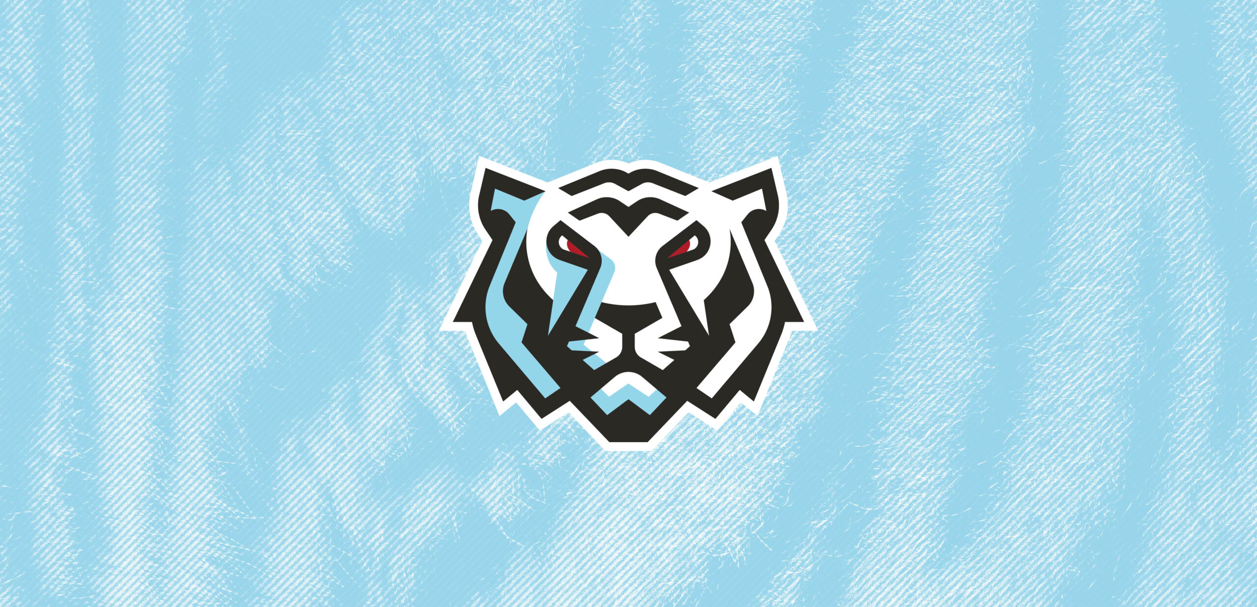
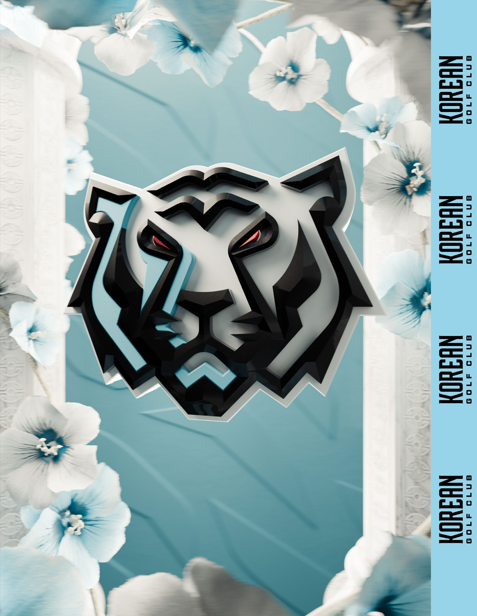
The Global Icon, the white tiger, is a revered figure in Korean folklore and history. As the “protector of the west,” it embodies the strength and tenacity of both our team and our country.
The tiger’s face includes a subtle nod to the game of golf – the eyes and bridge of the nose make the shapes of two golf clubs.
The Wordmark retains the signature tall letterforms of the team’s previous identity and enriches them with details drawn from traditional Korean motifs.
Photos: LIV Golf
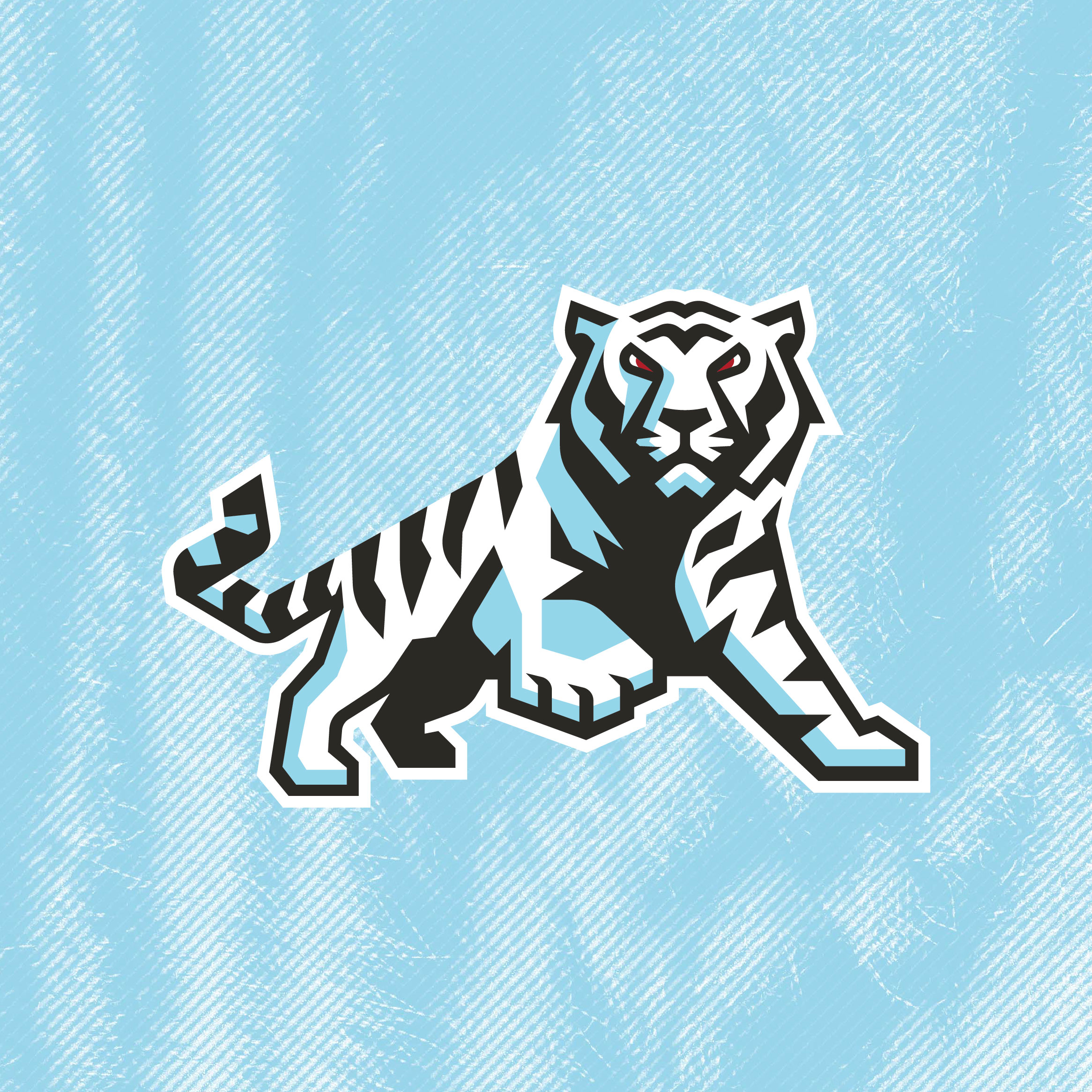
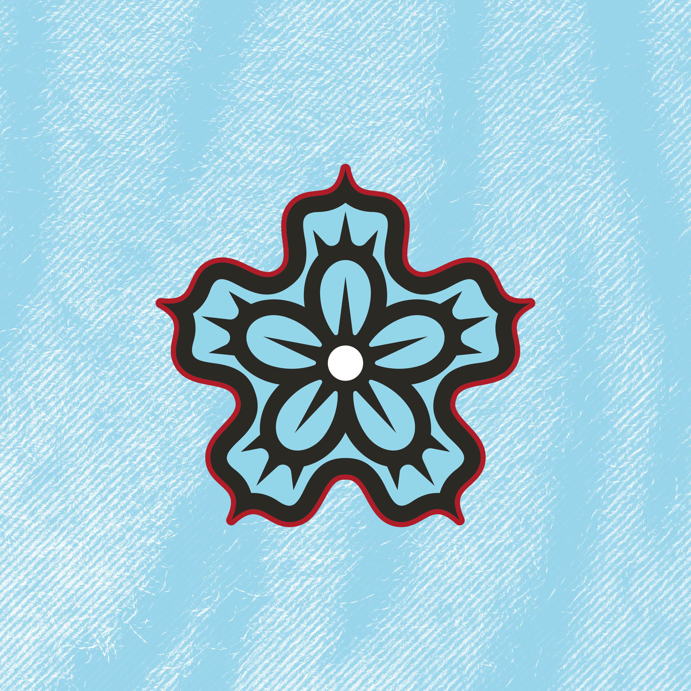
The White Tiger, known as Baekho, is a powerful emblem in Korean history and folklore, symbolizing strength and protection.
The Rose of Sharon is the national flower of South Korea that represents the country’s resilient spirit and enduring beauty.
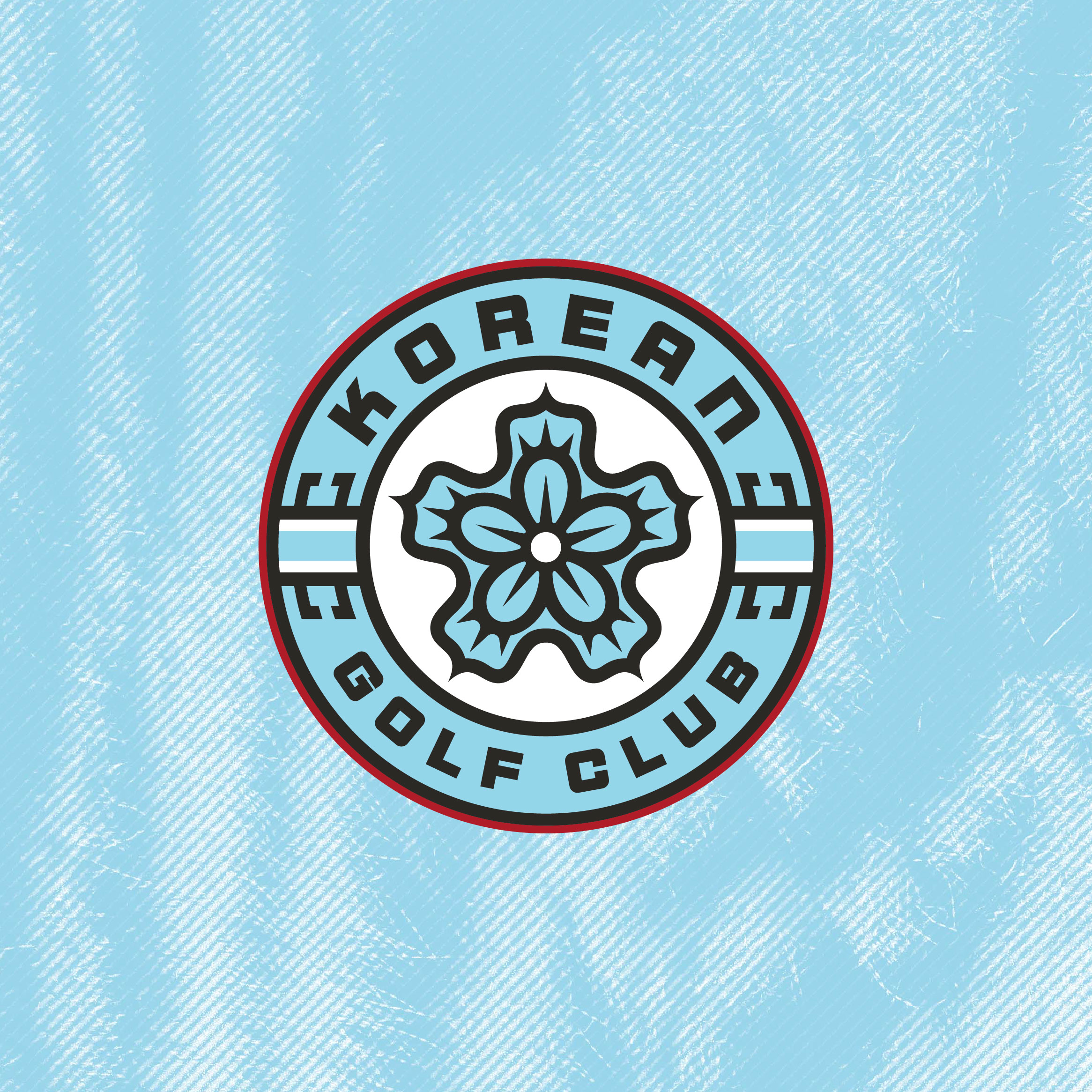
The Roundel is a badge of pride that features the team’s name and Rose of Sharon icon.
Photos: LIV Golf
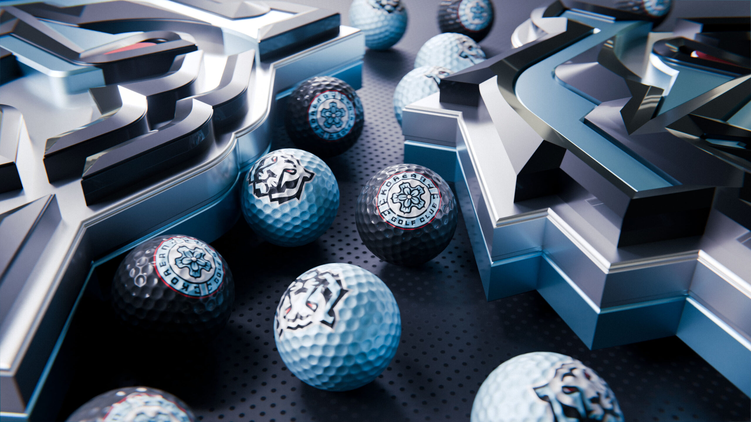
Photo: LIV Golf
Photos: LIV Golf
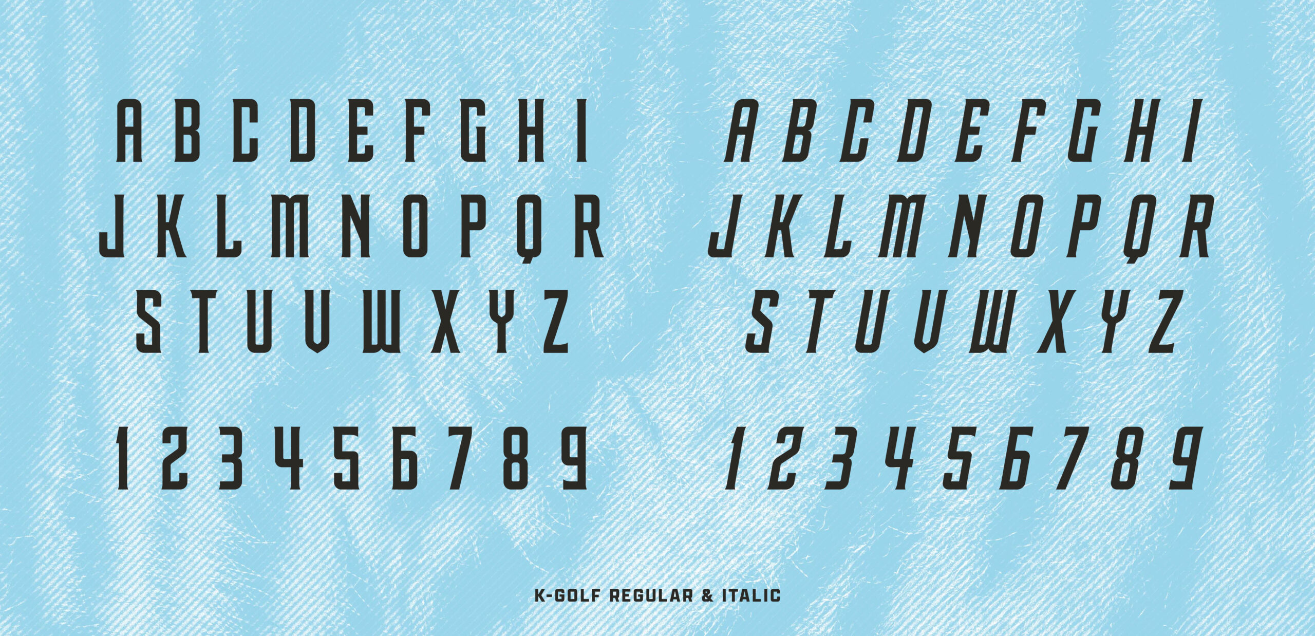
K-Golf Regular was created as a bridge between what Iron Heads GC already stood for and what it is becoming as Korean Golf Club. We carried forward the visual equity the team and its leadership believed in, then layered in a distinctly South Korean point of view that makes the typeface feel truly its own. Inspired by the strength and speed of the White Tiger, its sharp, confident serifs introduce a sense of motion and focus. The result is a type system that stands tall and moves with the same precision and intensity the team brings to the course.
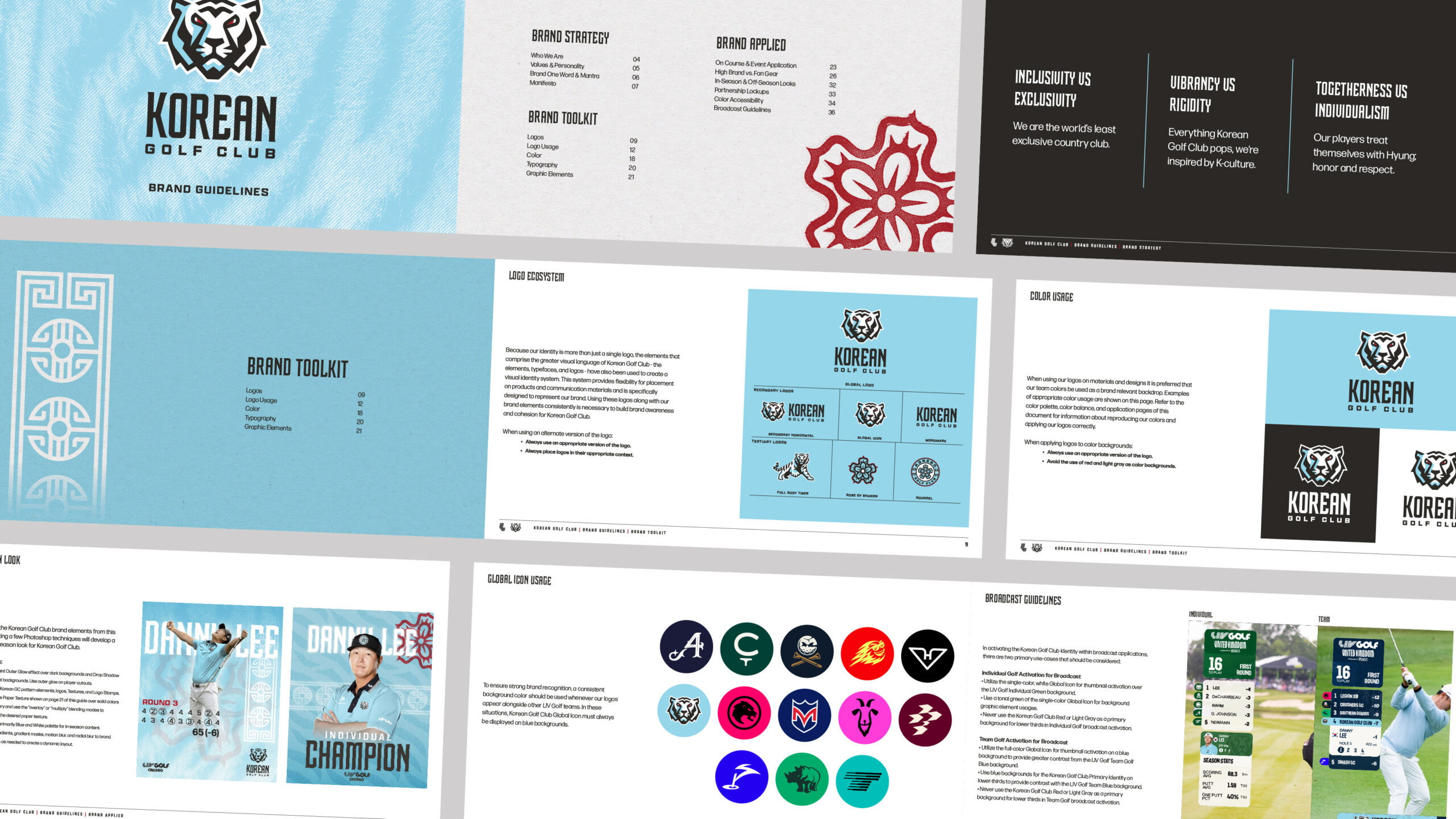
With a new visual language in place, Korean Golf Club needed a clear and capable toolkit to bring it to life. We built a set of guidelines that reflect the club’s philosophy and future facing position while giving the team the structure to show up with confidence on a global stage. The result is a system that feels considered and complete, one that supports the club as it continues to grow with the same focus and pride it brings to the game.
Photos: LIV Golf
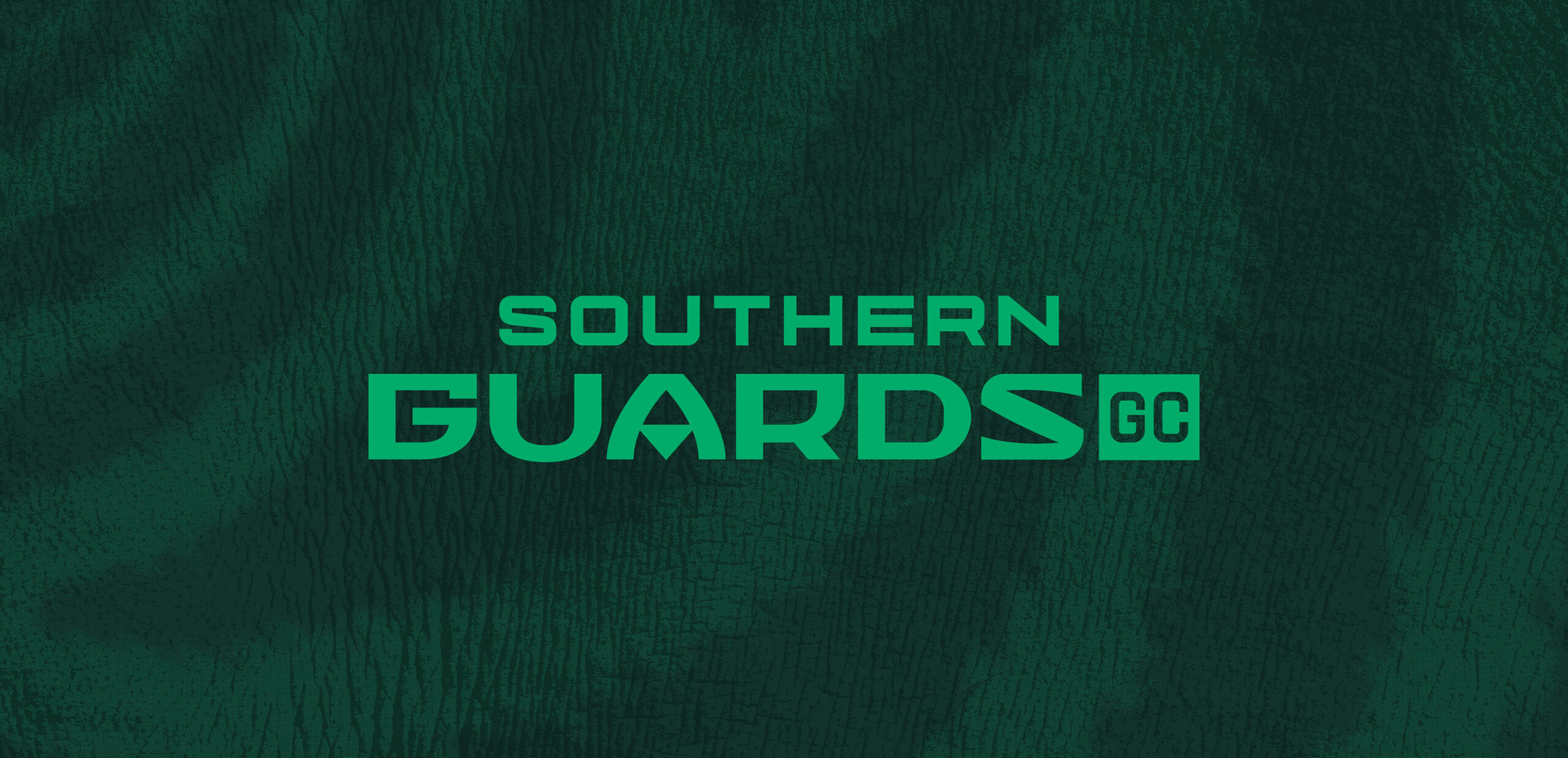
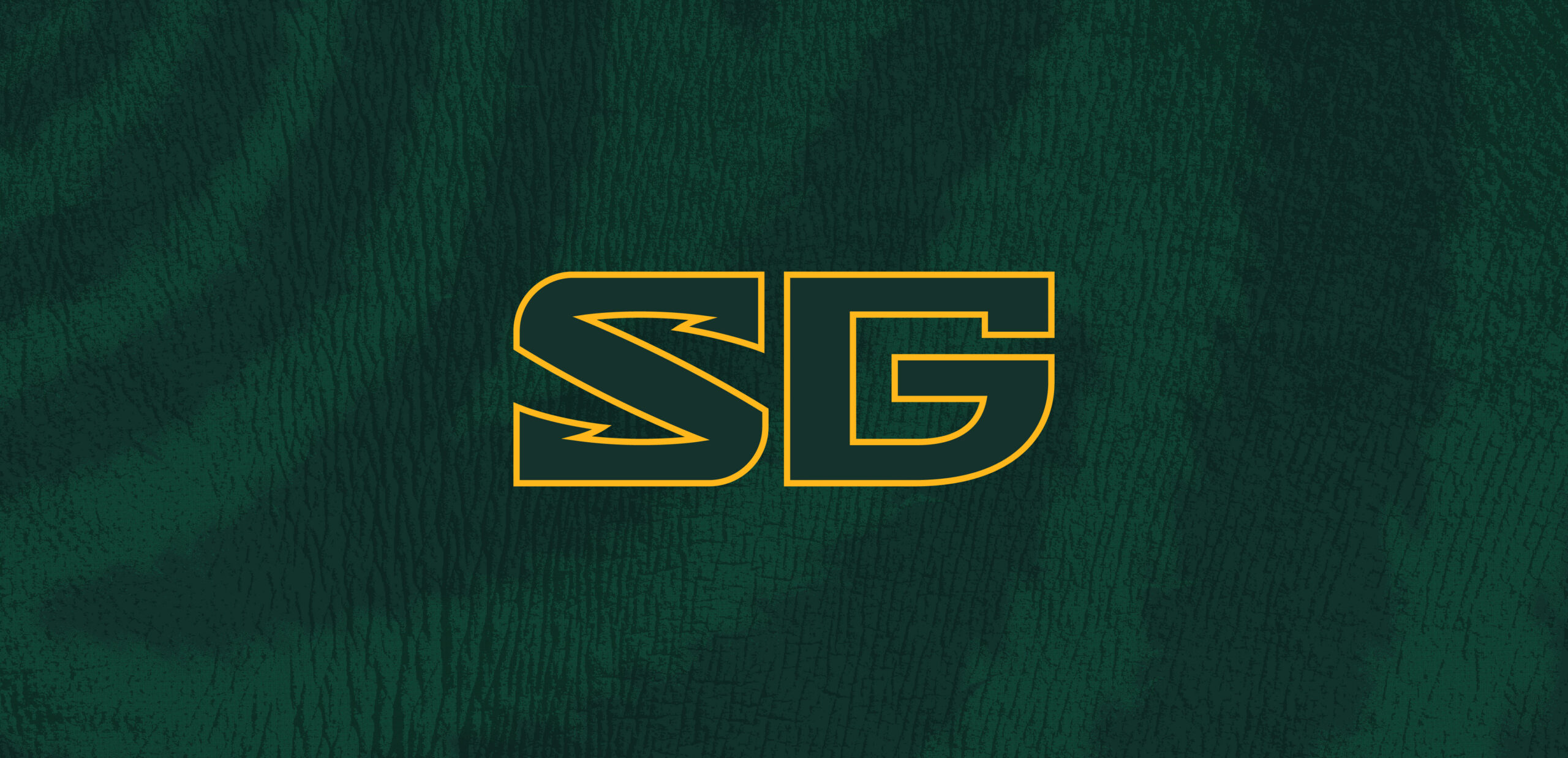
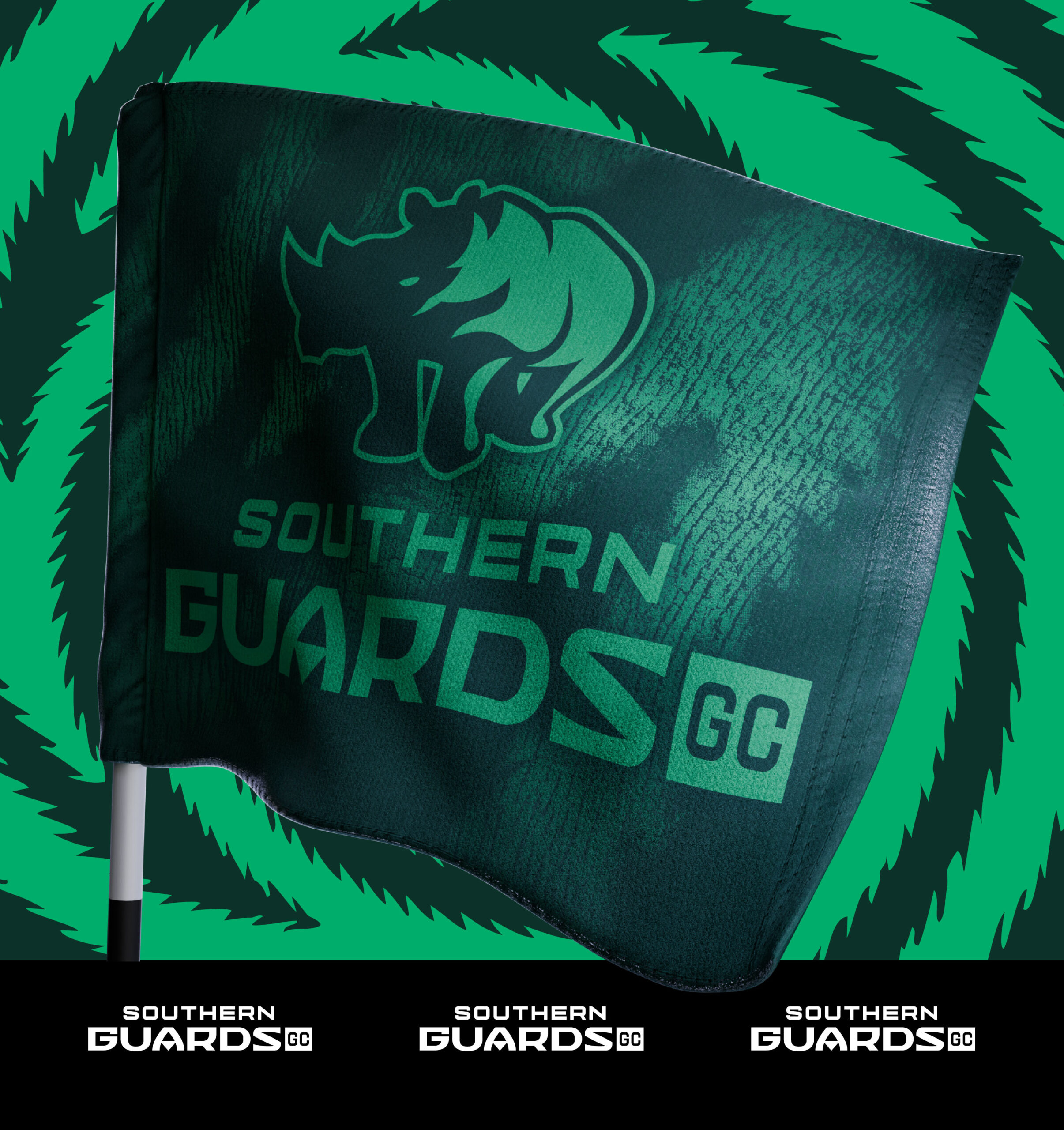
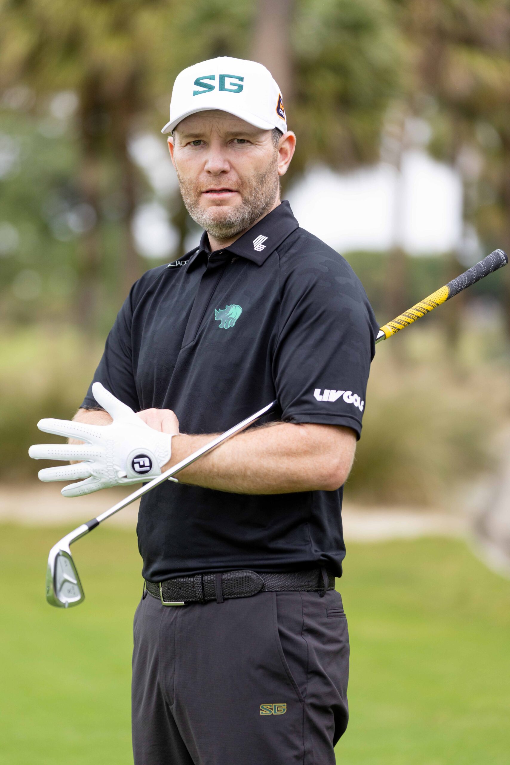
Southern Guards Golf Club
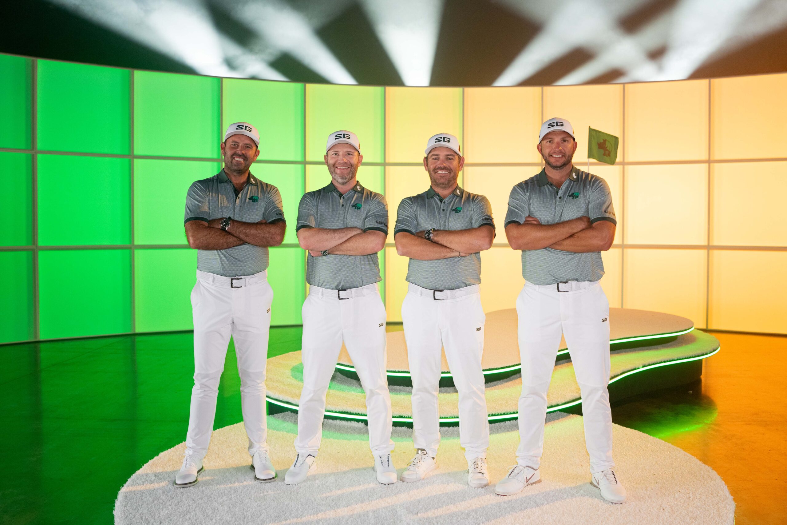
Photo: LIV Golf
UBUNTU. I am because we are. The timeless anthem of South Africa. An identity for a team whose commitment to one another is unrivaled. United by their collective strength, the Southern Guards understand that victory is attained through shared support of one another.
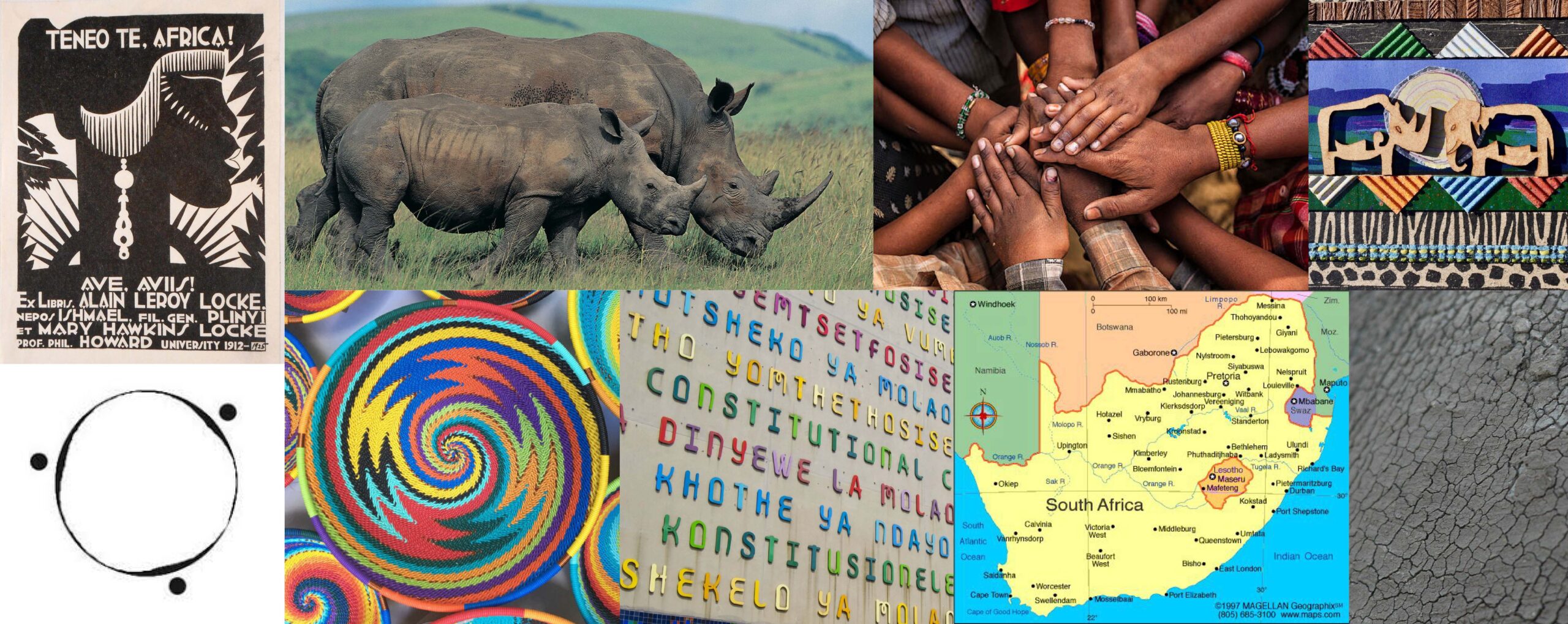
From Johannesburg to Pretoria to Cape Town, and across the rich diversity of its native tribes, South Africa has a vibrance and spirit unlike anywhere else in the world. We spent countless hours exploring, learning, and uncovering the stories and pride that define this place. At the heart of our work was the team’s deep respect for the people and culture, and the way they aim to honor and elevate that pride. We embraced the idea and brand one-word of Ubuntu —“I am because we are”— a unifying principle that extends from the team to their fans and communities. Every choice in the visual identity and system was made to reflect that connection, creating something that feels authentic, rooted, and truly South African.
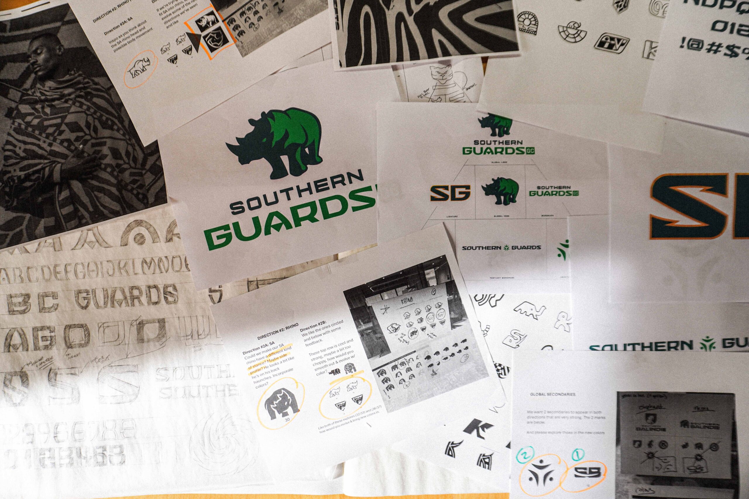
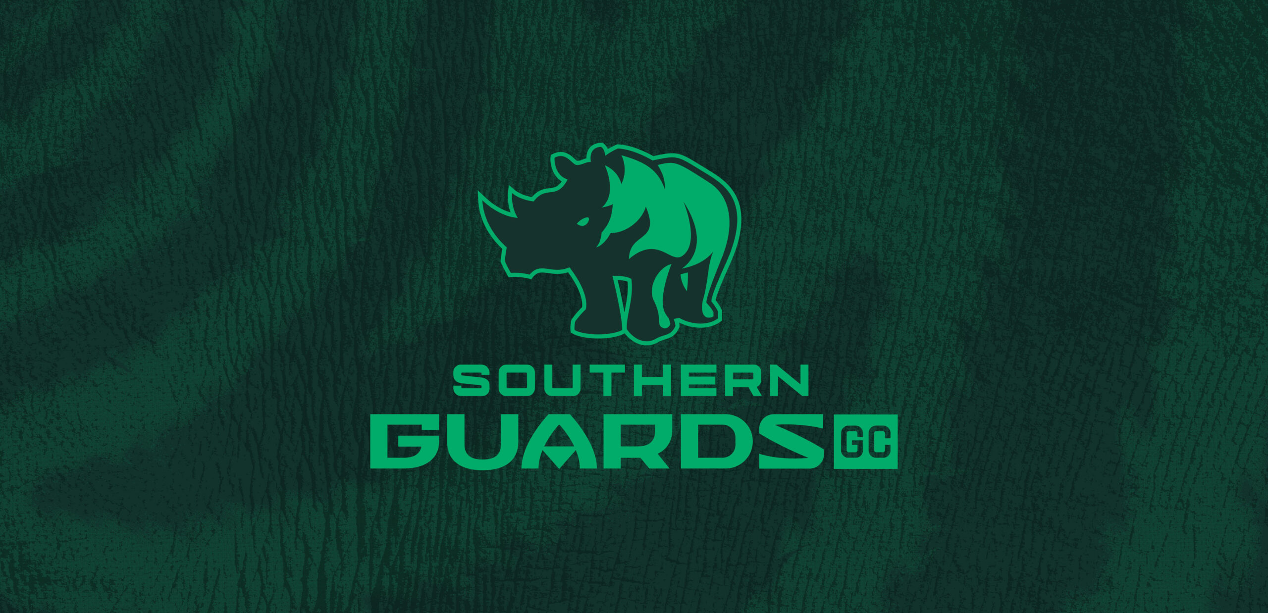
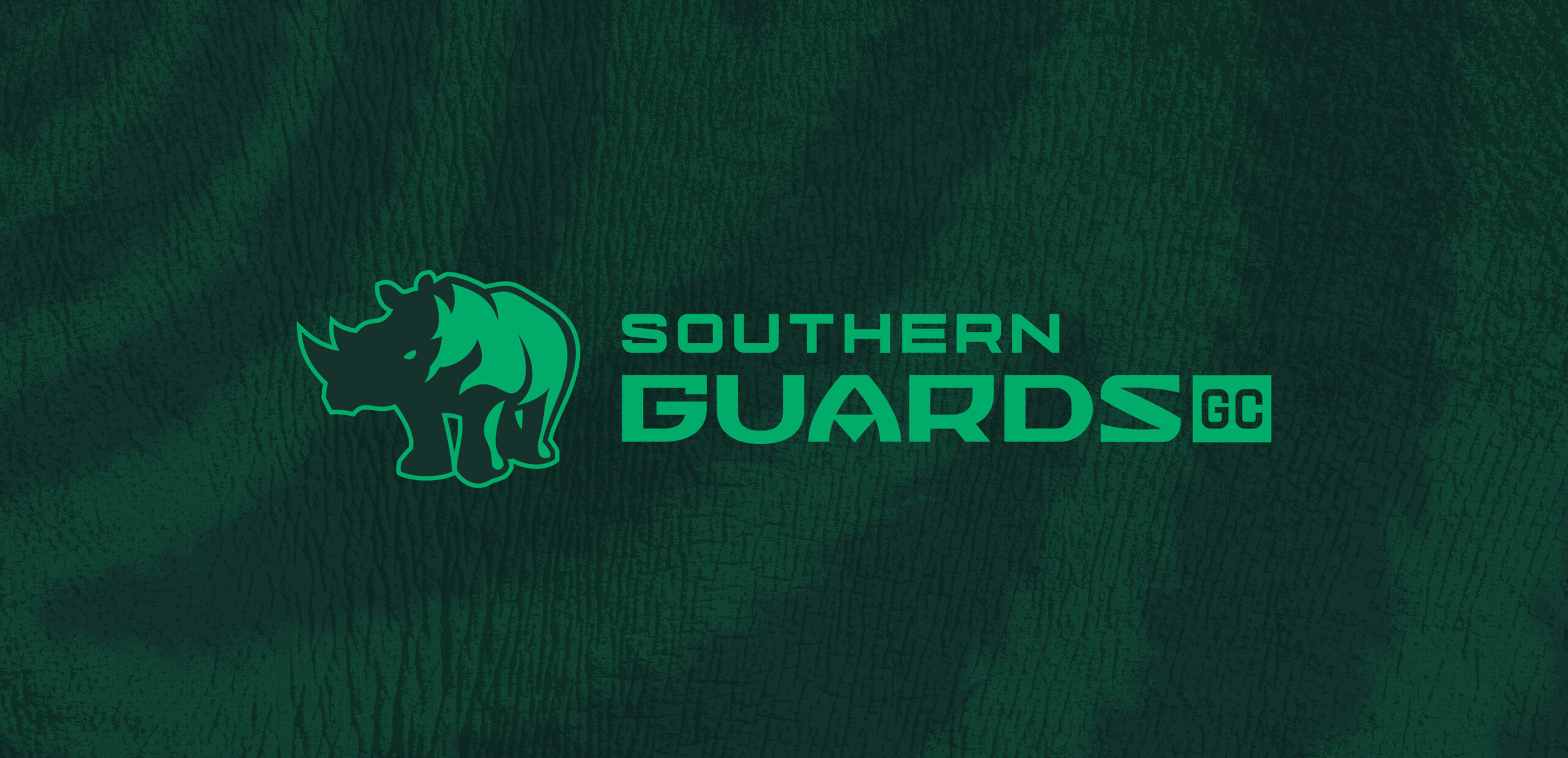
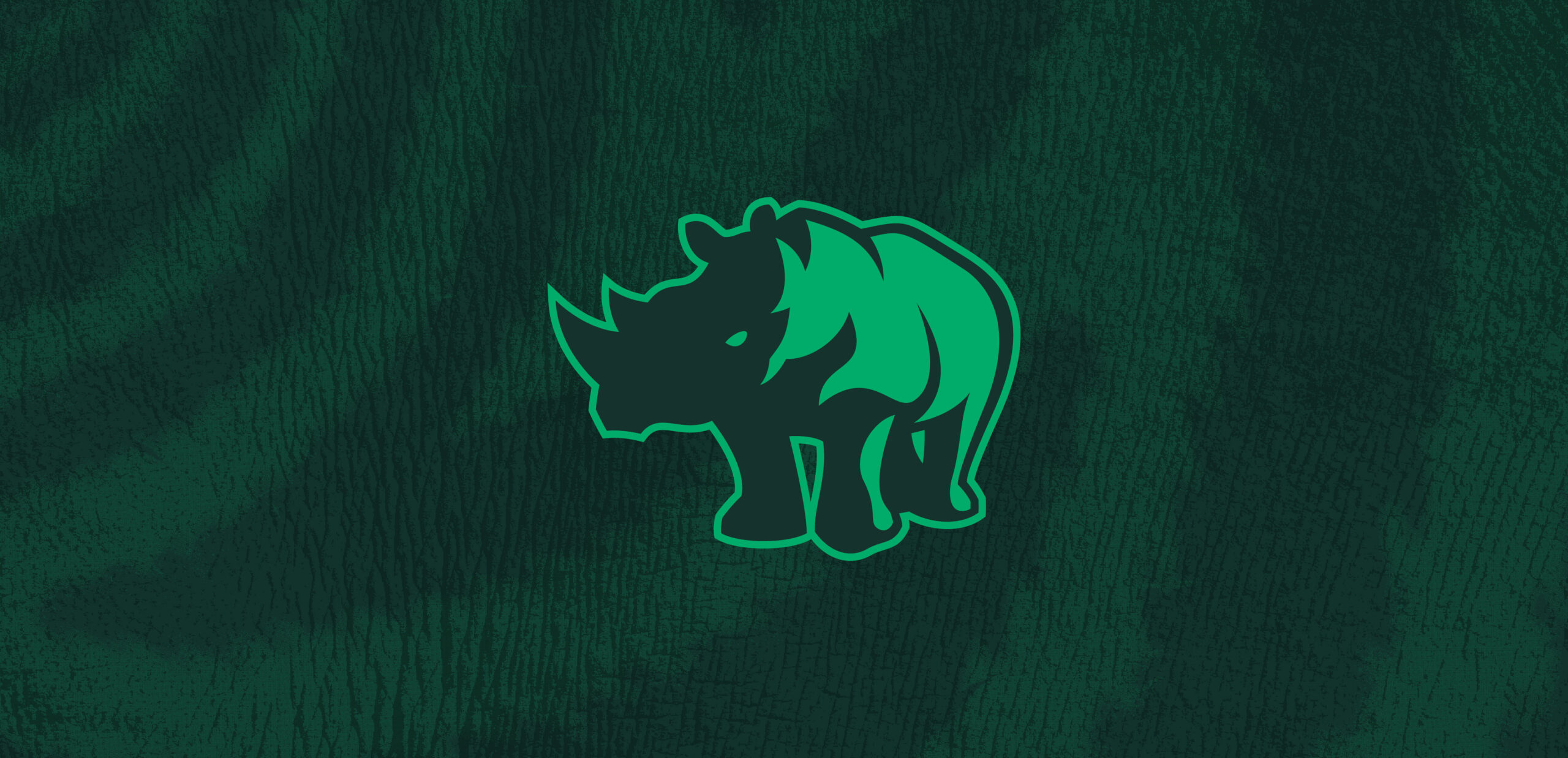
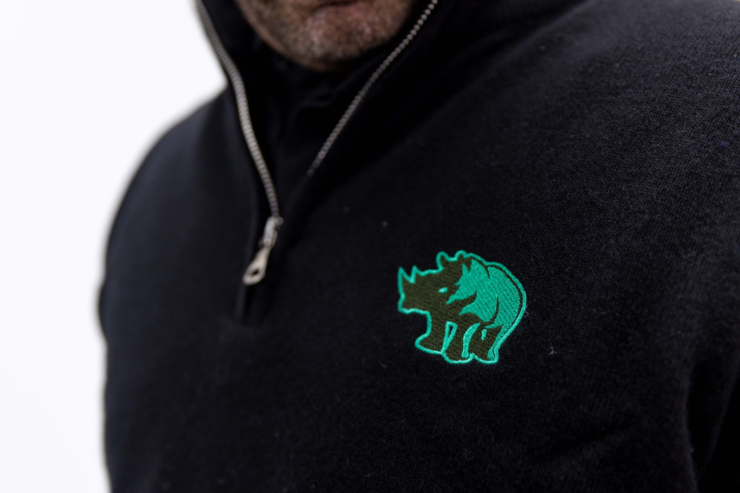
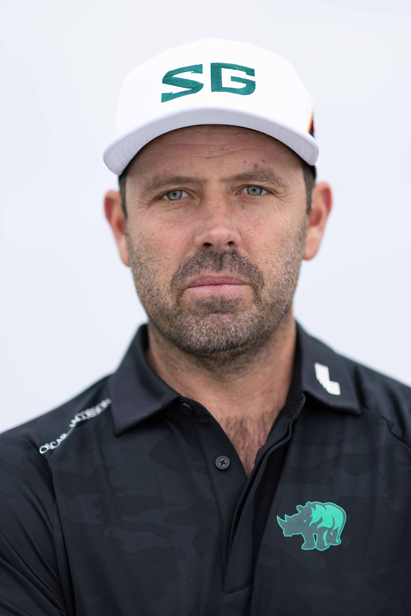
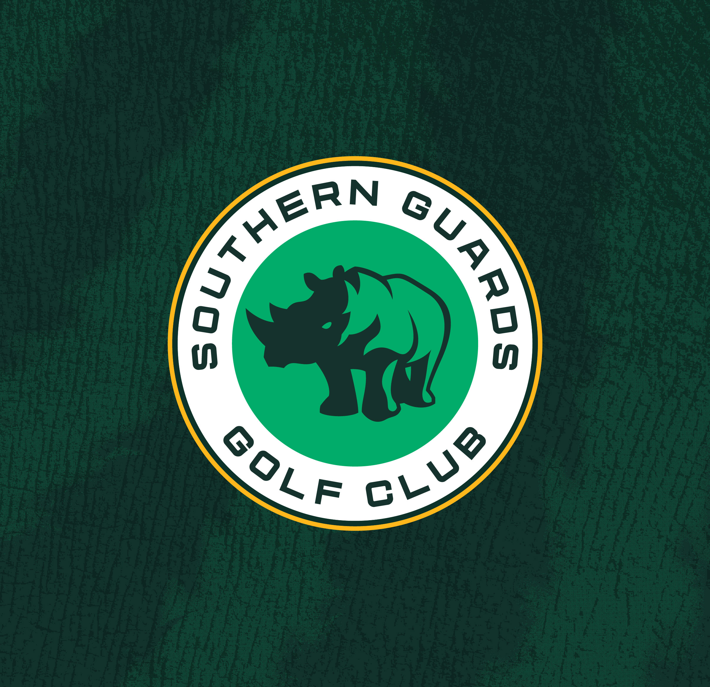
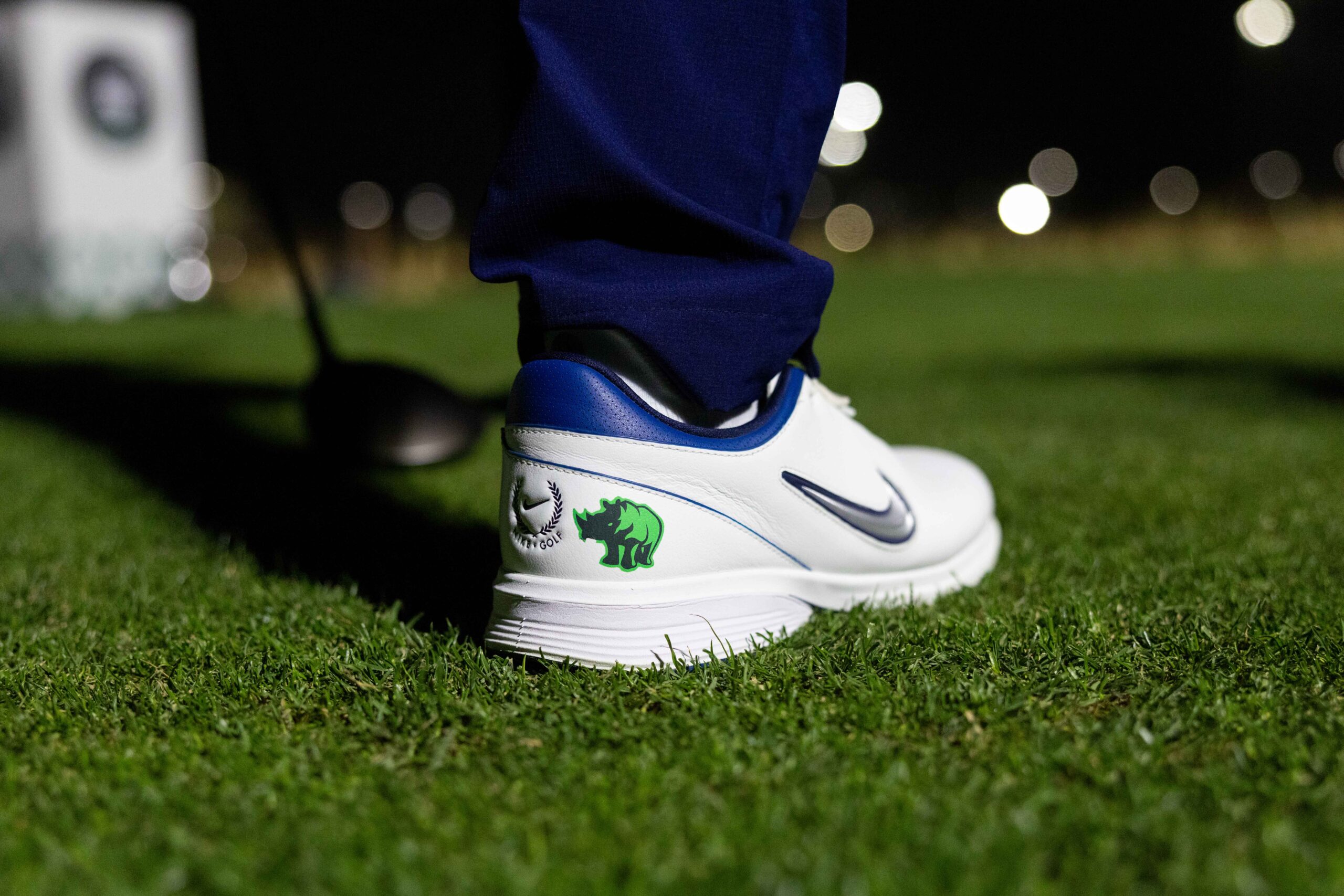
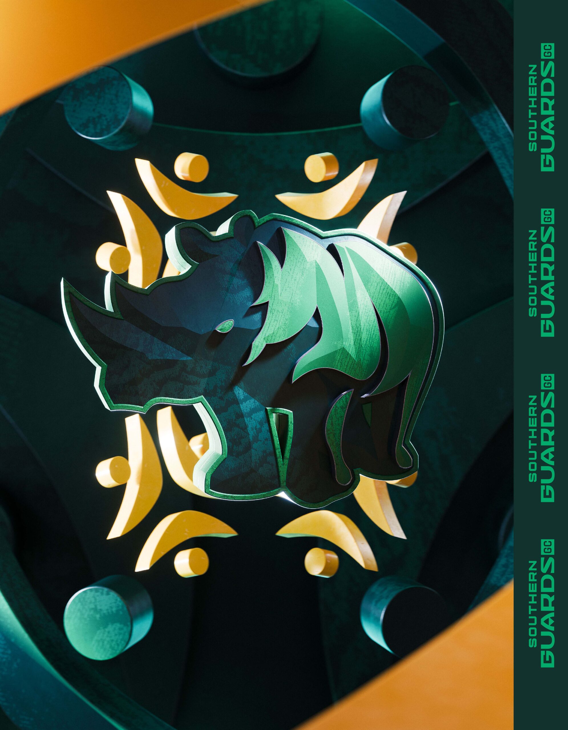
The Southern Guards Global Icon, the rhino, is one of South Africa’s most iconic and revered animals. Across many South African cultures, rhinos symbolize strength and resilience. They are seen as steadfast guardians of the land they call home. The Guards.
The shape of the rhino’s head mirrors the outline of South Africa, capturing the essence of the team’s brand one word: Ubuntu. It represents their belief in unity as one team and one country.
The rhino is dramatically shaded, standing under the bright South African sun. This sun-inspired treatment reflects the warmth and energetic spirit of the people while the strong shadowed stance reinforces the rhino as a steadfast guardian, stepping forward to protect what matters.
The Wordmark is crafted from bold, geometric shapes that echo the distinctive patterns woven into South Africa’s visual culture.
Photos: LIV Golf
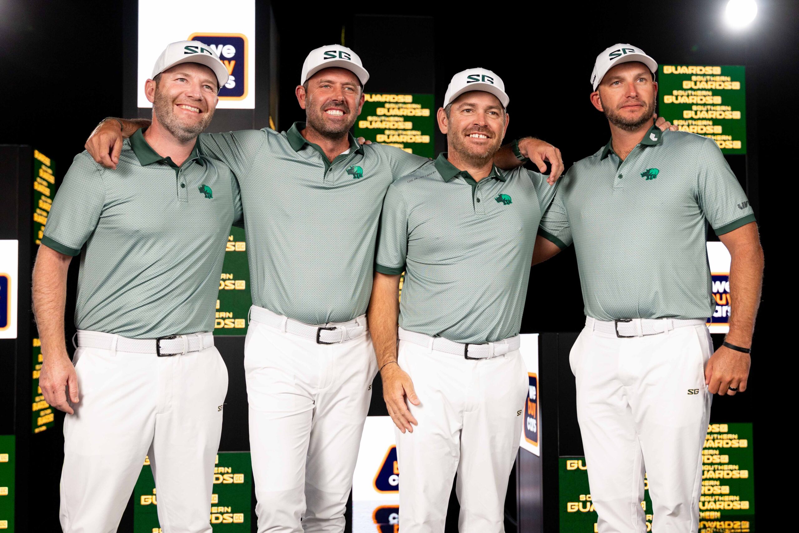
Photo: LIV Golf

The Ubuntu Icon symbolizes the uniting spirit of ubuntu, the team’s brand one word. “I am because we are.”
The additional Tertiary Wordmark includes the Ubuntu Icon, allowing the team to proudly represent its South African values.
The Roundel features the team name surrounding the strong rhino icon.
Photo: LIV Golf
Photos: LIV Golf
Photo: LIV Golf
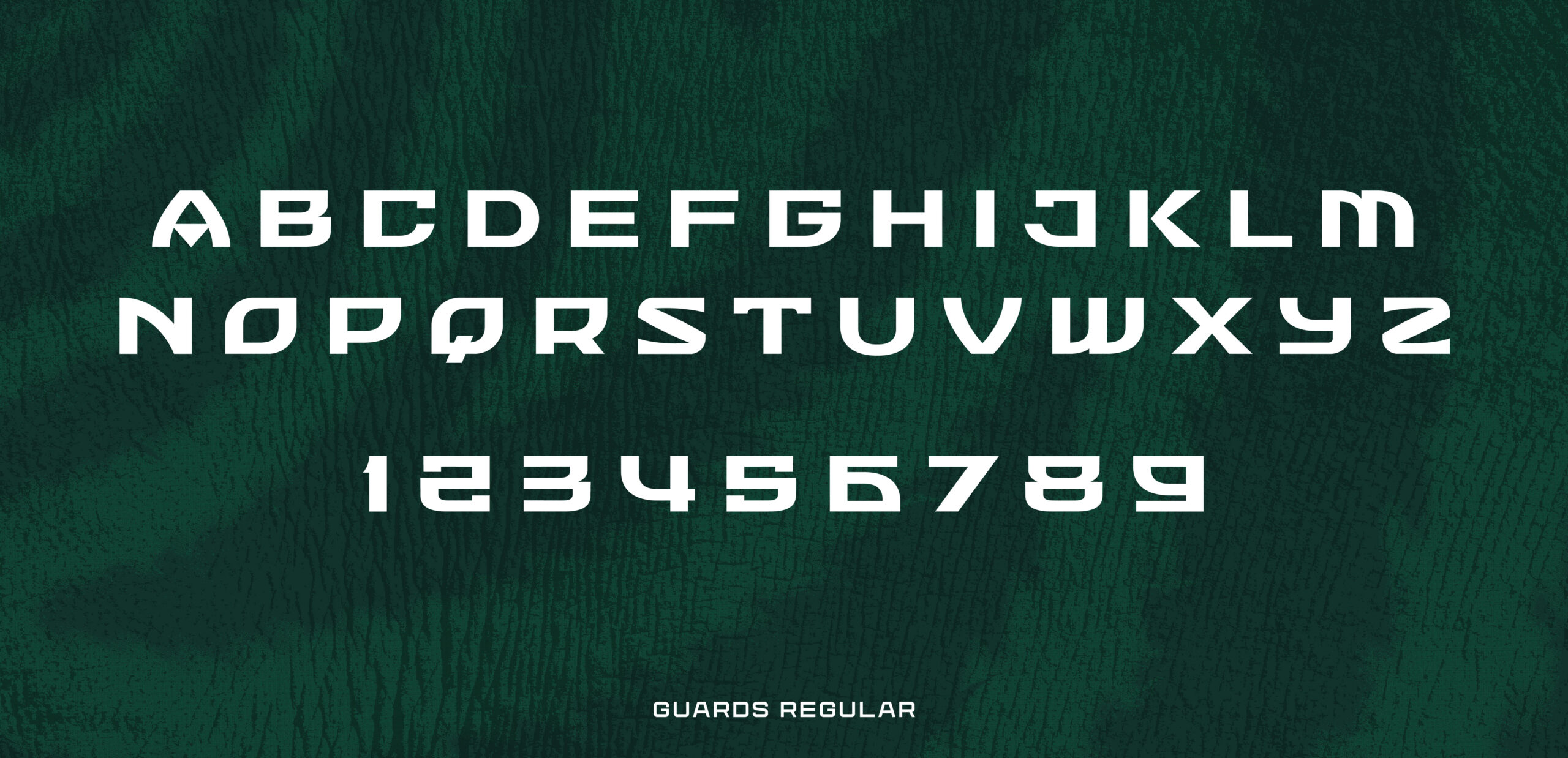
Guards Regular is a display typeface designed to capture the energy and spirit of South Africa. Every angle, terminal, and slab reflects the resilience and strength at the heart of Southern Guards GC, both in their philosophy and on the course. The letterforms were treated as art in their own right, inspired by the textures, patterns, and motifs found throughout South African culture. The goal was to create something that feels vibrant, connected, and completely unique to Southern Guards, a typography system that only they can call their own.
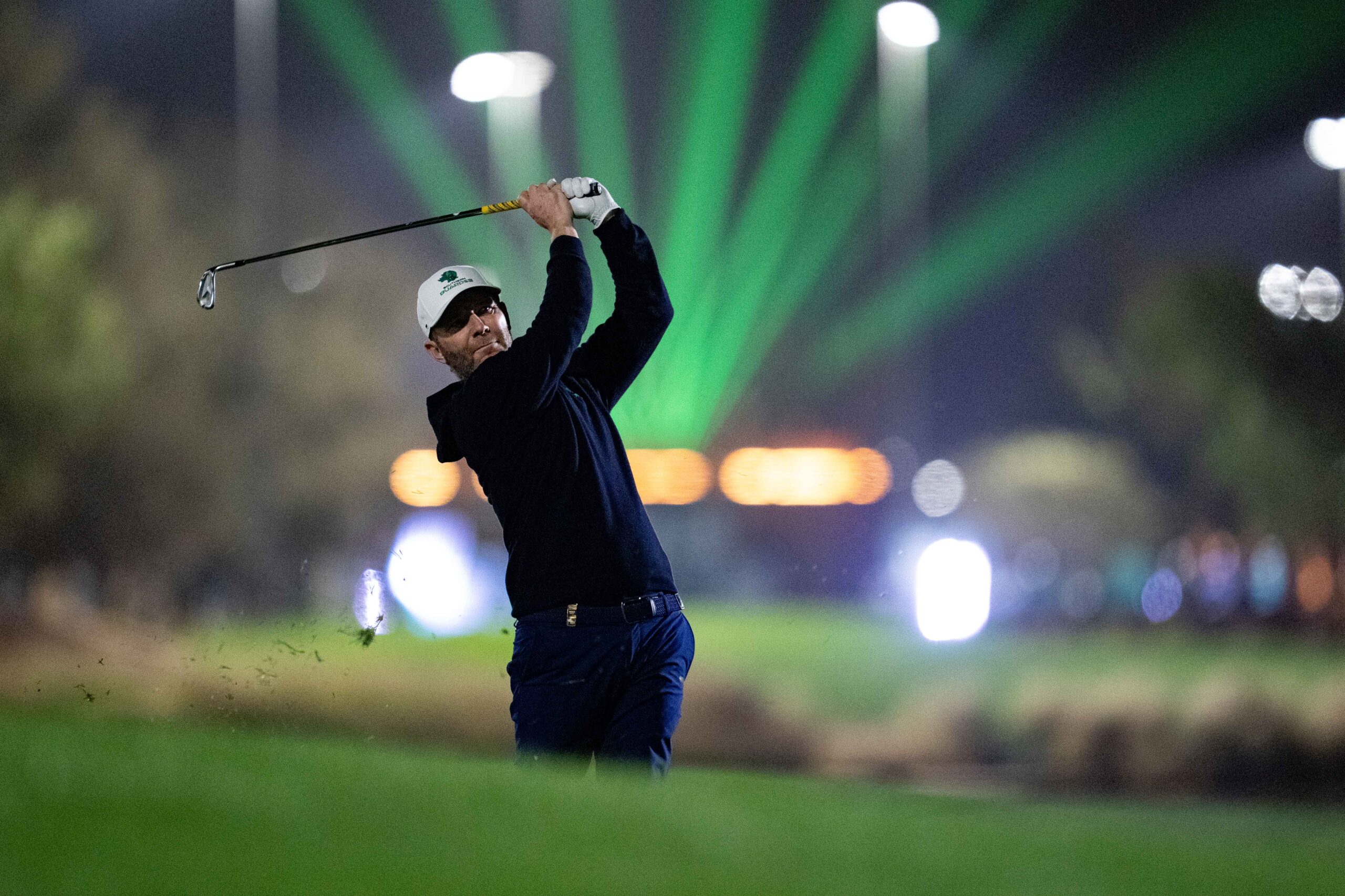
Photo: LIV Golf
Photos: LIV Golf
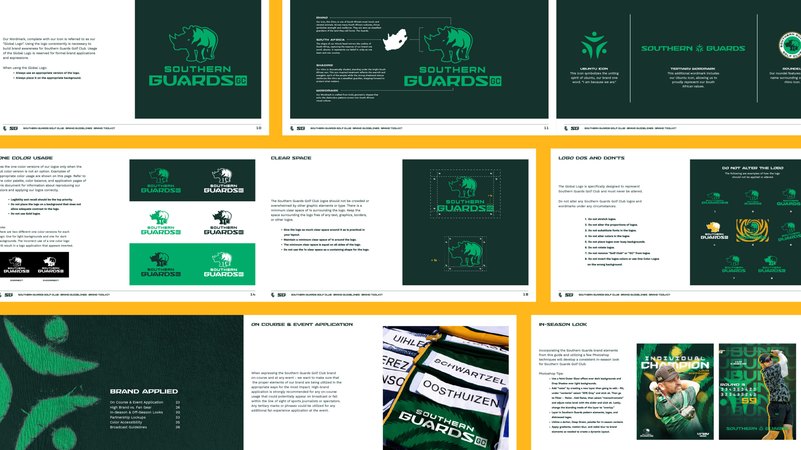
Bringing this new visual system to life as a complete set of brand guidelines was a careful and deliberate process. We wanted to create a toolkit that gave the Southern Guards and their internal teams the confidence to speak with one voice, whether on the course, in marketing, or across every fan touchpoint. Every decision in the guidelines, from color and typography to imagery and layout, was made to ensure the brand could be expressed with energy, clarity, and pride. The goal was not just consistency but a system that feels alive, inspiring, and truly reflective of who the Southern Guards are and the passion they bring to the game.
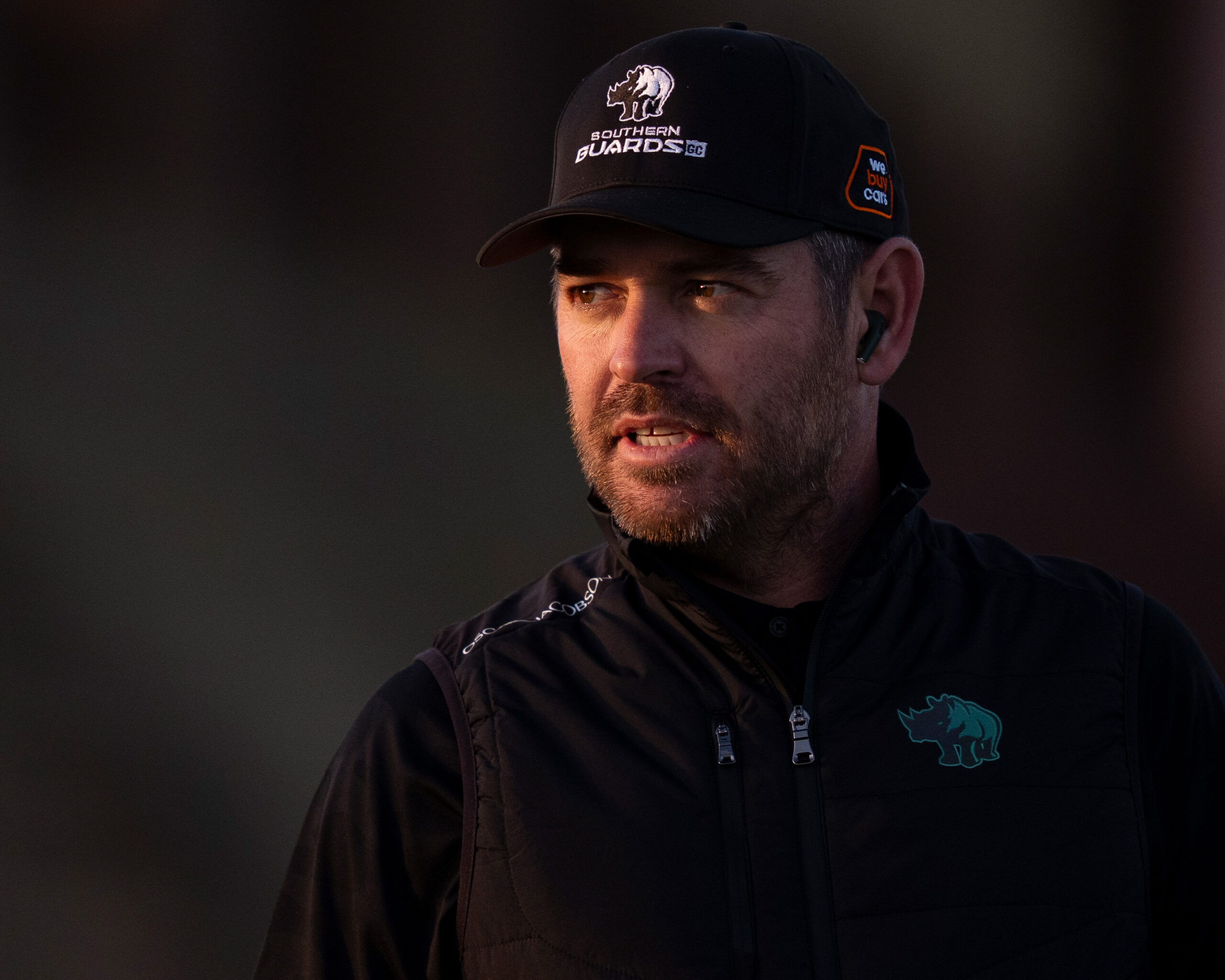
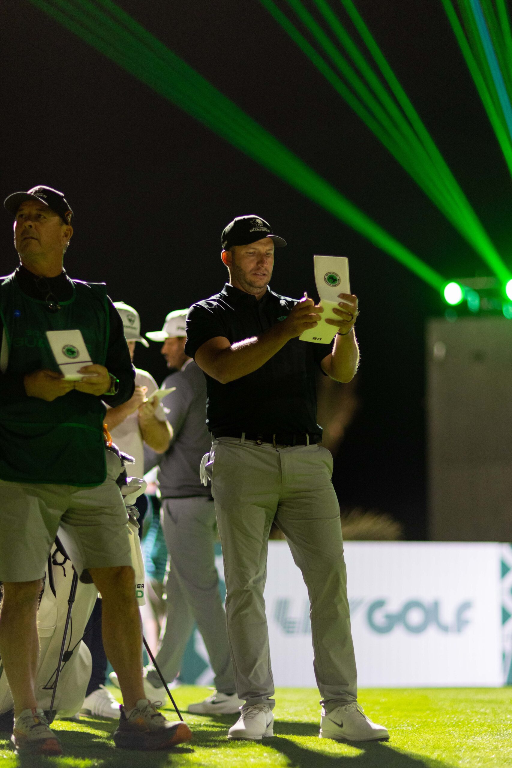
Photo: LIV Golf
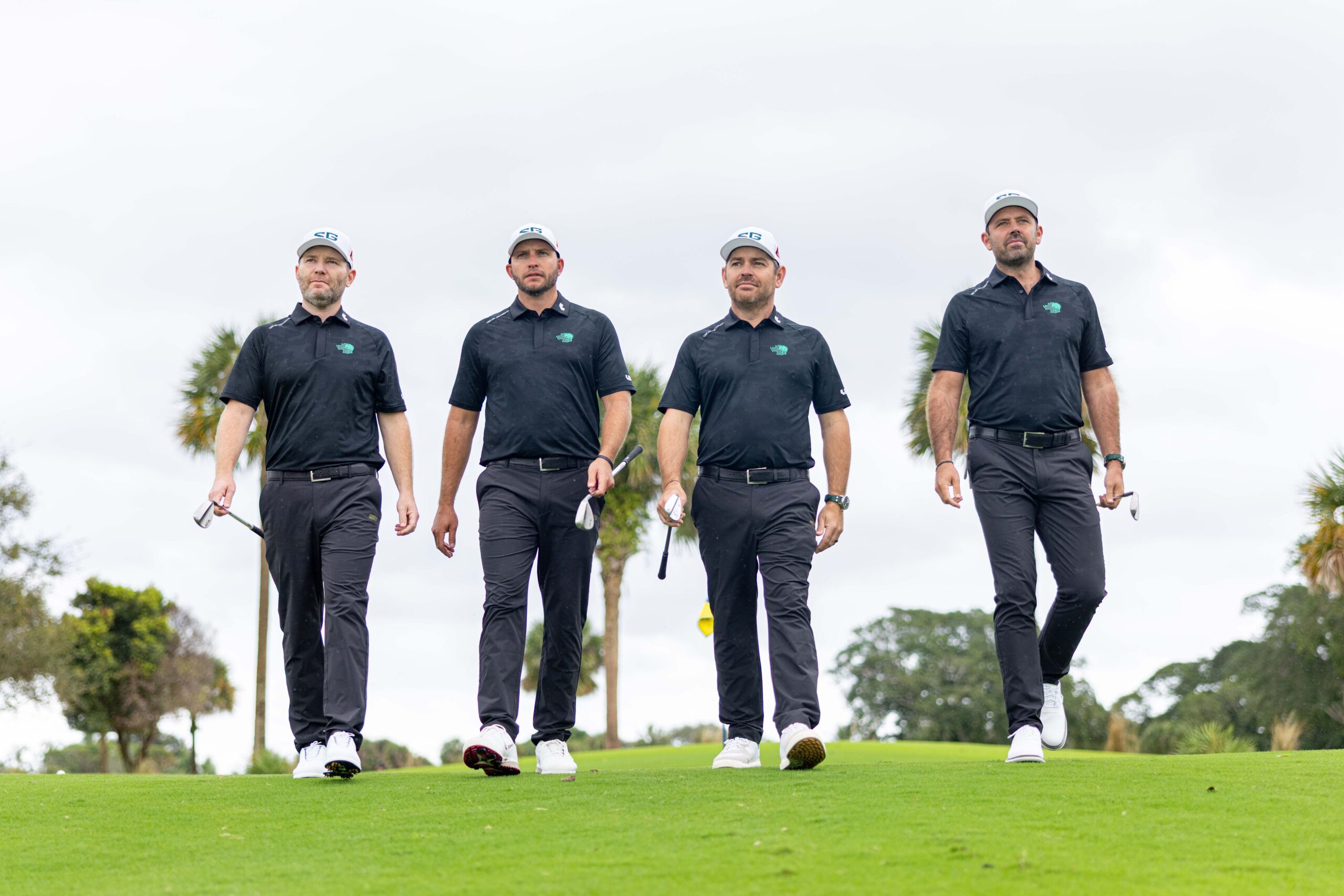
Photo: LIV Golf