NASCAR
Apparel Design, Brand Guidelines, Brand Positioning & Strategy, Branding, Corporate Branding, Custom Typography, Digital and Print Design, Identity System Design, Logo Design, Social Media Design,OVERVIEW
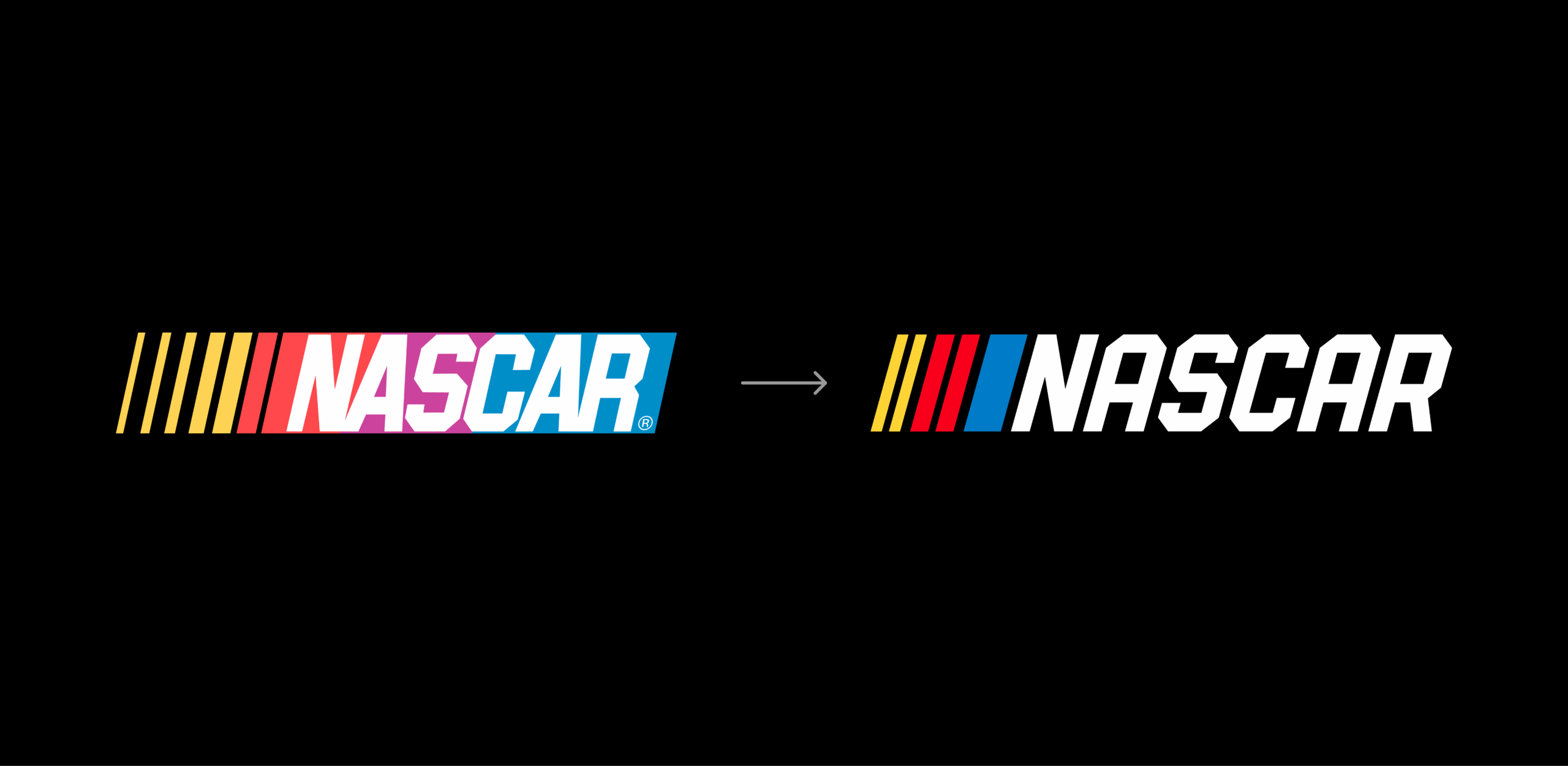
NASCAR’s iconic bar mark successfully portrayed the motion and energy of NASCAR for 40 years. But as the sport grew and evolved and sought to reclaim its roots while racing into the future, so should its identity.
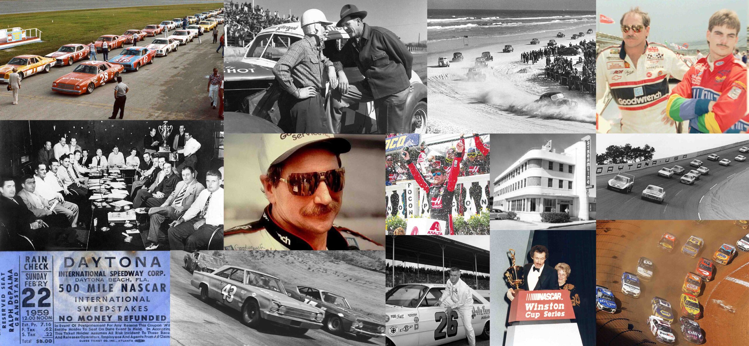
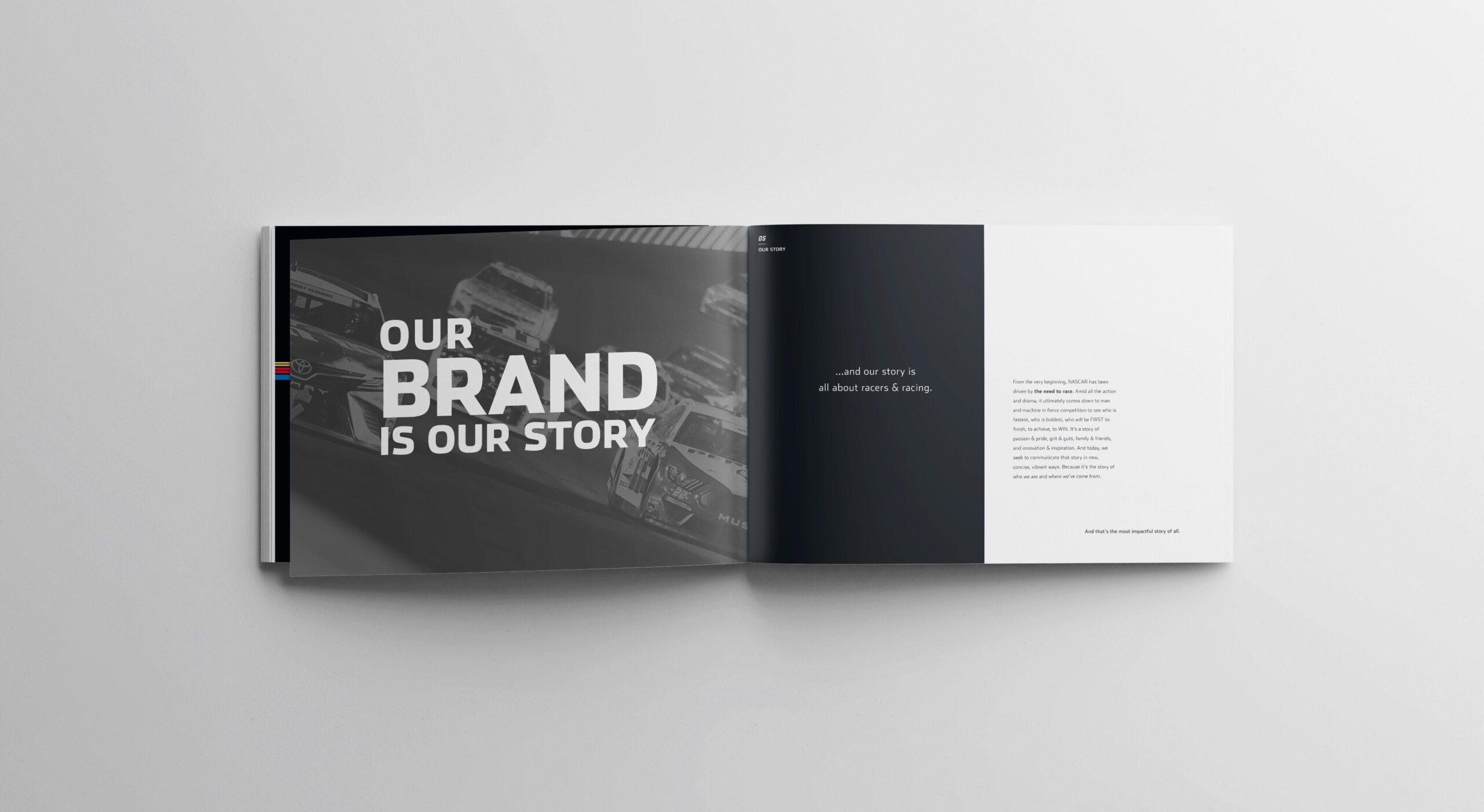
From the very beginning, NASCAR has been driven by the need to race. Amid all the action and drama, it ultimately comes down to man and machine in fierce competition to see who is fastest, who is boldest, who will be FIRST to finish, to achieve, to WIN. It’s a story of passion & pride, grit & guts, family & friends, and innovation & inspiration. And today, we seek to communicate that story in new, concise, vibrant ways. Because it’s the story of who we are and where we’ve come from.
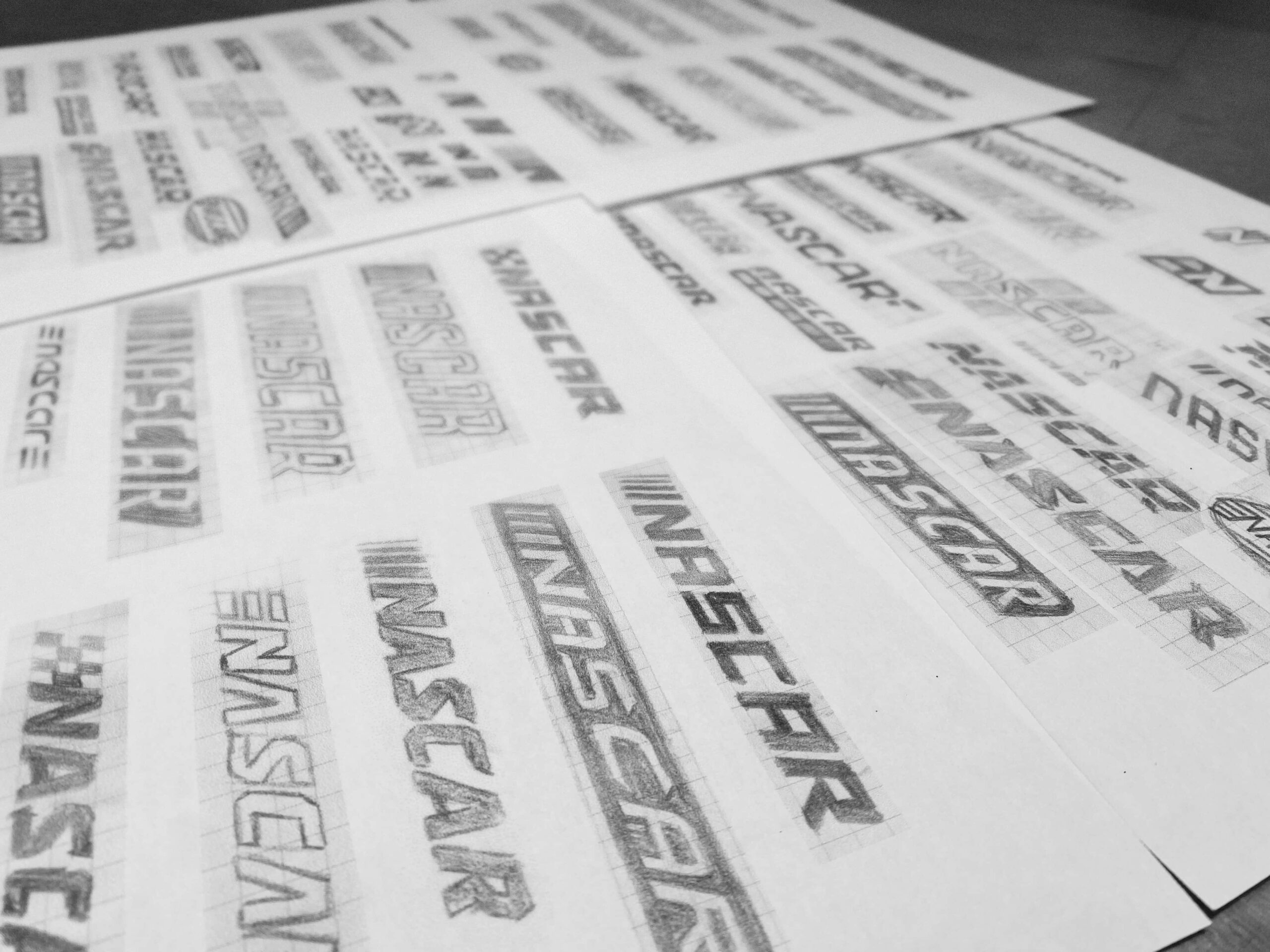
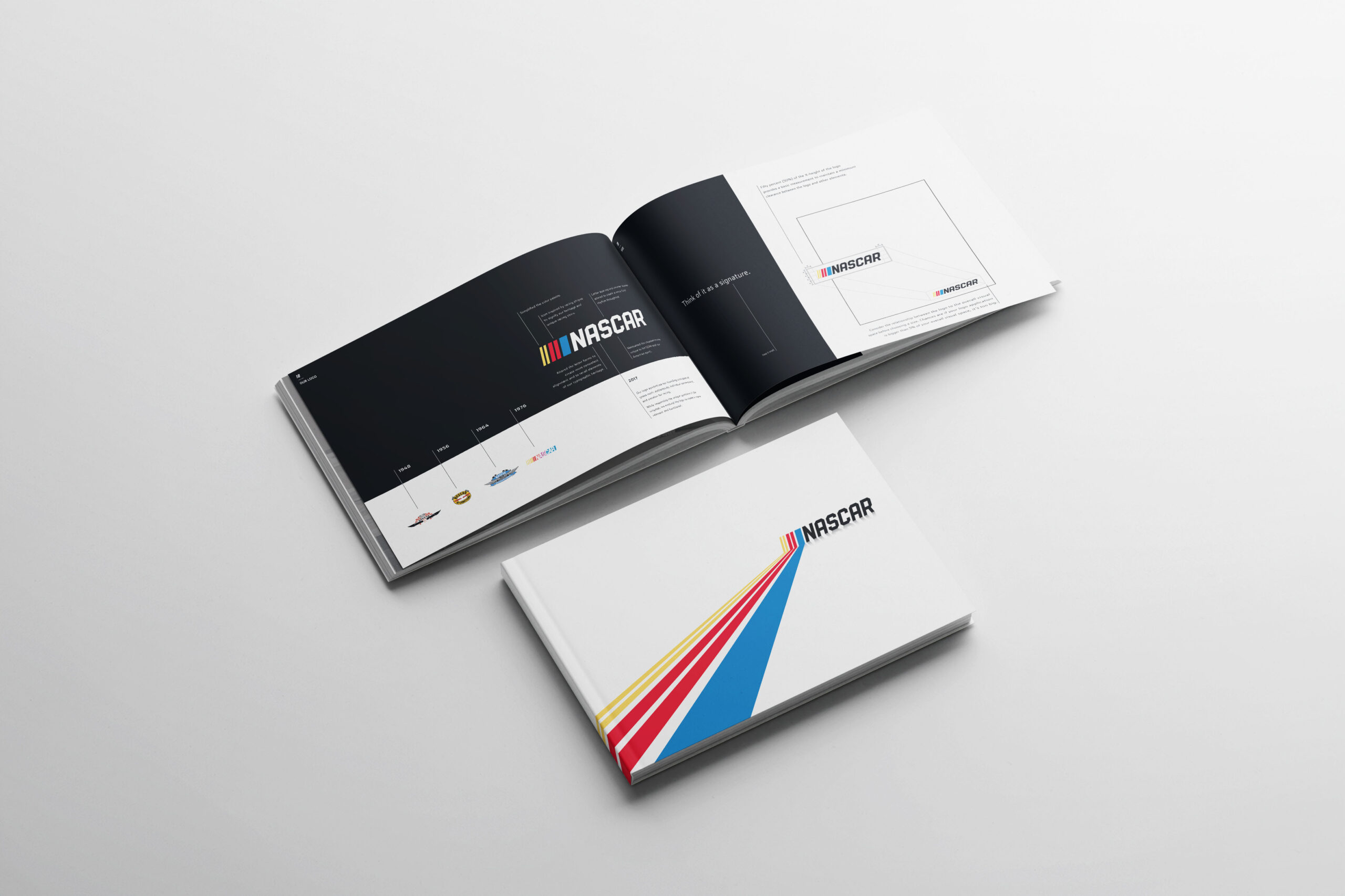
Pairing NASCAR’s storied history with its contemporary needs, we positioned the brand’s identity to be bold and genuine yet relevant and functional. By maintaining the chiseled forms and racing stripes unique to the iconic bar logo and utilizing a cleaner presentation and simplified color palette, the new NASCAR logo strips away excess to get at the heart of the sport — the need to race.
The rediscovery and repositioning of NASCAR is all about racing, and throughout the entire process, we sought to communicate that story in new, concise, vibrant ways. Because it’s the story of who NASCAR is and where they’ve come from.
This repositioning kickstarted a brand new, top down approach to the way NASCAR operates visually and philosophically.
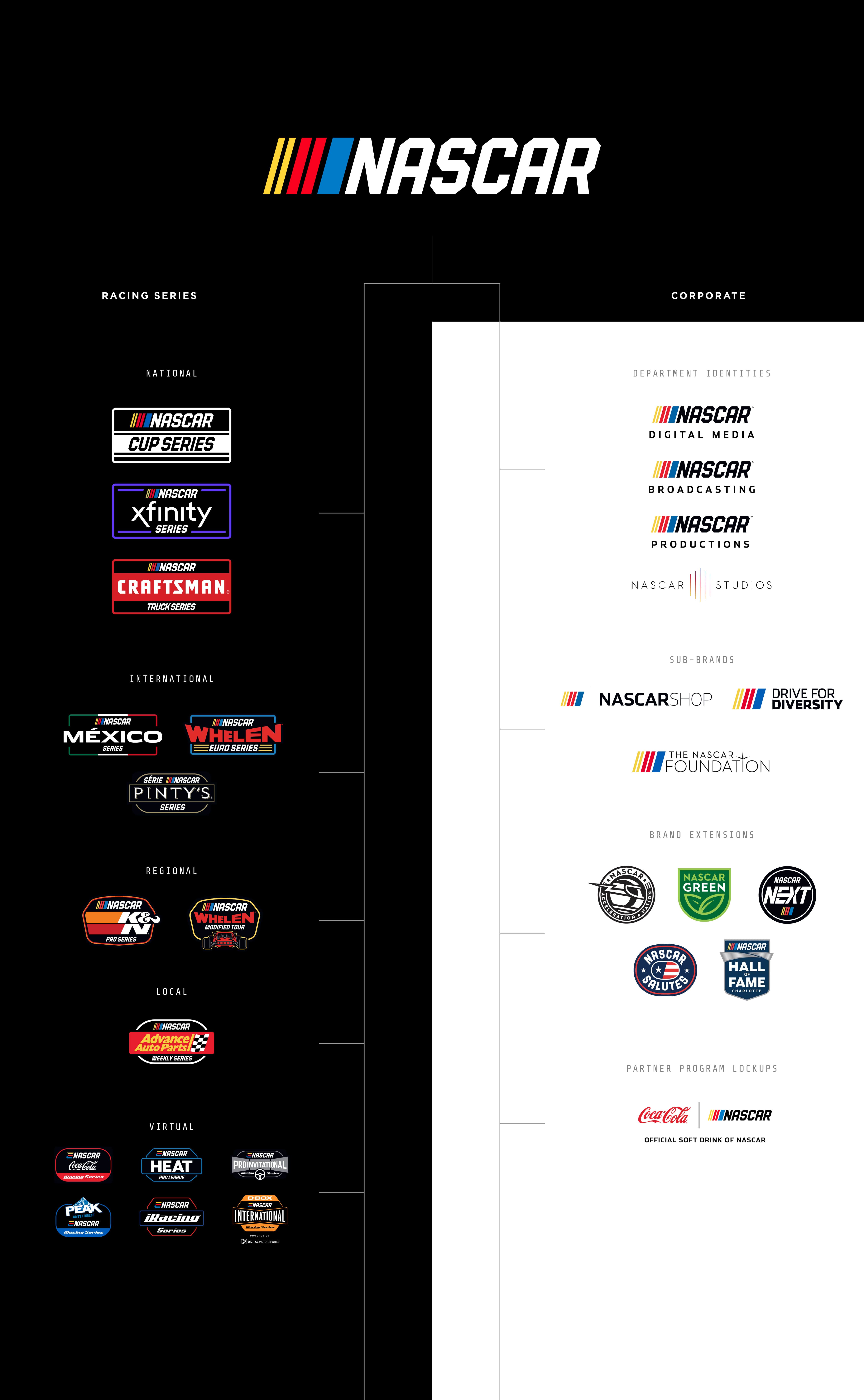
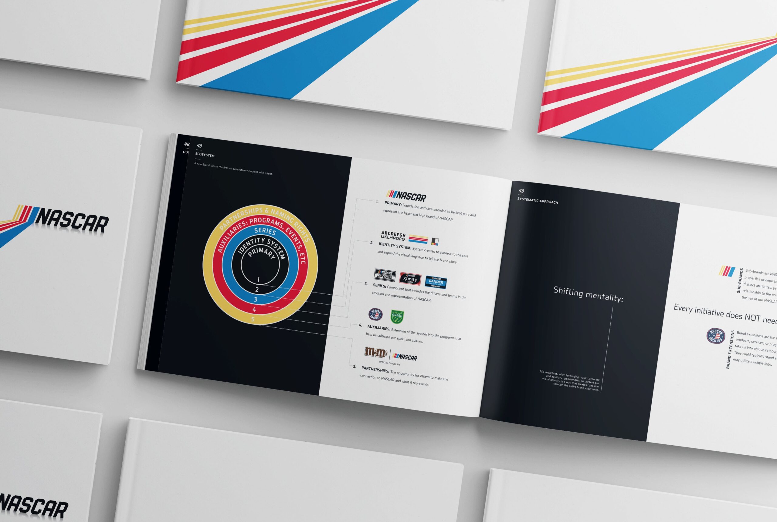
A comprehensive set of brand guidelines were developed for internal use by NASCAR. Following the complete restructuring of how the brand story is told, the NASCAR brand guide required more than simple clarity on how to use brand assets. It was made to inspire.
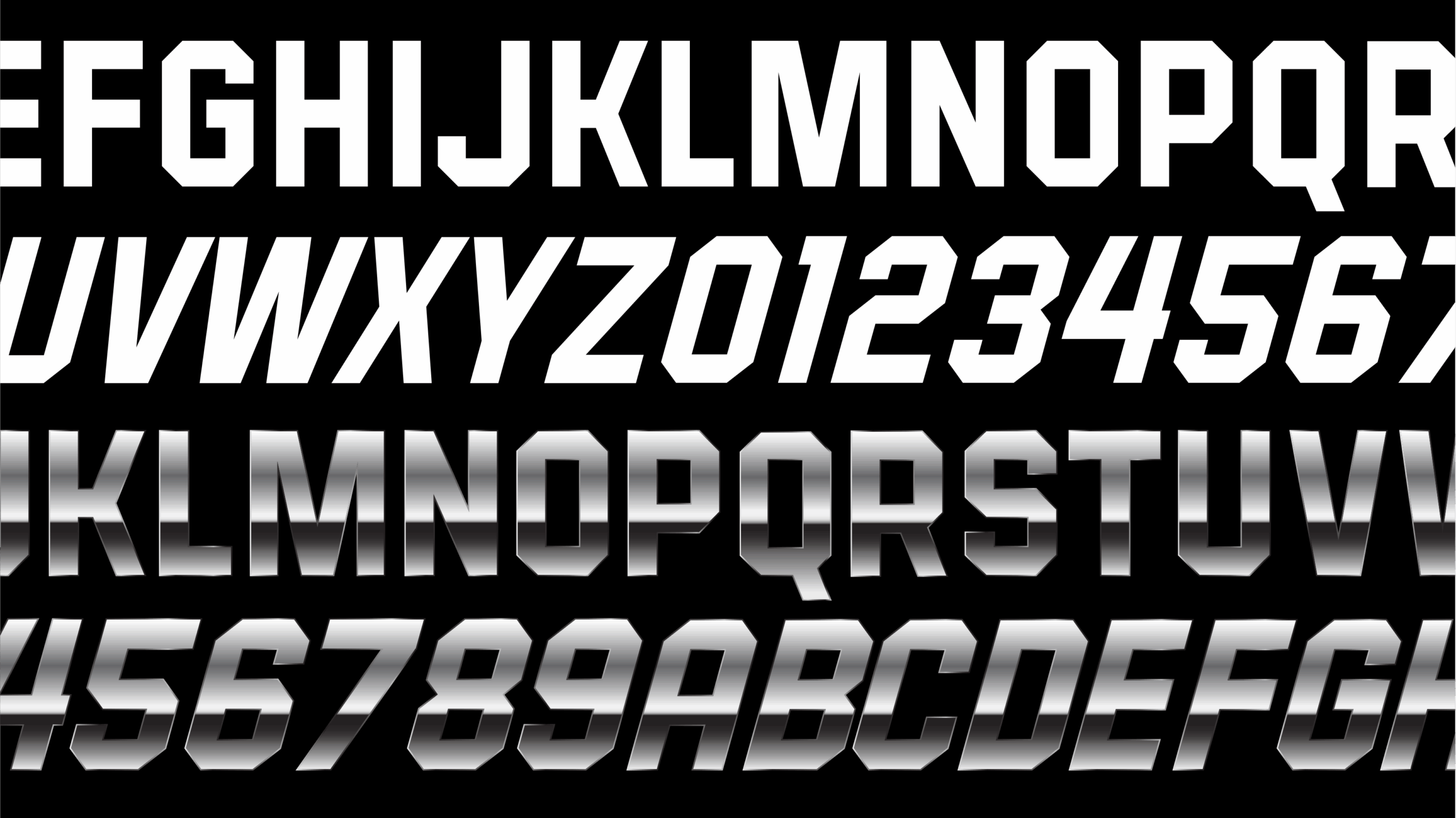
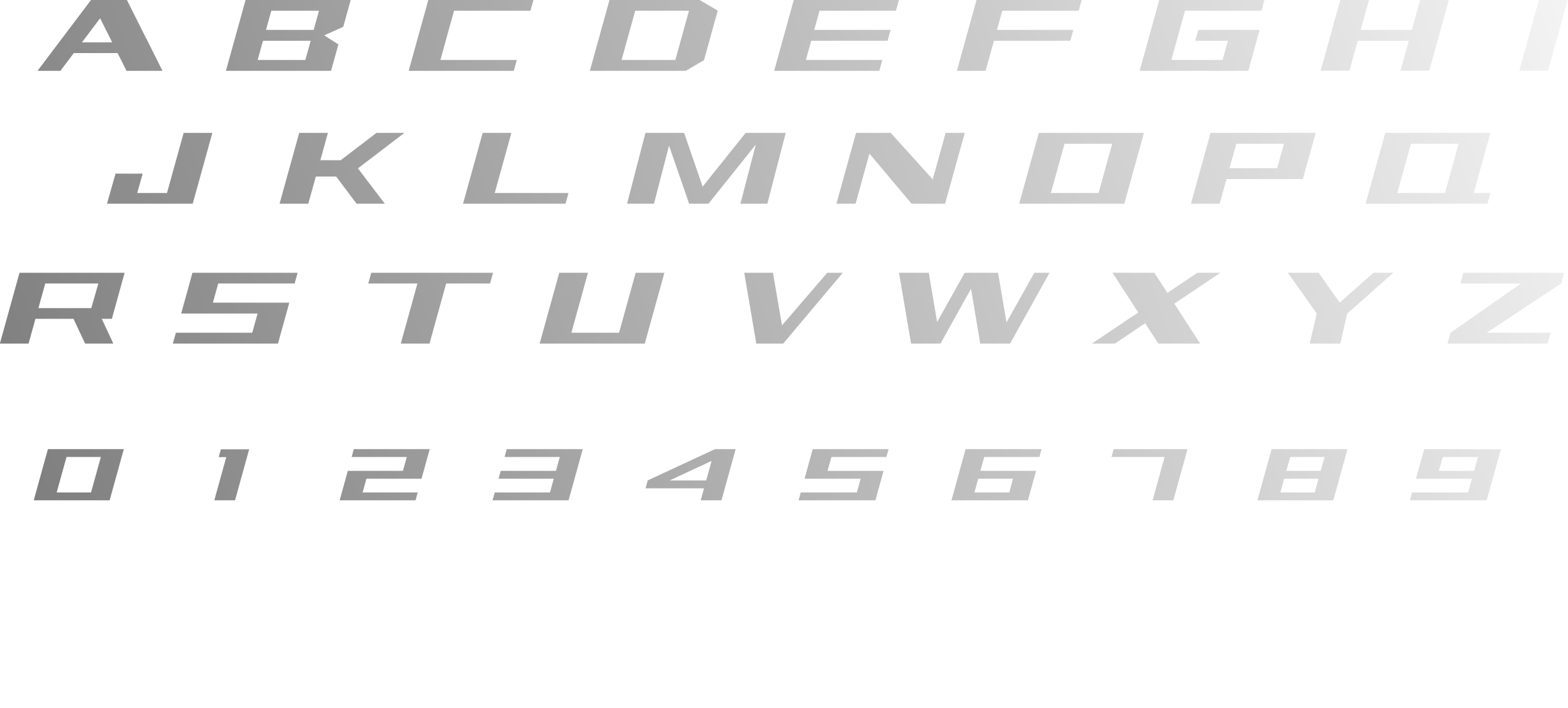
TYPEFACE DESIGN – BIG BILL
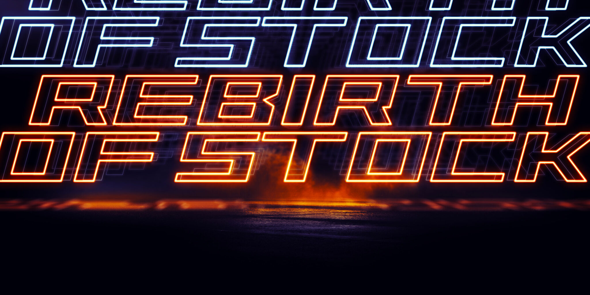
Influenced by elements from past league logos, “Big Bill” was created. The typeface is named after the founder of NASCAR, Bill France, Sr., and his larger than life personality.
CROWN JEWEL EVENTS
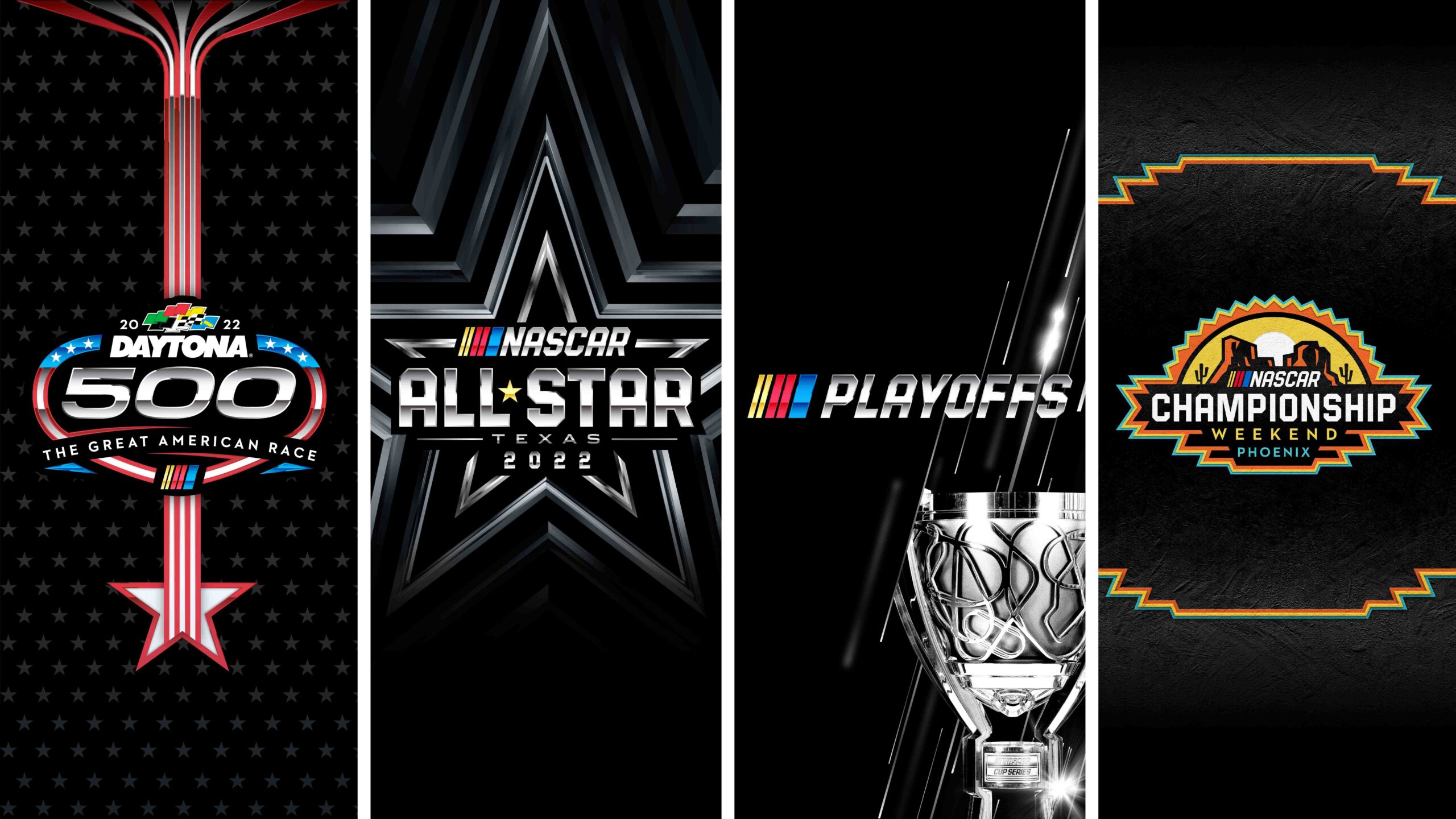
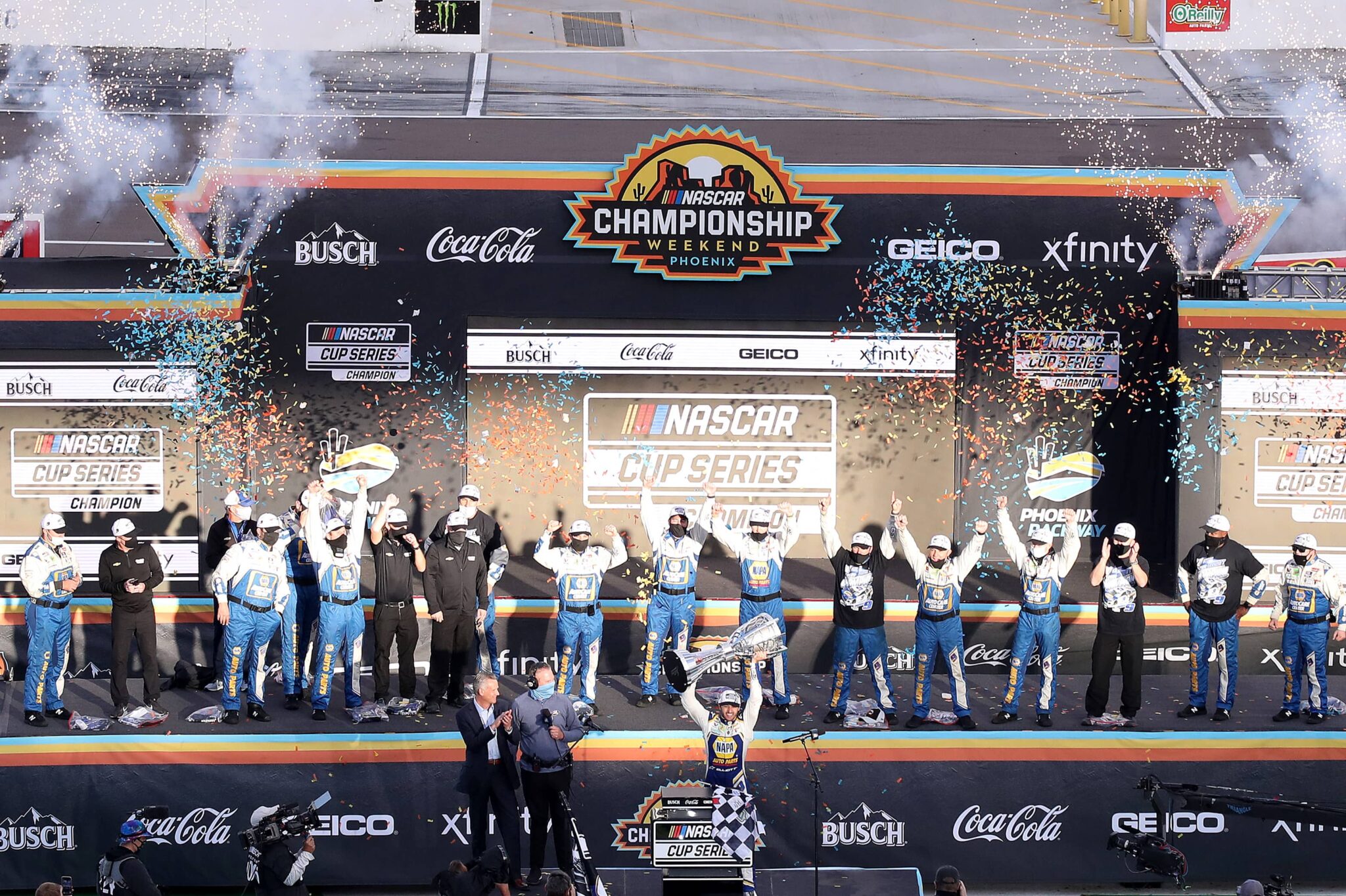
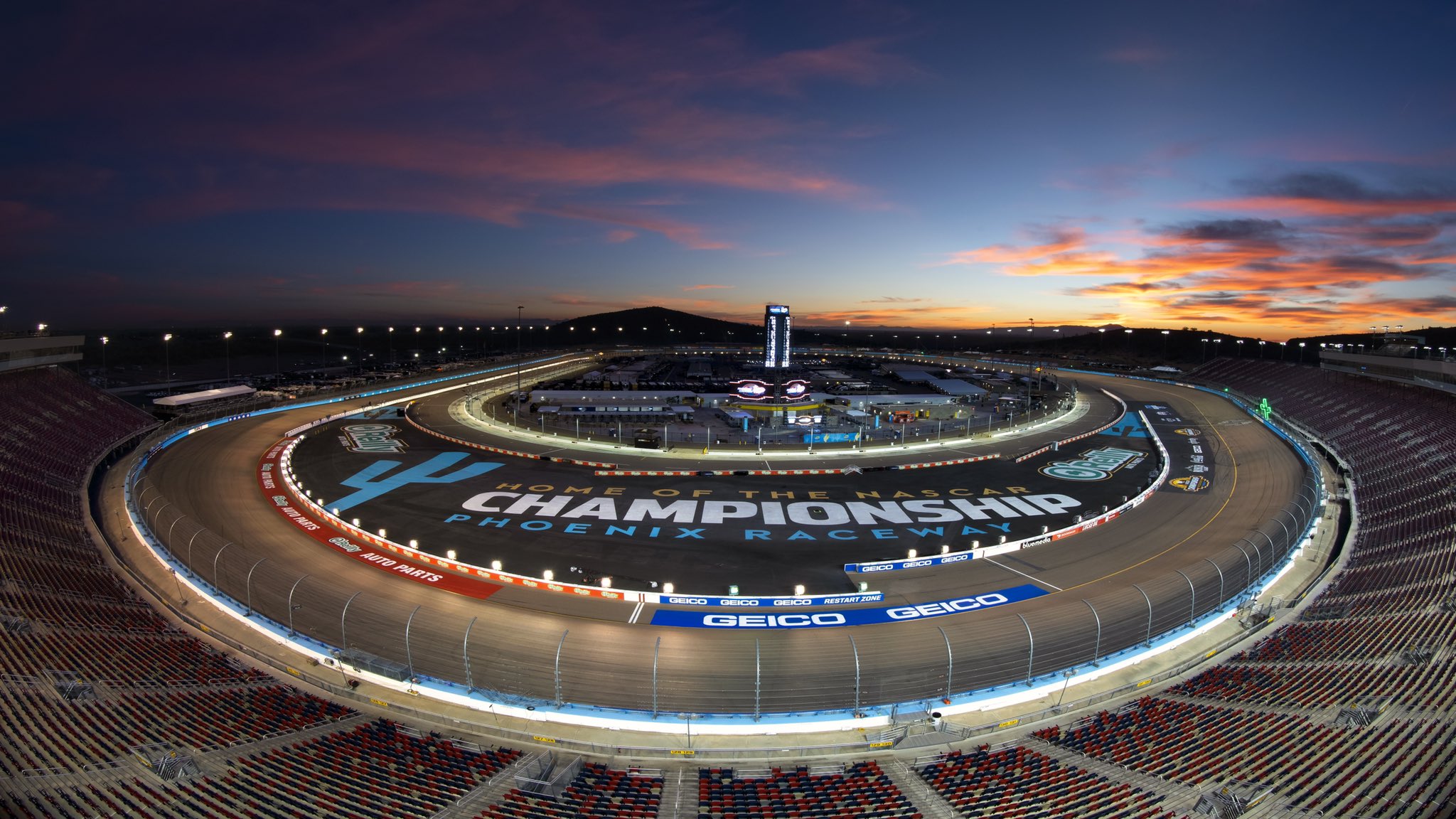
Every sport has its most significant milestones. For NASCAR, these are the Crown Jewel Events. From beginning to end, they tell the story of a season: The roaring start of “The Great American Race”, the midseason showcase of raw skill at the All-Star, the grueling test of the Playoffs, and the final battle for ultimate glory at the Championship.
The Identities developed for these events, utilizing key visual elements from the NASCAR toolkit, pay homage to the unique character of each event while still maintaining a clear connection to NASCAR.
DAYTONA 500 (2021-2023)


LOGOS & ELEMENTS
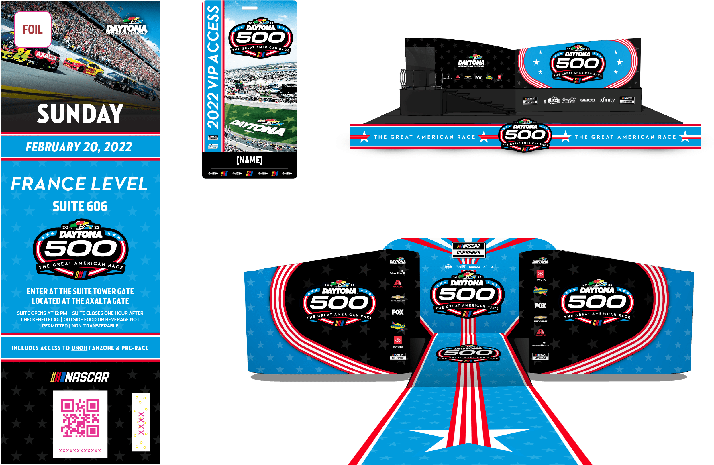
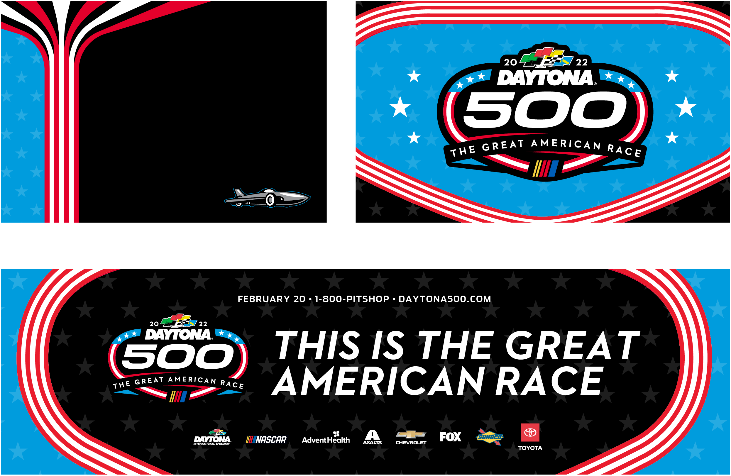
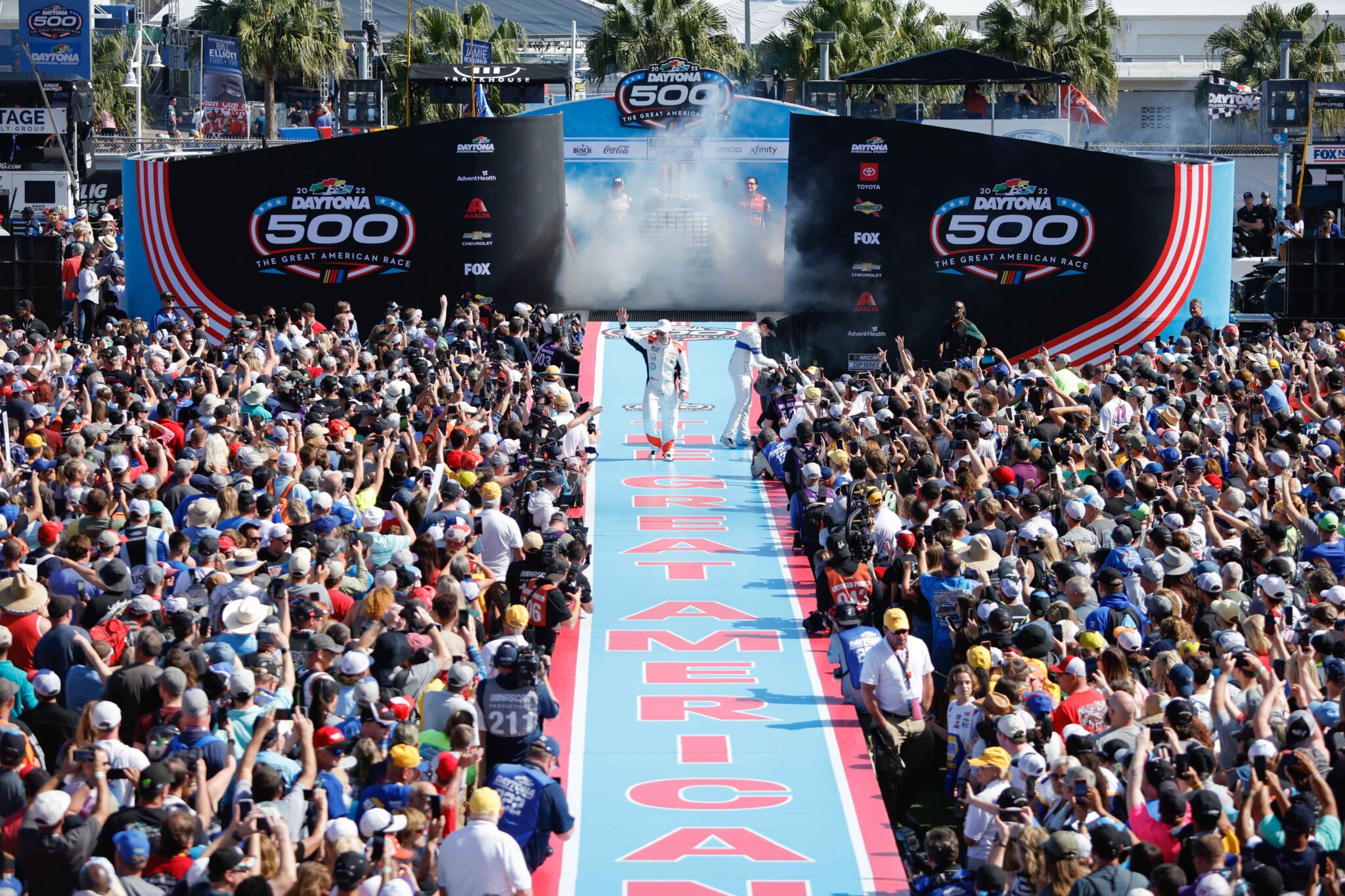
TICKET & STAGE DESIGN, SAMPLE LAYOUTS
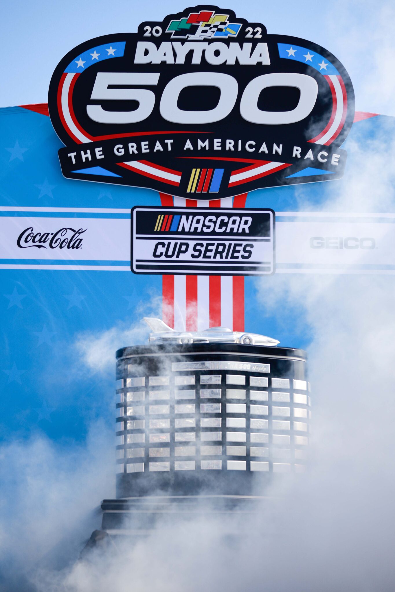
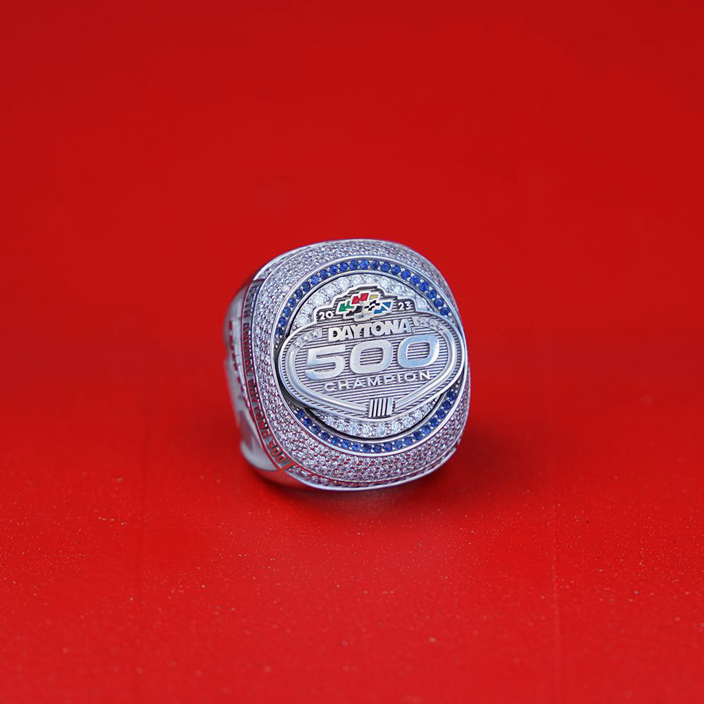
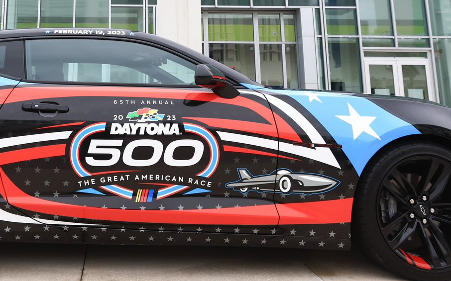
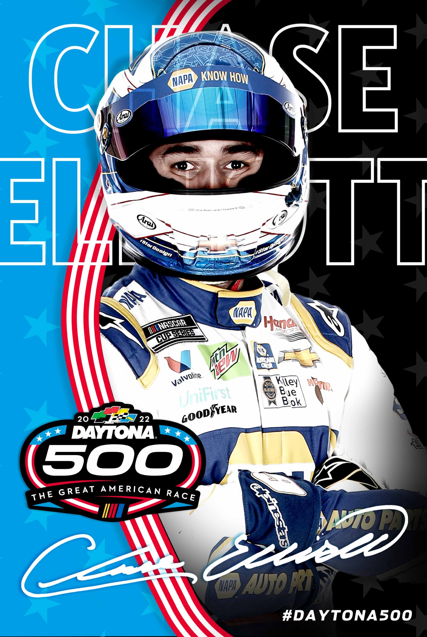
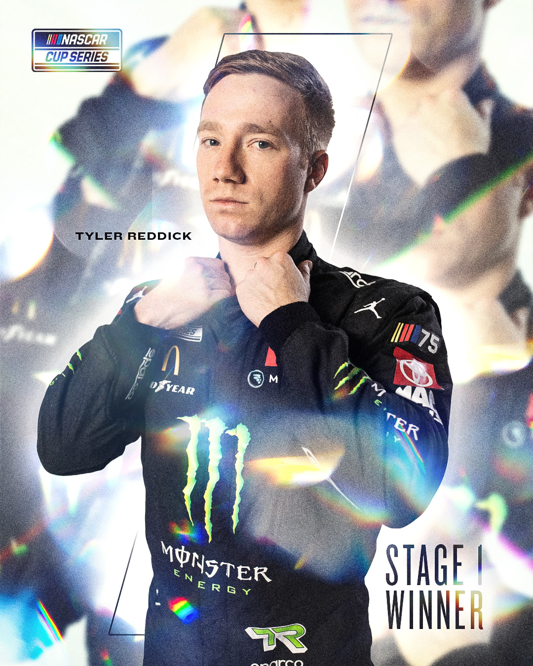
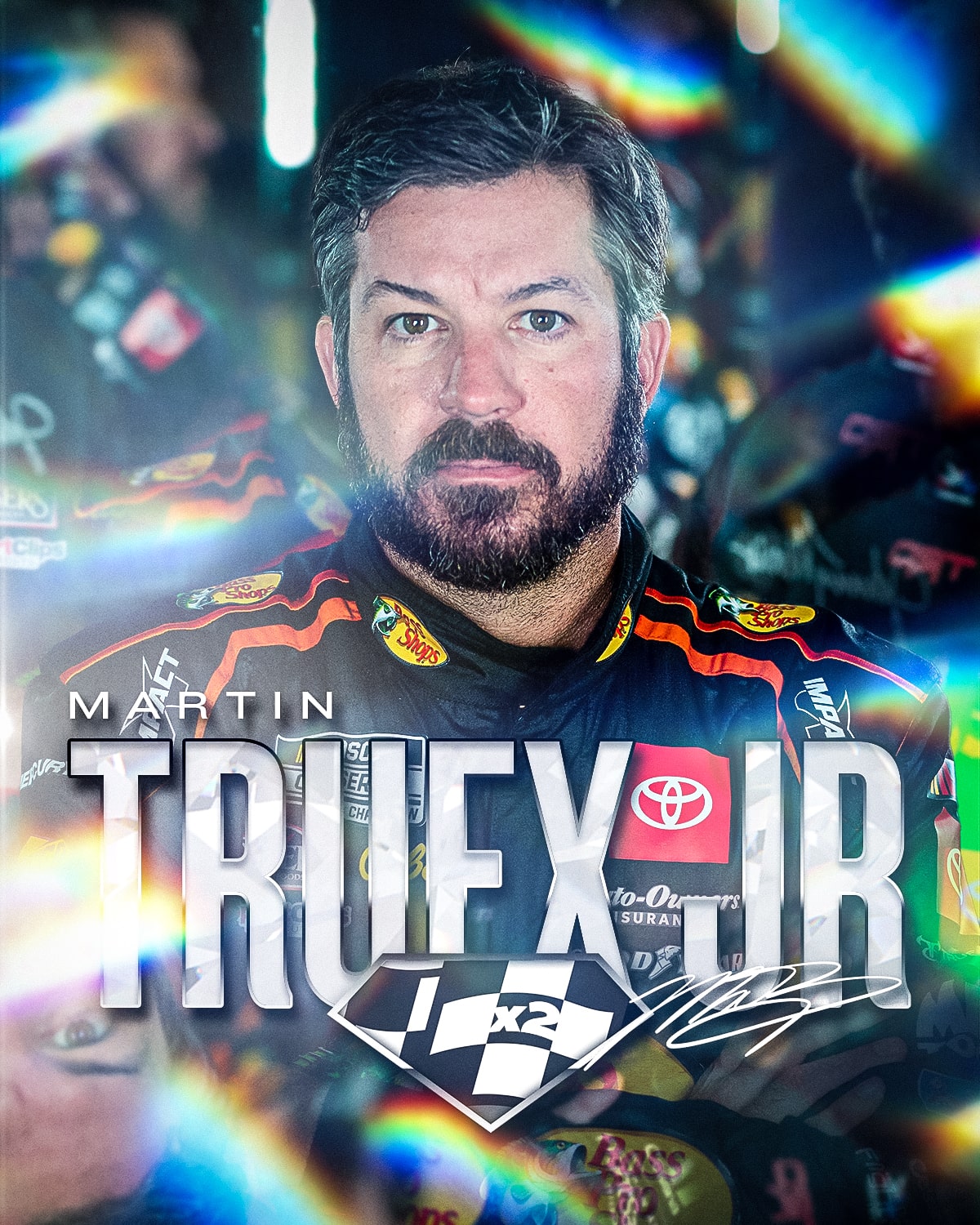
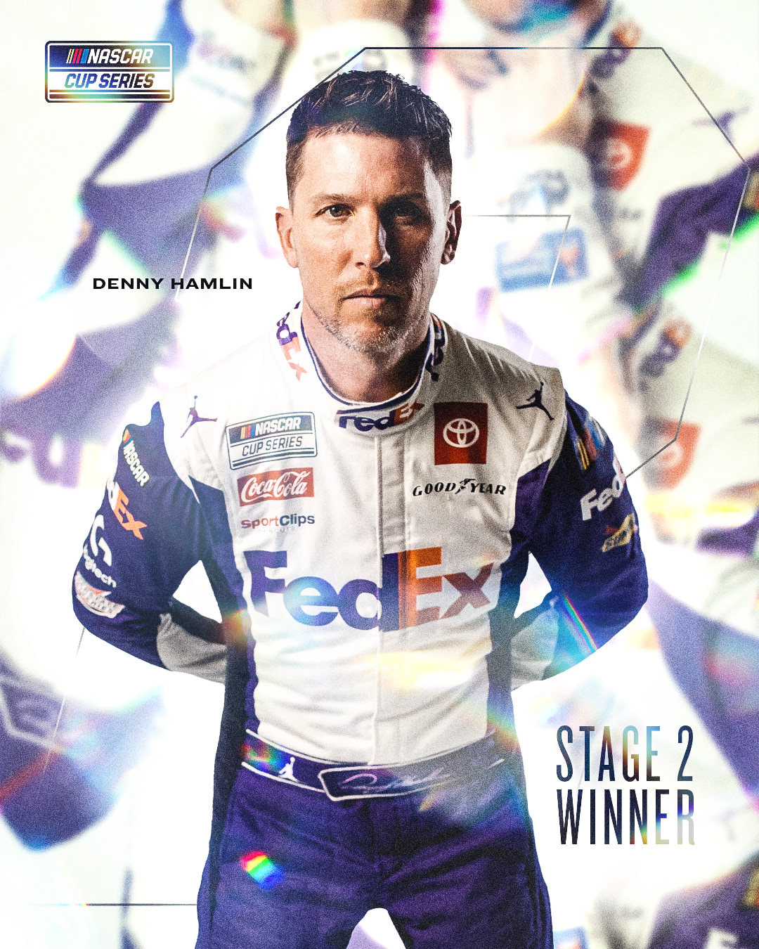
DRIVER KEY ART
ALL STAR (2018-2022)

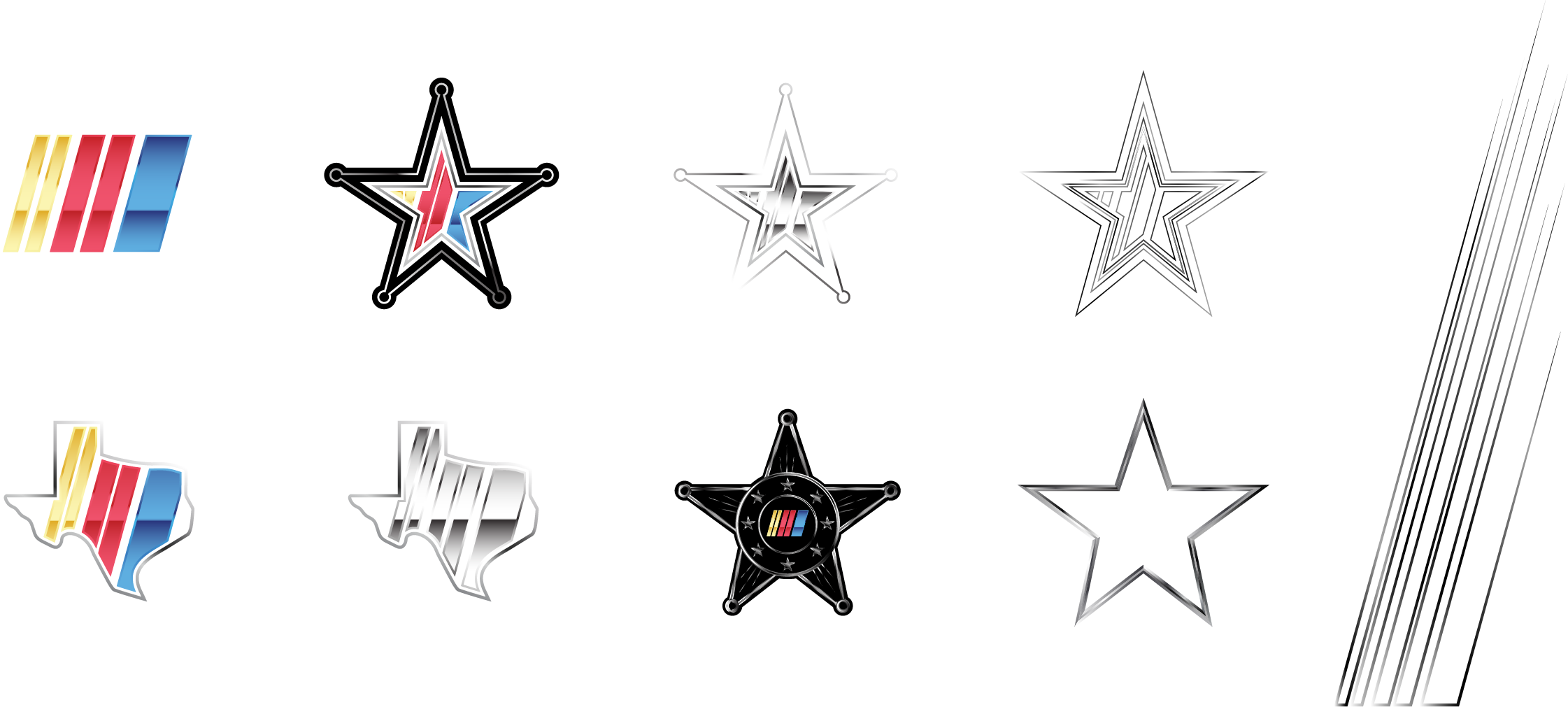
LOGOS & ELEMENTS
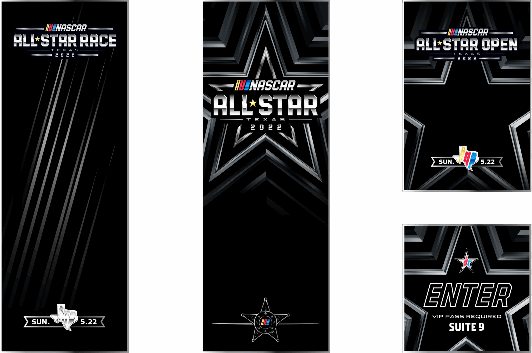
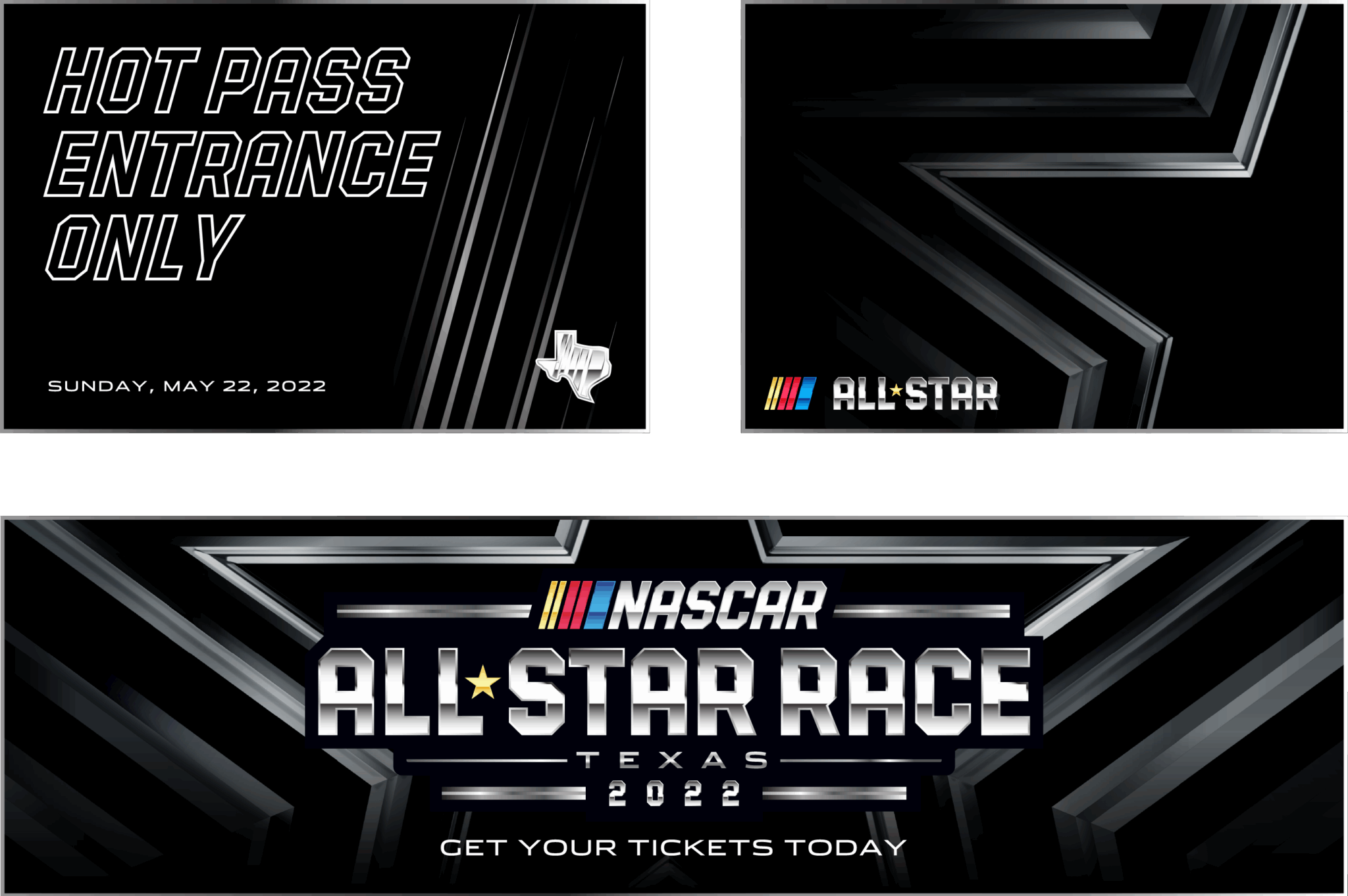
SAMPLE LAYOUTS
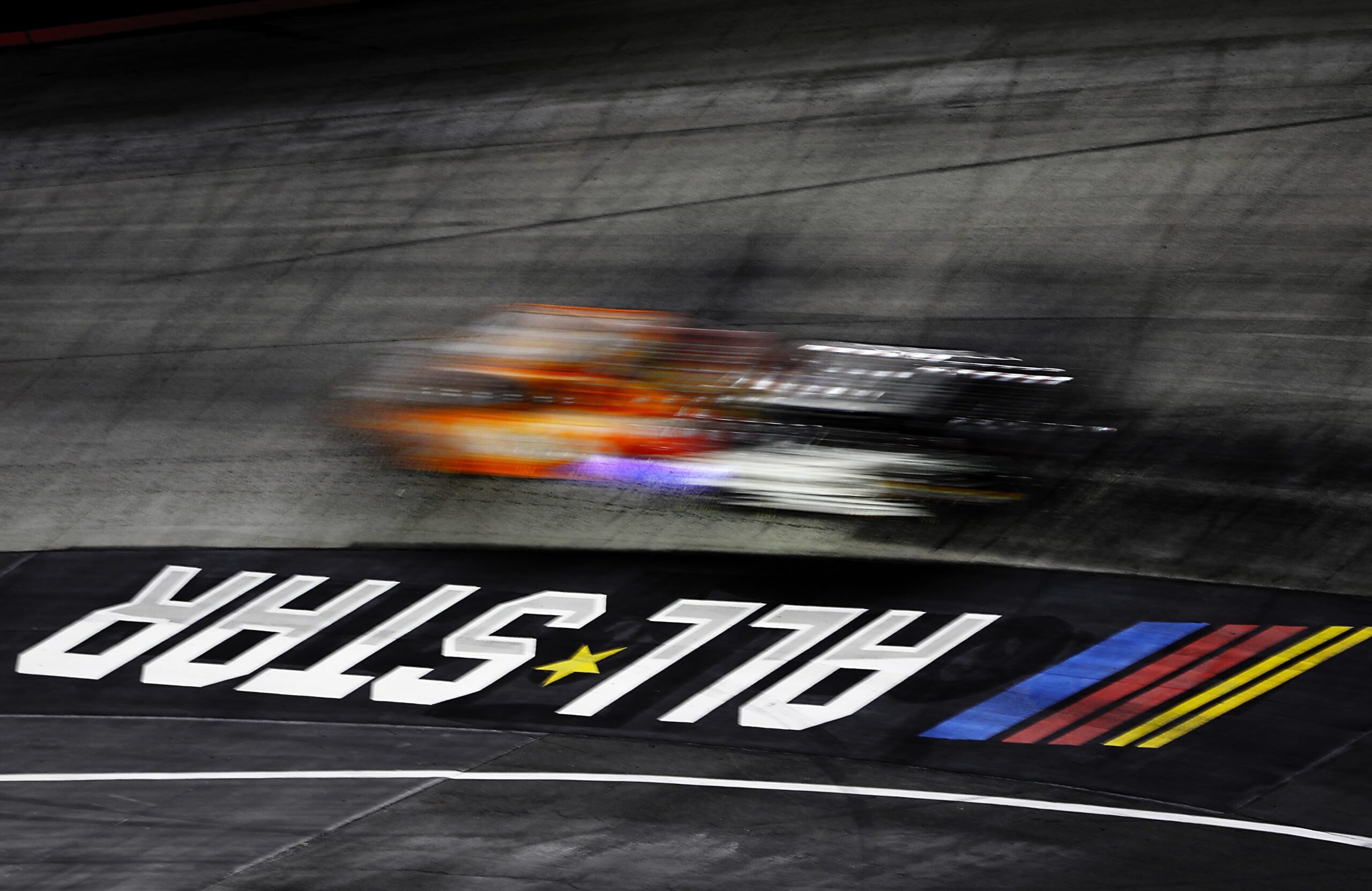
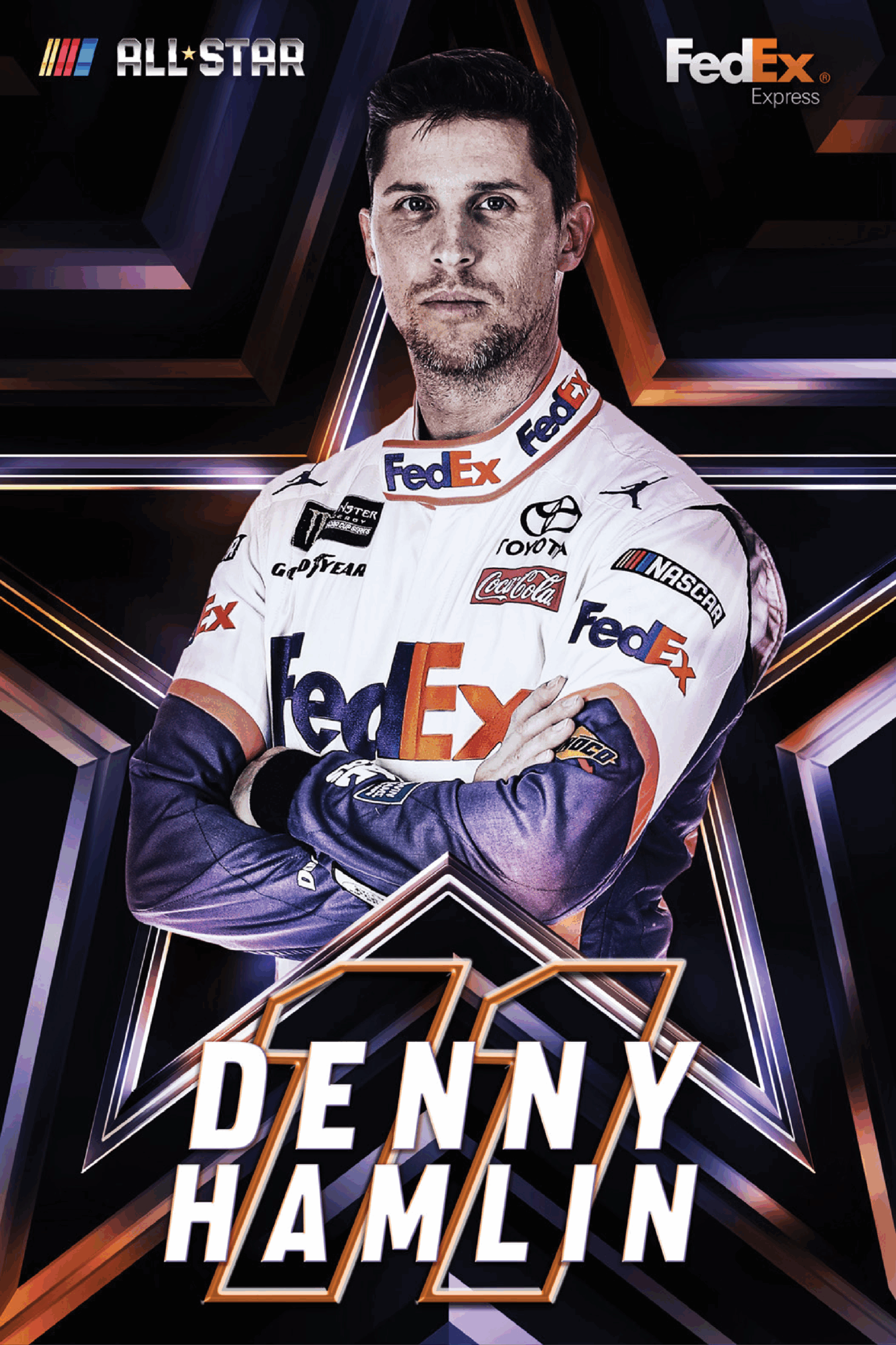
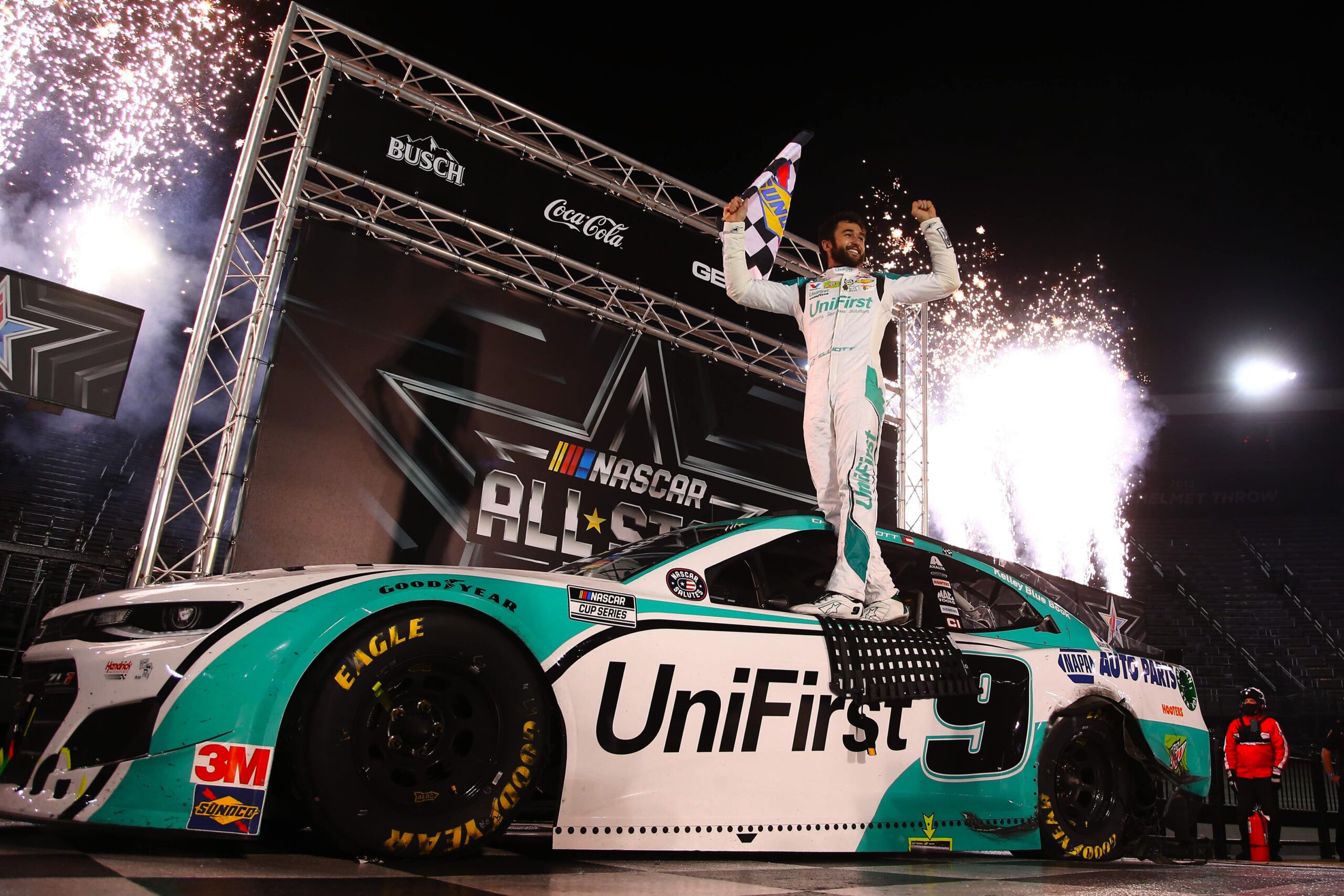
DRIVER KEY ART
PLAYOFFS


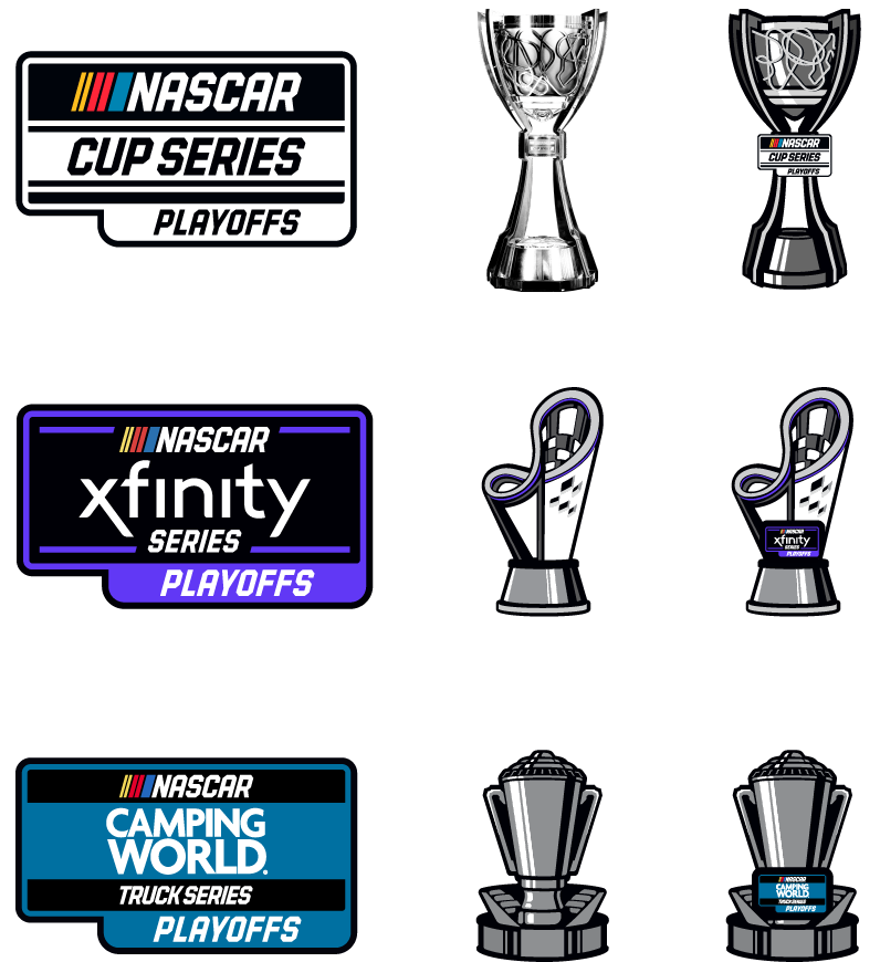
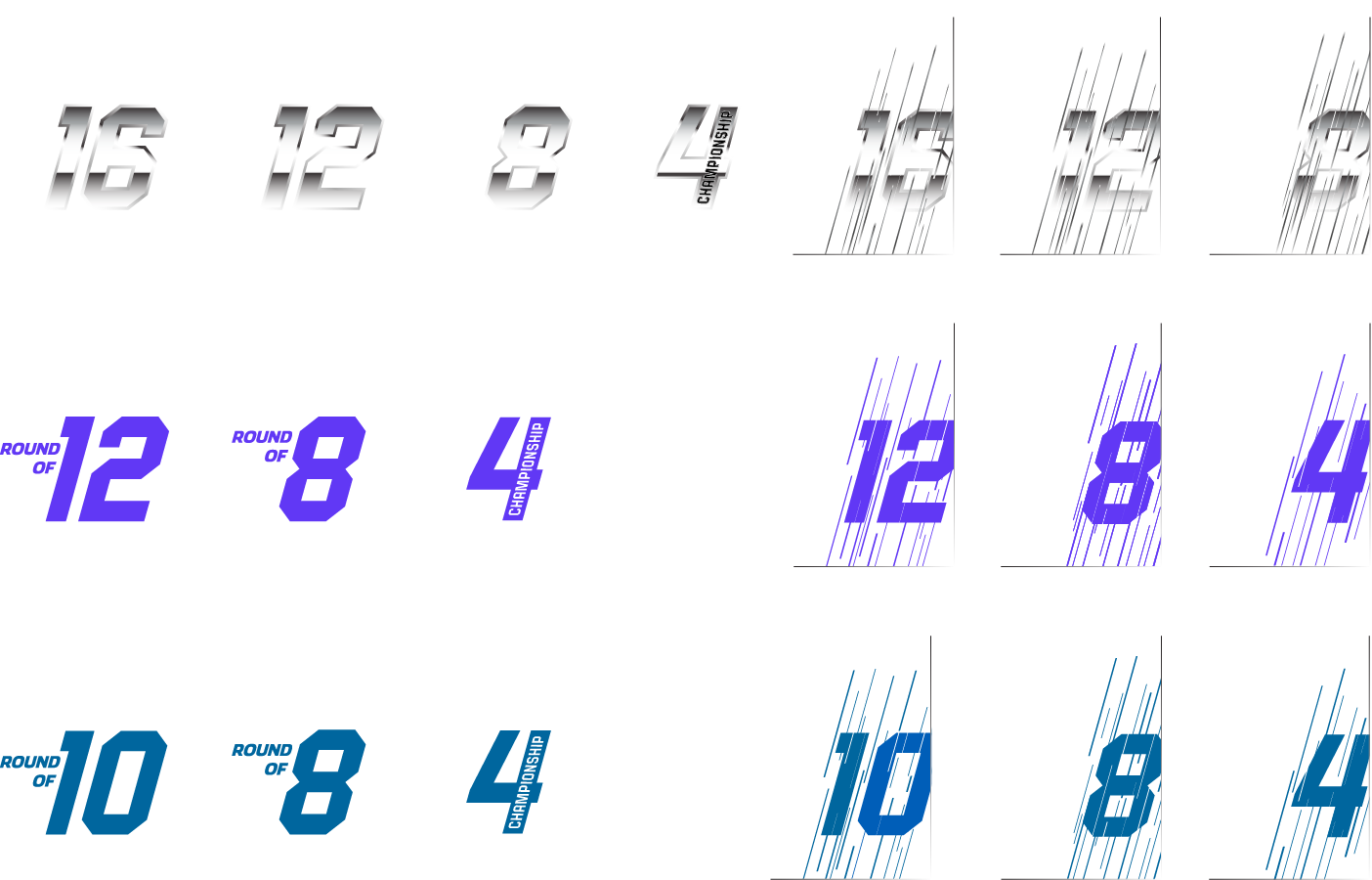

LOGOS & ELEMENTS
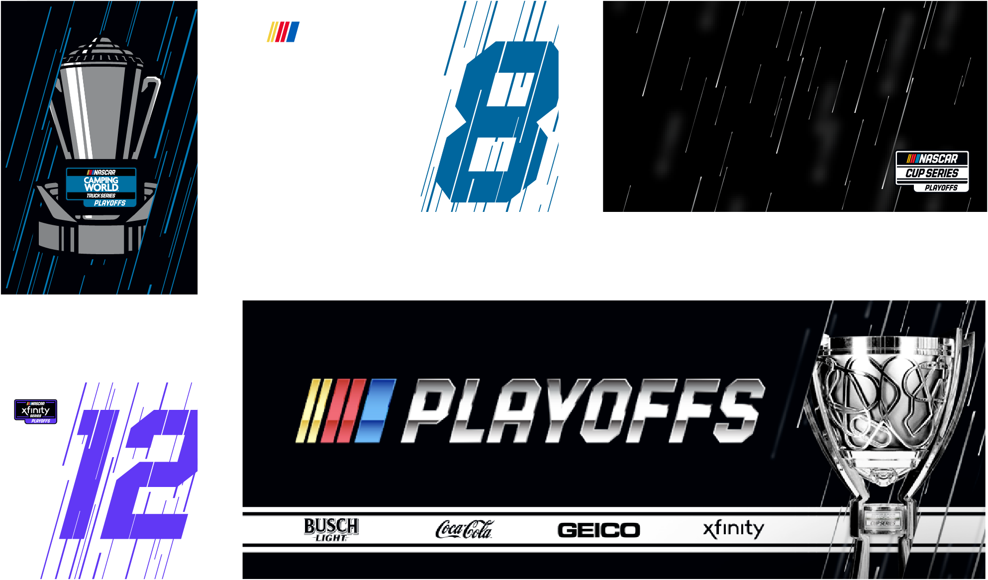
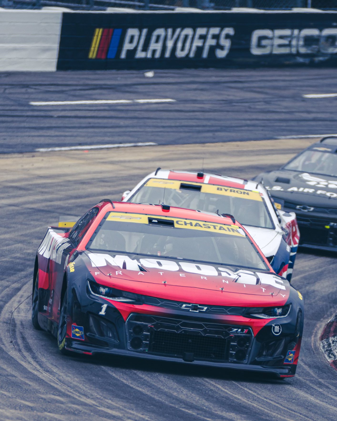
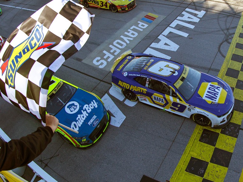
SAMPLE LAYOUTS
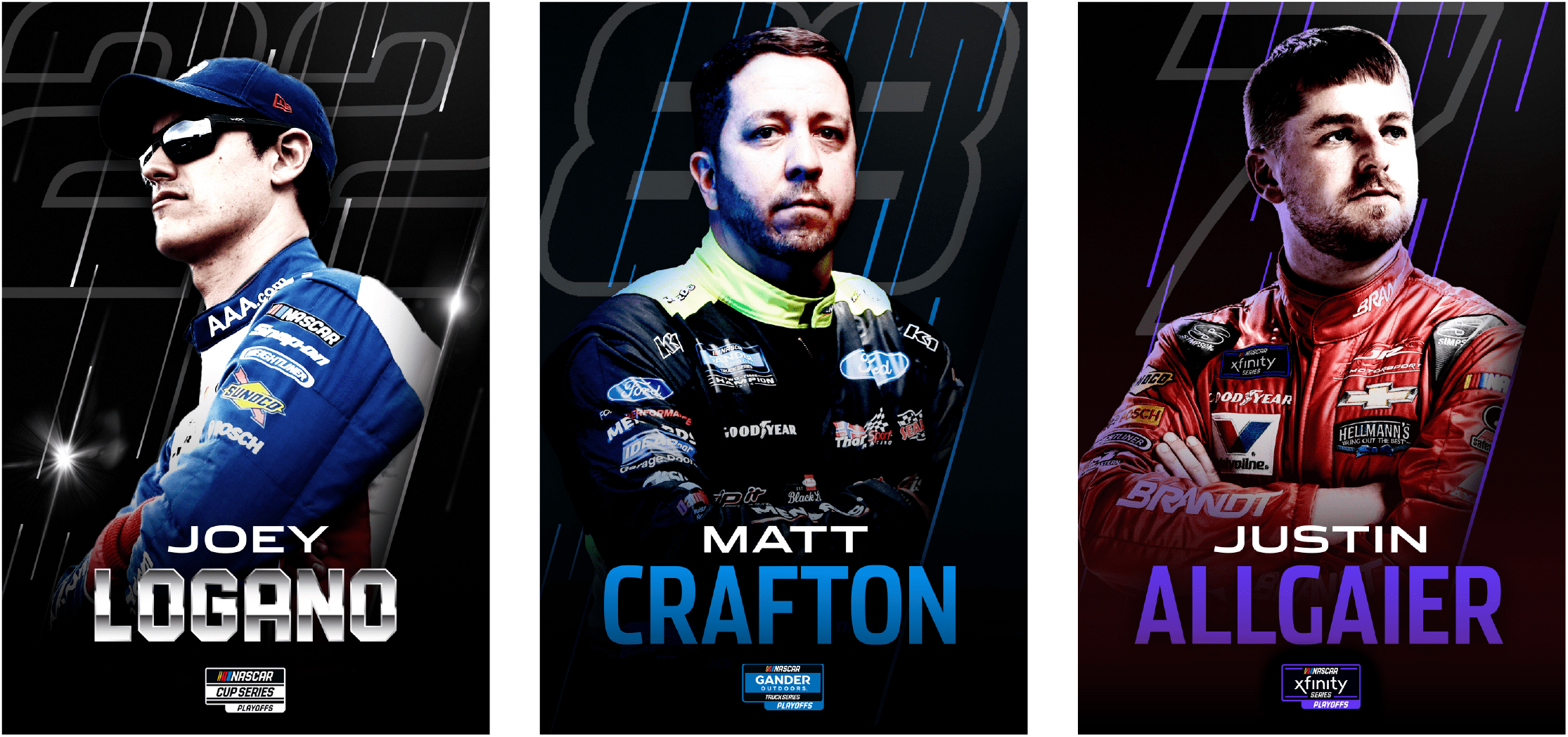
DRIVER KEY ART
CHAMPIONSHIP WEEKEND
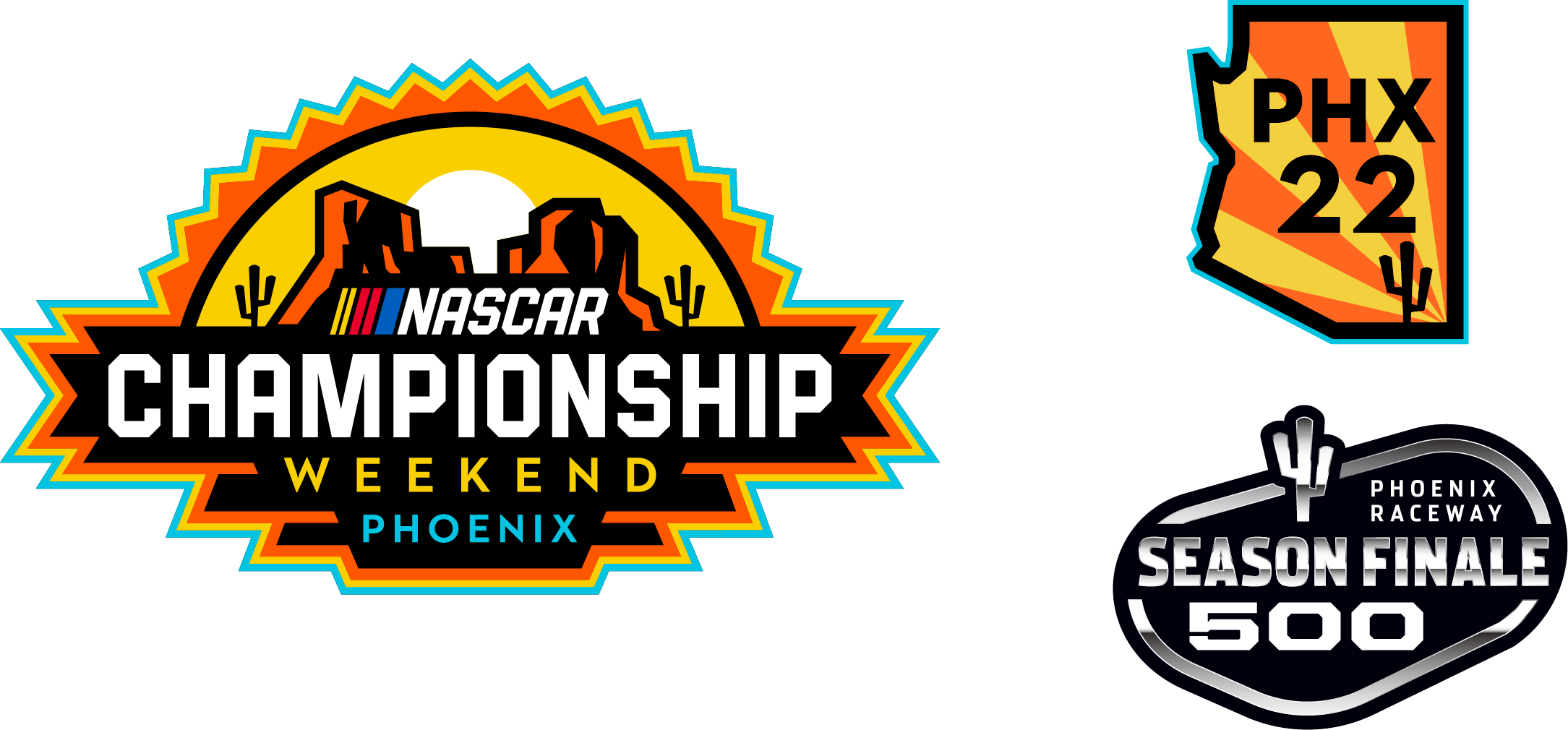

LOGOS & ELEMENTS
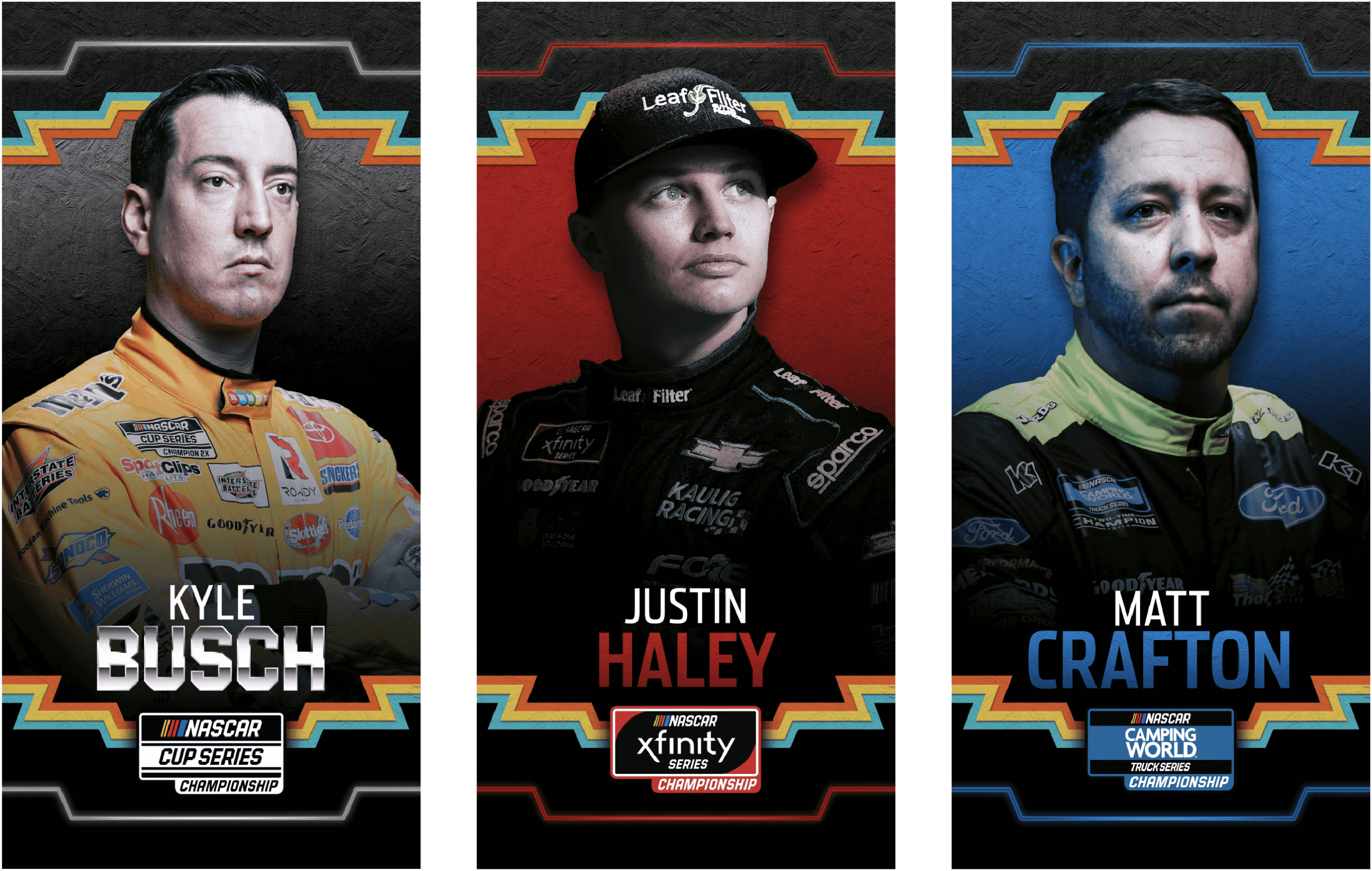
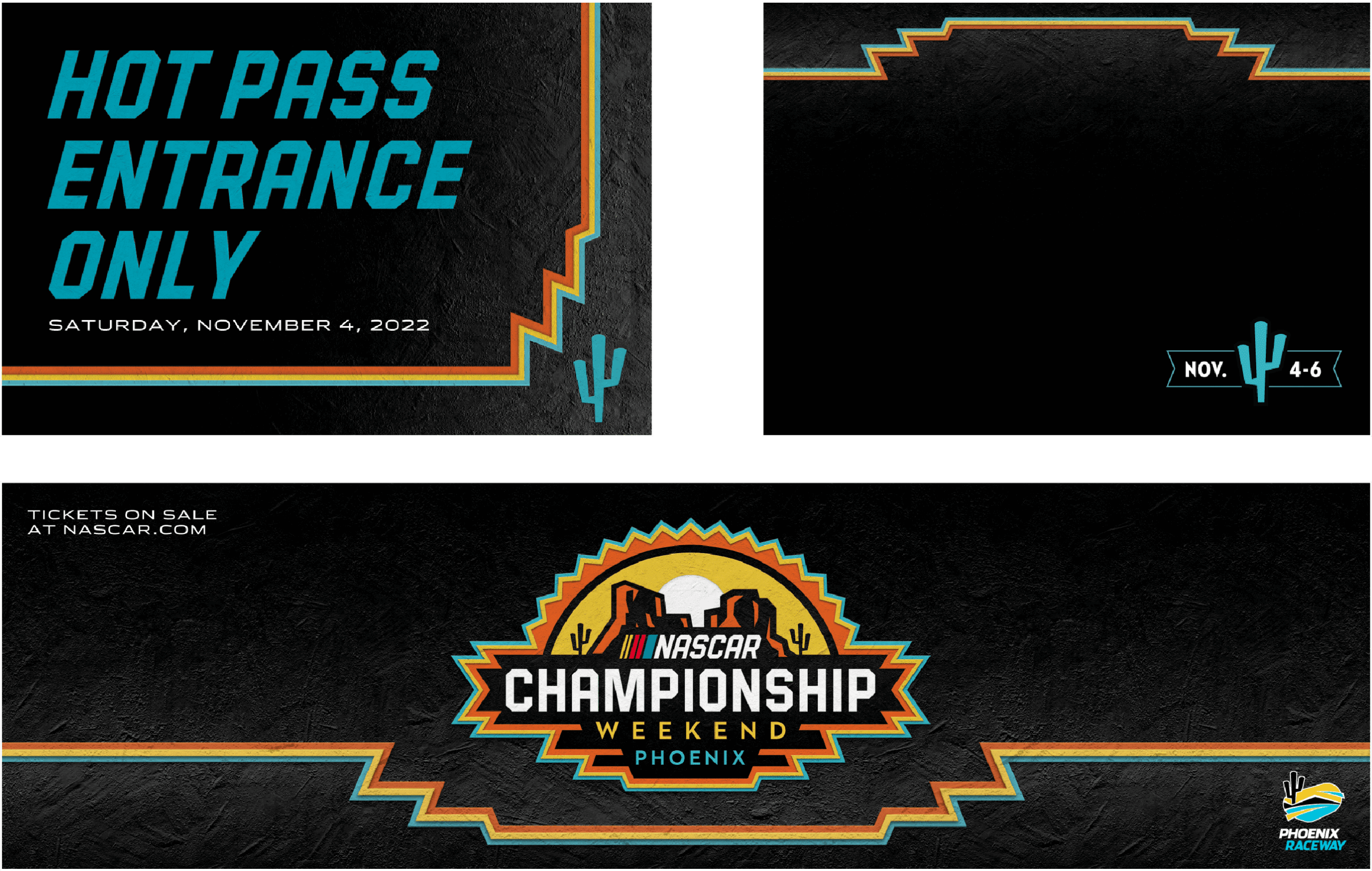
DRIVER KEY ART, SAMPLE LAYOUTS
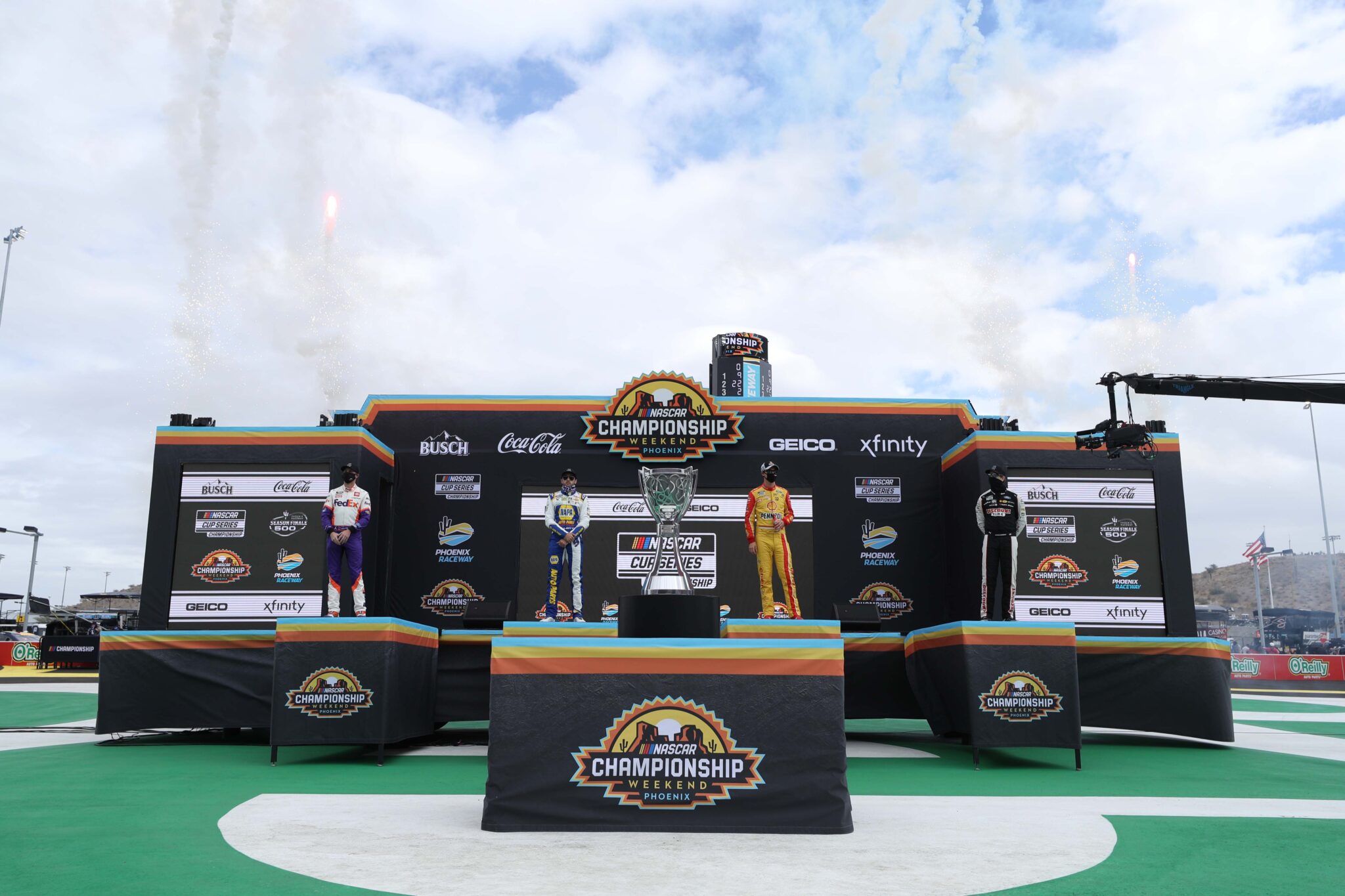
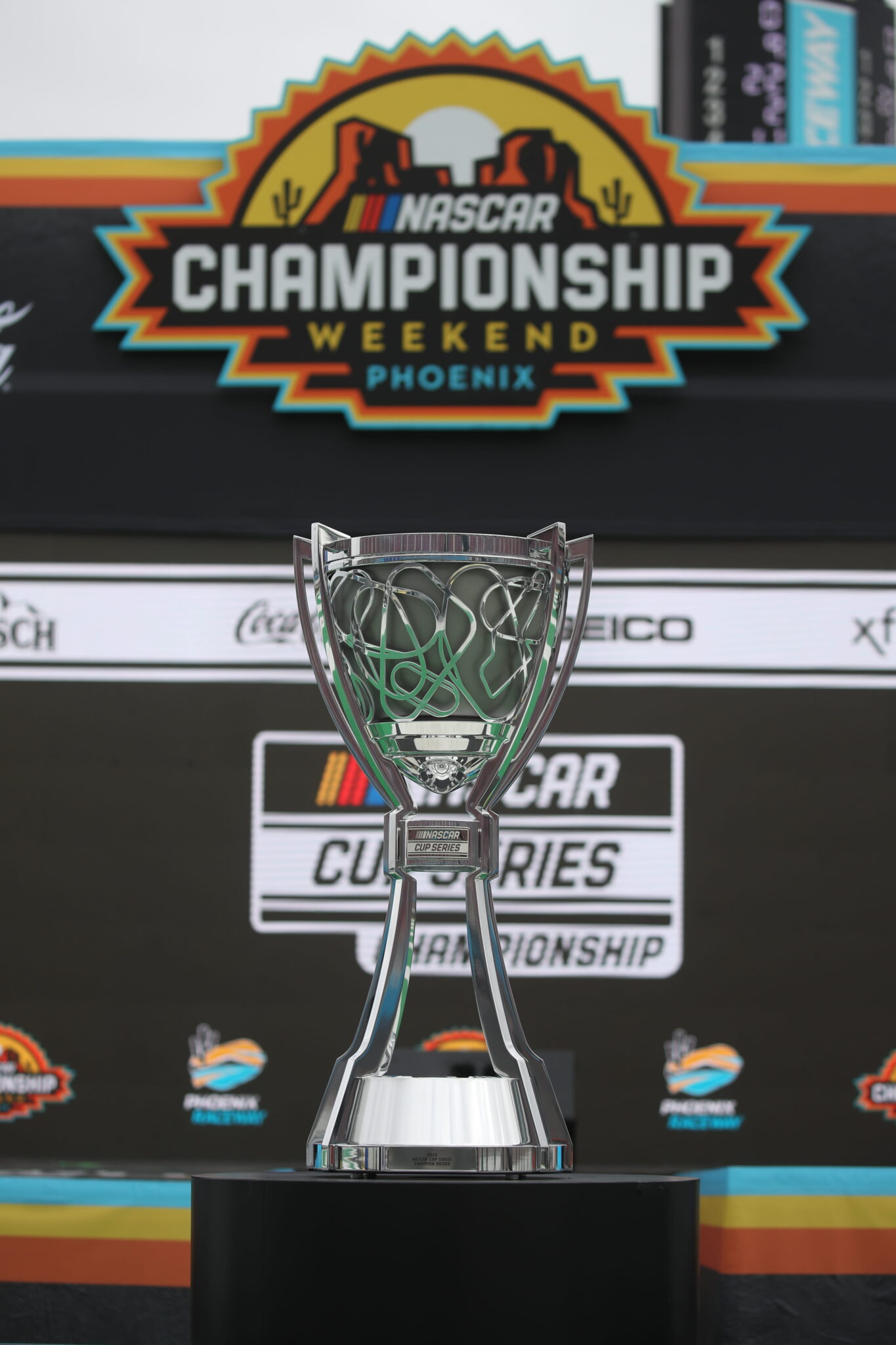
SEASON EVENTS
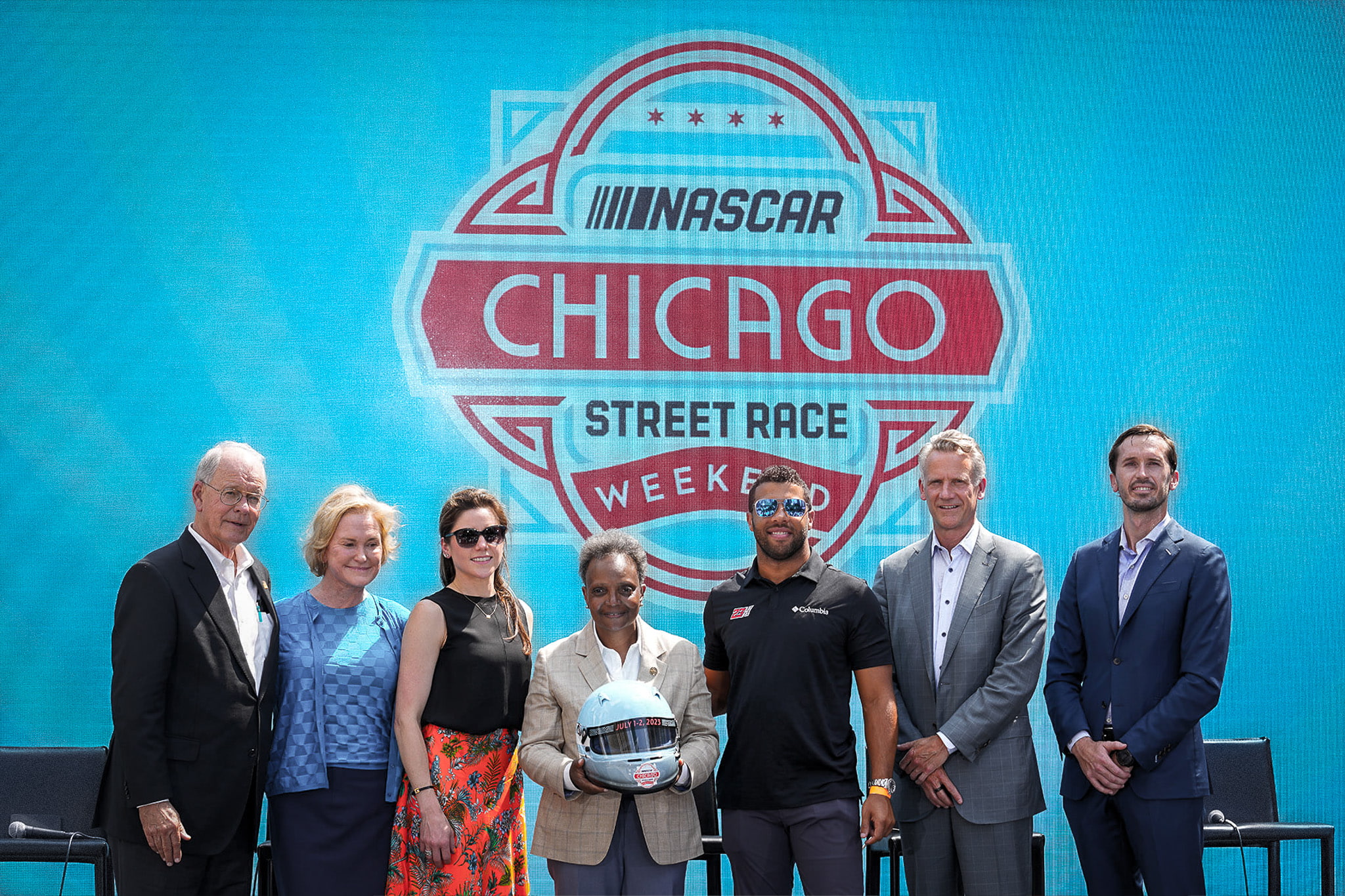
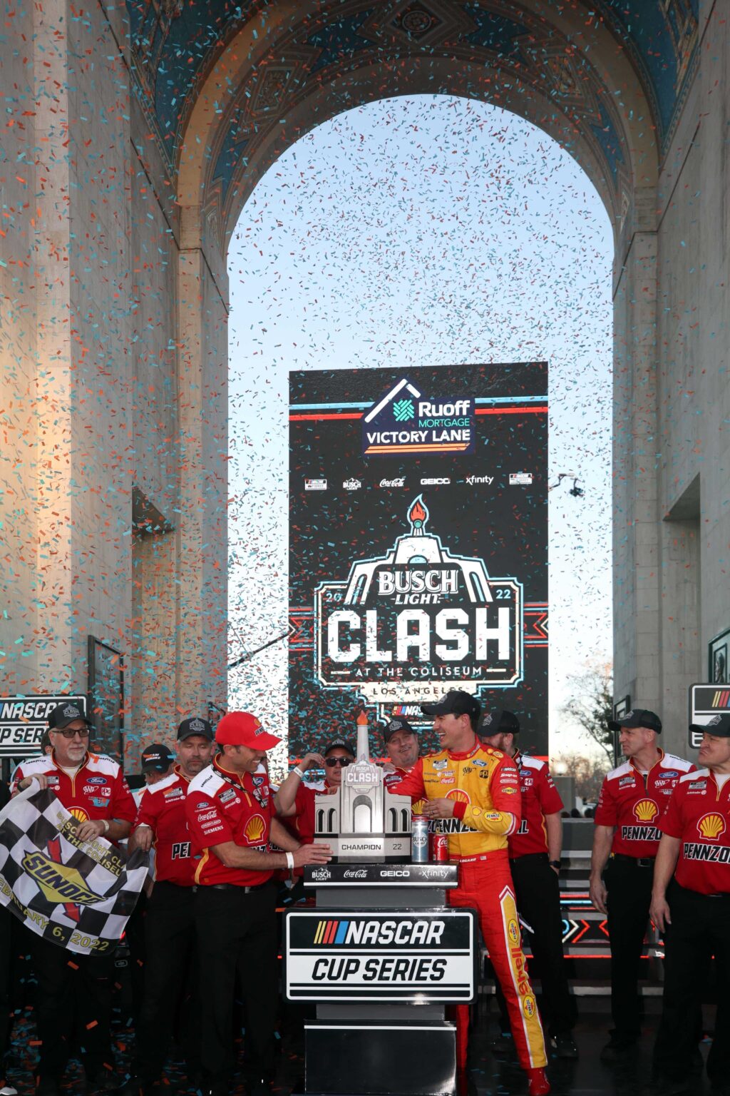
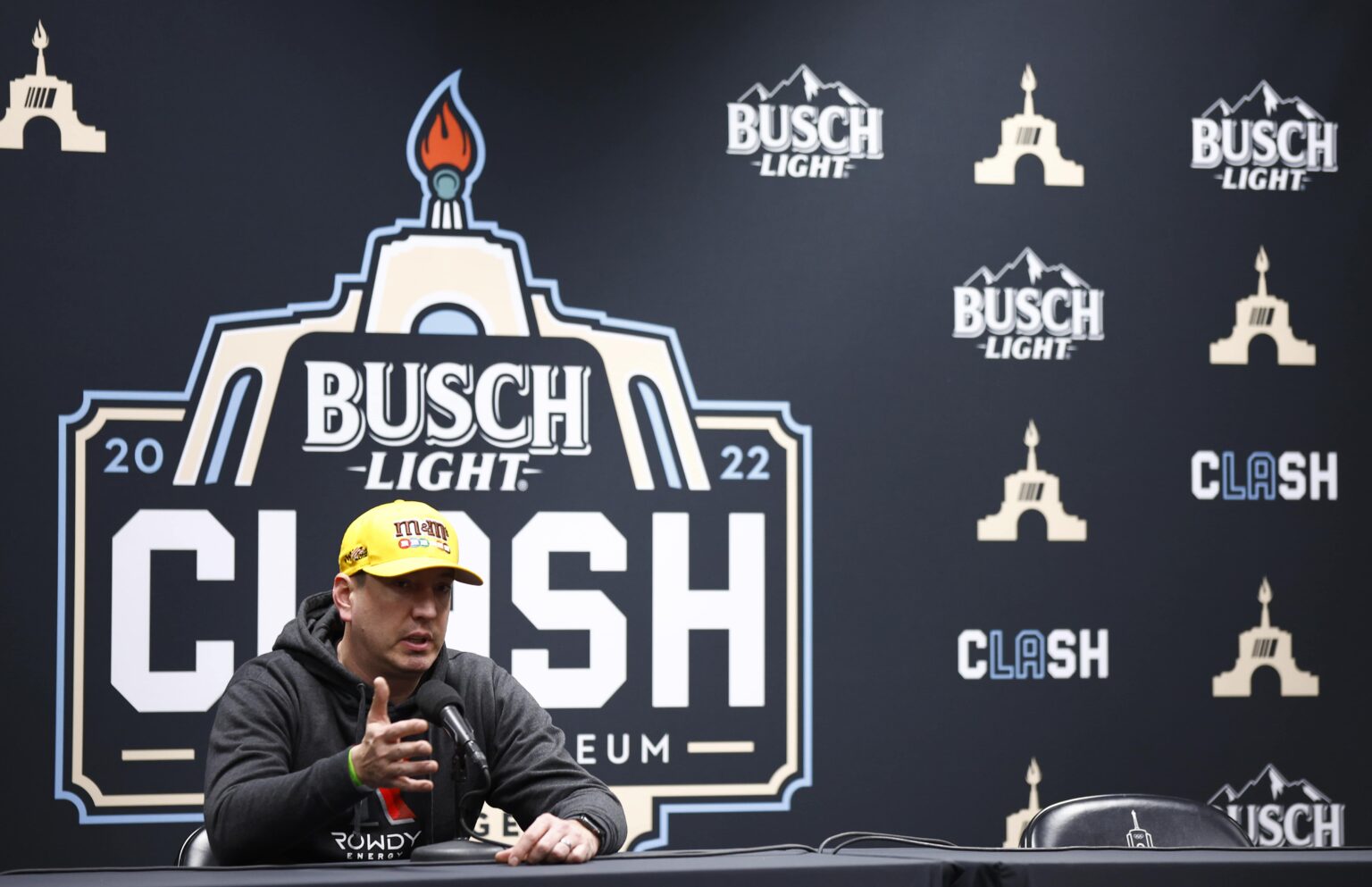
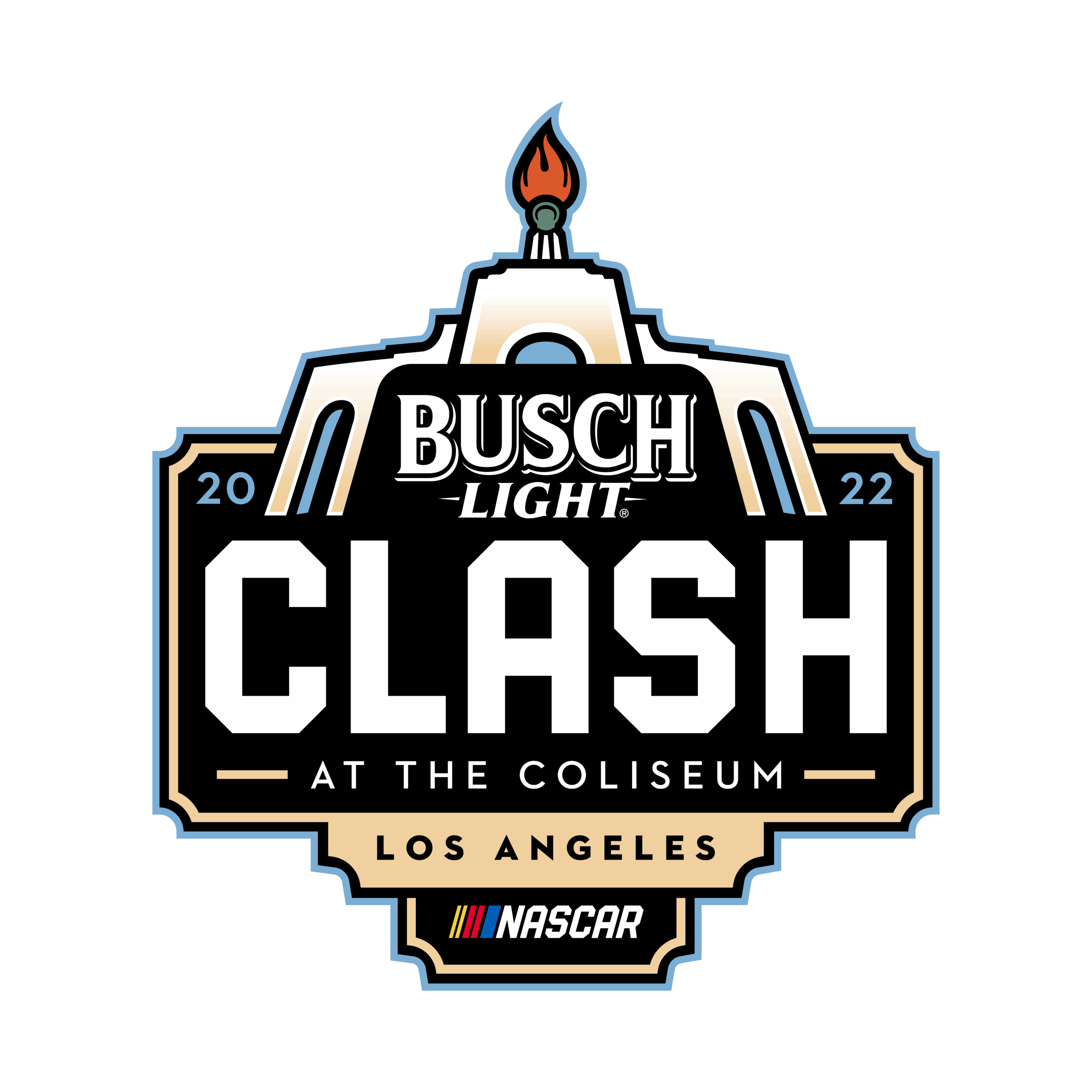
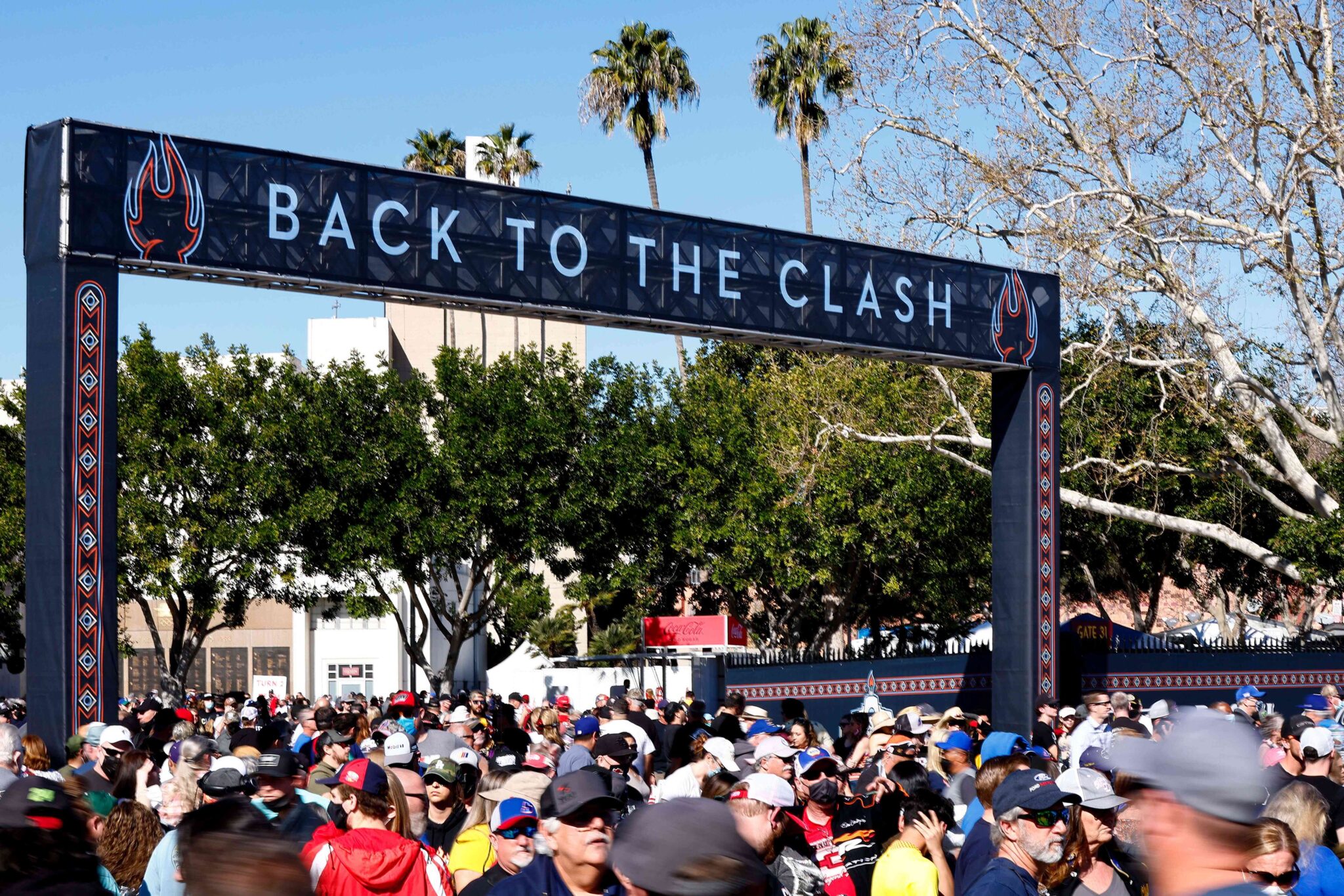
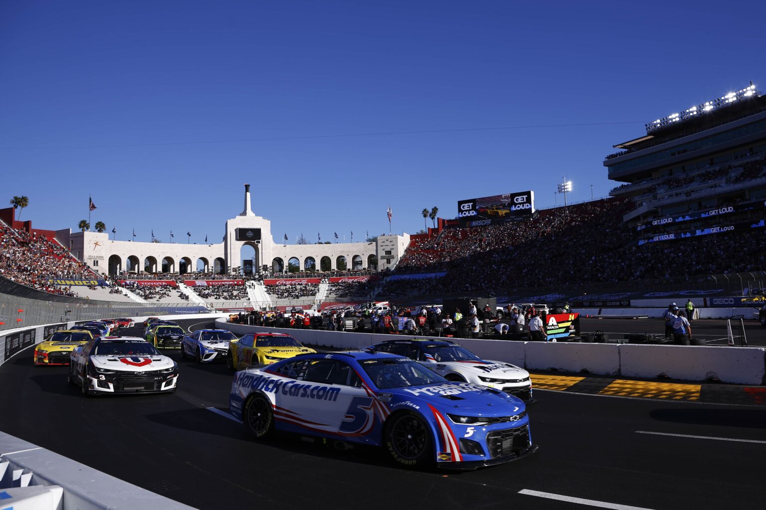
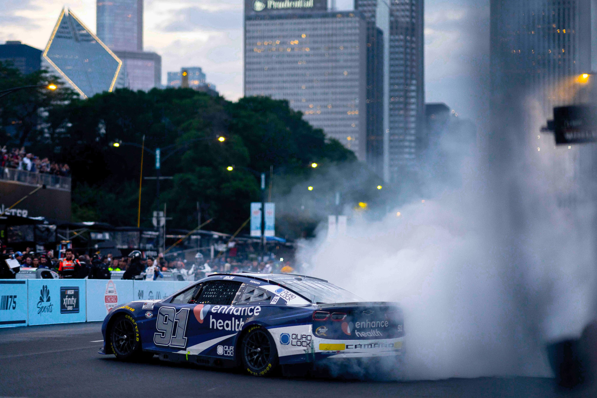
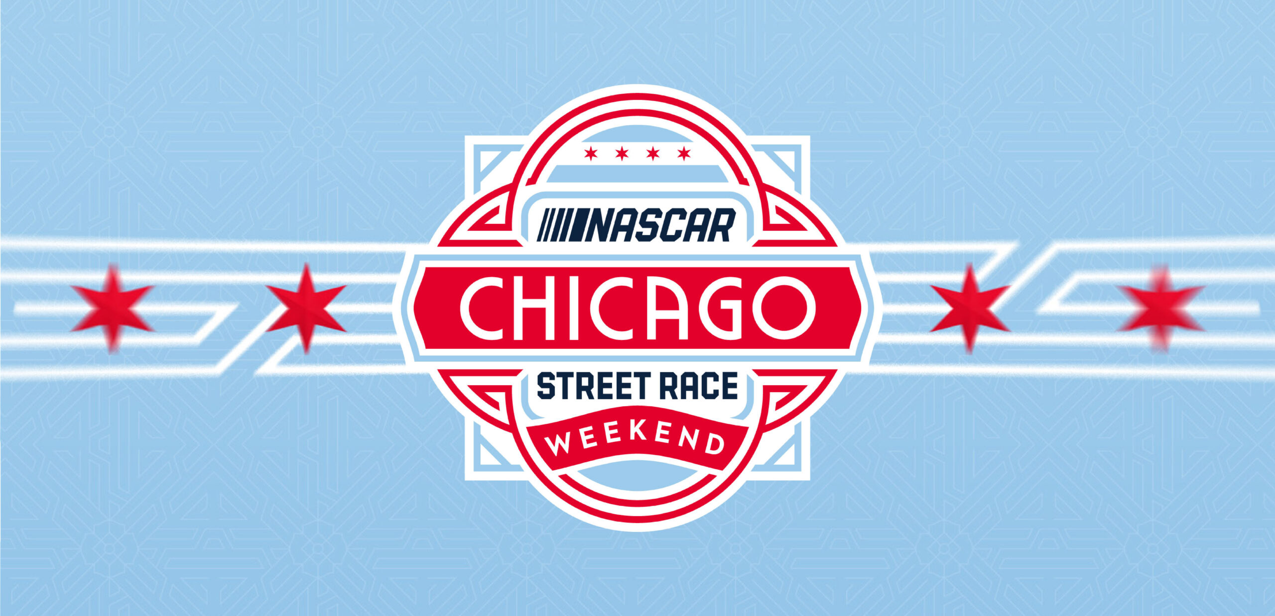
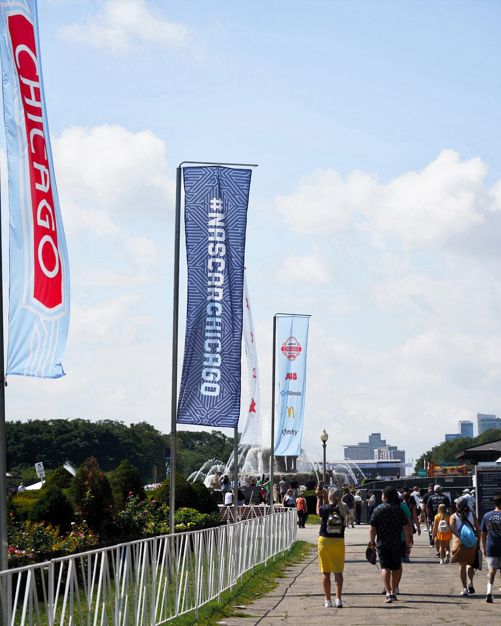
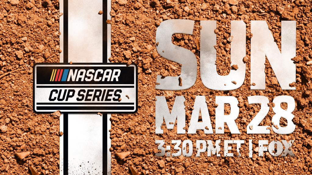
Each event of the season offers a unique window into the world of NASCAR — an opportunity to experience the sport through the lens of fan communities across the country. From race-day traditions and distinctive fan vernacular to immersive on-site experiences, every event contributes something singular to the season. These event identities reflect those unique characteristics while remaining part of the broader NASCAR ecosystem.
BUSCH LITE CLASH AT THE COLISEUM
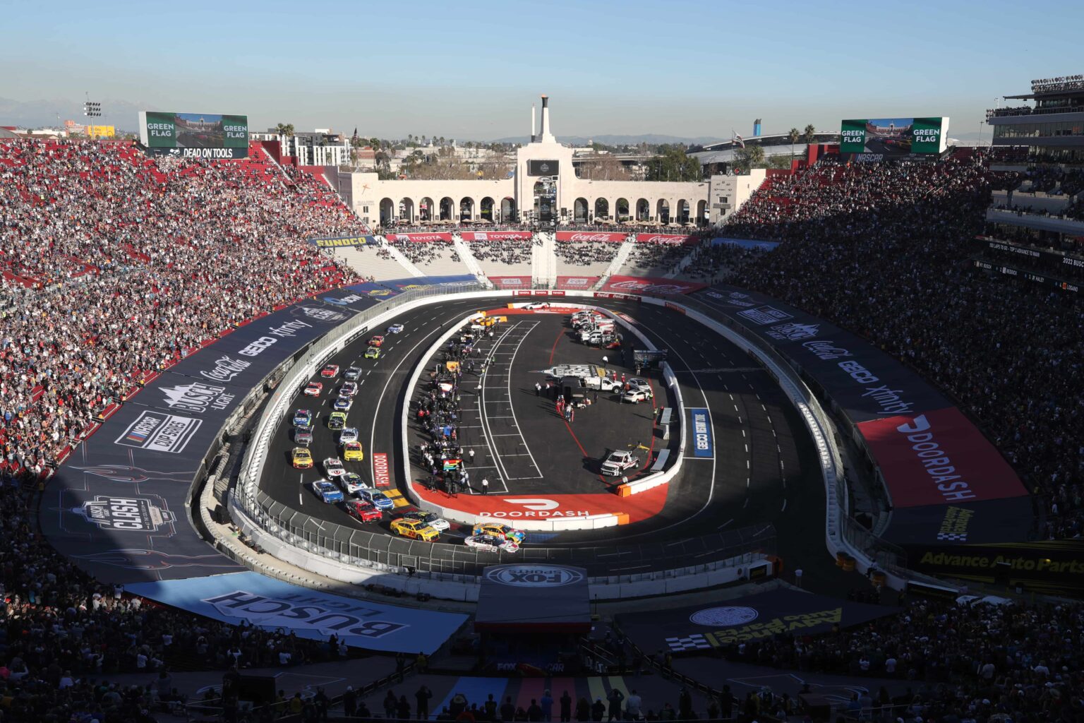

CHIGAGO STREET RACE
View the full case study here


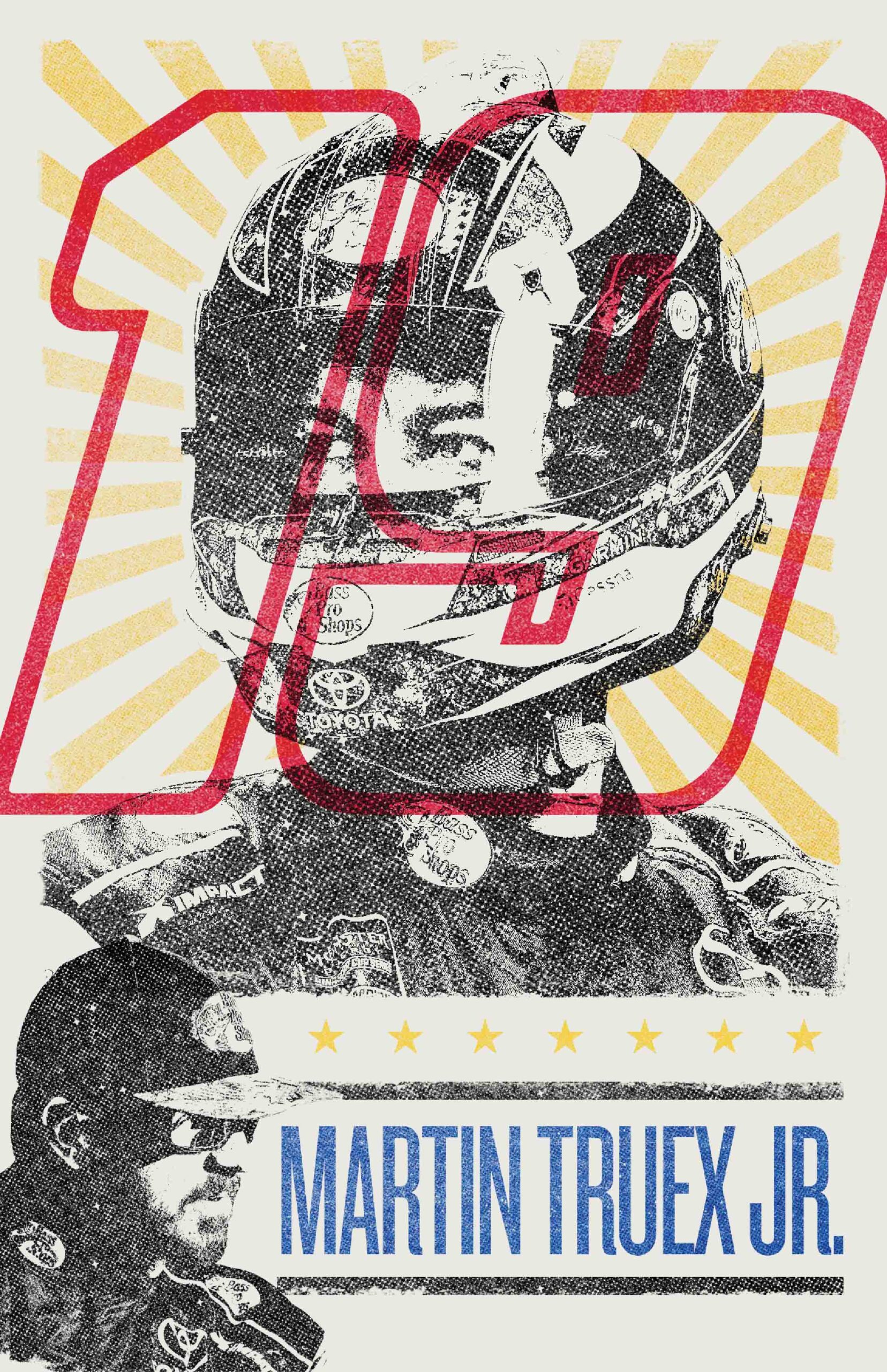
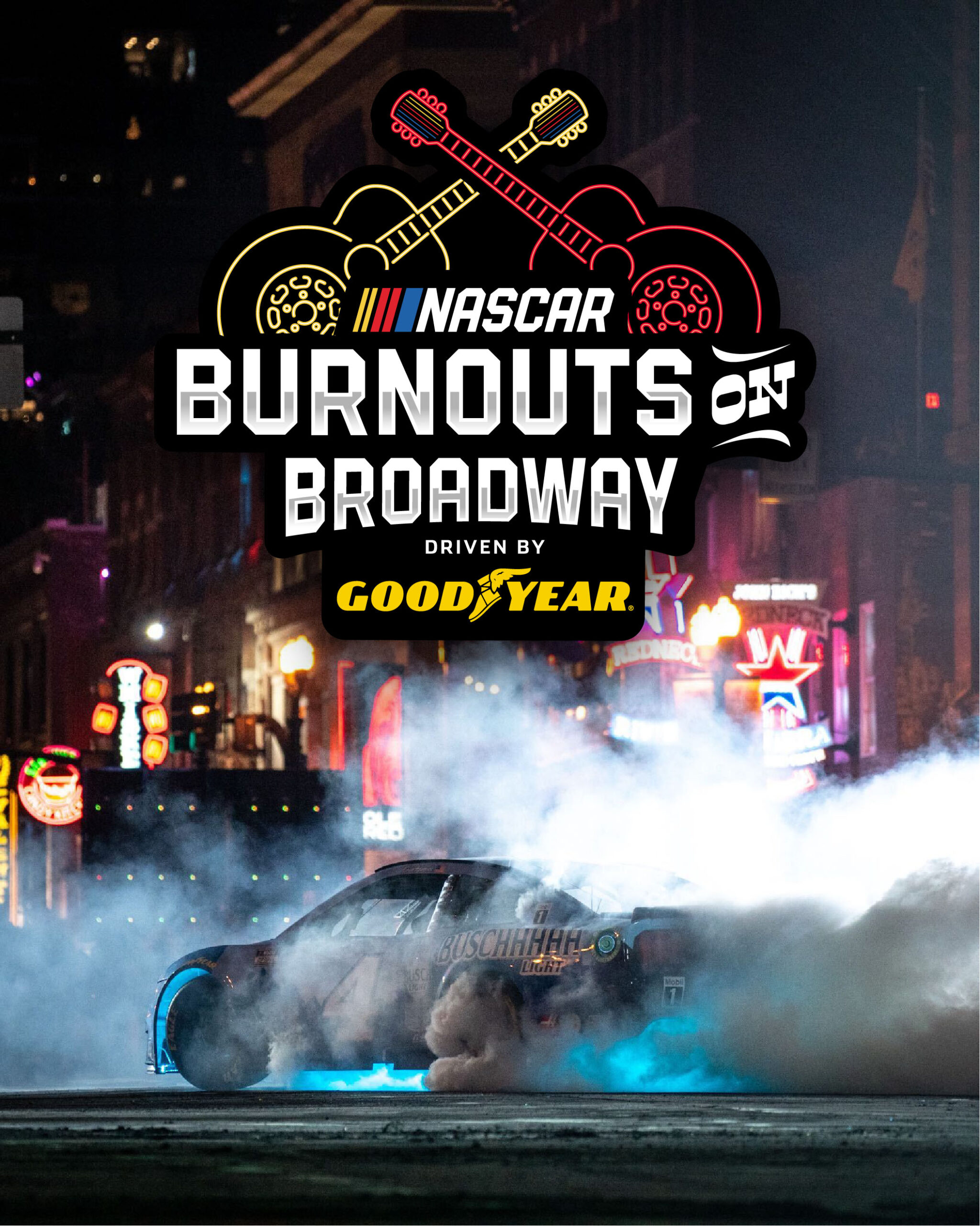
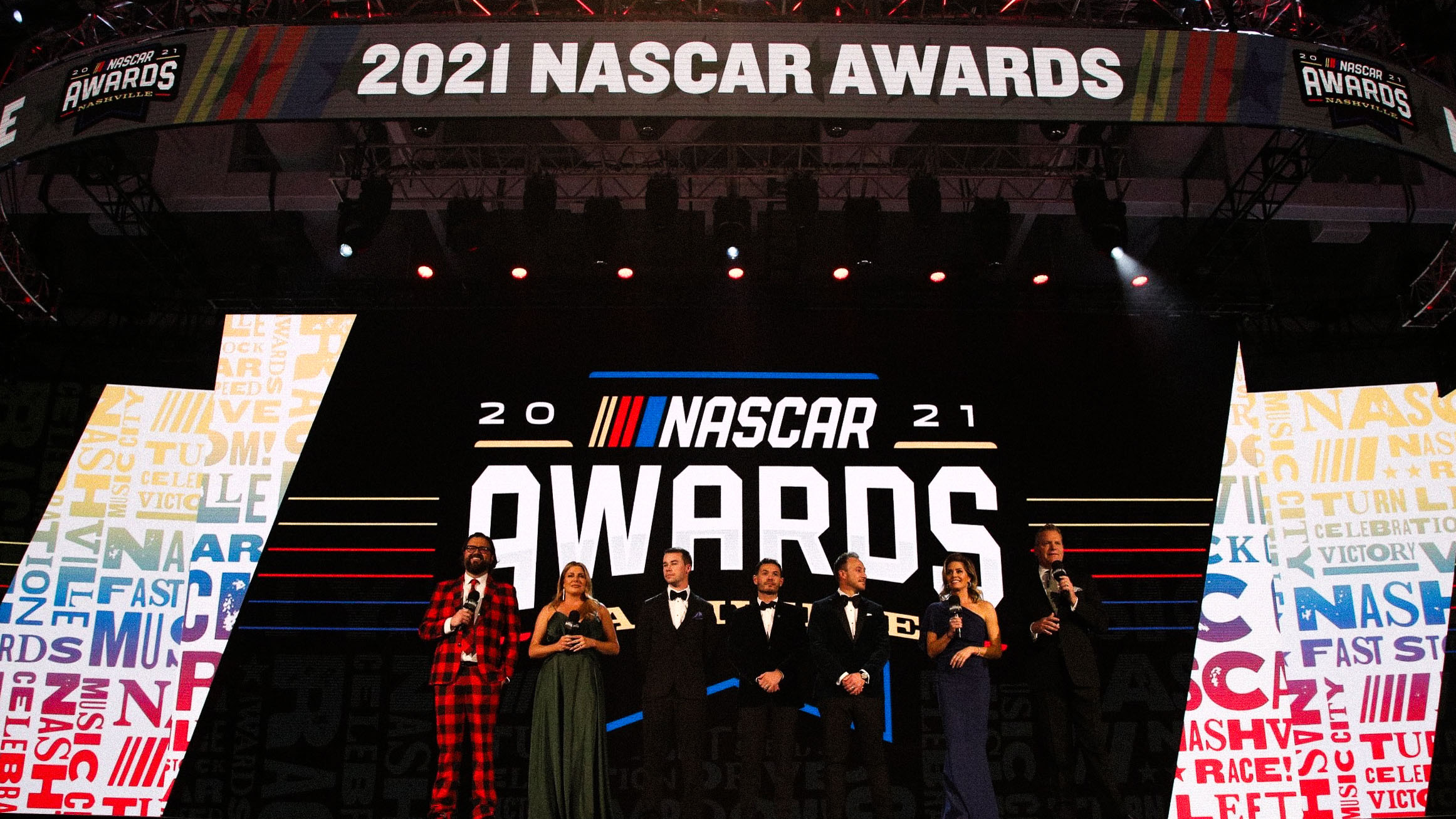
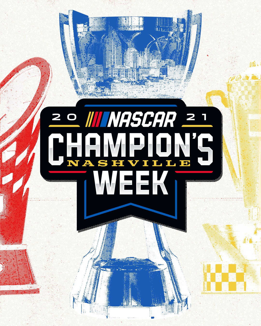
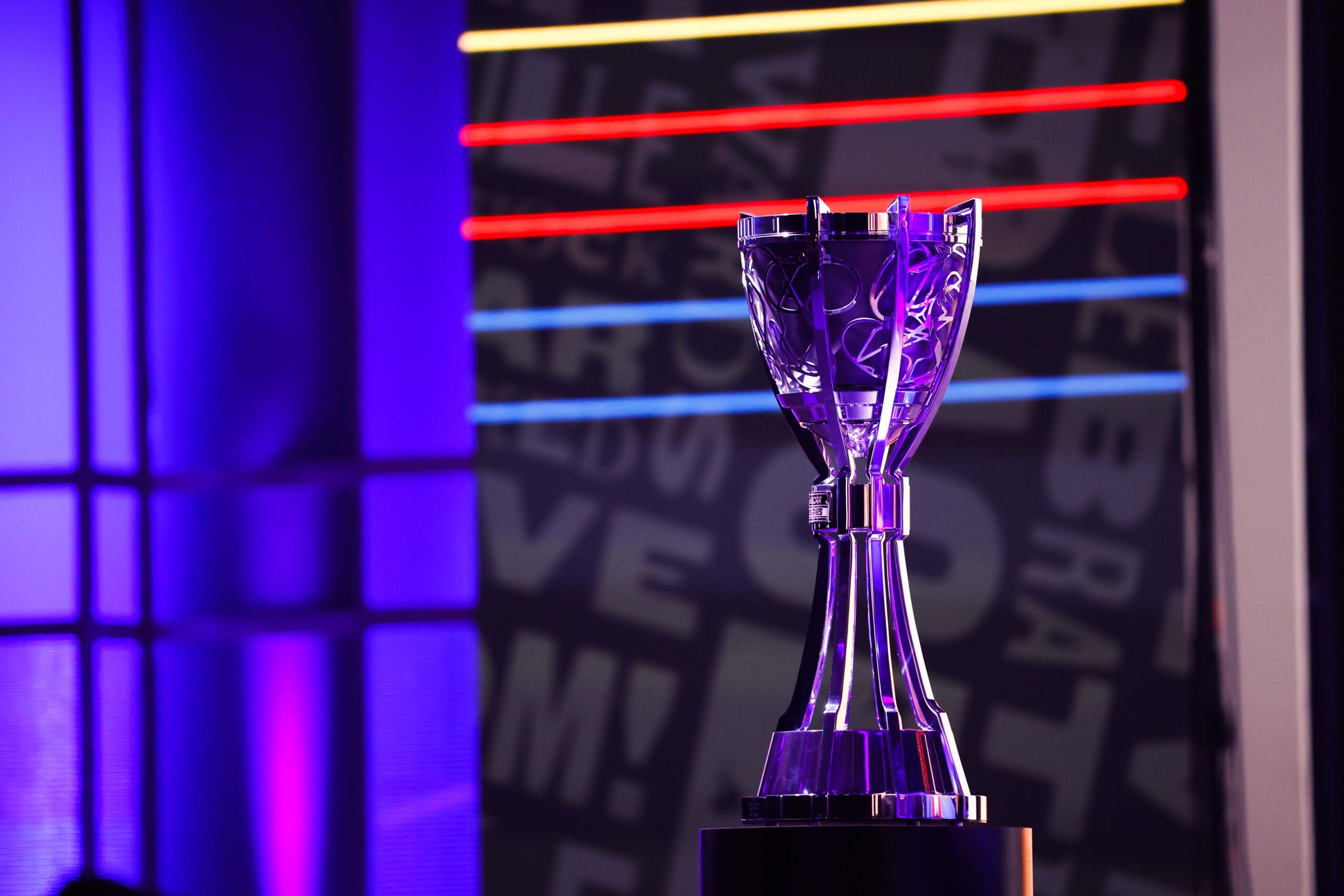
CHAMPION’S WEEK



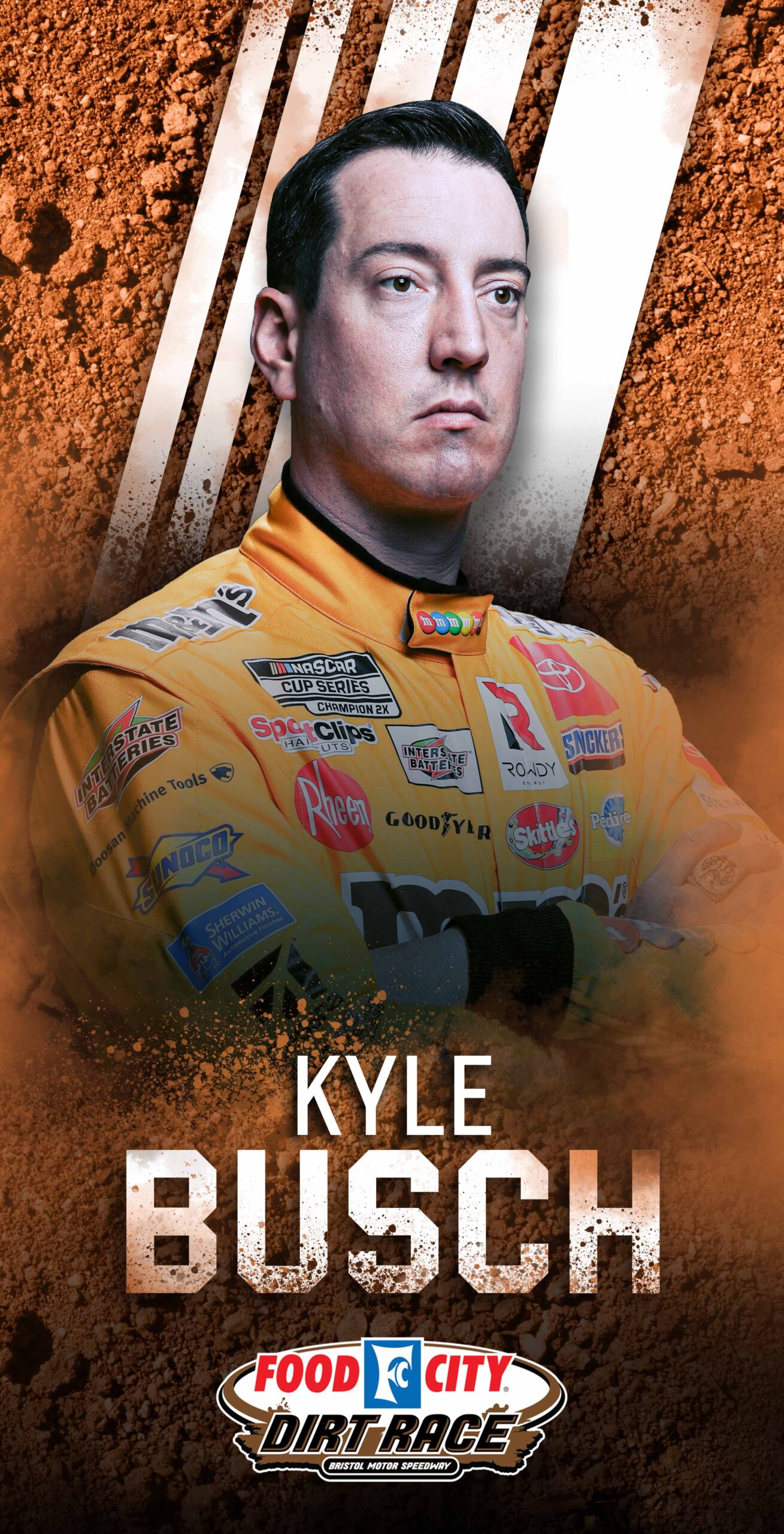
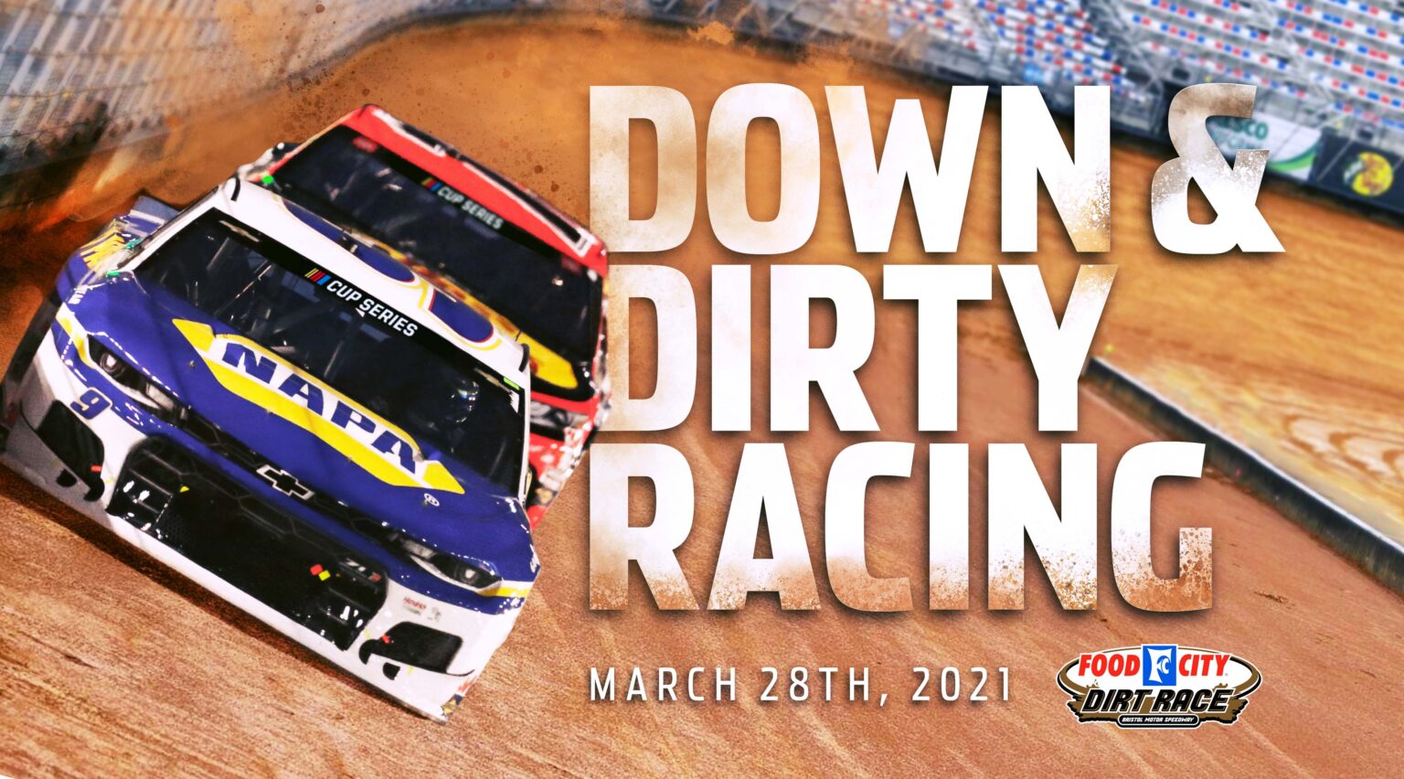
BRISTOL DIRT


INITIATIVES
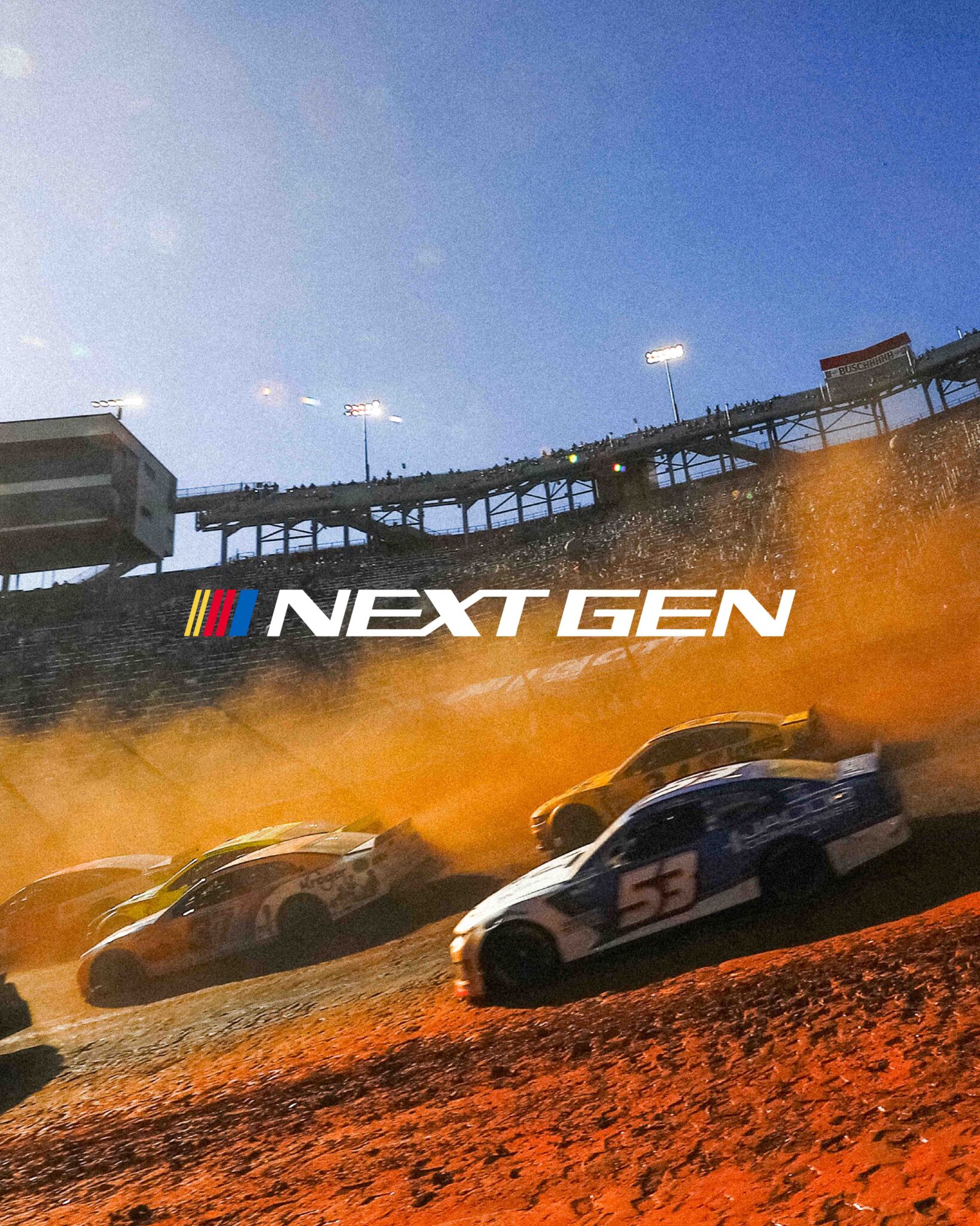
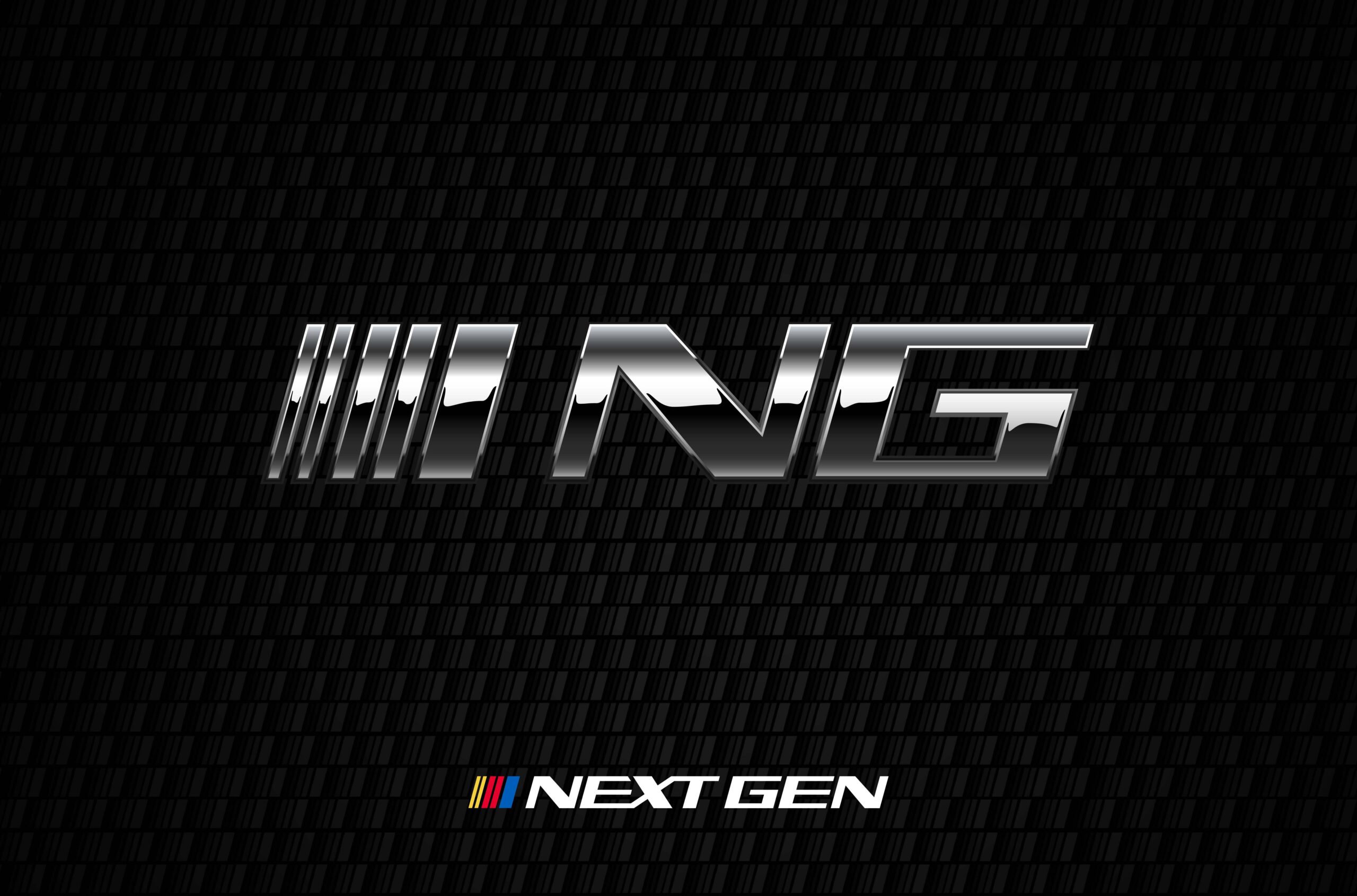
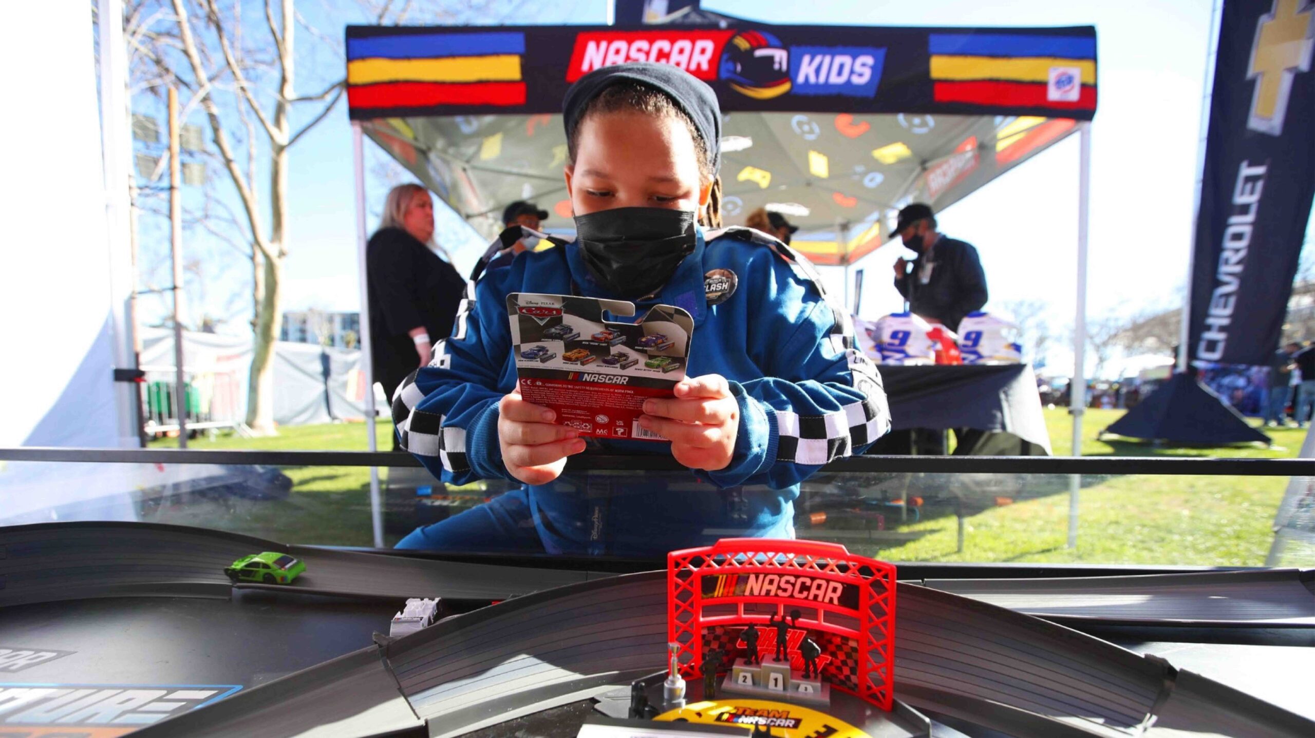
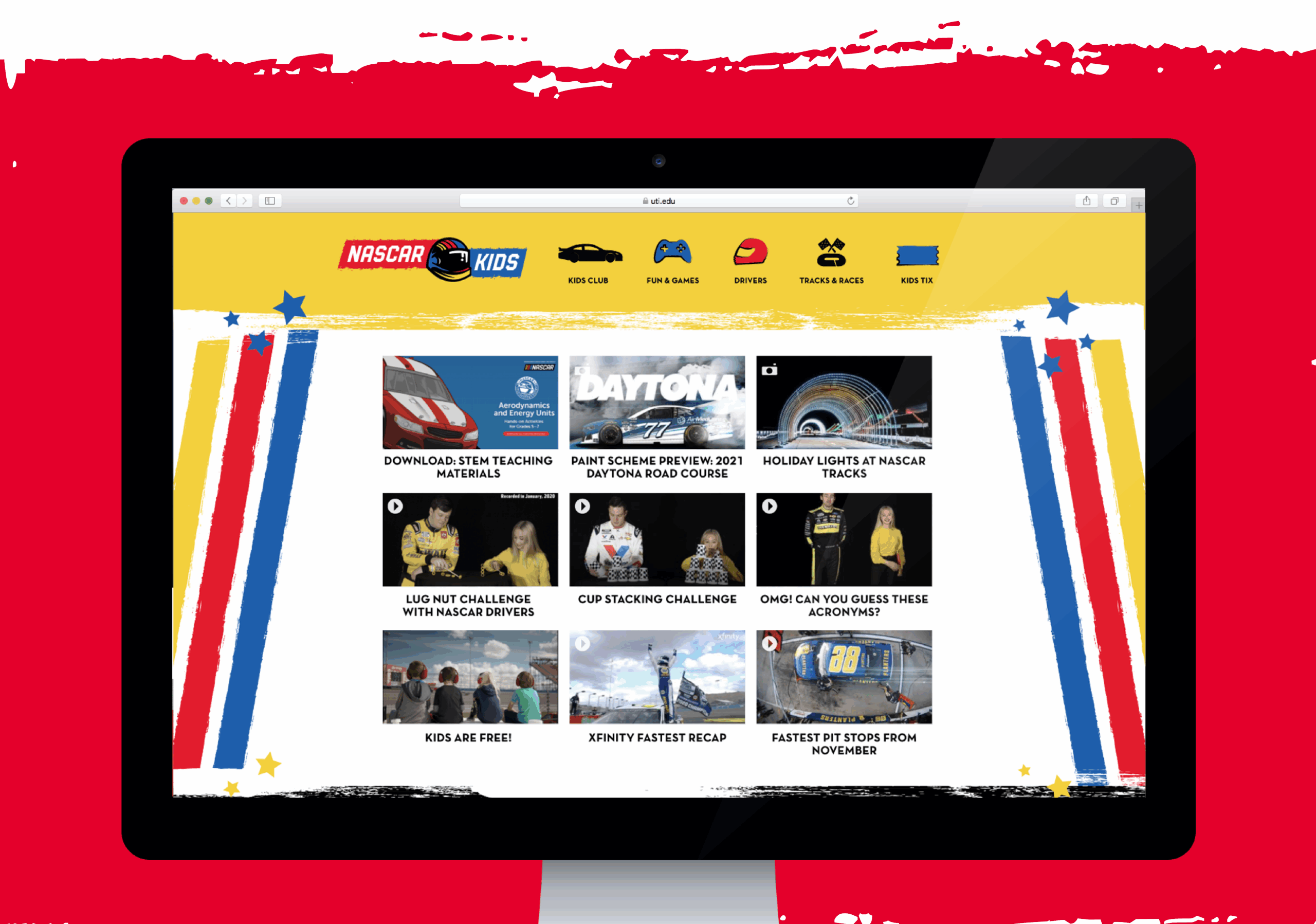
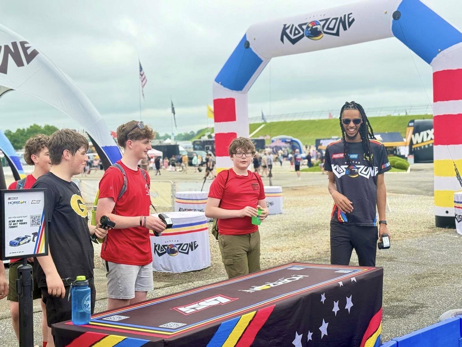
Within the NASCAR brand ecosystem, initiatives extend the brand into programs that cultivate the sport and culture.
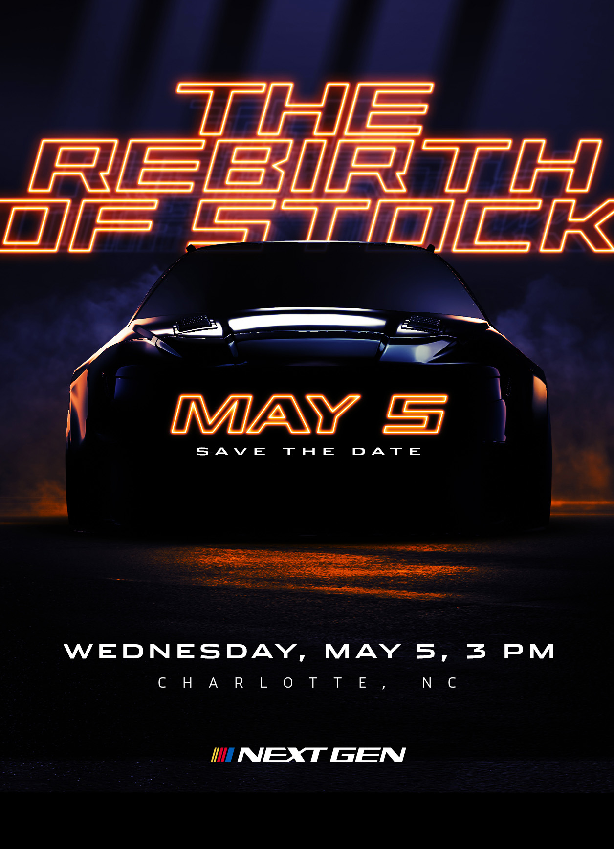
NEXT GEN


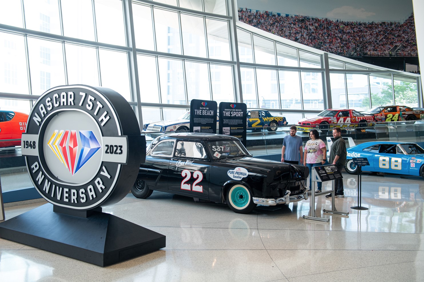
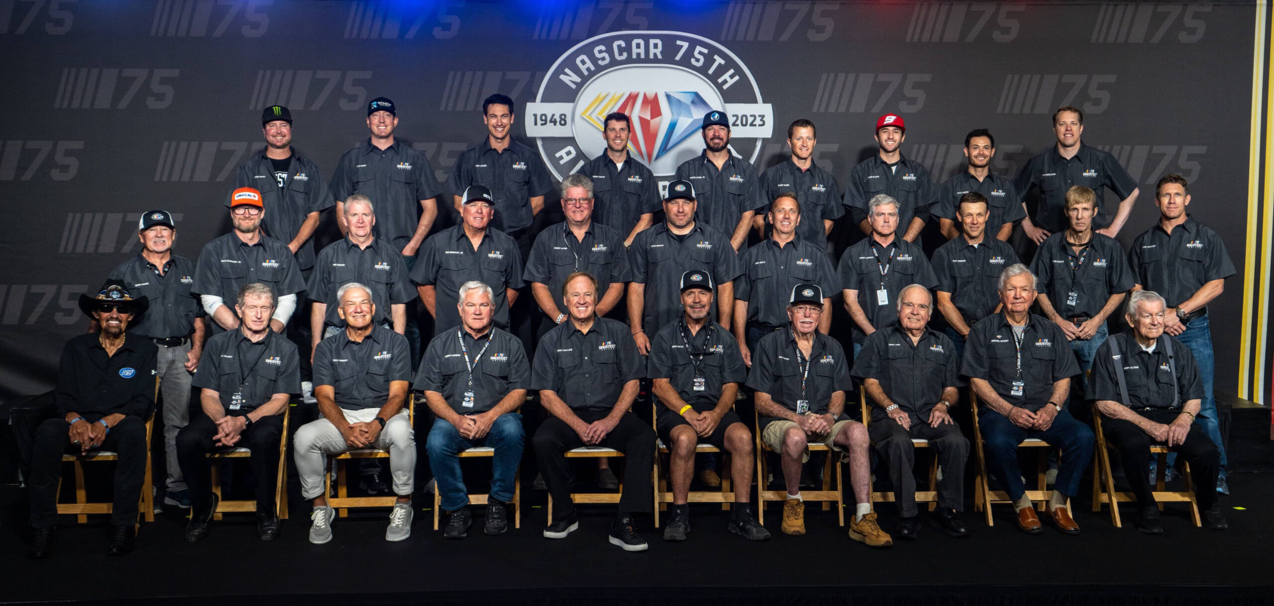
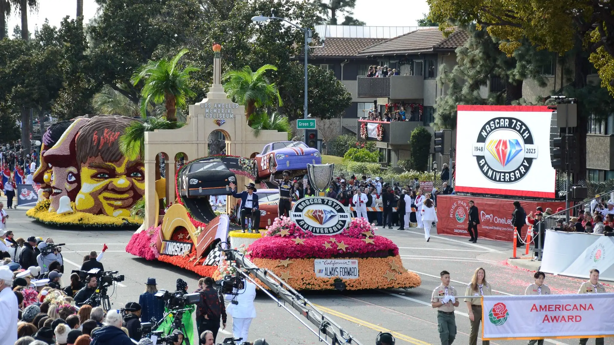
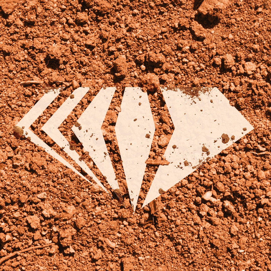
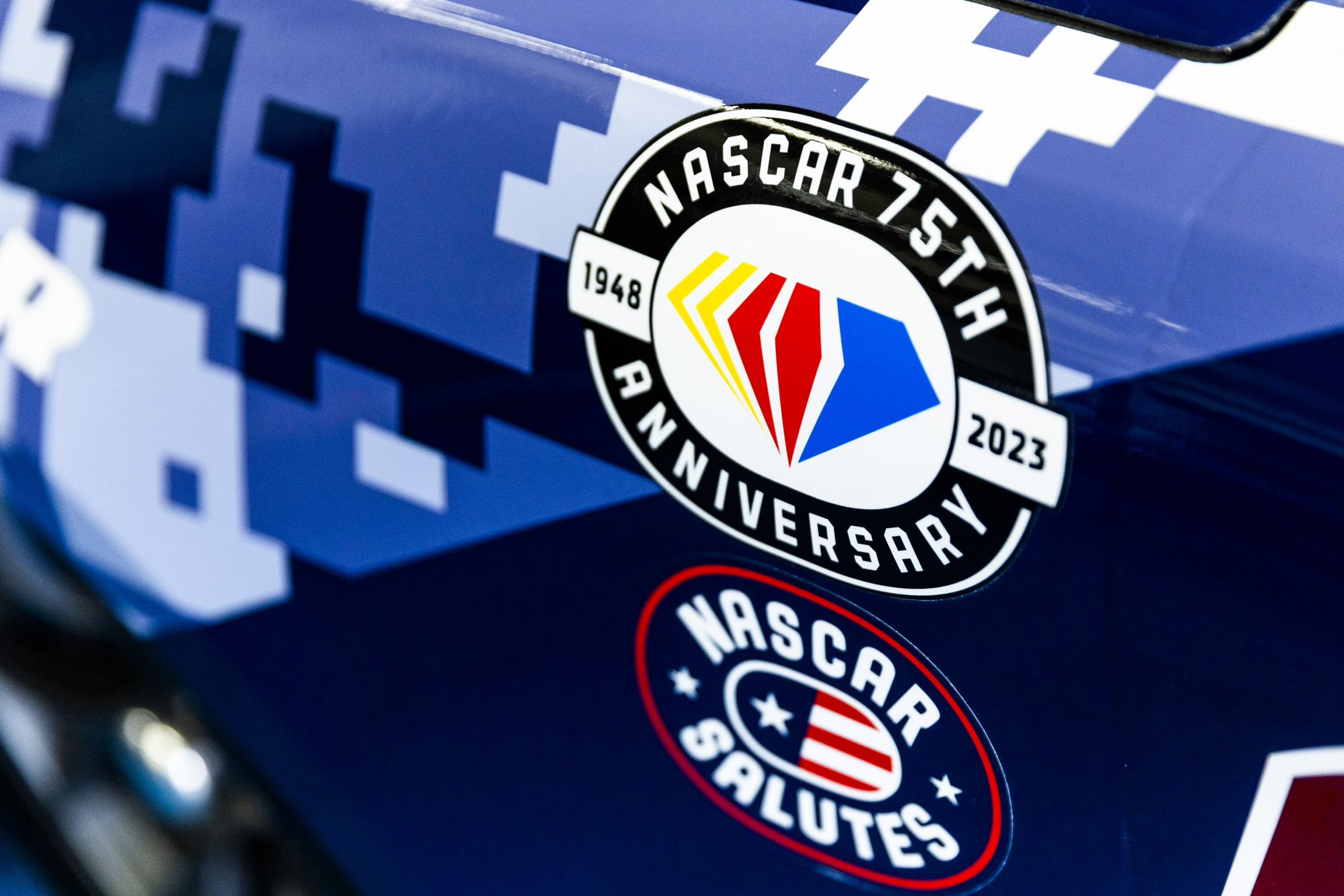
75TH ANNIVERSARY
View the full case study here


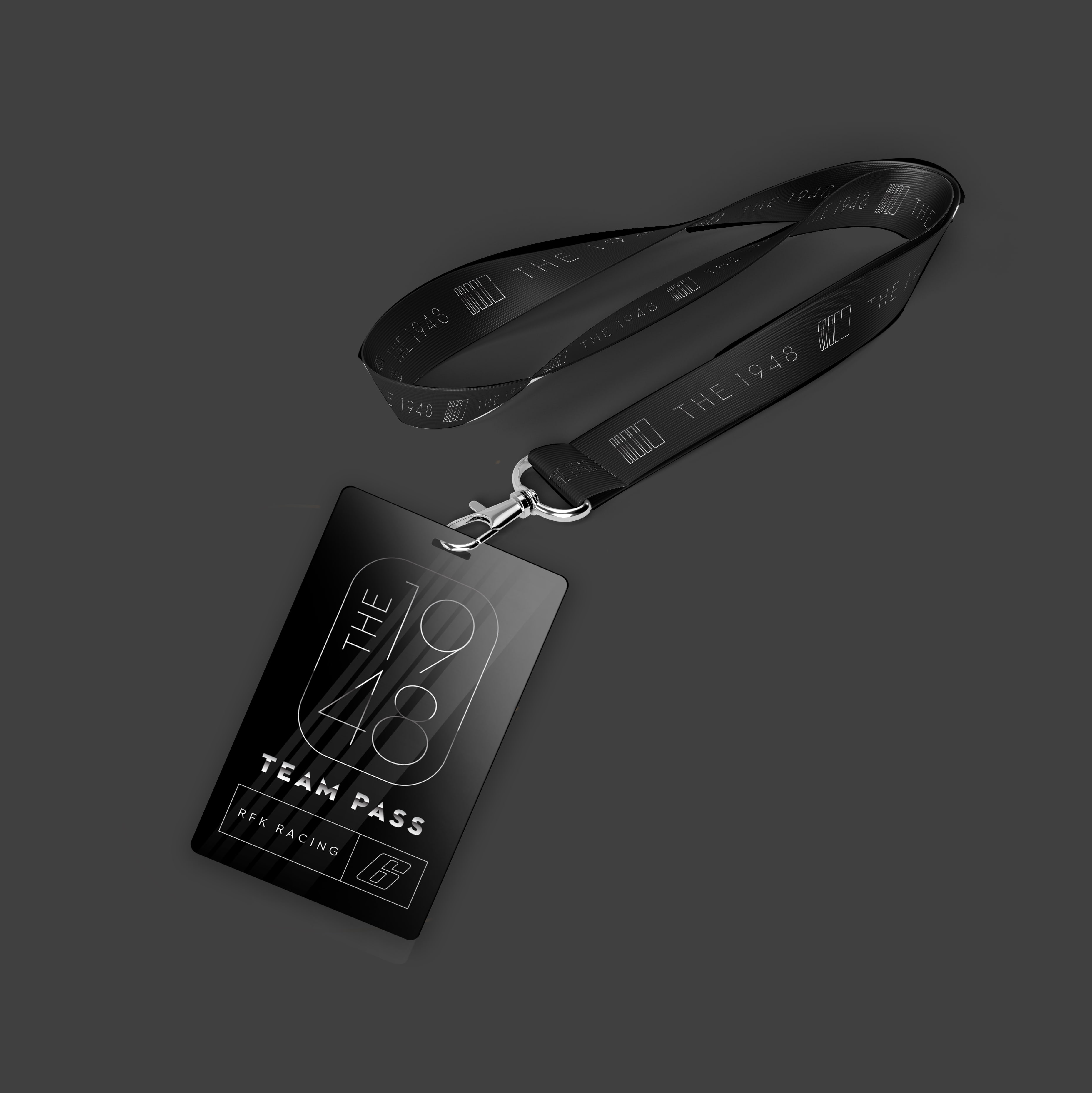
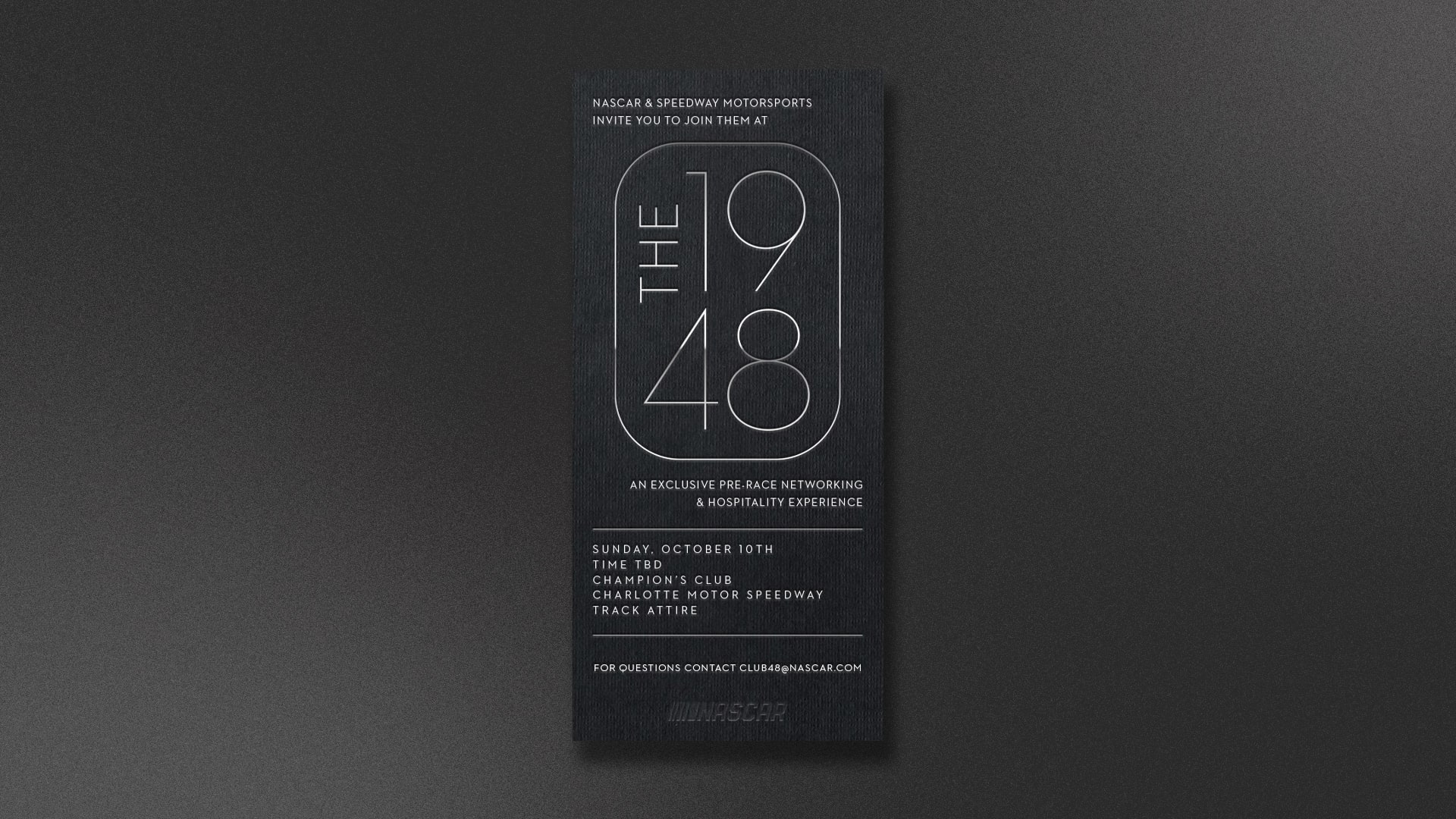
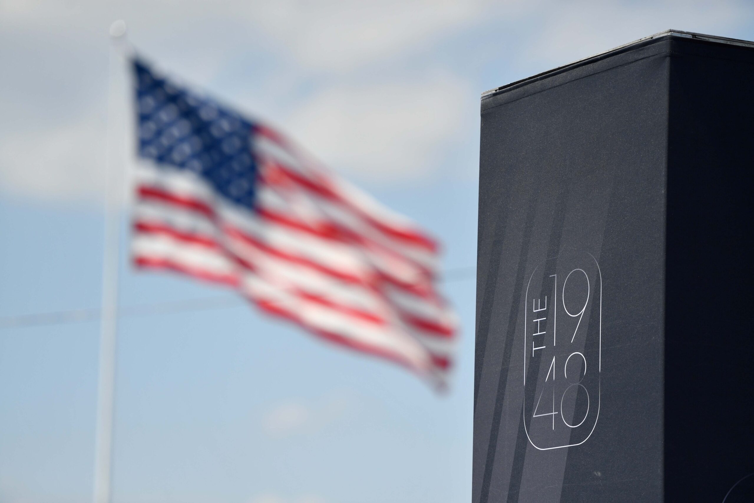
1948 CLUB
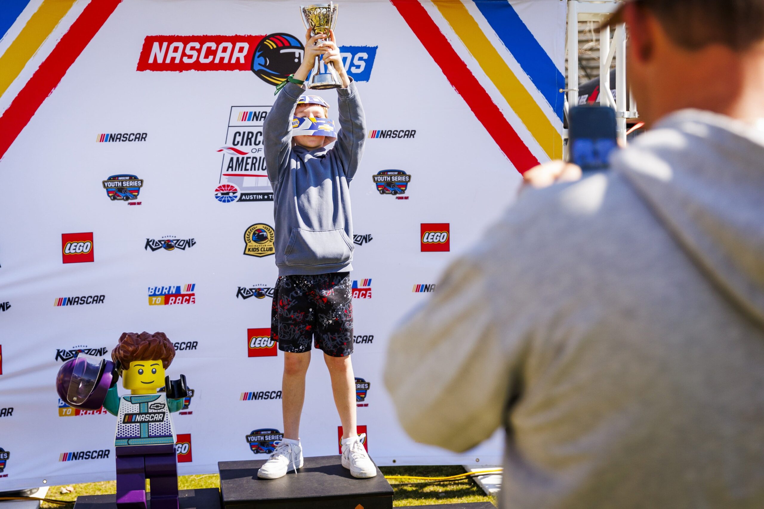
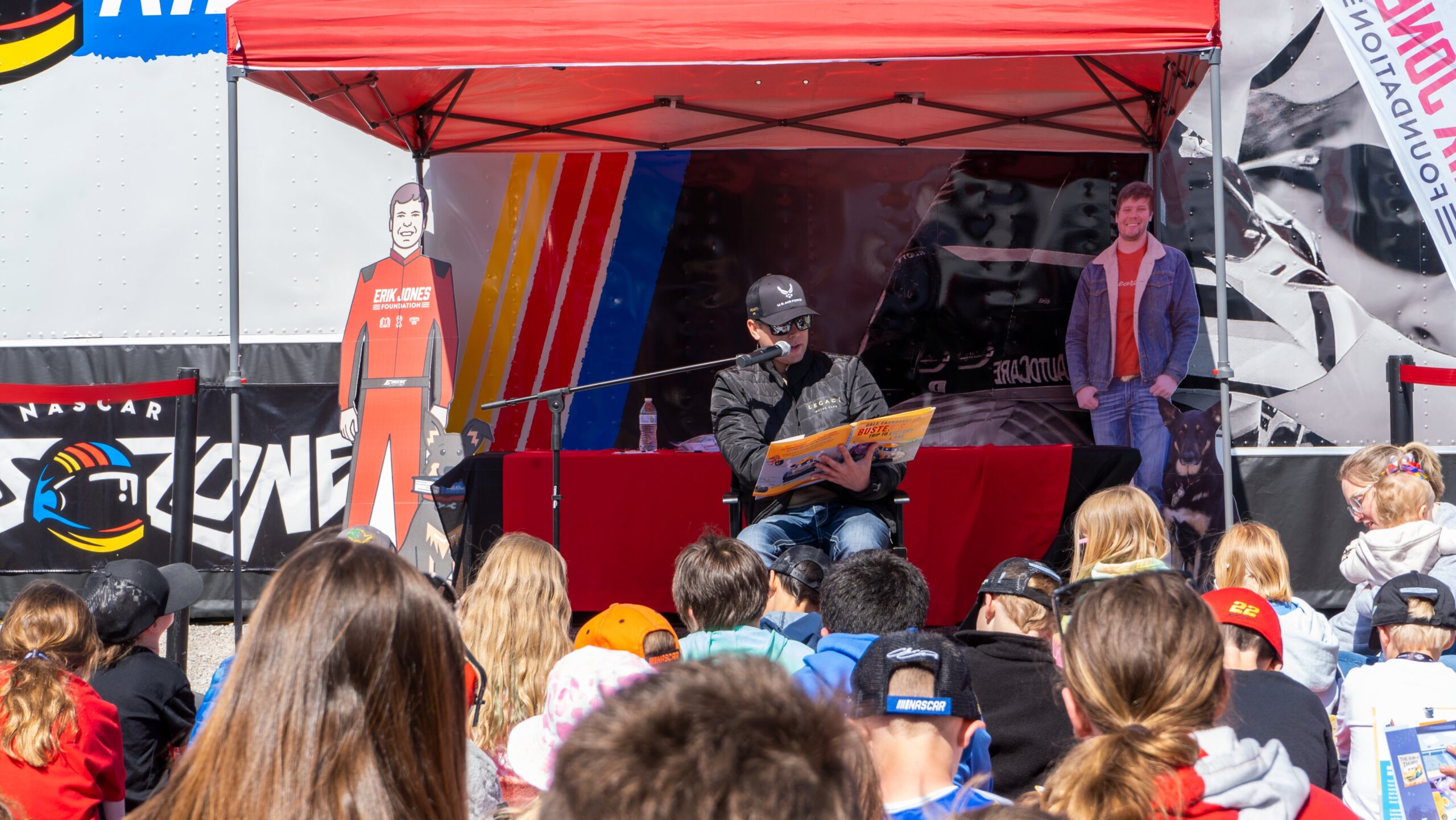
NASCAR KIDS


TRACK IDENTITIES
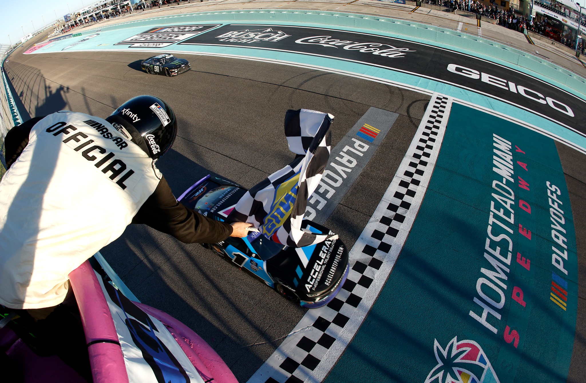
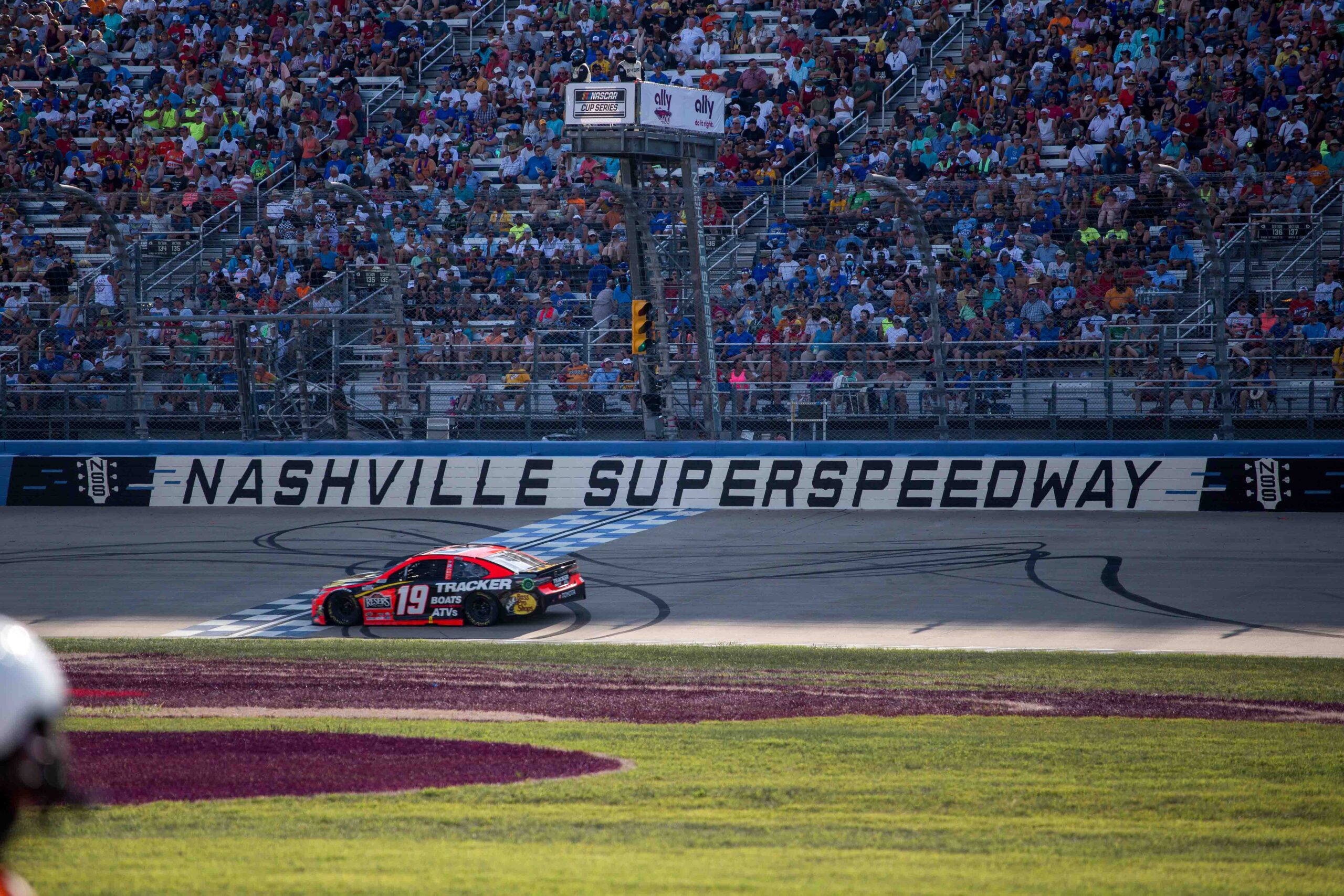
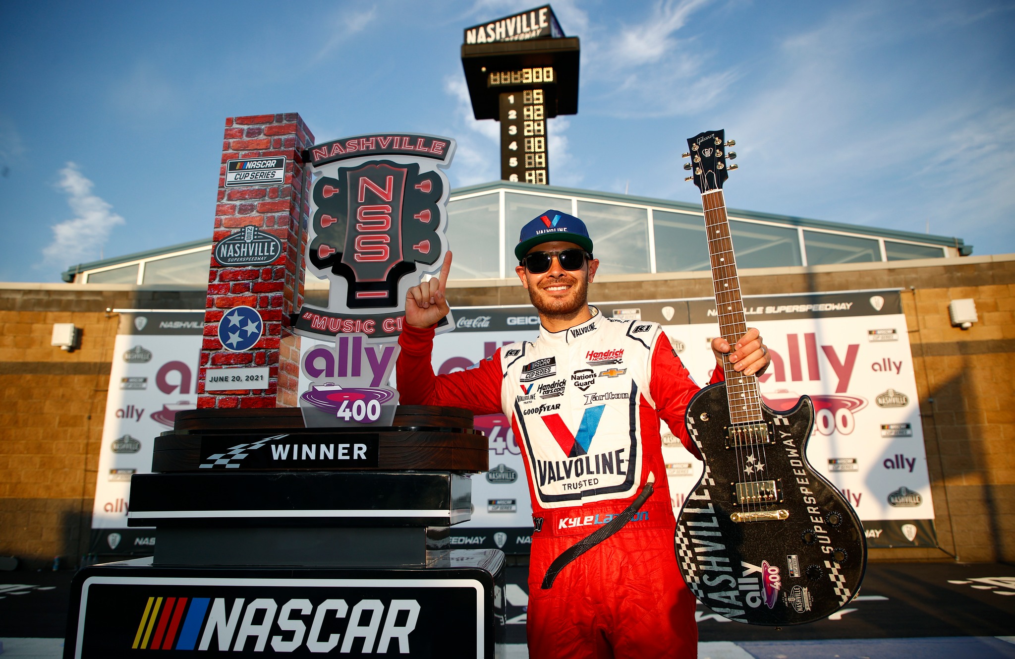
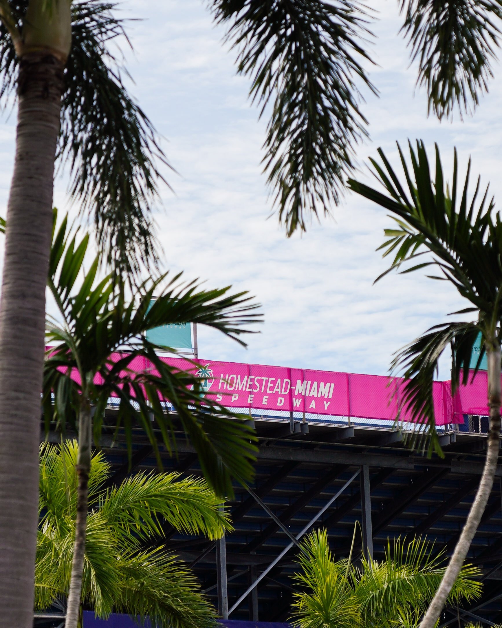
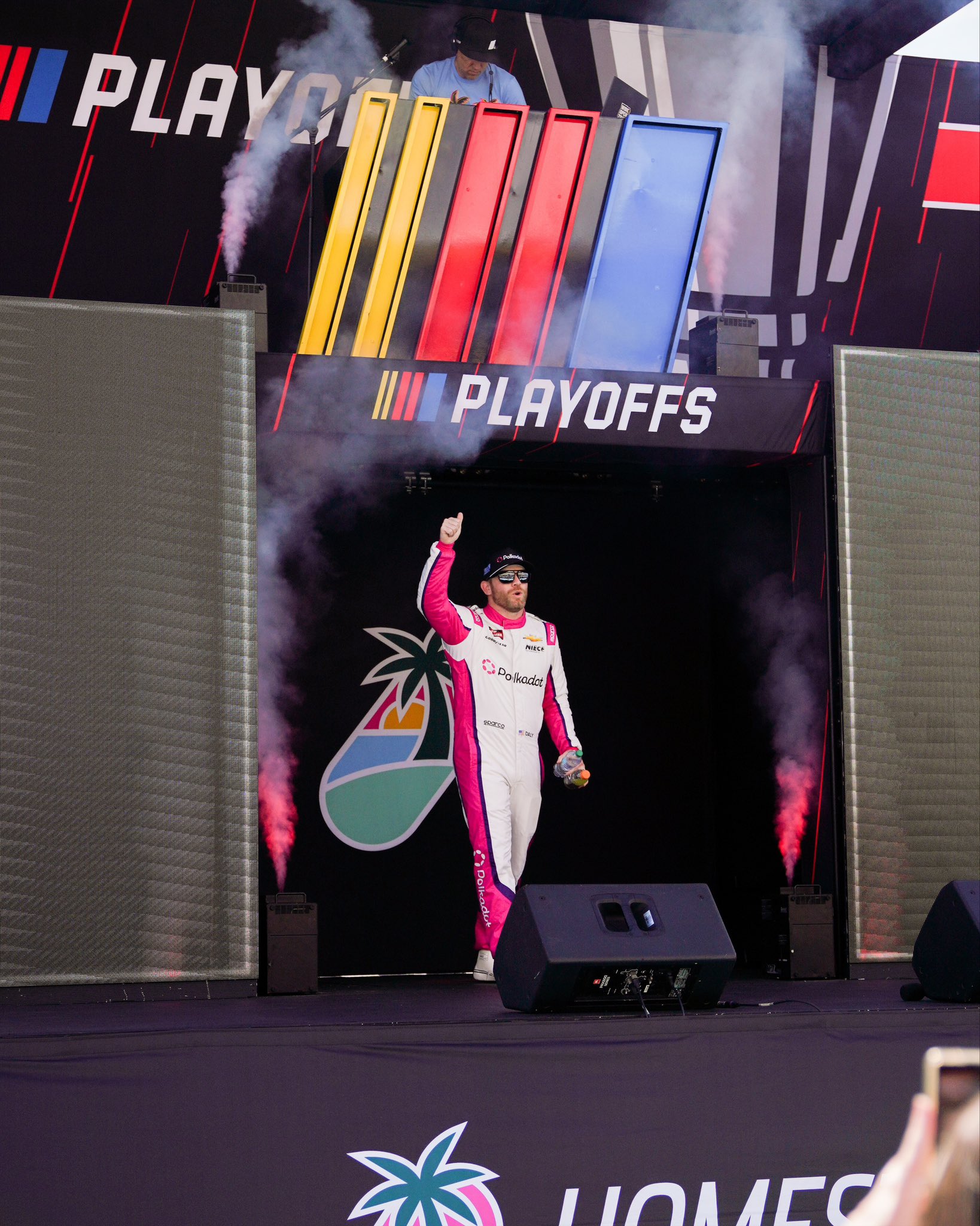
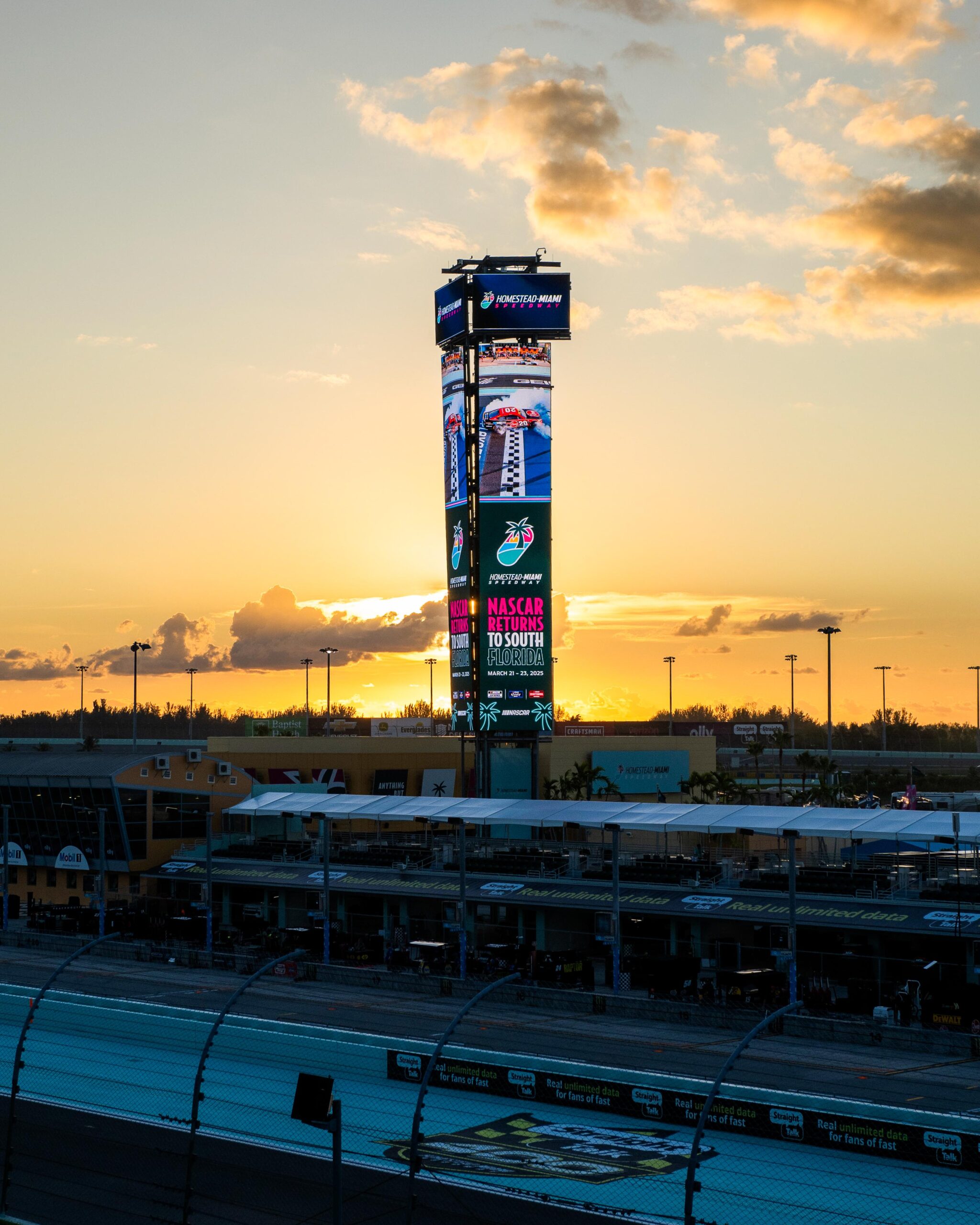
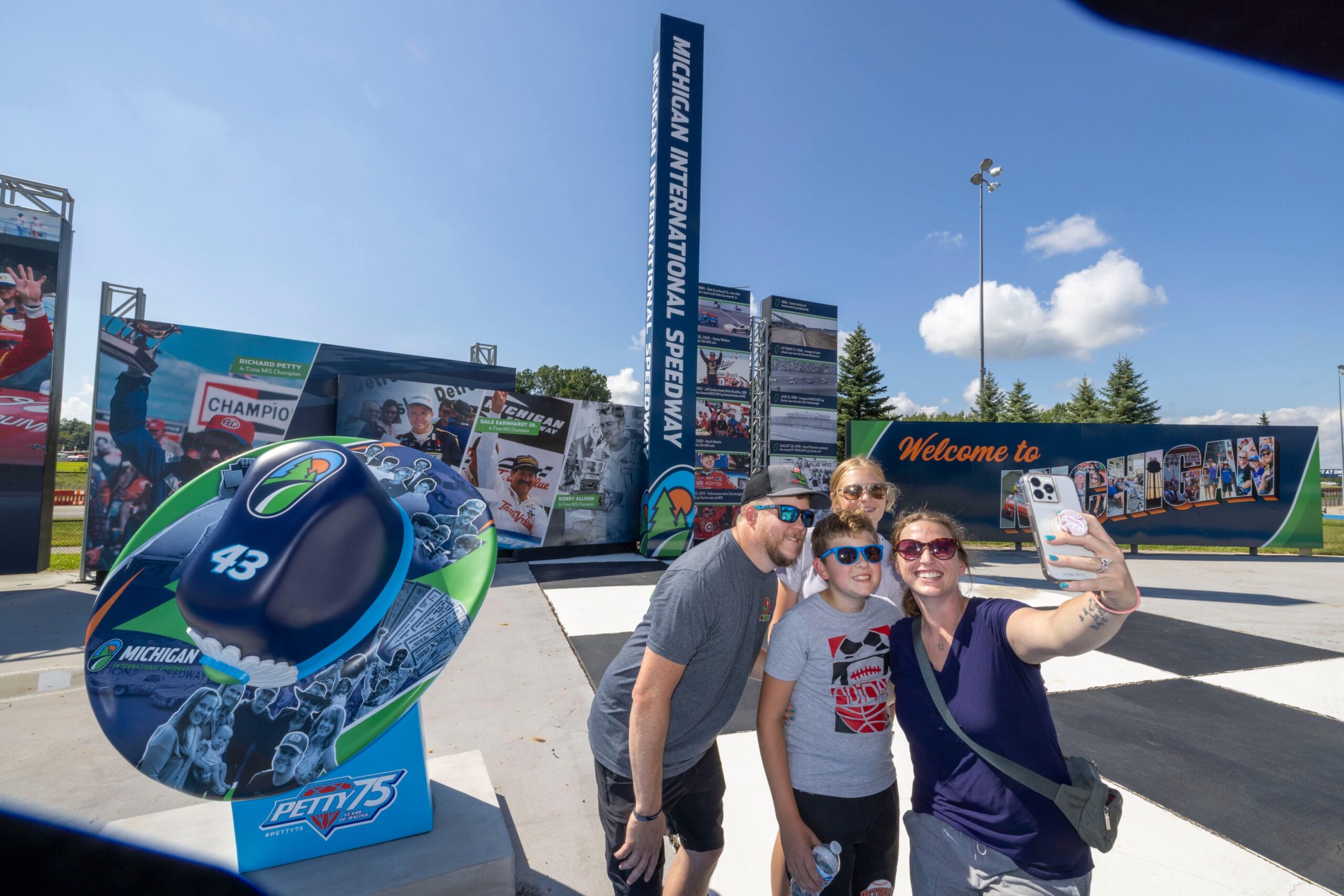
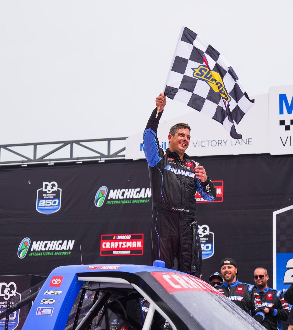
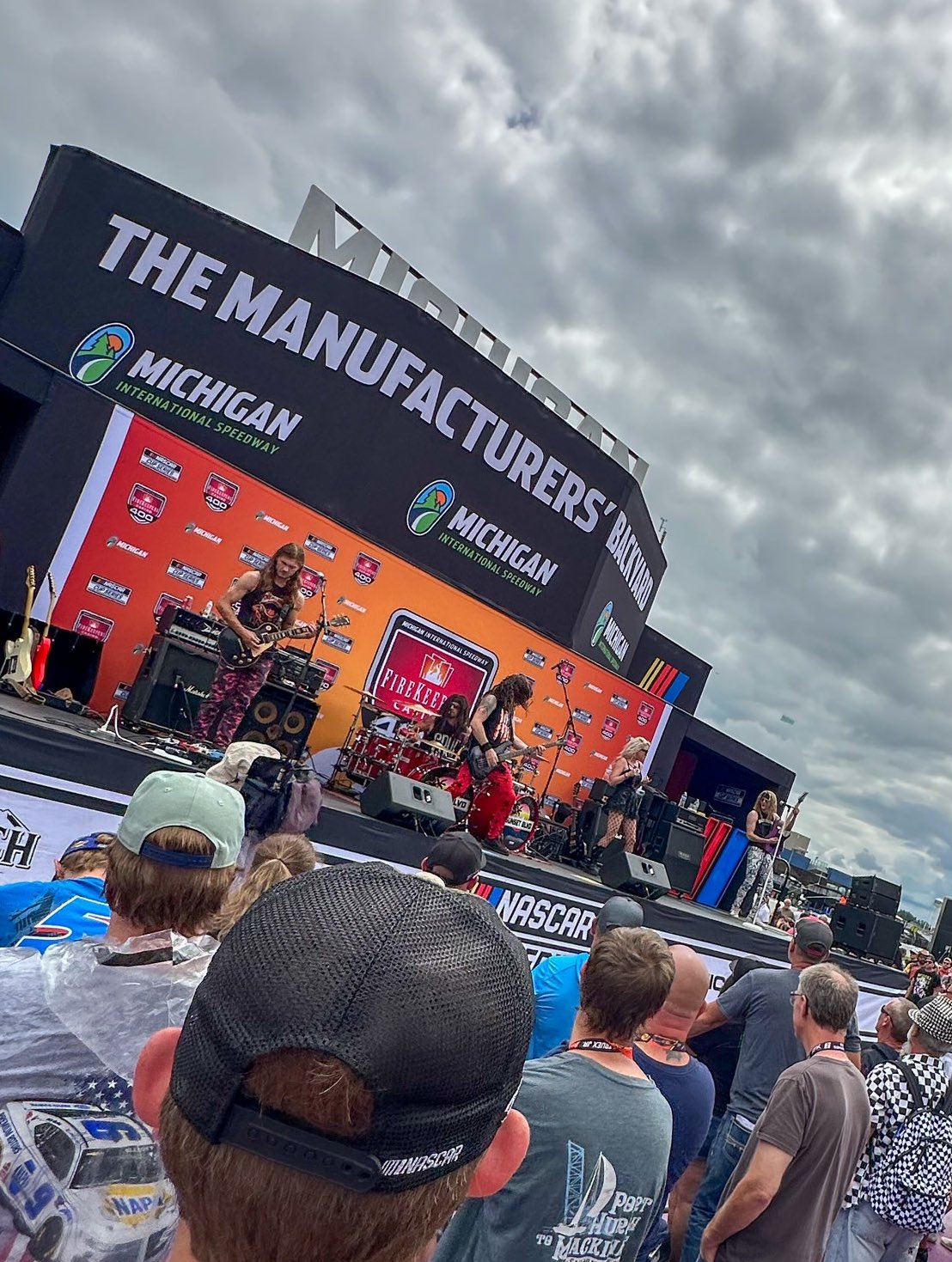
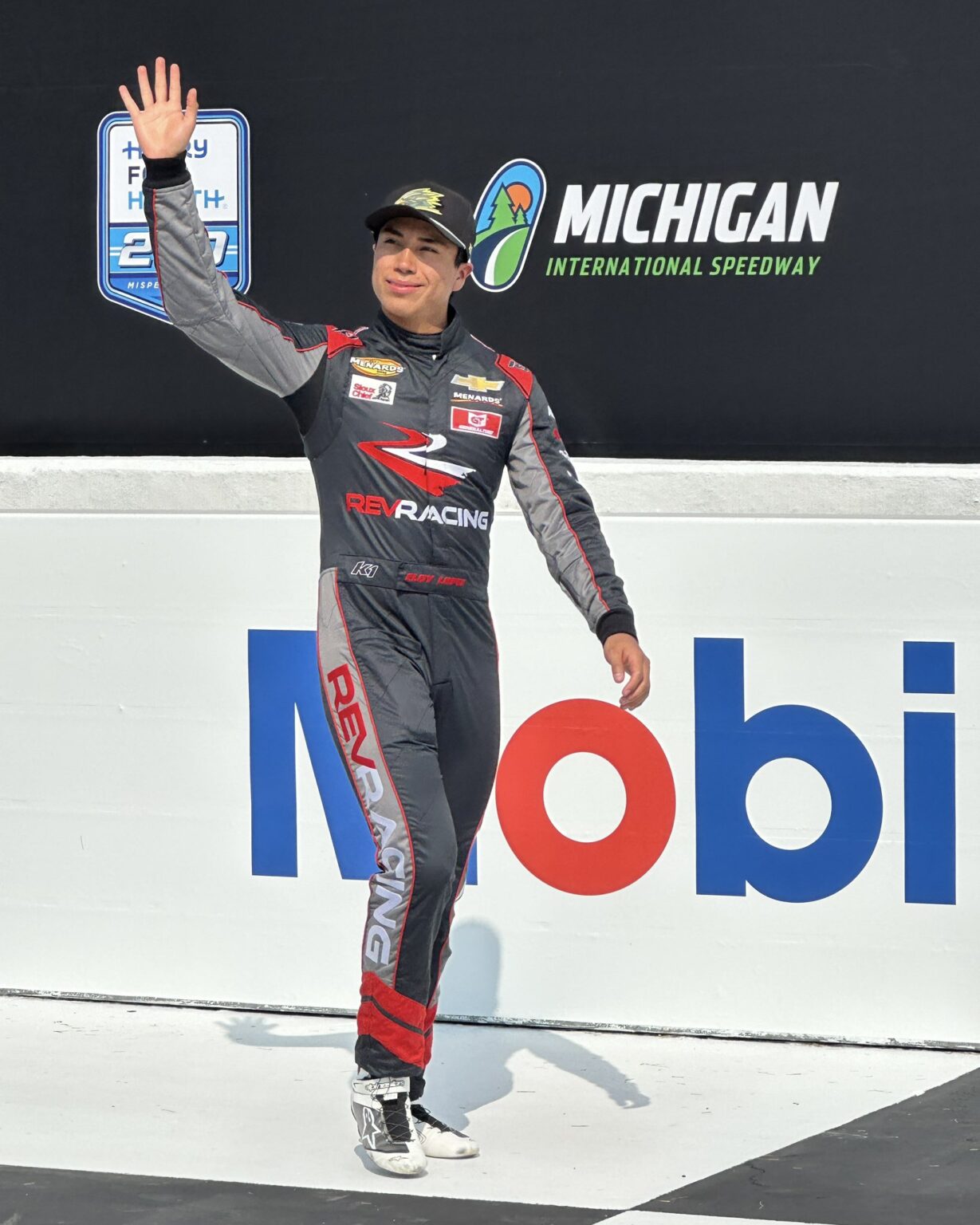
Every track in the NASCAR season reflects the meaning of the sport in its region and embodies a distinct chapter of NASCAR’s history. Each track operates within the NASCAR system while maintaining a distinct identity informed by its year-round events and independent racing history.
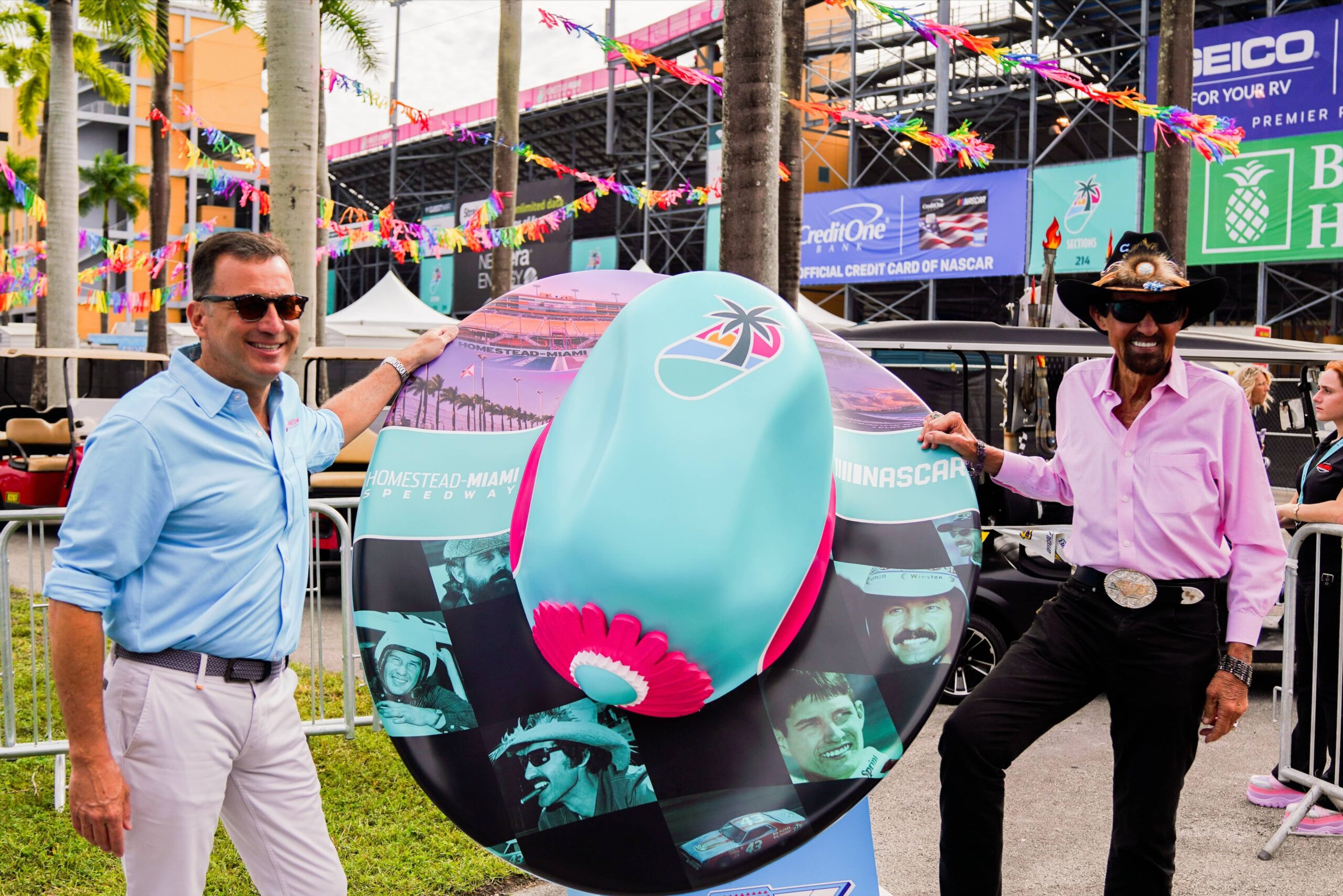
HOMESTEAD MIAMI SPEEDWAY


LOGOS & ELEMENTS
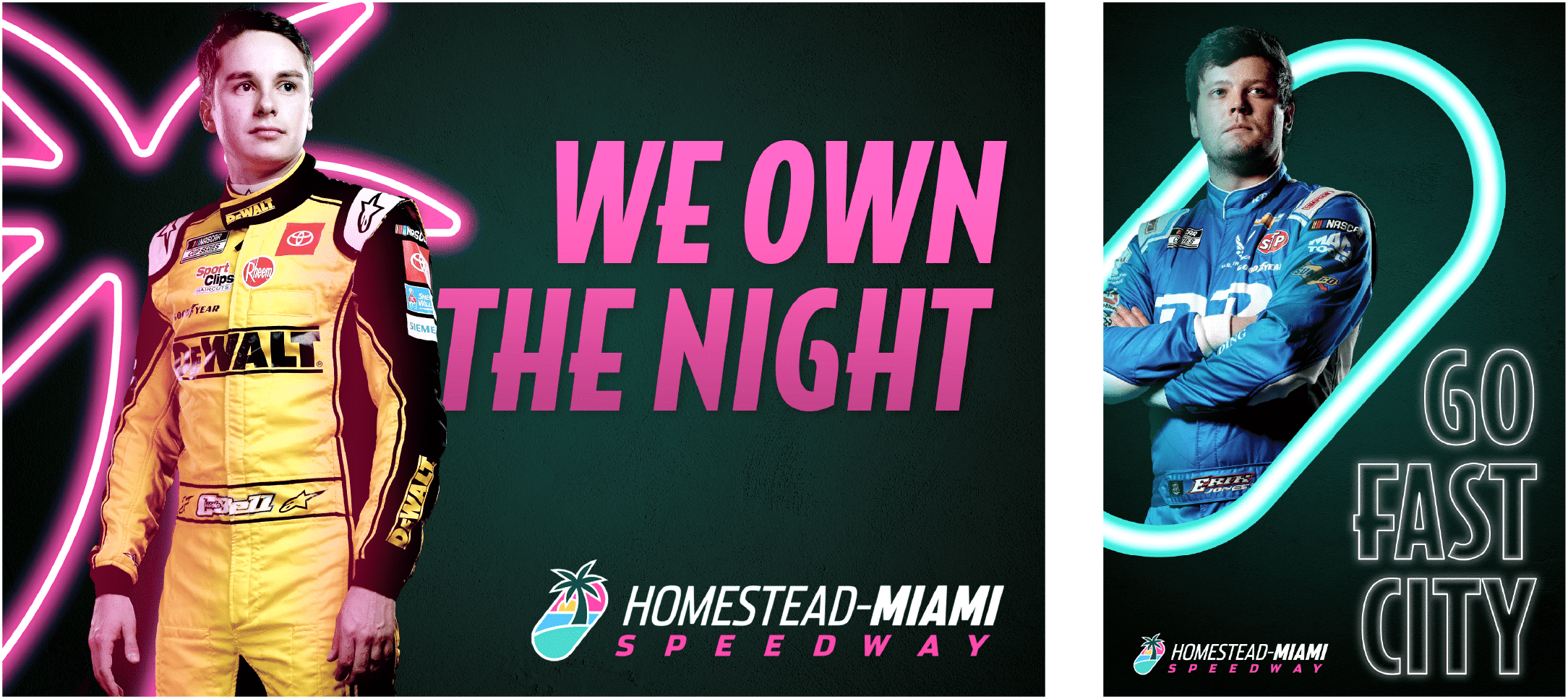

SAMPLE LAYOUTS
MICHIGAN INTERNATIONAL SPEEDWAY

LOGO
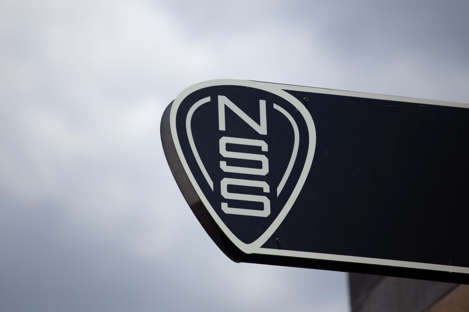
NASHVILLE SUPERSPEEDWAY
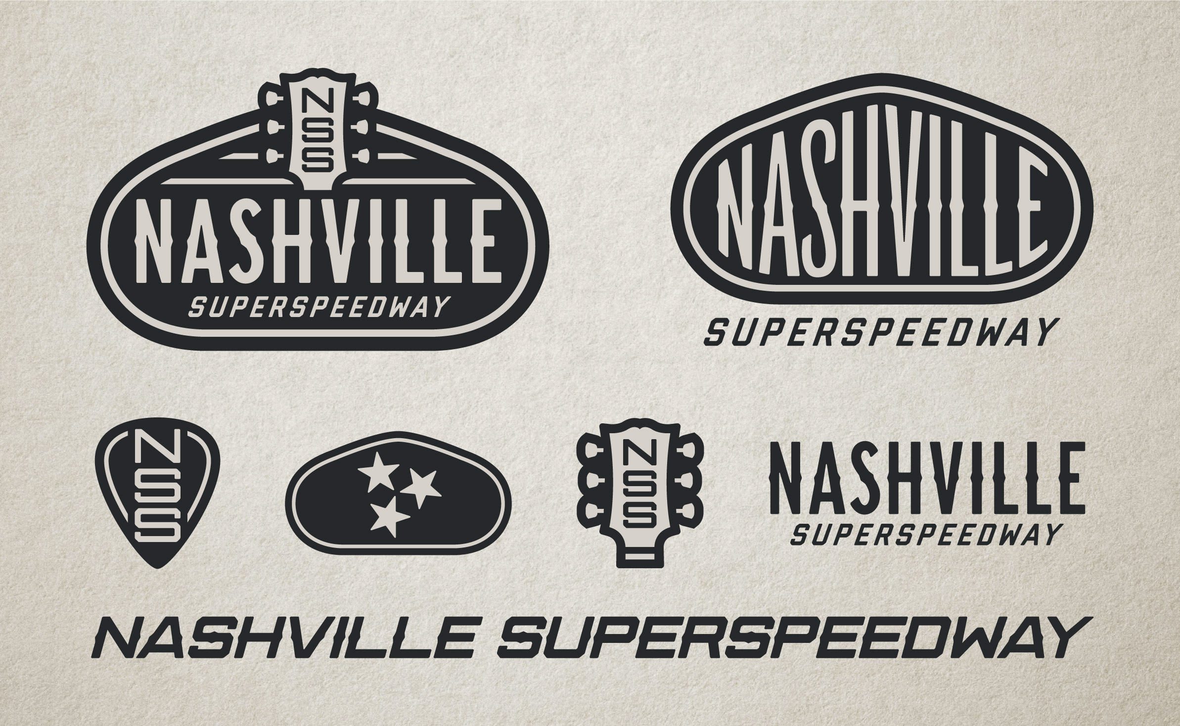

LOGOS & ELEMENTS
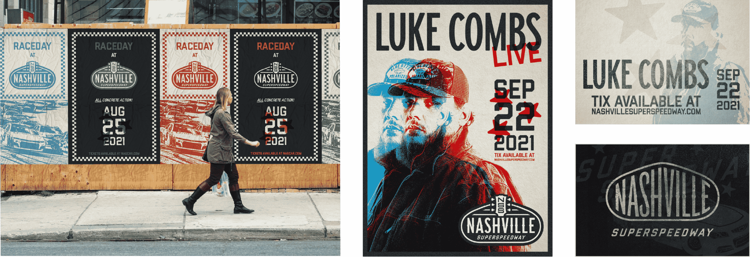
SAMPLE LAYOUTS
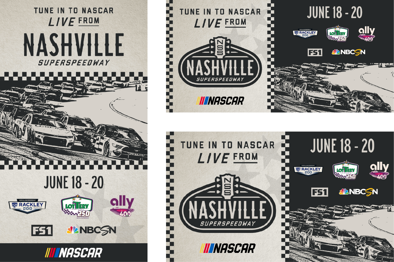
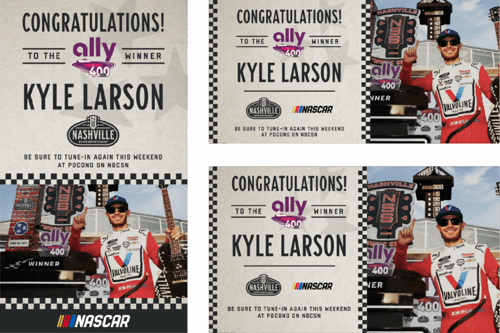
BILLBOARD DESIGN
