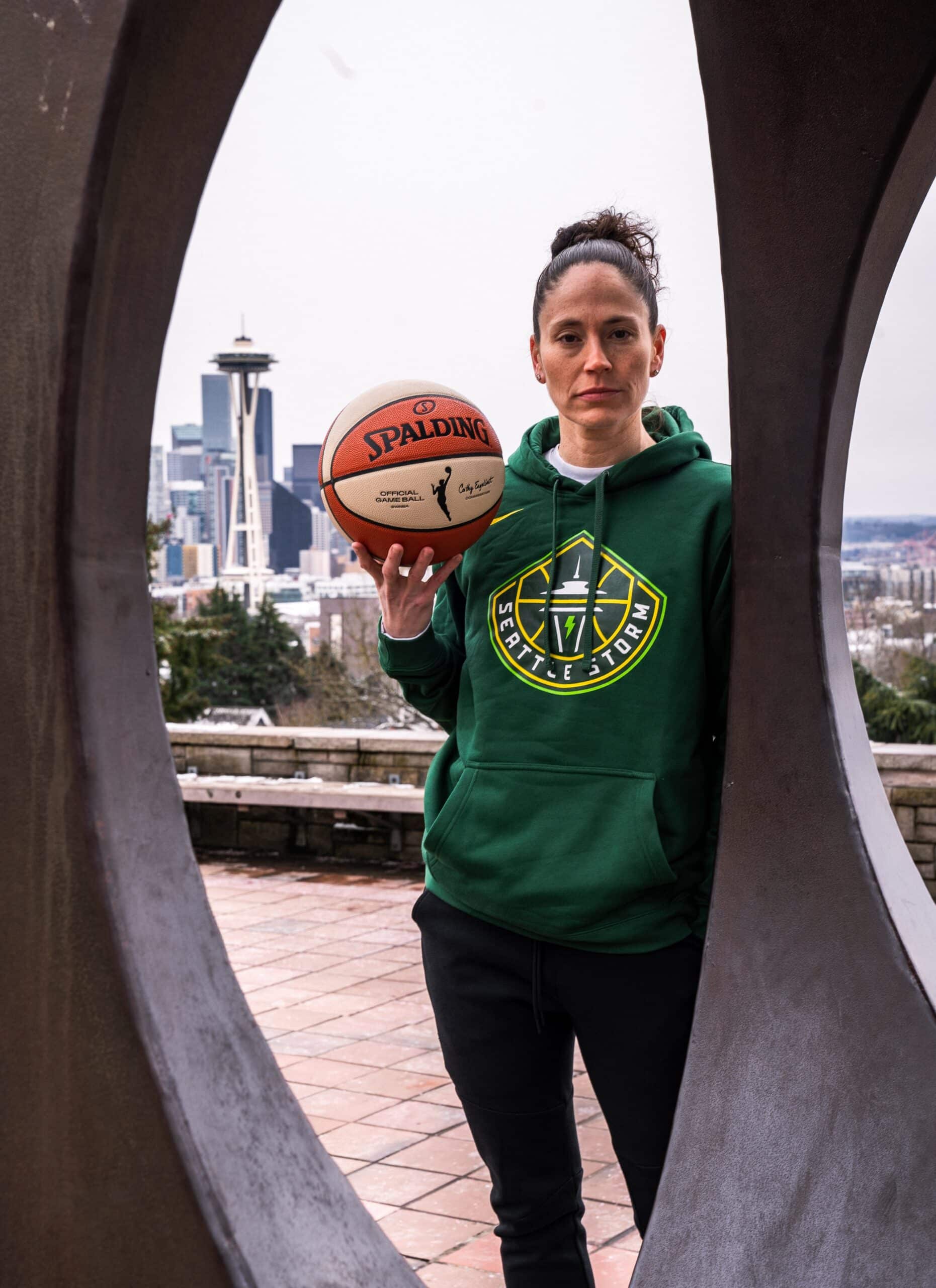
Seattle Storm
Branding, Custom Typography, Identity System Design, Logo Design, Uniform Design,OVERVIEW
A powerful brand identity for Seattle Storm.

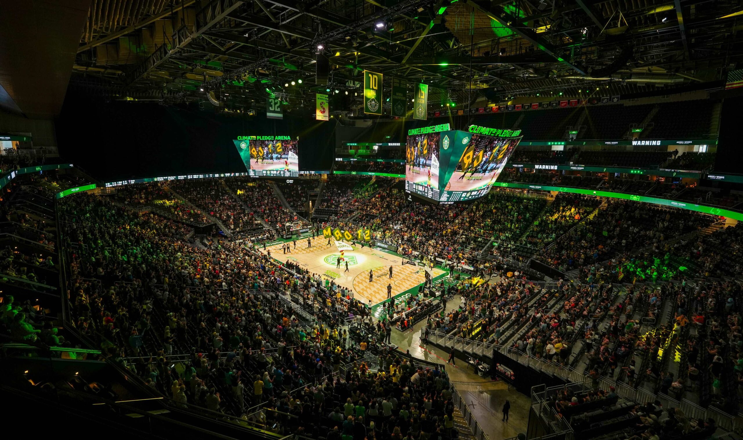
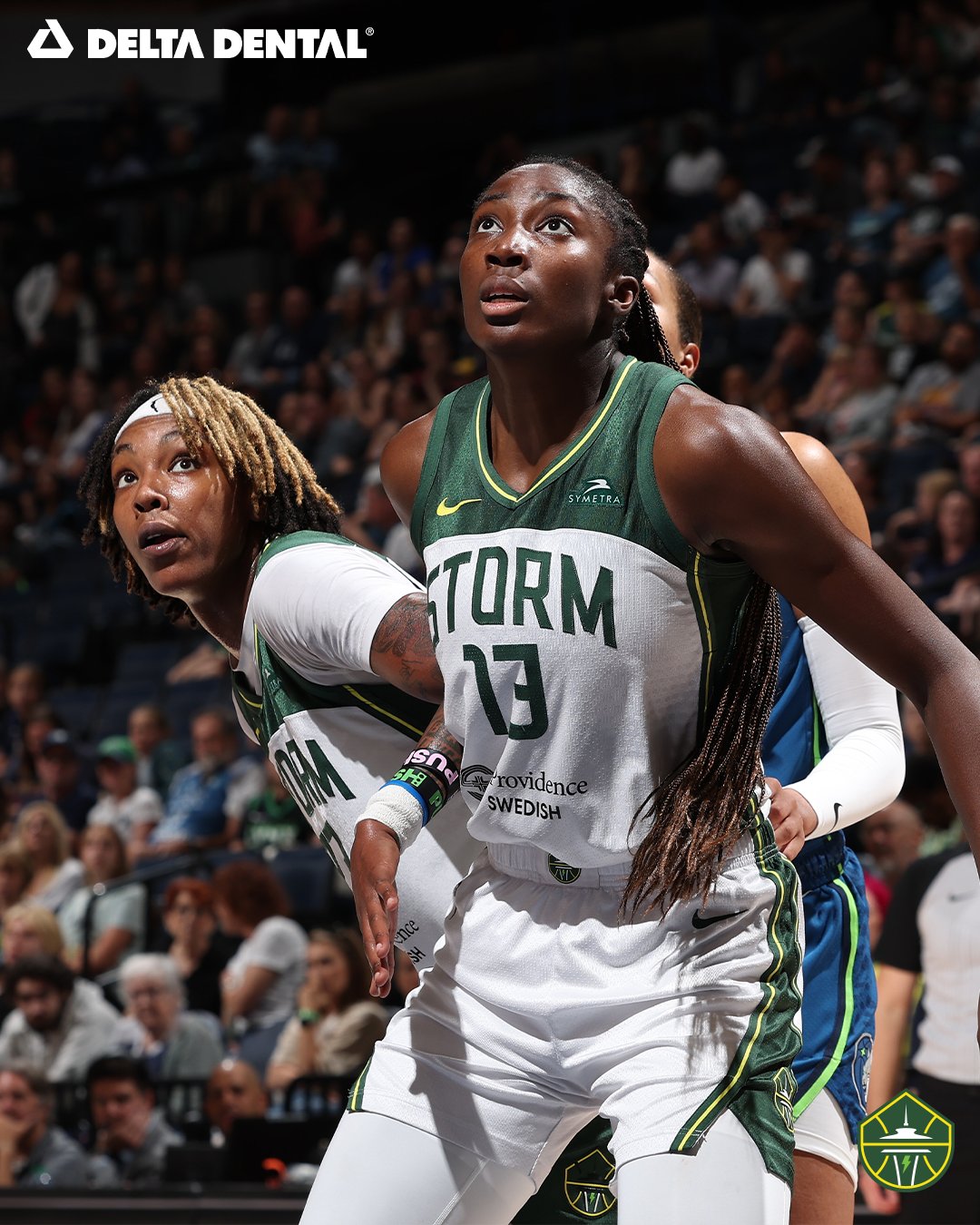
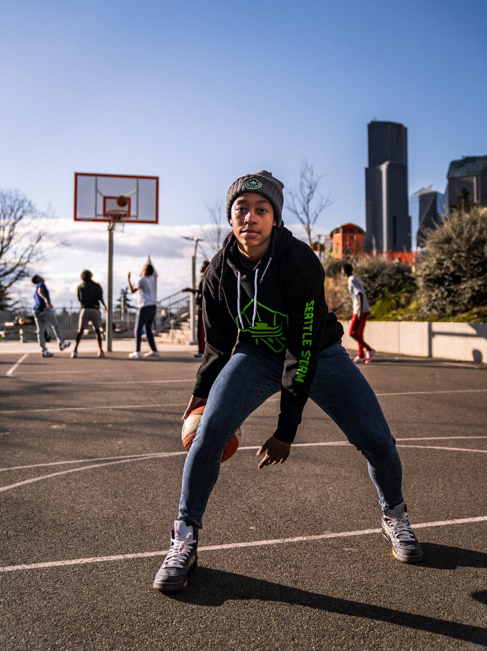
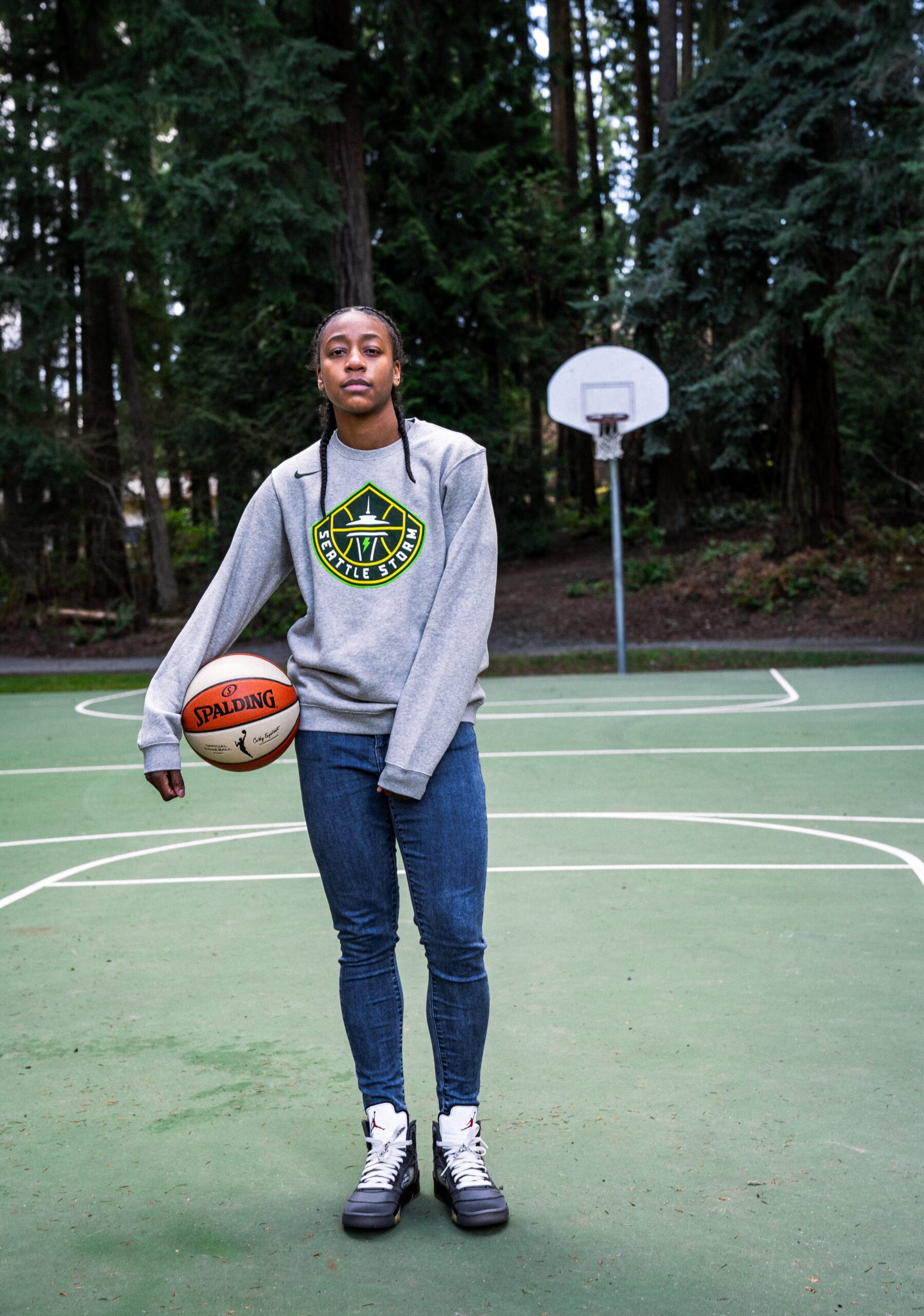
For the 2021 WNBA season, RARE Design was asked to refresh the identity of the Seattle Storm. Fresh off its fourth WNBA Championship, the team needed an identity that reflected its world-class athletes and on-court performance as well as the natural power of the city of Seattle.
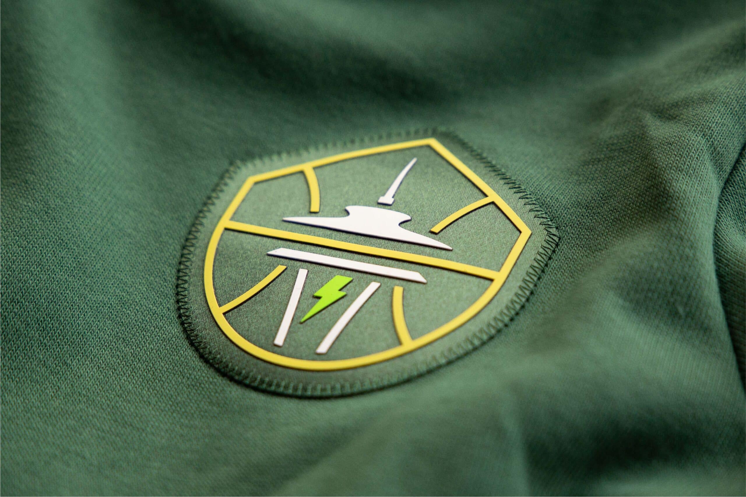
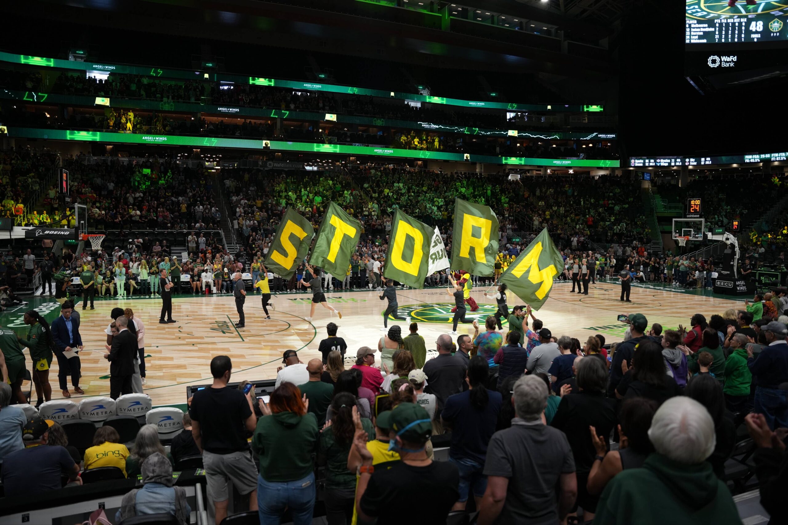
The new identity retains the iconic image of the Space Needle, which sits within basketball ribs. Overlooking it all is the peak of Mount Rainier, representing Seattle’s home in the Pacific Northwest. At the center, a lightning bolt evokes the intensity, power, and purpose of the Storm identity on and off the court.
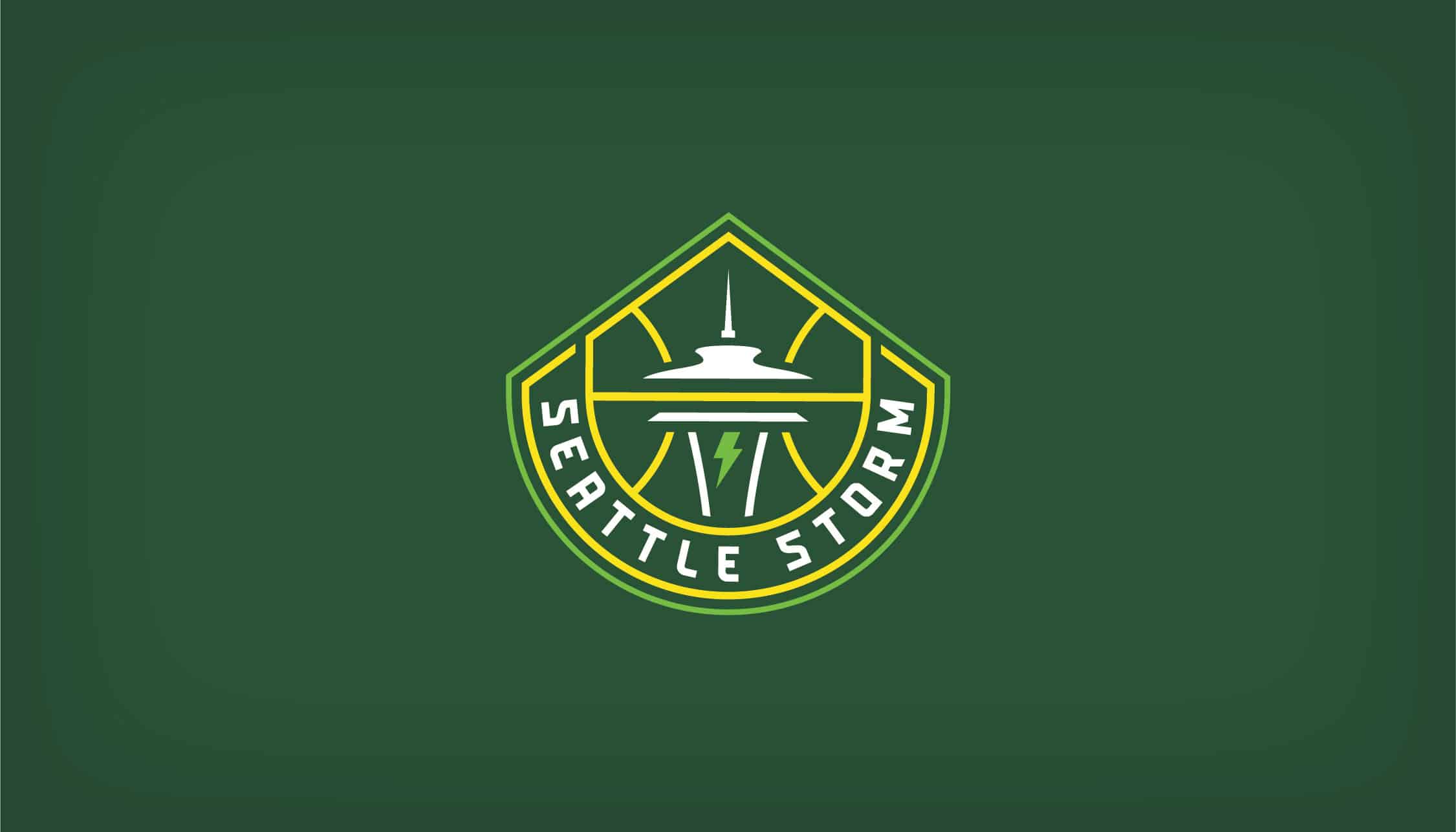

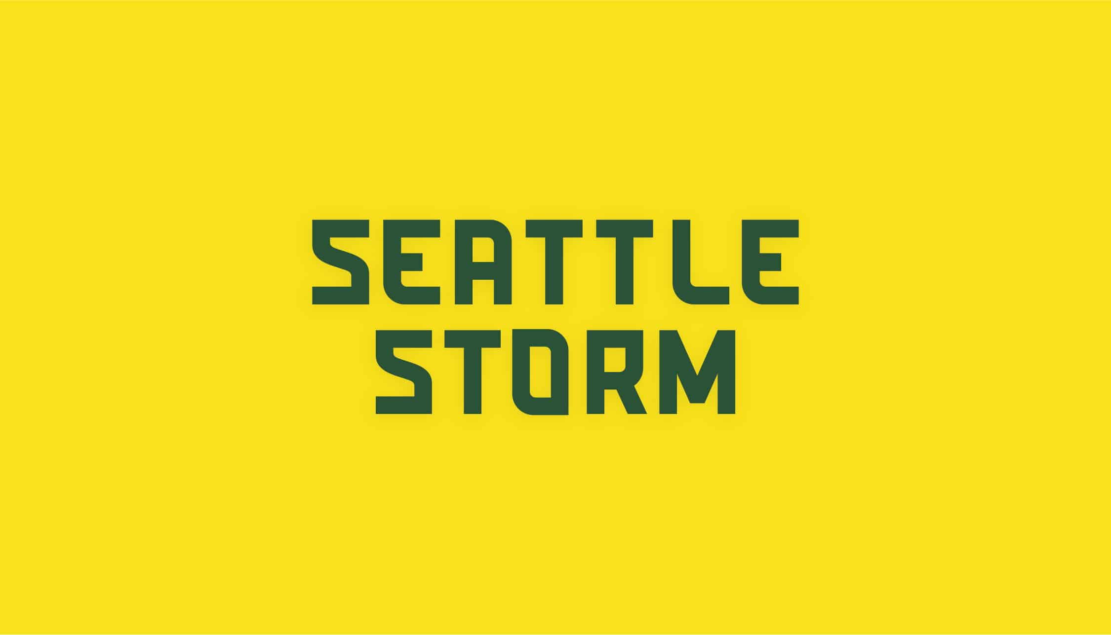
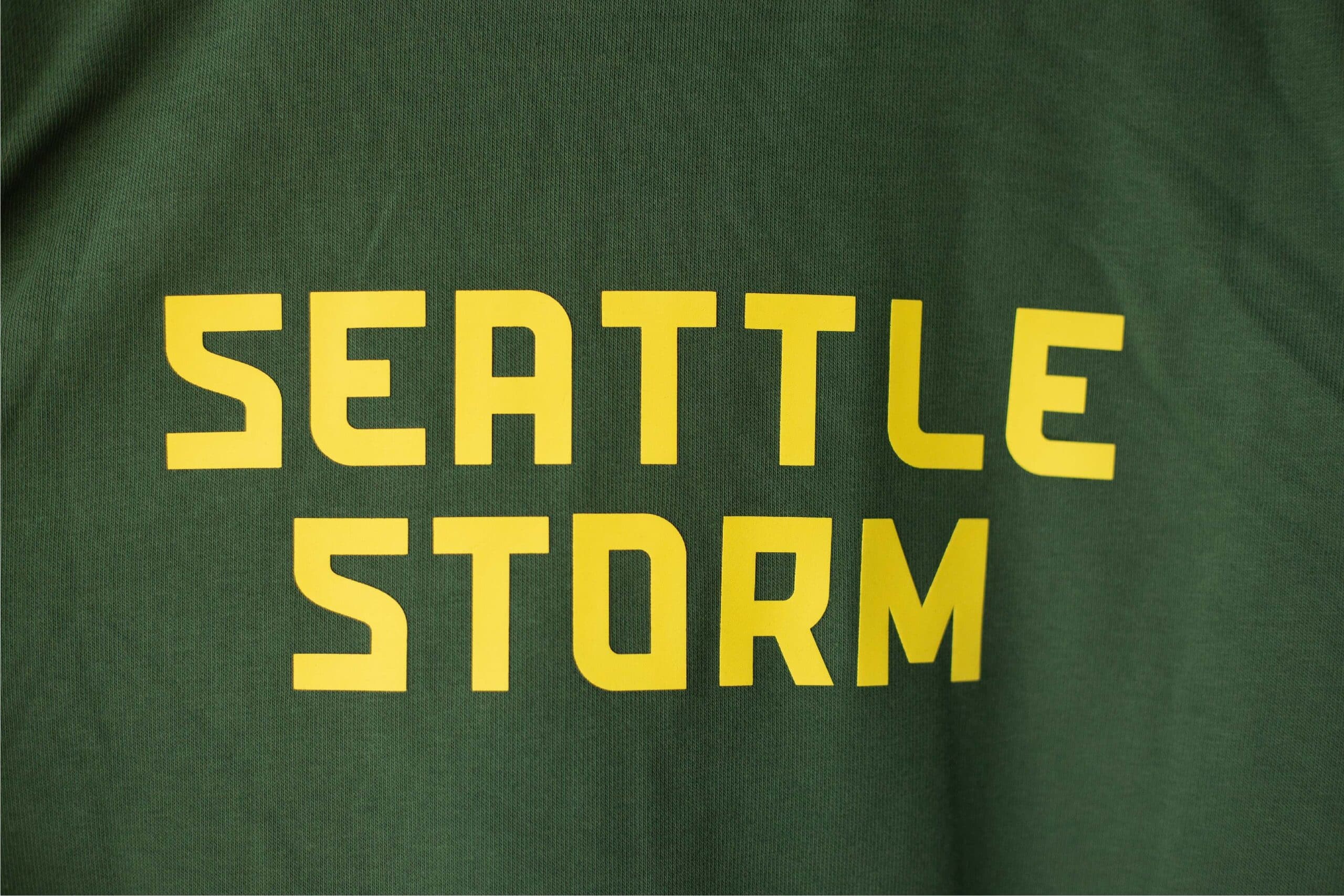
The logo’s combined elements bring together the sleek, innovative aesthetic of Seattle with the natural power in the surrounding Pacific Northwest. The new wordmark uses a more futuristic typeface to better represent the fast-paced and forward-moving city the Storm calls home.
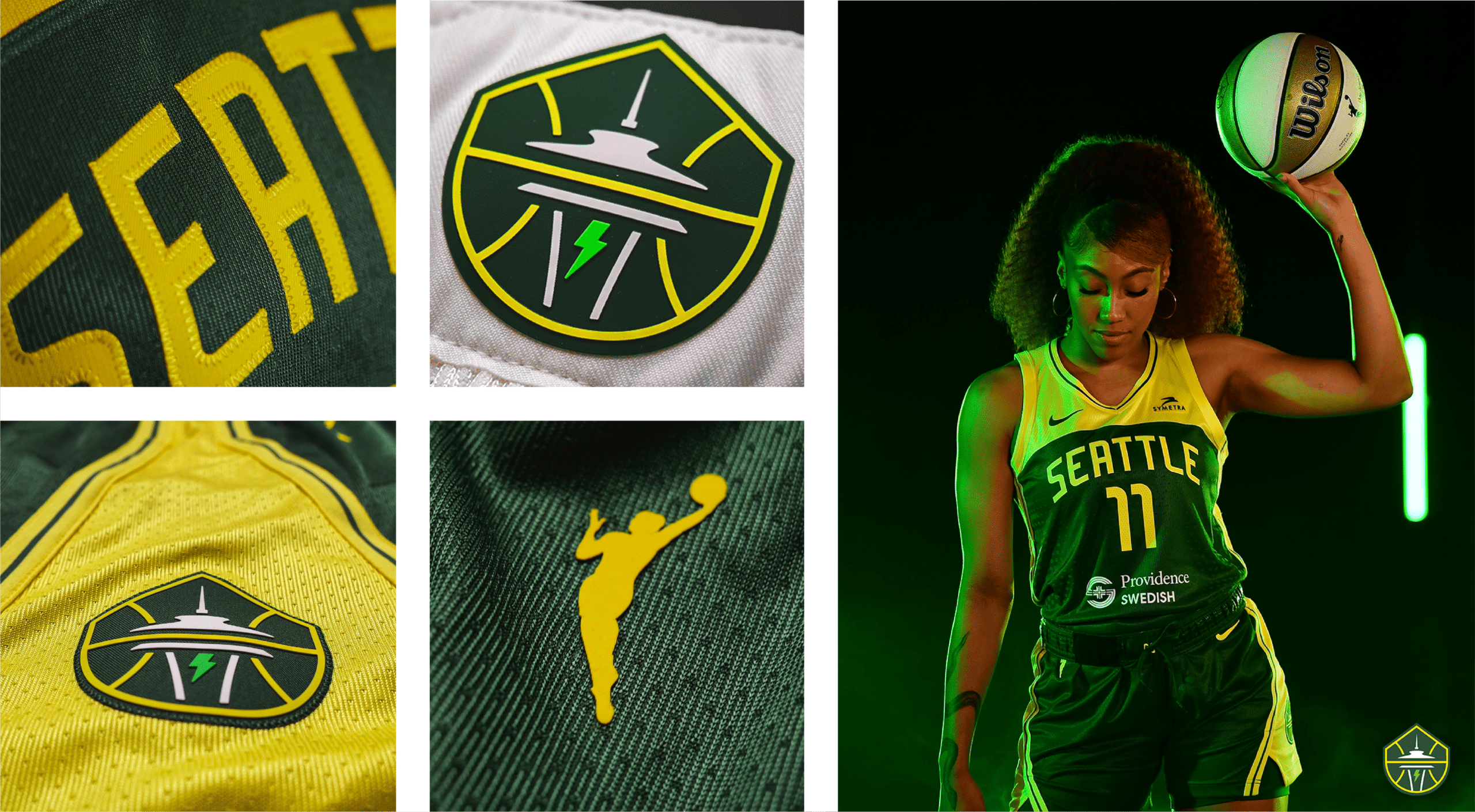
The primary colors, Lightning Yellow, a deep Thunder Green, and a brighter Bolt Green, maintain the legacy of the original Seattle Storm brand.