St. Louis Blues
Athletic Branding, Custom Typography, Identity System Design, Logo Design,OVERVIEW
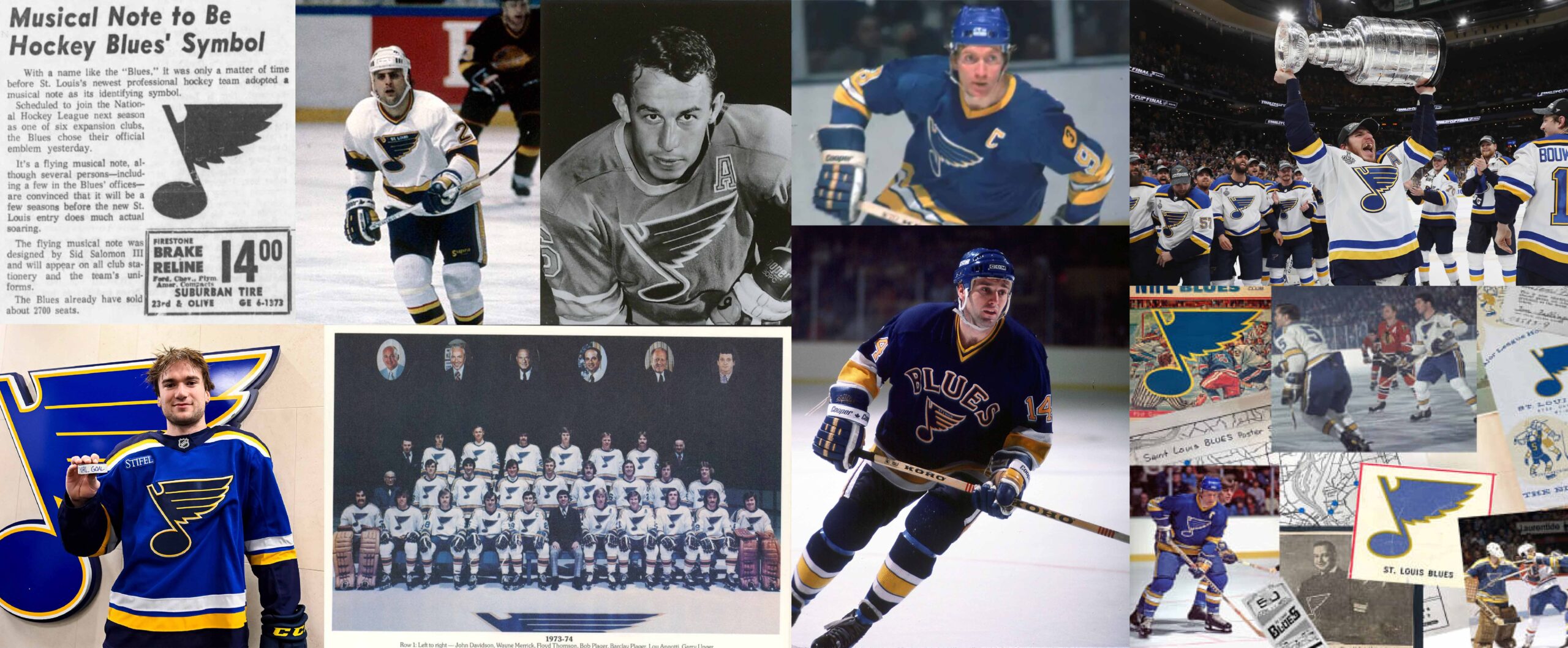
Remixed. Remastered. Reborn.
St. Louis, Missouri. A blue-collar city where hockey is woven into the community tighter than the fabric of denim jeans. When the Blues turned to us, they weren’t looking for a new song to sing, but a remix to a timeless classic. A slight update to the Blue Note and a fresh system of marks that reflect the rhythm of St. Louis culture.
Our work on this project was a love letter to our belief that when proper understanding of story and culture meets proper expression, magic happens.

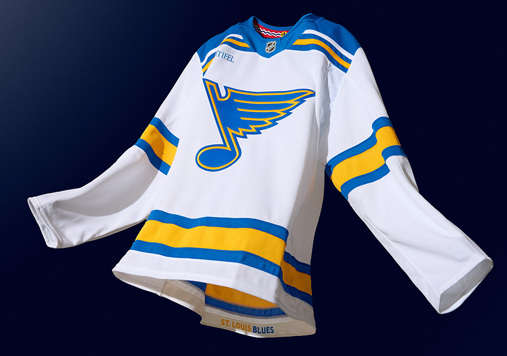
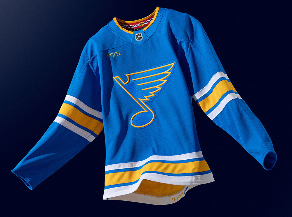
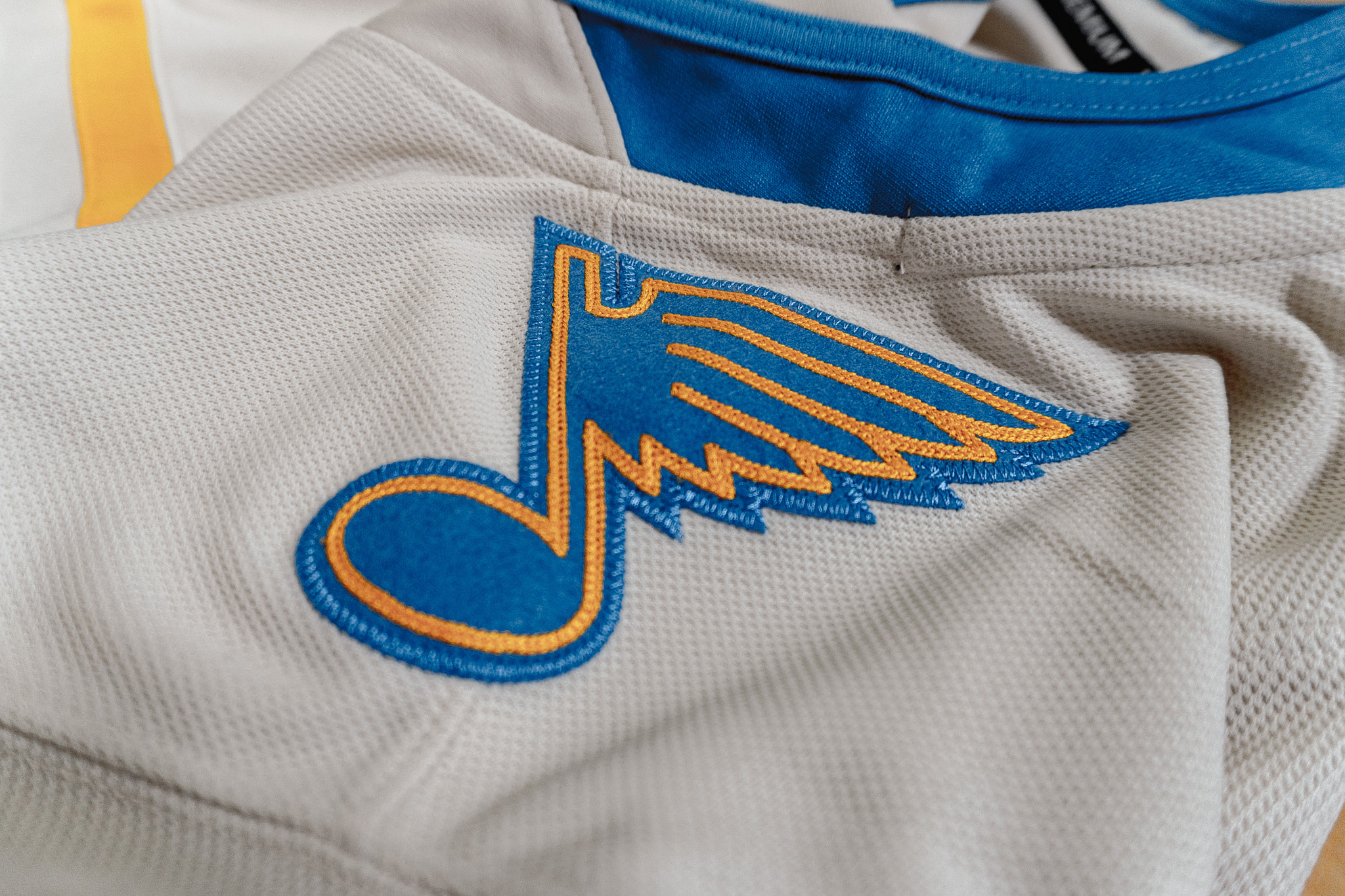
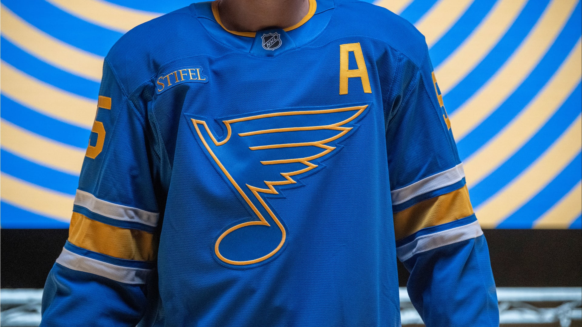
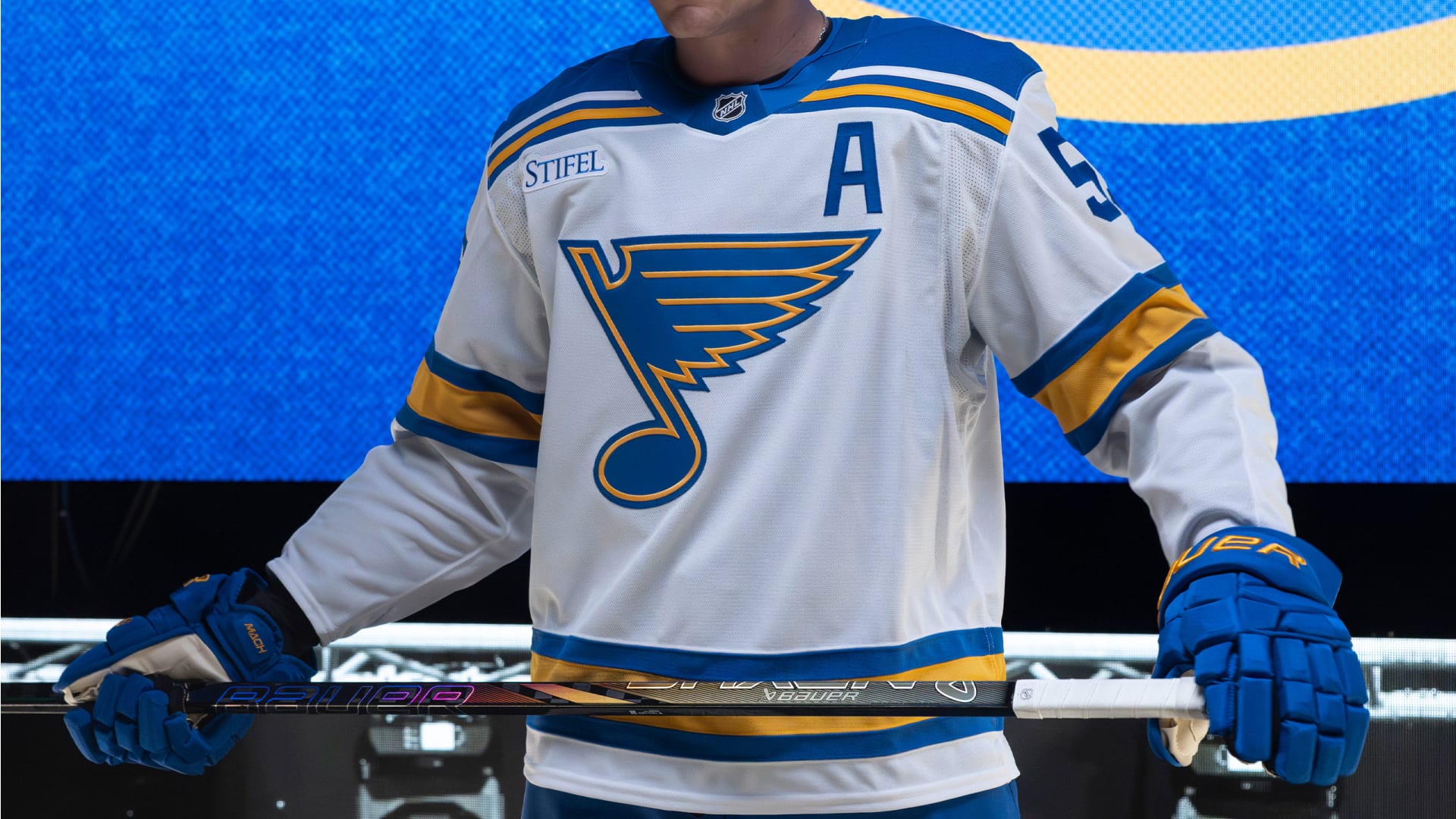
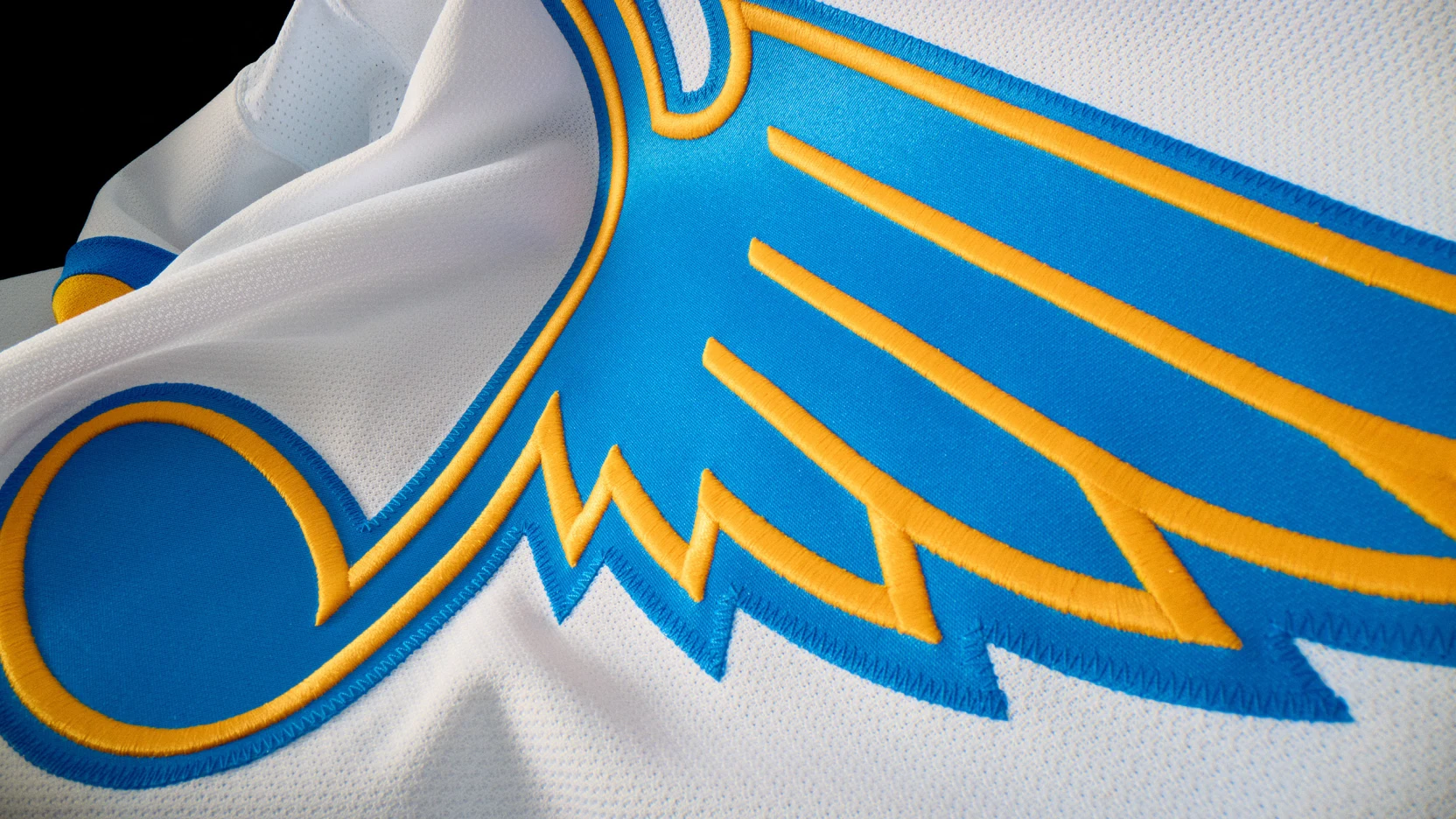
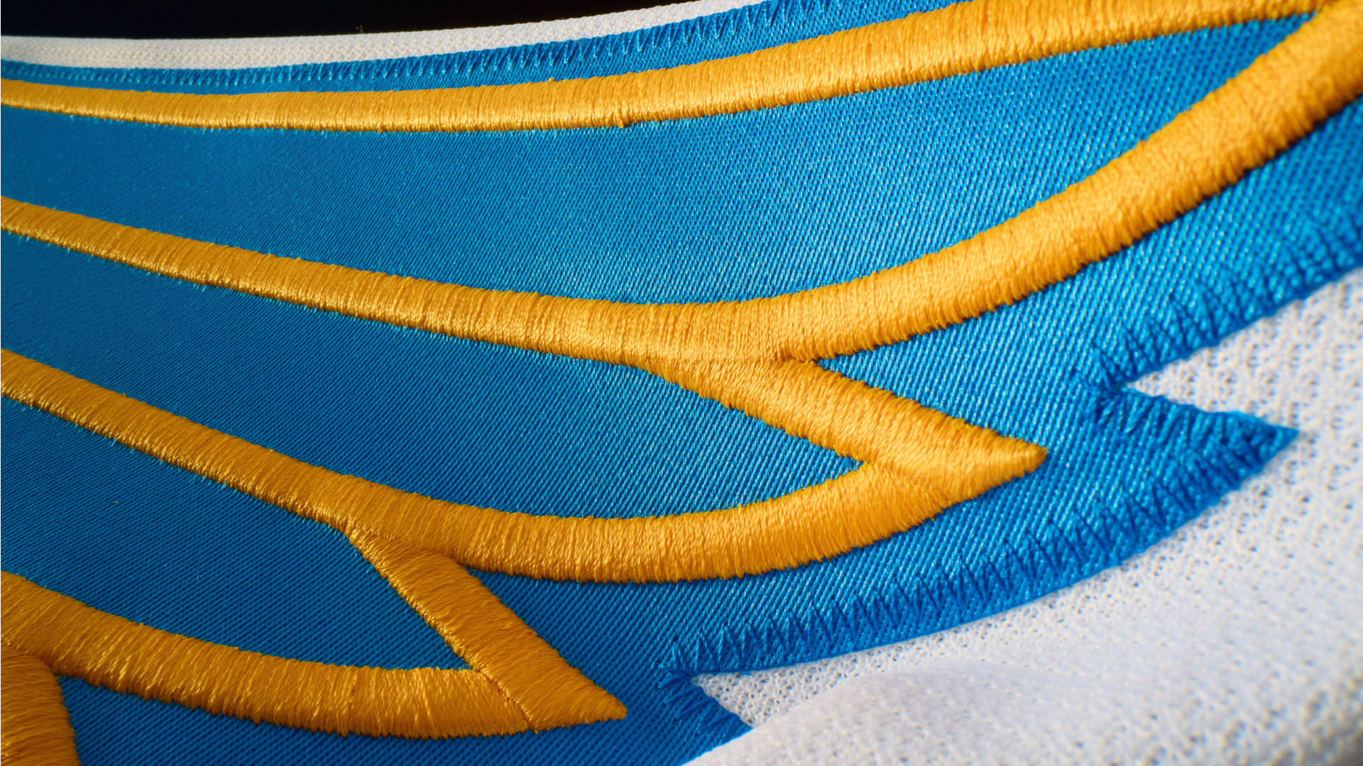
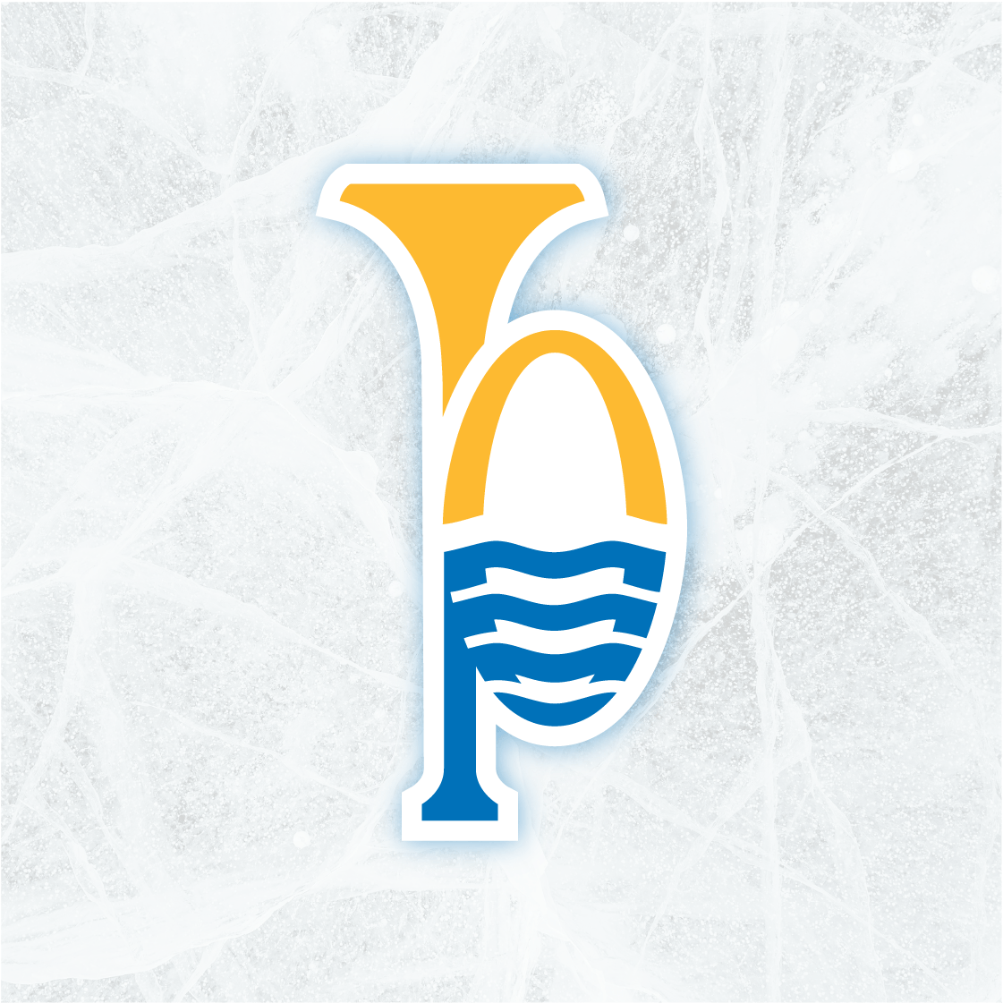
The Homecoming of the Heritage Note was a big moment for the Blues—bringing back a fan favorite with just the right amount of polish. It didn’t take much to get it ready for its return to the rink, just a few thoughtful tweaks to make it sharper than ever.
Feather tips were balanced for a cleaner shape, terminals were angled, and the horizontal key lines were thickened to match the outer line. The base note got a subtle tilt to add motion and energy, and the outer stroke was removed for a sleeker finish.
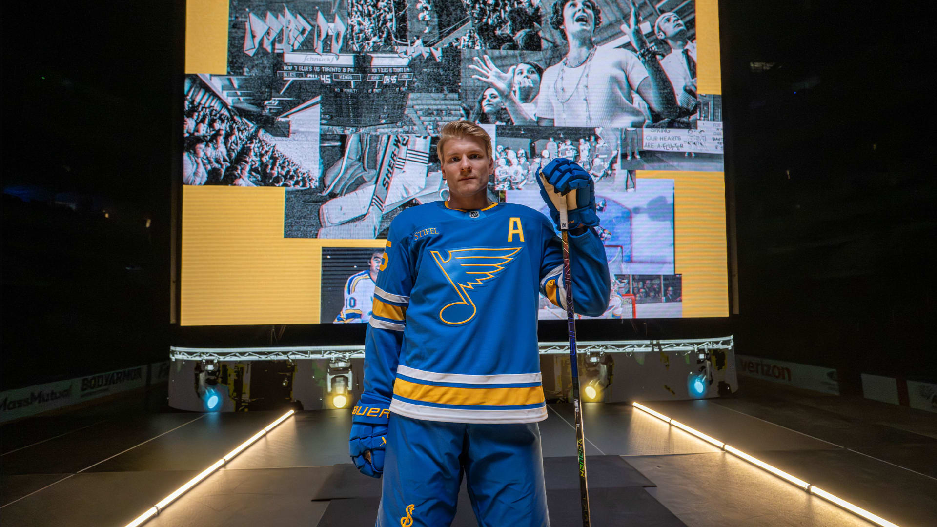

An organization as storied as the Blues deserved more than a refresh. The Blues were in need of an upbeat injection to their identity system to galvanize and recognize their city and fans. A renewed energy that could echo through arenas, resonate with the city’s soul, and honor the fans who have stood by for generations. Together with key voices from St. Louis, we embarked on a deep dive to unearth the forgotten, spotlight the iconic, and trace the lineage of a franchise born from the banks of the Mississippi and the heart of the Delta sound.
The Blues have long carried a visual legacy woven with rich visuals: horns, rivers, notes, strings, and nods to their musical namesake. We set out to craft something truly resonant. A system of tertiary marks that didn’t just support the brand, but told a focused, layered story of identity, pride, and place. A story only this team, in this city, could tell.
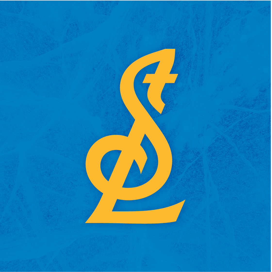
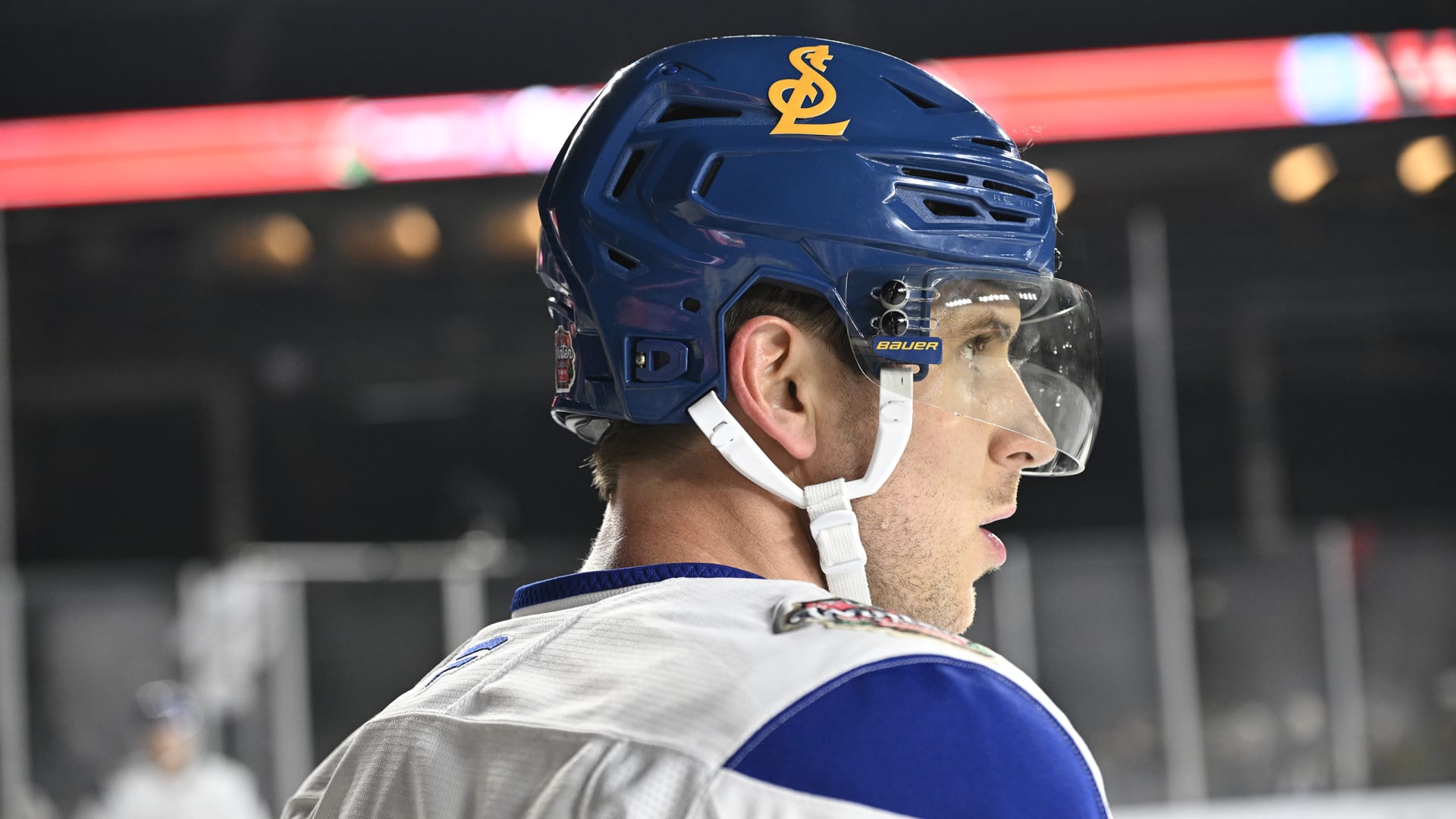
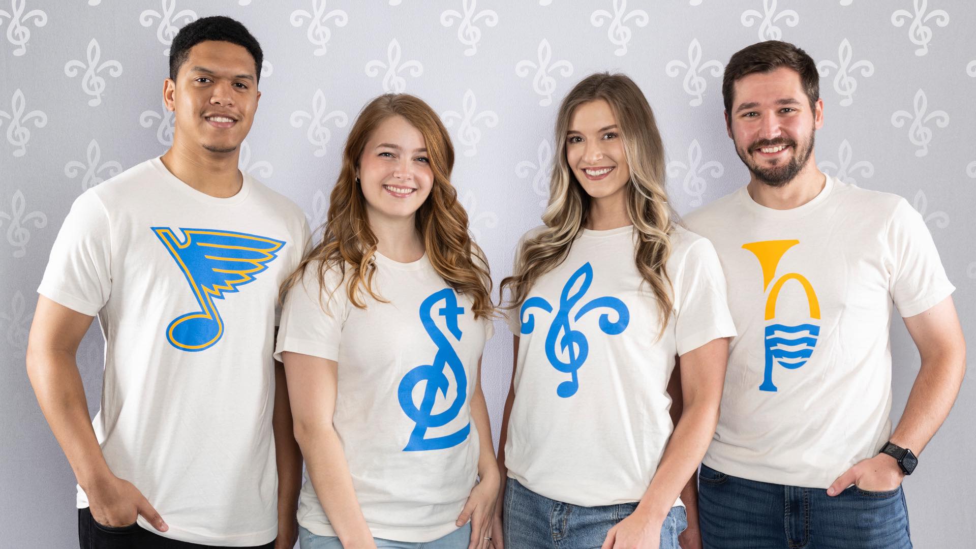
At the center is the STL ligature. It is a typographic heirloom reimagined. This mark draws from one of the most iconic design elements in sport, long championed by the Cardinals, and reinterprets it through the lens of professional hockey. Anchored in early 20th-century artwork and historic St. Louis typography, this is more than a symbol. It is a design that feels pulled from etched stone. This mark is timeless, tactile, and born of the city’s own rhythm and heritage.
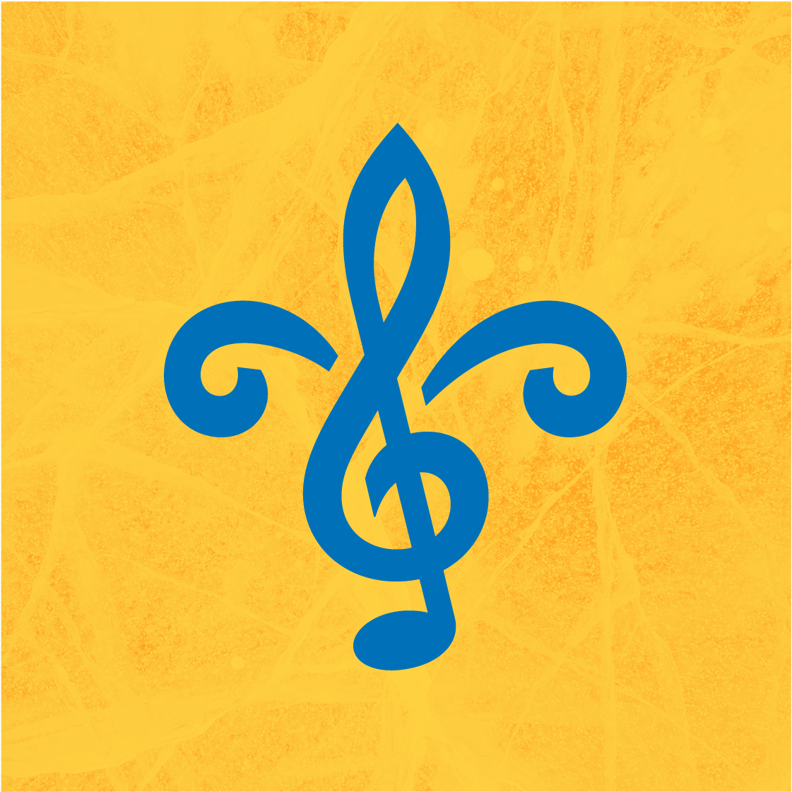
The Fleur icon follows suit. Inspired directly by the city’s flag, it is more than a flourish. It is a symbol stitched into the very identity of St. Louis, now refined and reborn to feel unmistakably and exclusively Blues.
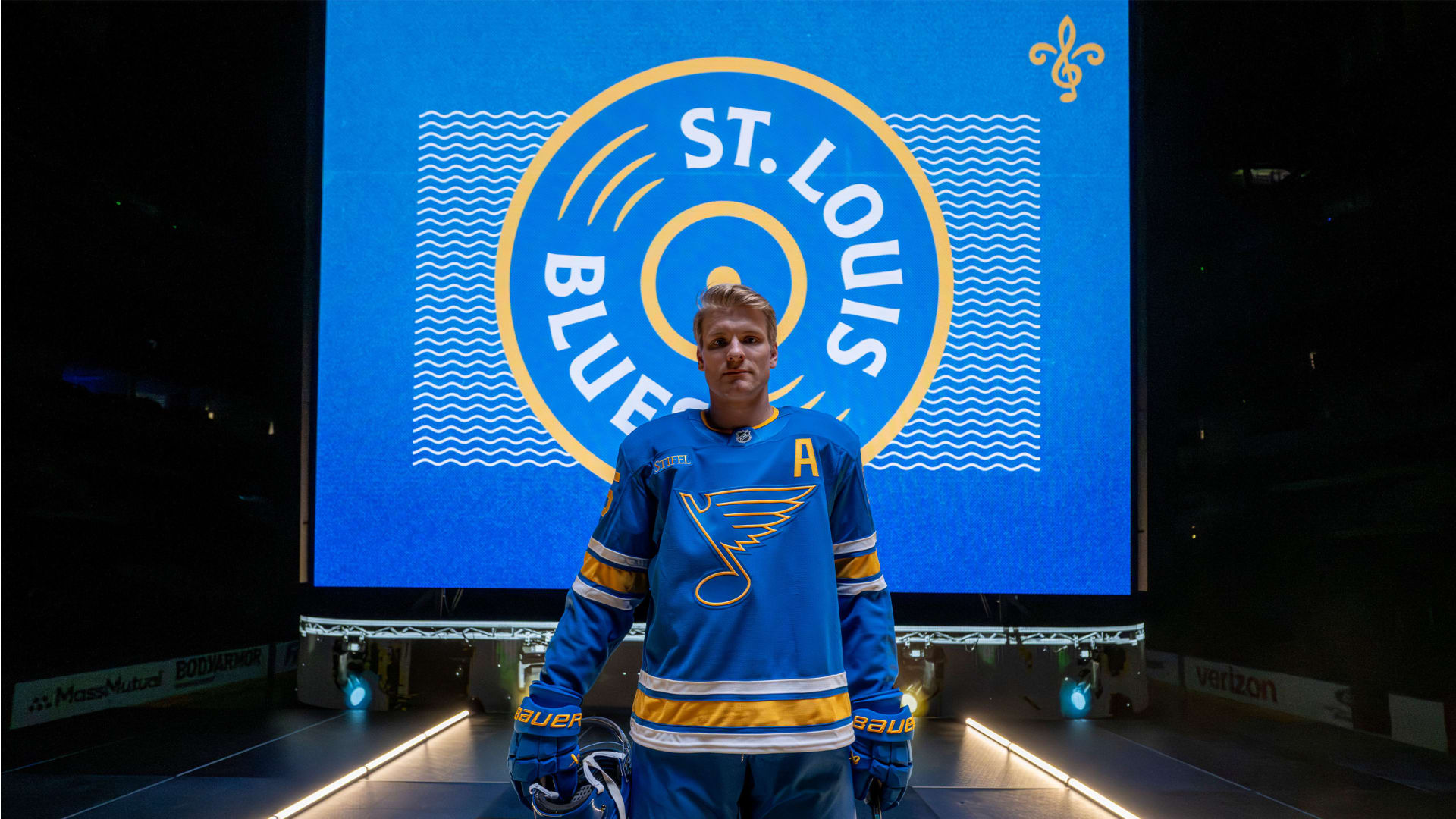
The River Music icon channels the pulse of the past. It incorporates familiar elements from previous Blues marks while boldly inserting the Gateway Arch rising above the Mighty Mississippi. This is a direct homage to a city whose legacy is written in music, perseverance, and vision.
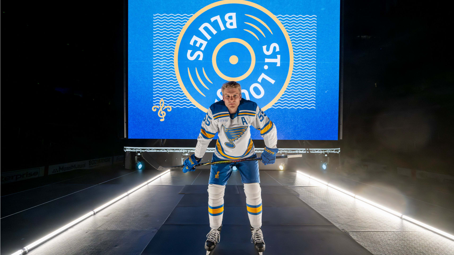
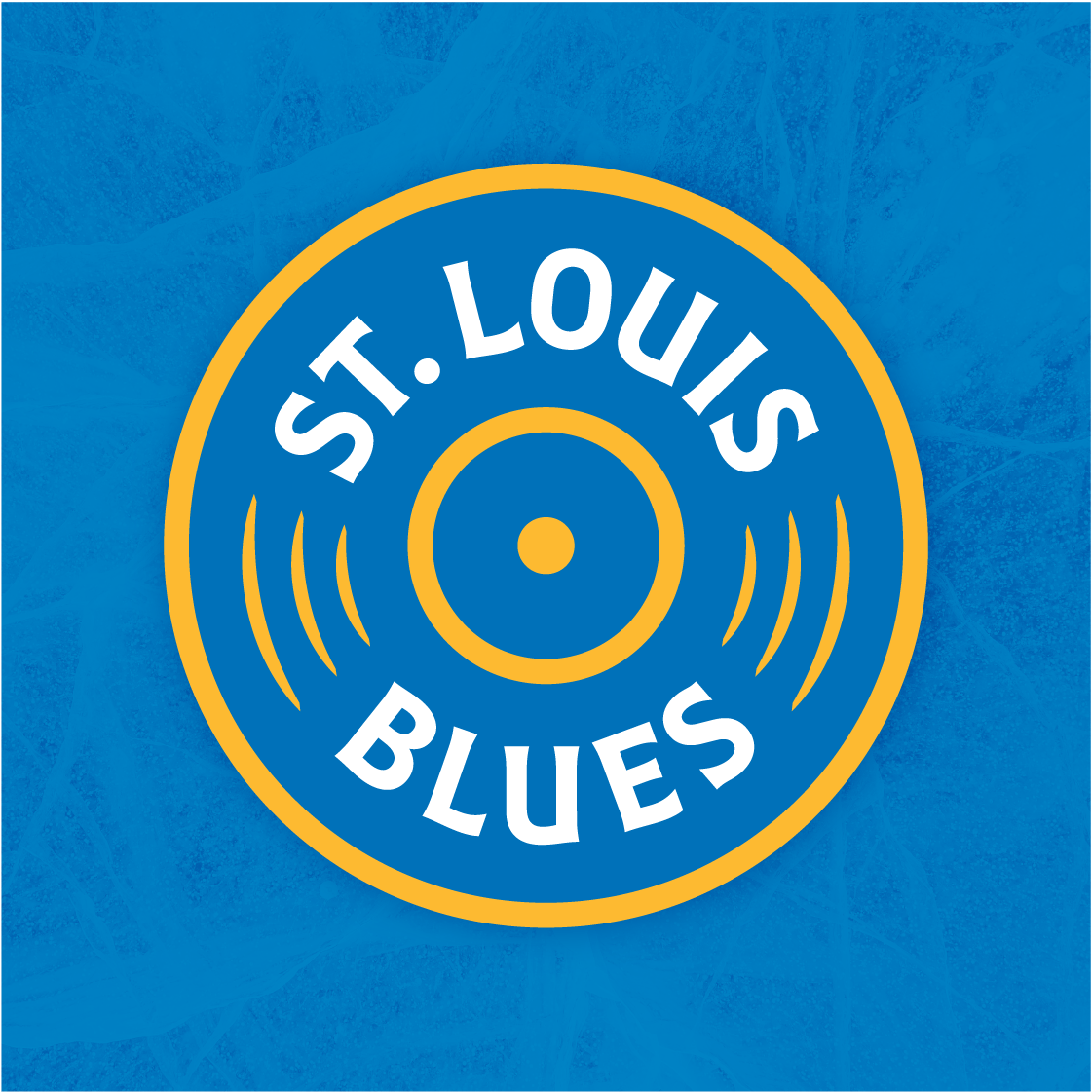
And finally, the Record Roundel was designed to spin with spirit. Wrapped in our custom-designed “Ragtime” typeface, this mark hums with motion, rhythm, and energy. It is a celebration of the team’s heritage through the lens of sound, where each rotation honors a city that moves to its own beat.
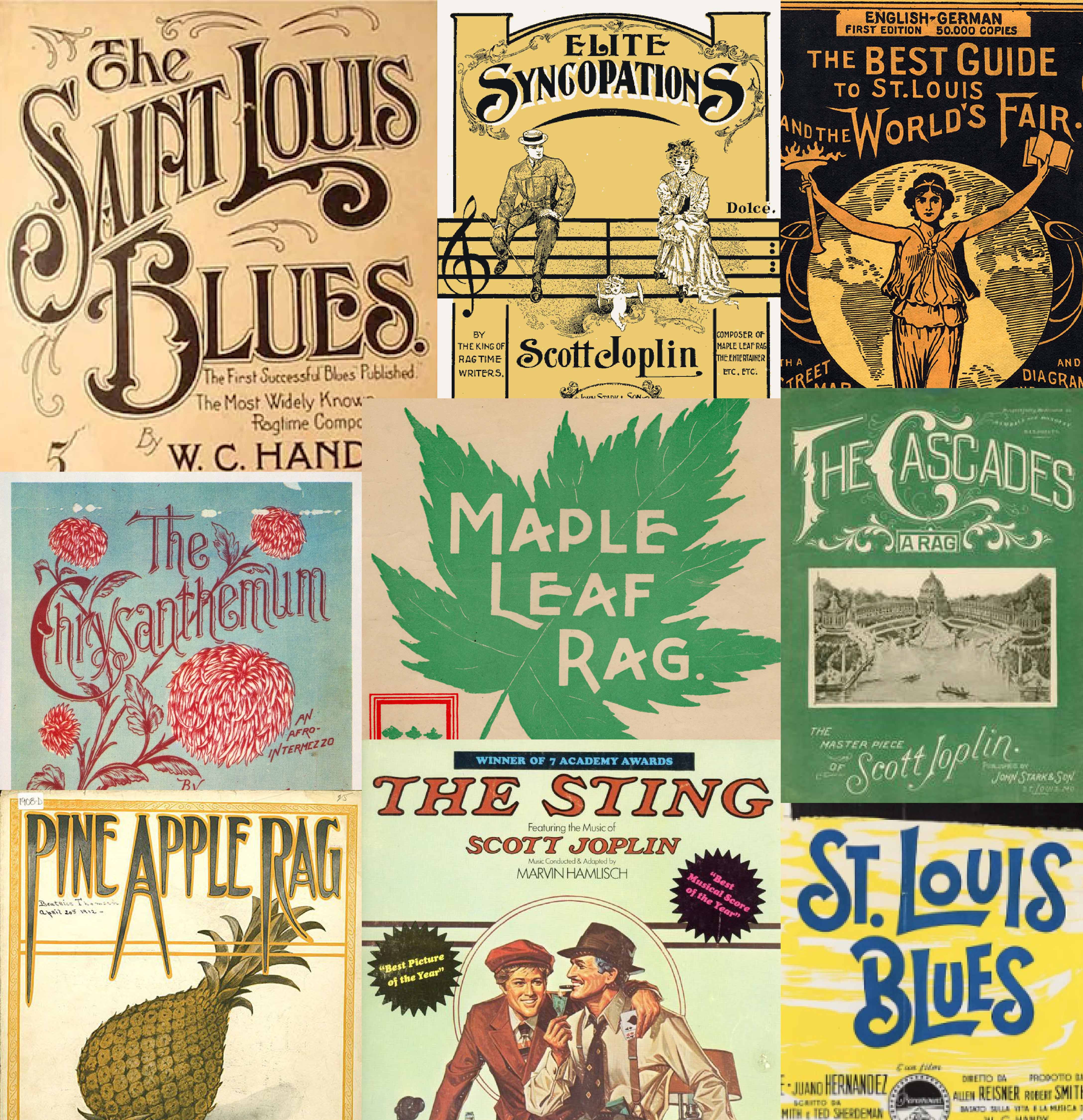
When we think of Blues music, we don’t just hear it. We see it.
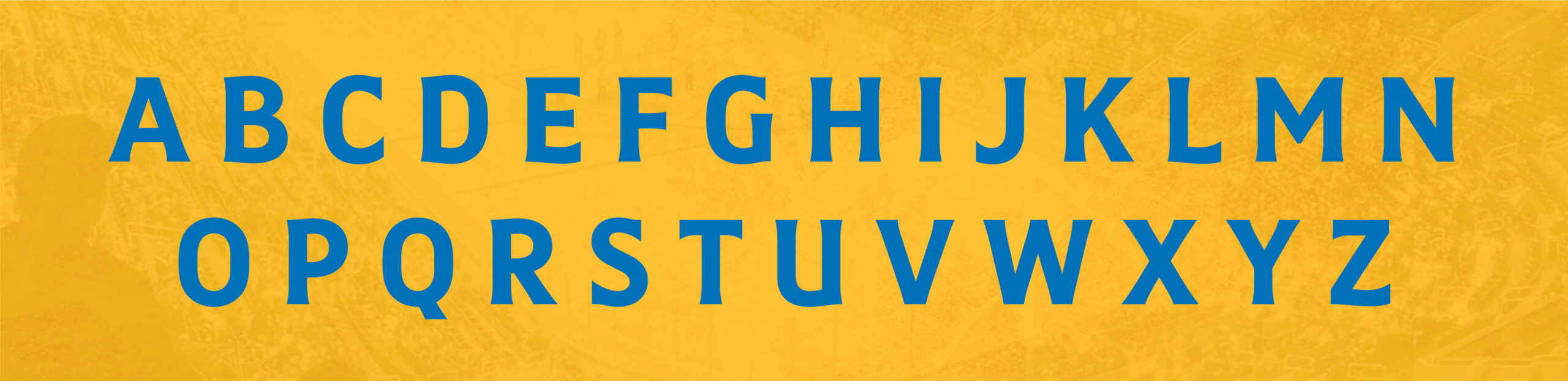
We see the ornate letterforms of early 1900s songbooks, their flourishes dancing across aged pages like the music itself. The visual language of that era was exceptionally inspiring to our team. The bold drop caps, expressive strokes, and hand-rendered typography is inseparable from the sound it framed.
Artists like W.C. Handy, Scott Joplin, Lonnie Johnson, and Bessie Smith are not just names in the liner notes of history. These people are the lifeblood of St. Louis’s cultural identity. Their voices, style, and presence shaped a city and is still echoing through generations. In designing a custom typeface for the Blues, we reached back into that legacy, pulling from the elegance and emotion of that visual tradition.
Every slight curve in a bowl and every angle of a crossbar carries intention. These are subtle nods to the past, embedded in a structure built for the present. The typeface holds tension between softness and strength, echoing the music’s emotional pull while standing firm as a cornerstone of the team’s new visual language.
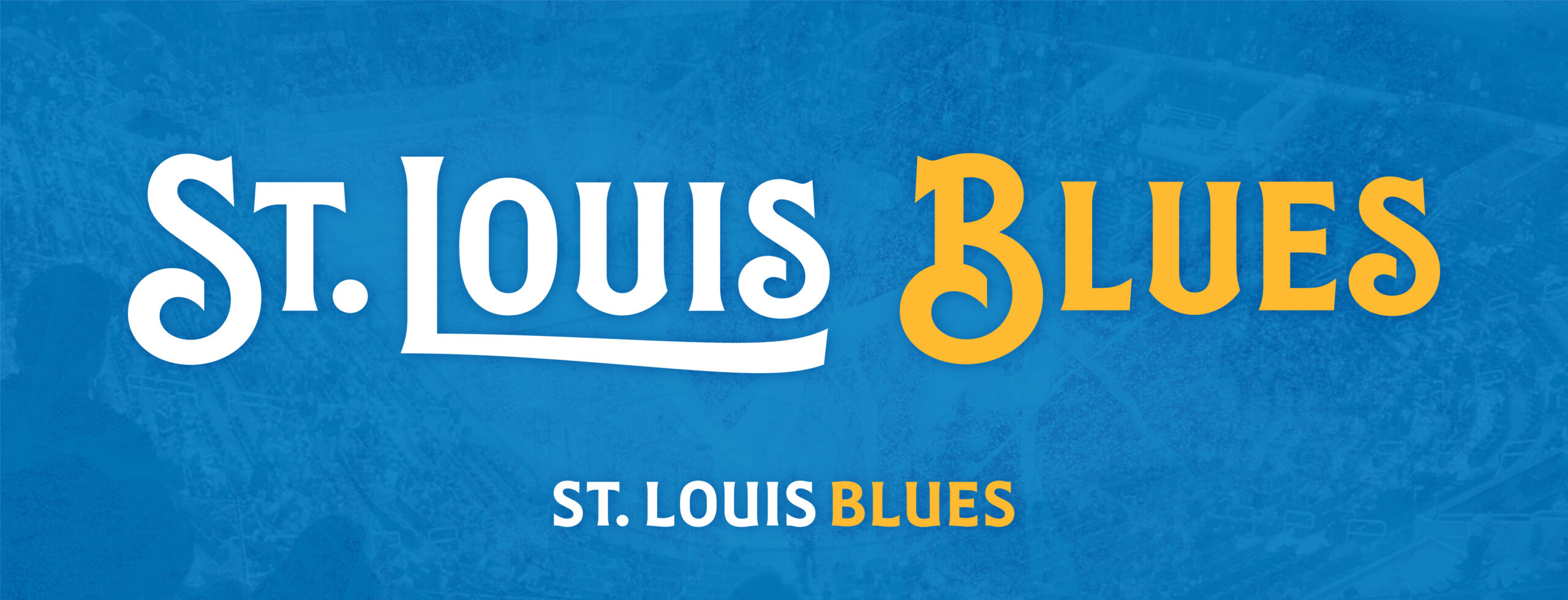
In the new Illustrative Wordmark, those ideas crescendo. Inspired by the elongated descenders and embellished terminals of these classic songbooks, we built a mark that sings with heritage. It doesn’t just spell a name. It tells a story of rhythm, resilience, and a city whose soul was forged in sound.