Milwaukee Brewers
Brand Guidelines, Brand Positioning & Strategy, Branding, Custom Typography, Identity System Design, Logo Design, Uniform Design,OVERVIEW
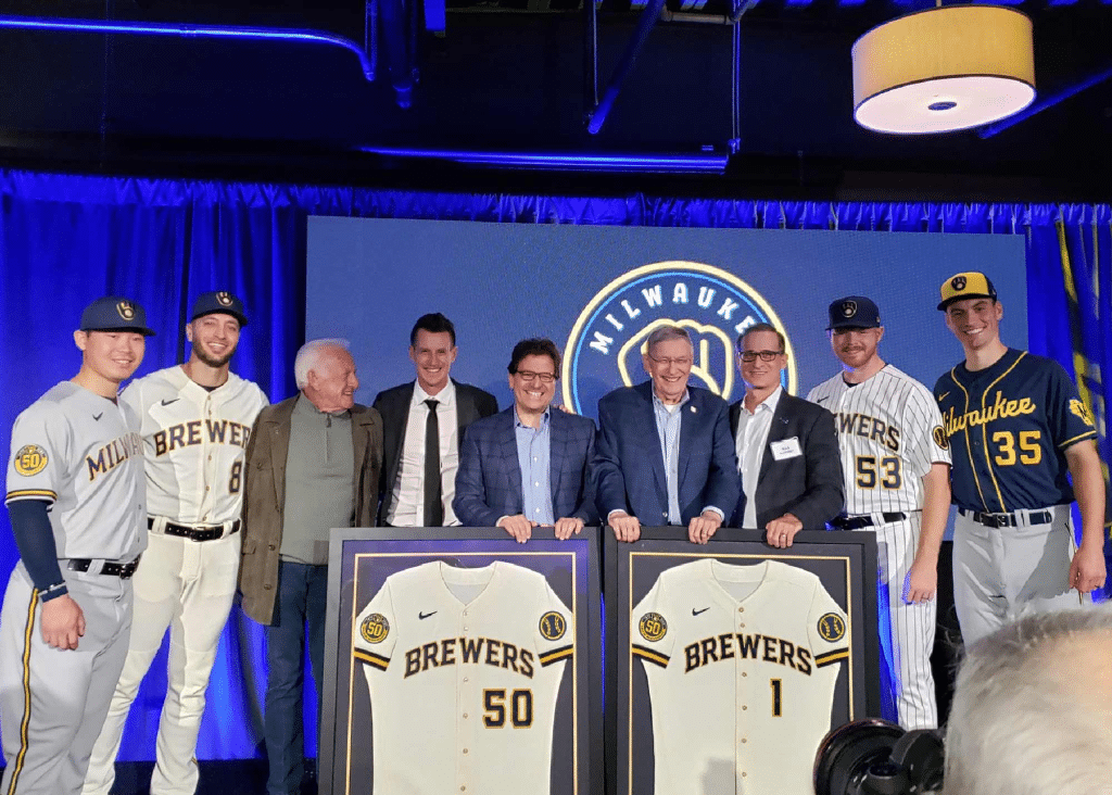
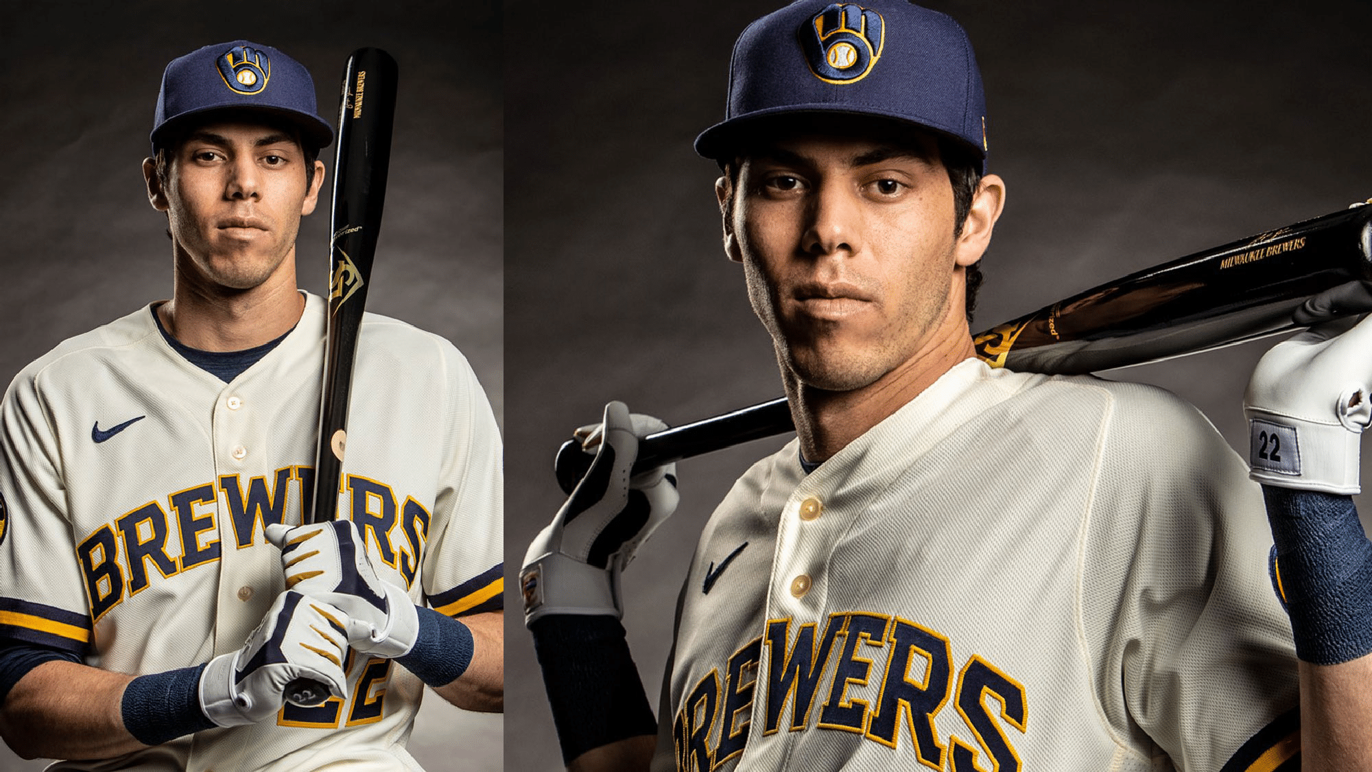
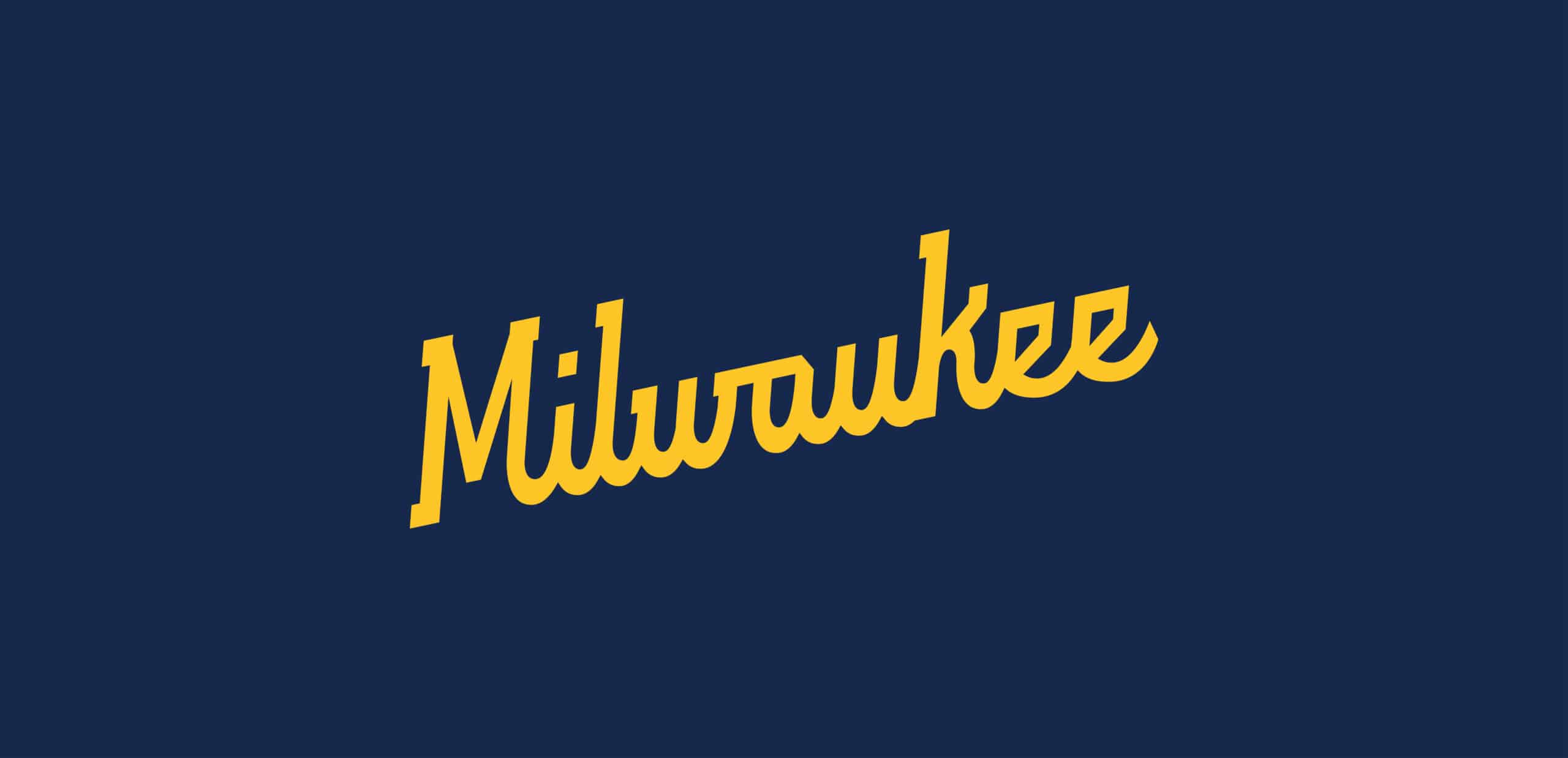
Brand, identity, and uniforms for Milwaukee’s best.
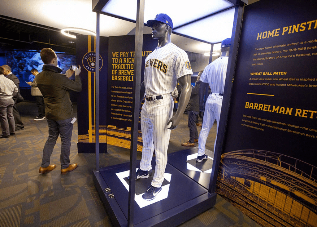
The evolution of an icon. One of baseball’s most beloved logos gets refreshed and put back in its rightful place.

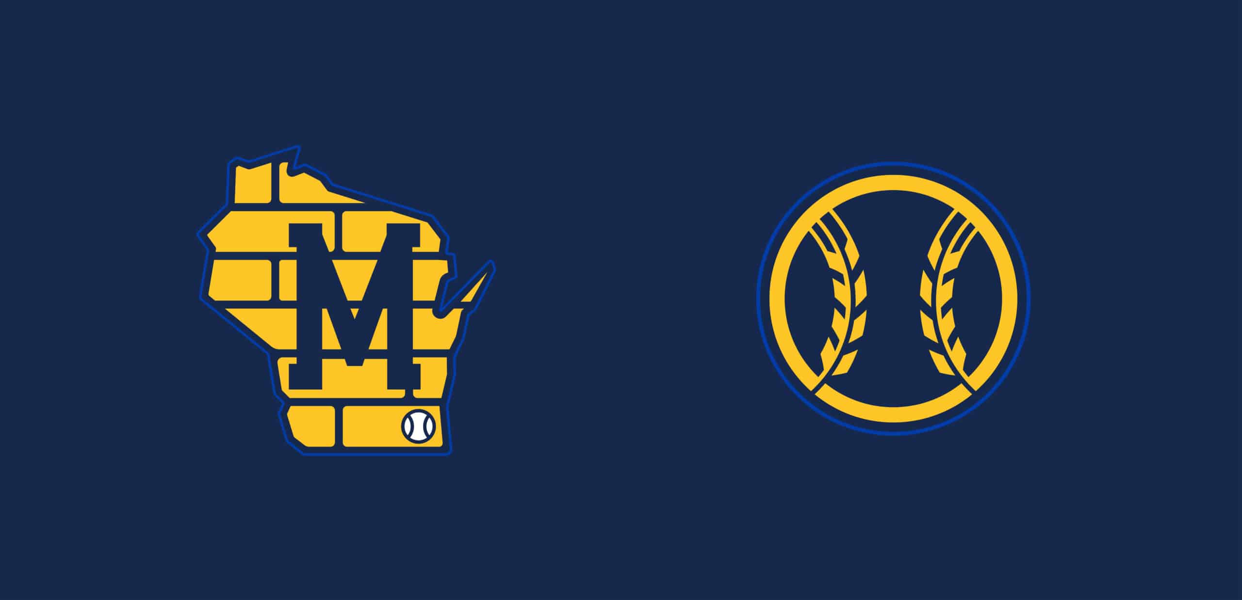

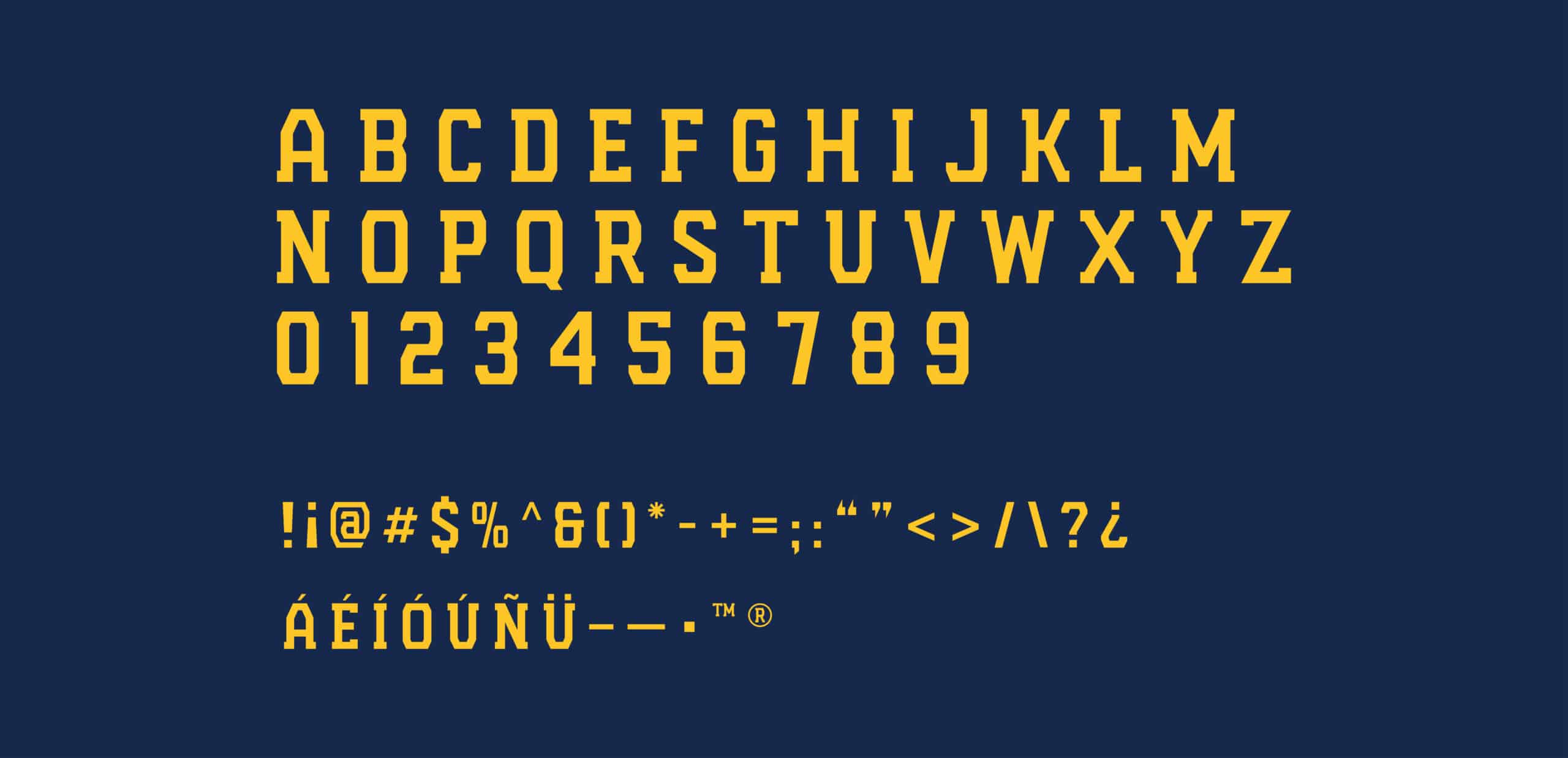
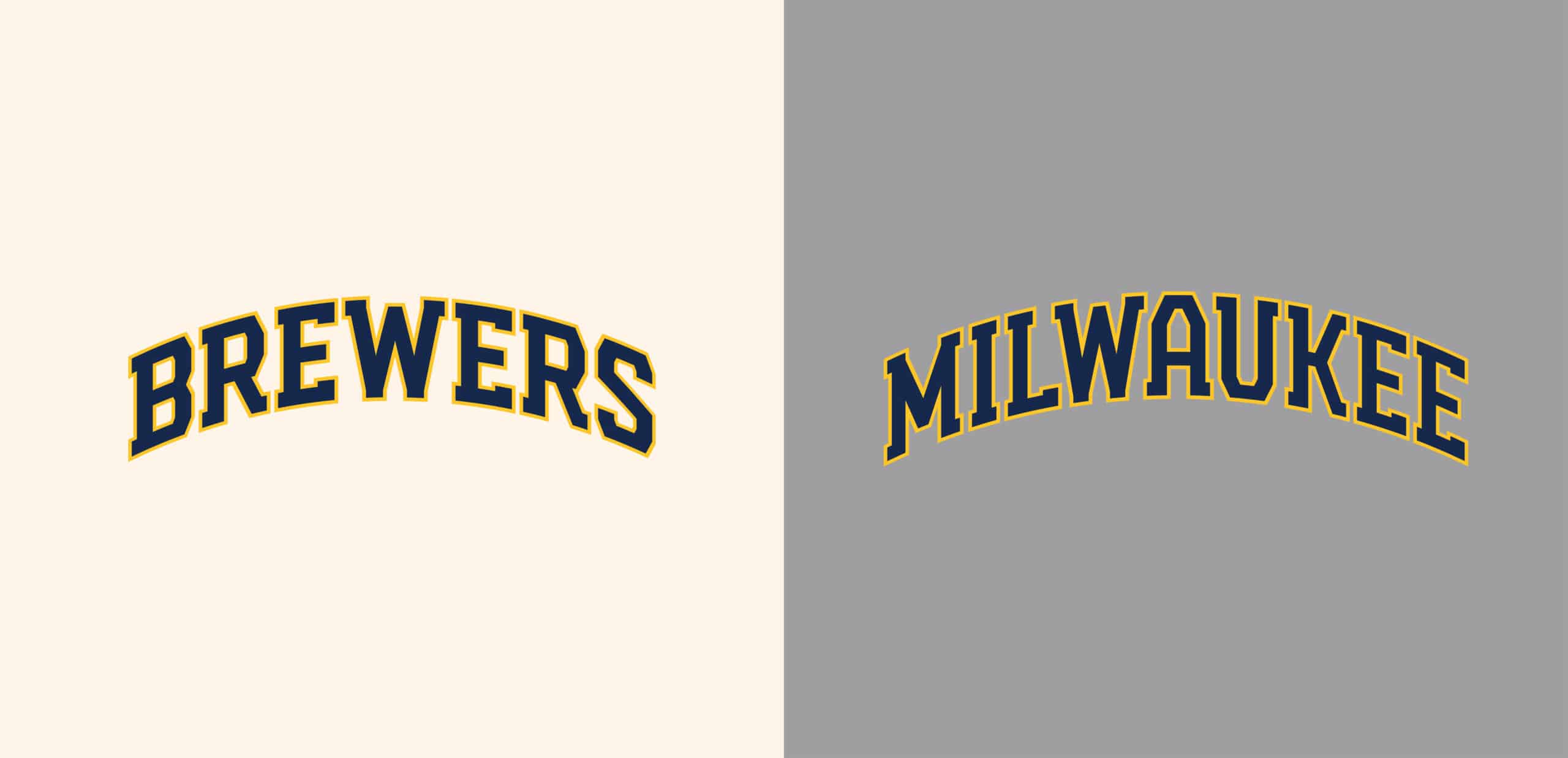
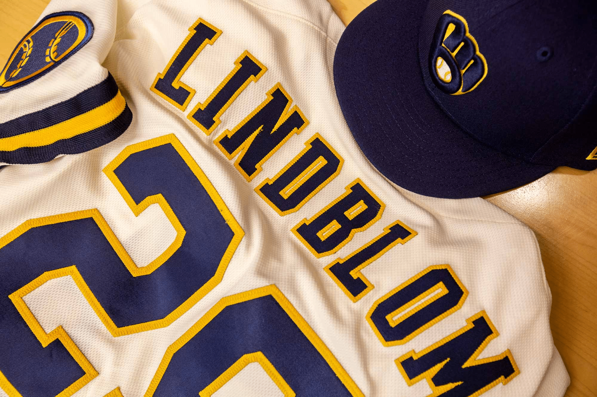
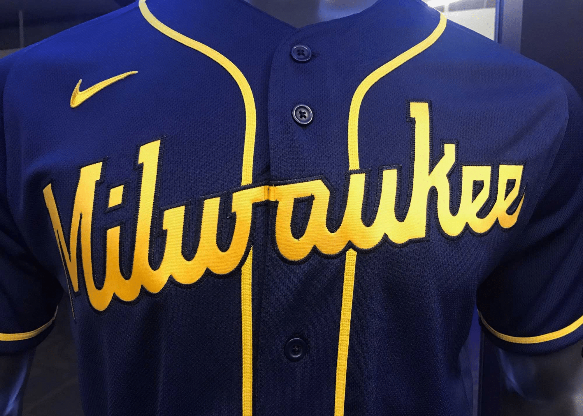
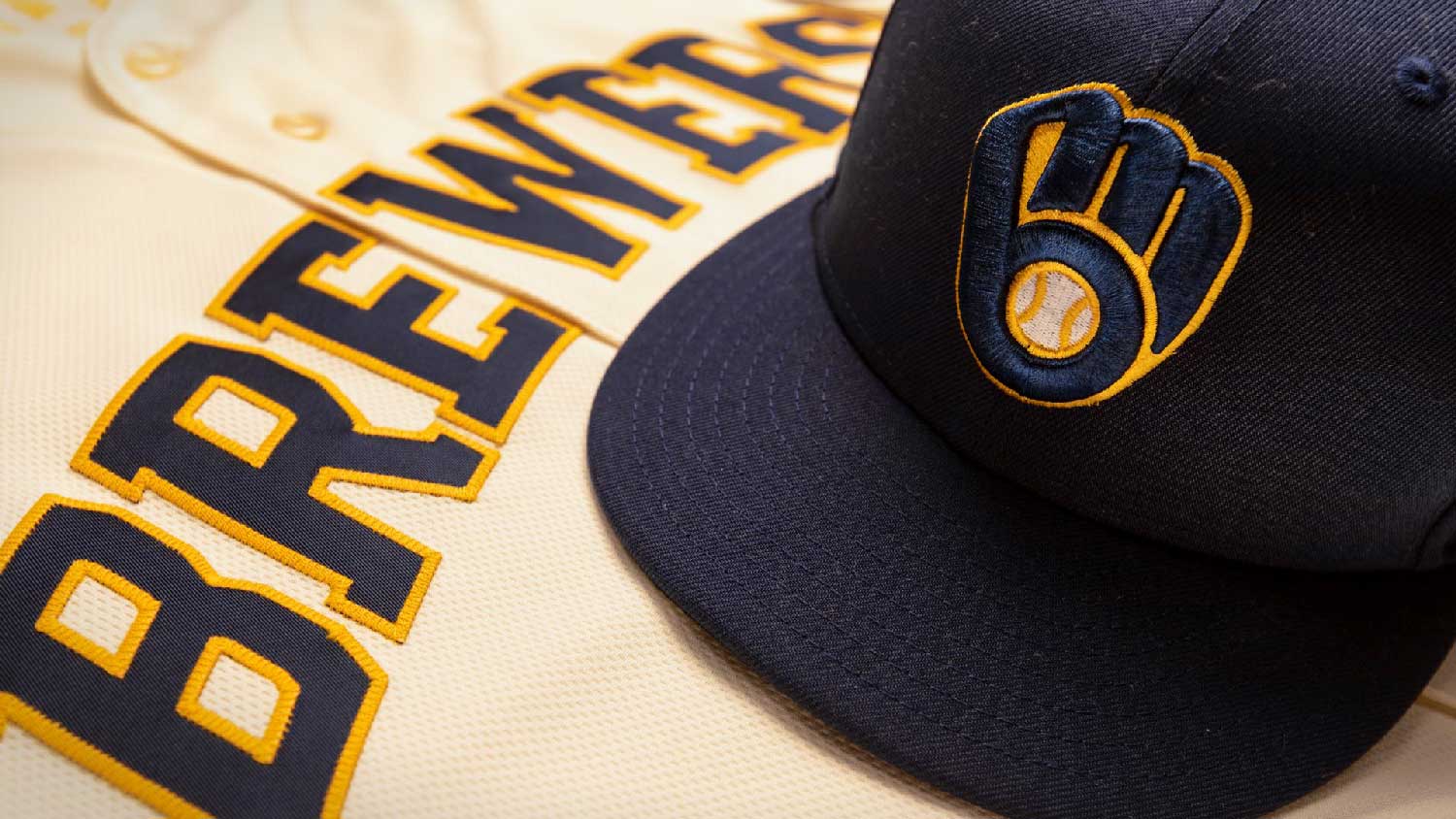
From the connection of the “m” and “b” to signify the unwavering connection between Milwaukee and the Brewers, to the modern industrial typeface celebrating the city’s powerful past and enthusiastic rejuvenation, this identity is all about this team’s love affair with its fans and city.
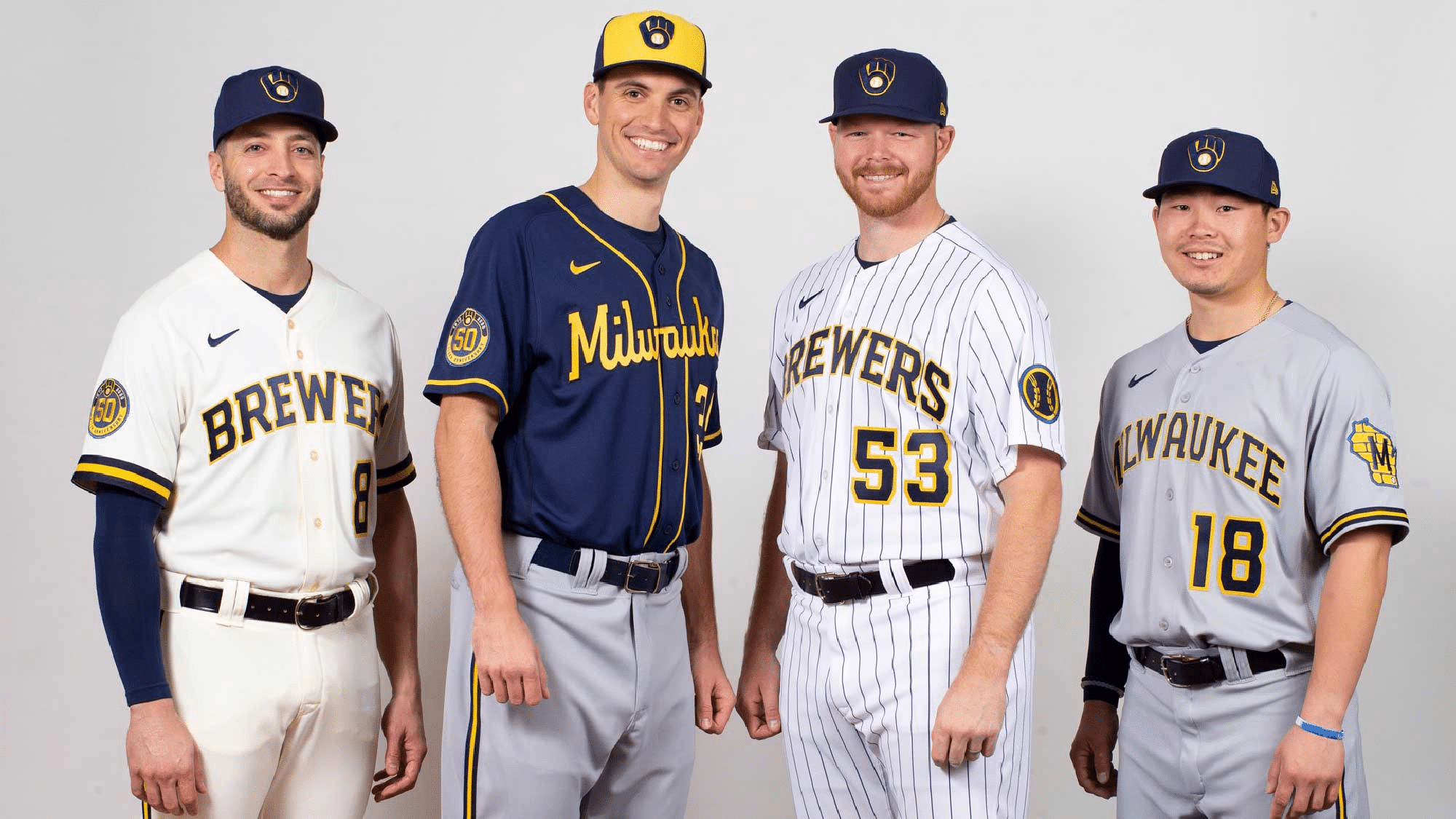
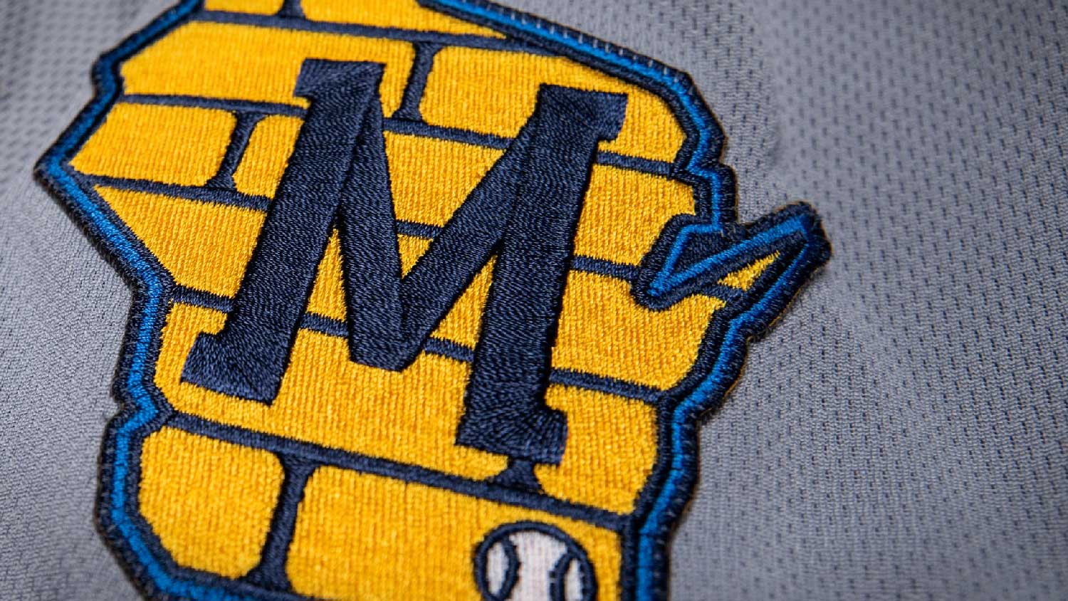
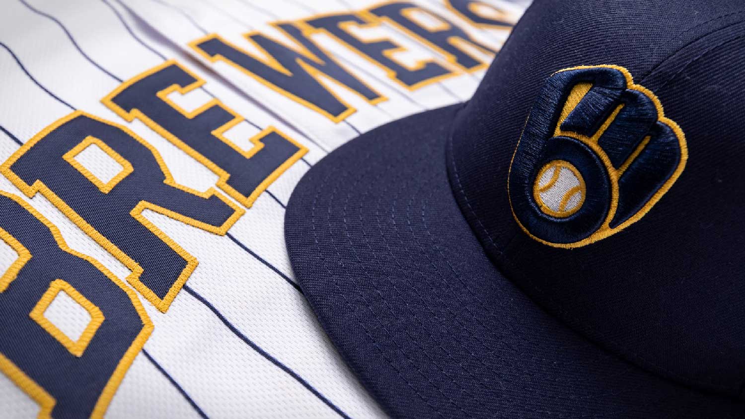
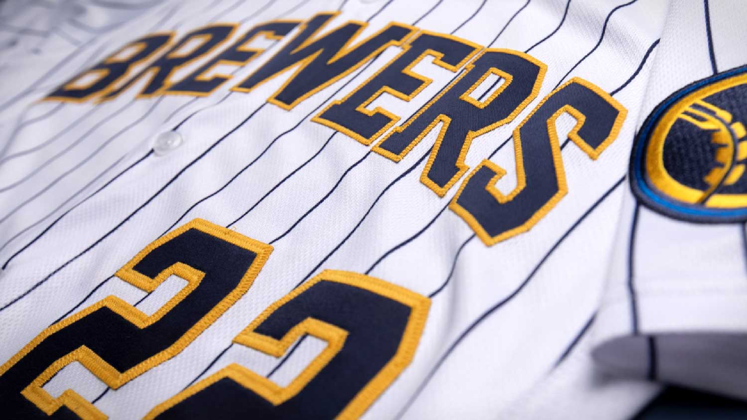
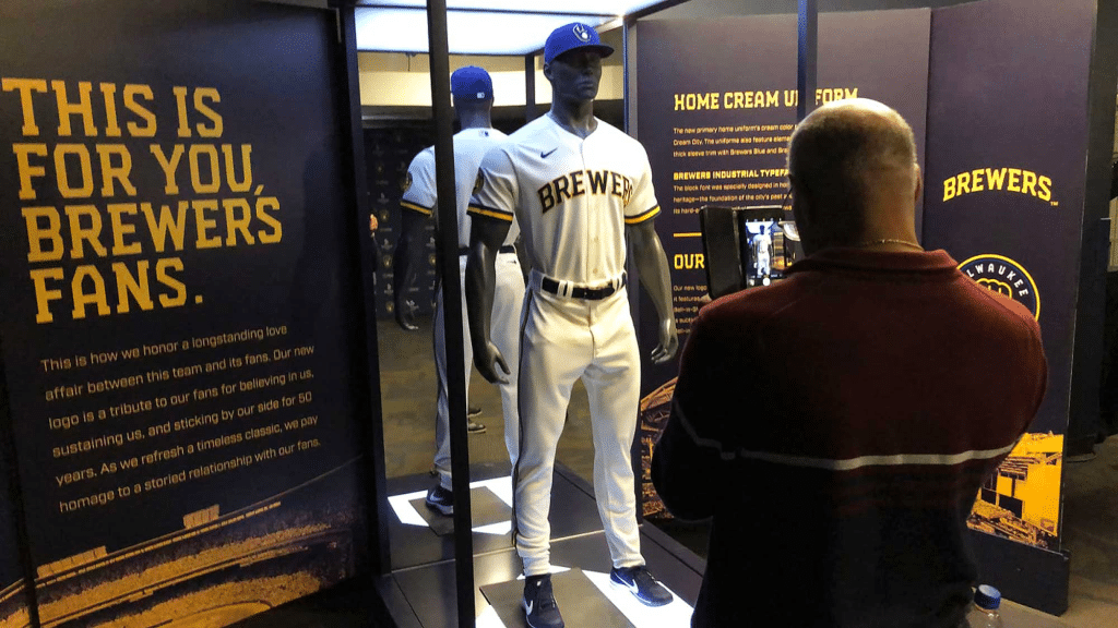
The team will don new cream duds in homage to the Cream City, Milwaukee’s nickname due to the cream colored bricks used in its foundational construction.