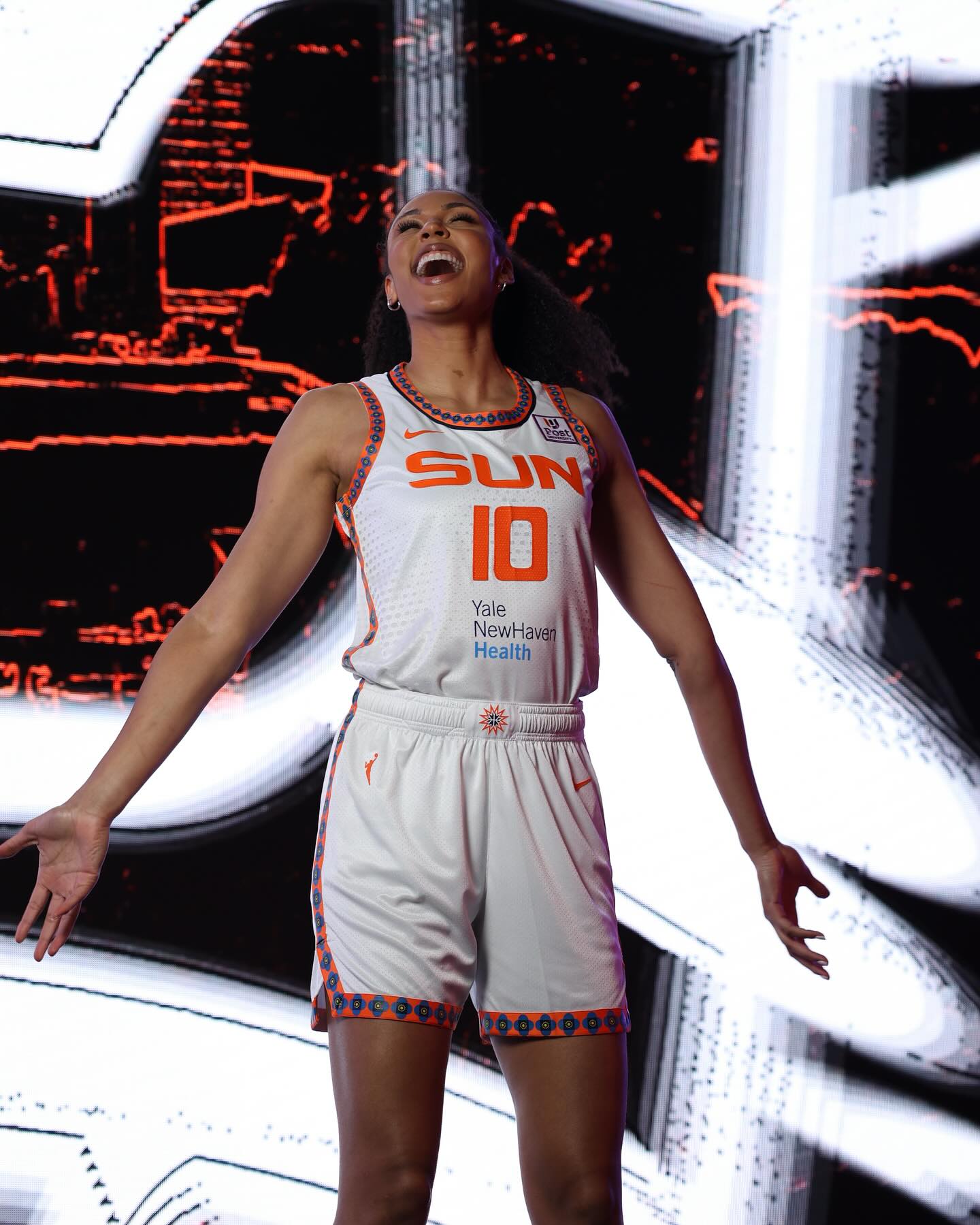
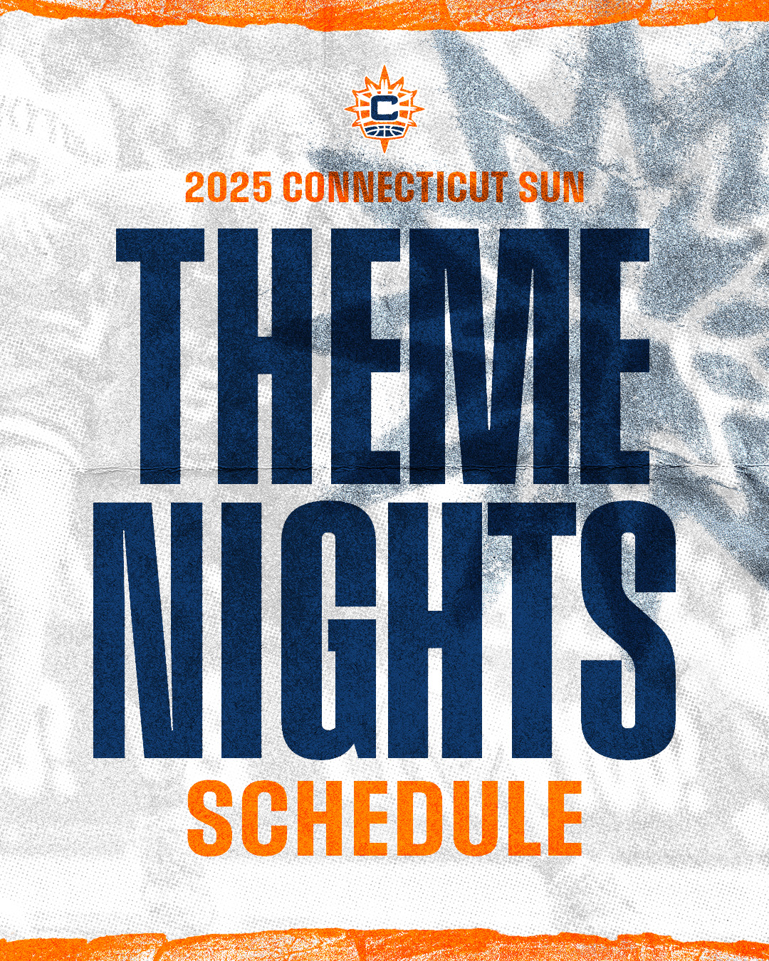
Connecticut Sun
Art Direction, Athletic Branding, Brand Guidelines, Campaign Design, Custom Typography, Digital and Print Design, Identity System Design, Logo Design, Social Media Design,OVERVIEW
Brand identity design & 2025 Seasonal Campaign Art Direction for New England’s WNBA team.
The Connecticut Sun came to RARE in 2021 with an idea to reimagine their iconic identity. They wanted to rediscover and refresh their brand in a way that both honored their deep heritage to the Mohegan tribe, as well as to prepare themselves for the rising tide of the WNBA. Inspired by these deep tribal and cultural roots, our team immersed ourselves in this spirit of the organization to define a visual identity that could parallel the momentum happening within women’s sports. What we were able to uncover was a revitalized brand that speaks to their fierce fanbase in New England, while paying homage to the team’s original namesake.

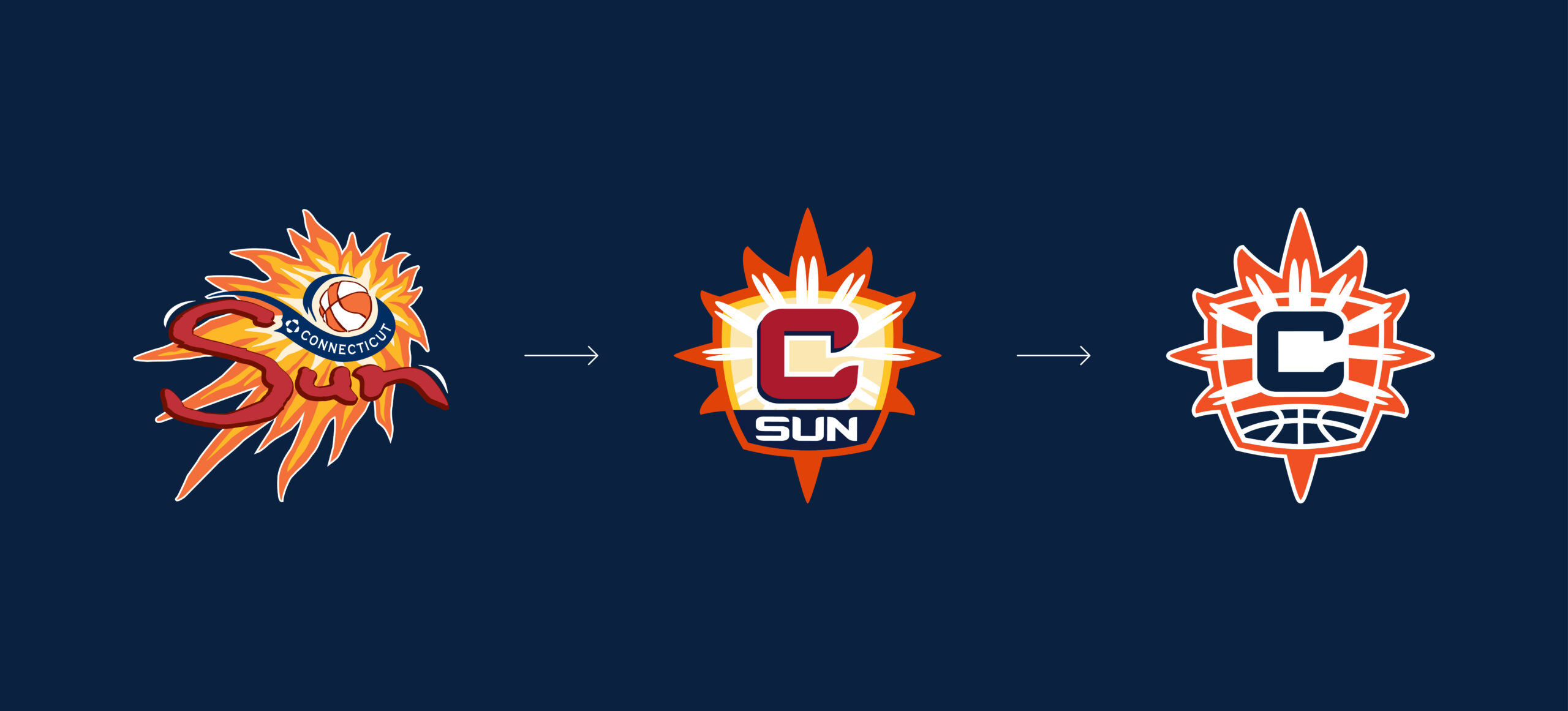
When the Sun approached us to refresh their primary identity, we saw it as an opportunity to fan the flame of what the current identity was doing with their fanbase to something greater. The goal wasn’t to reinvent the wheel but to evolve the mark by taking the essence of what was already there and amplify it into something powerful, iconic, and uniquely theirs. The result is a bold and foundational mark rooted in legacy and built for the future. A brand forged in purpose and elevated in presence. A mark fully optimized to thrive across every platform and elevated moment the league demands.


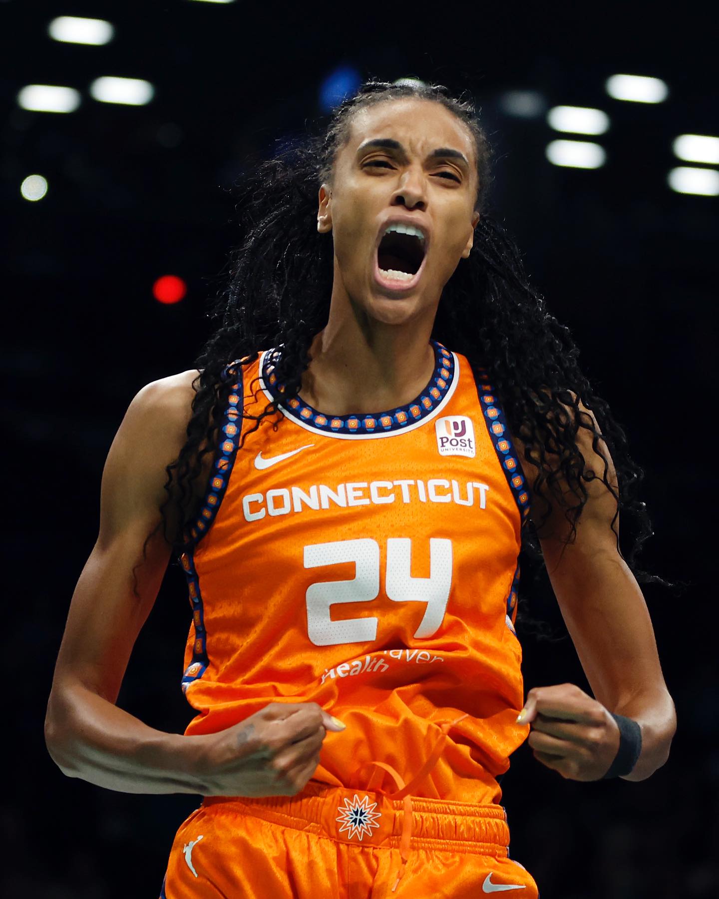

2025 SEASON CAMPAIGN
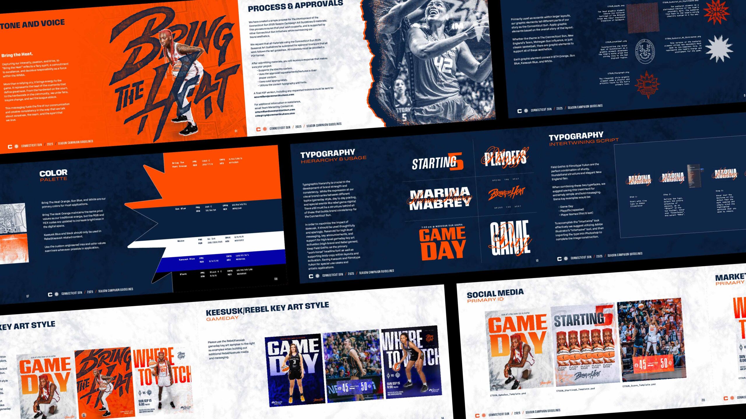
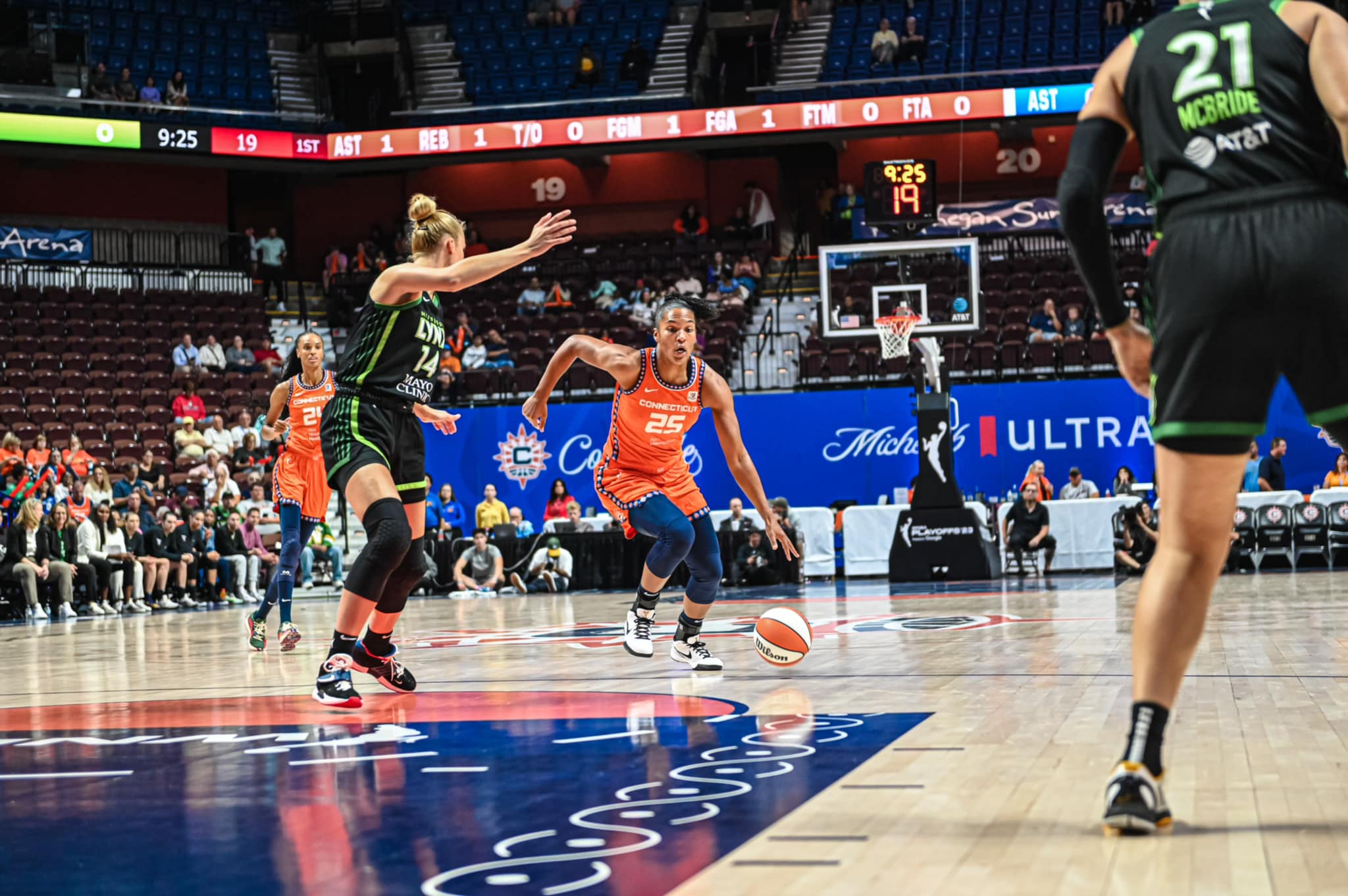
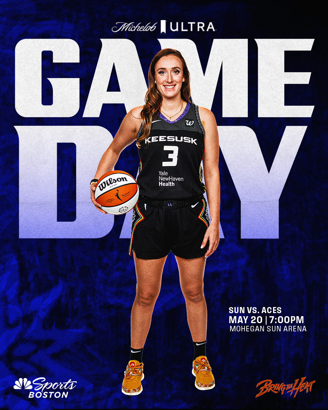
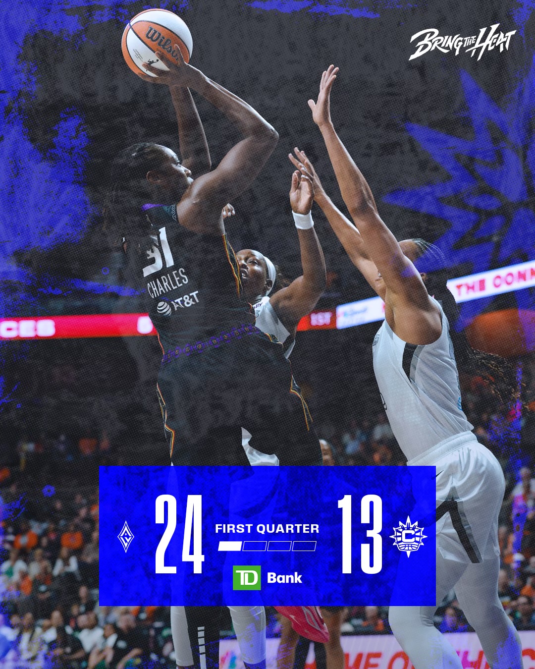
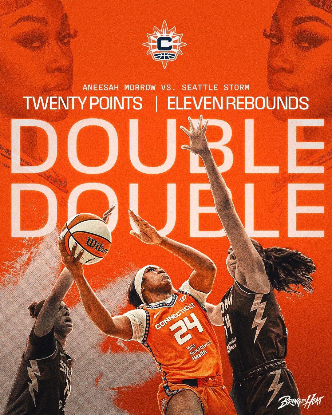
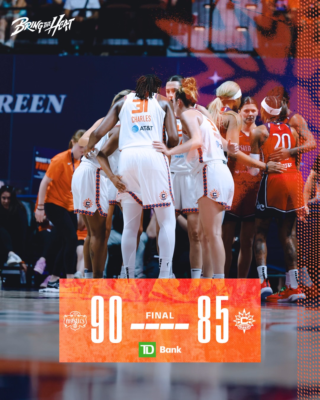
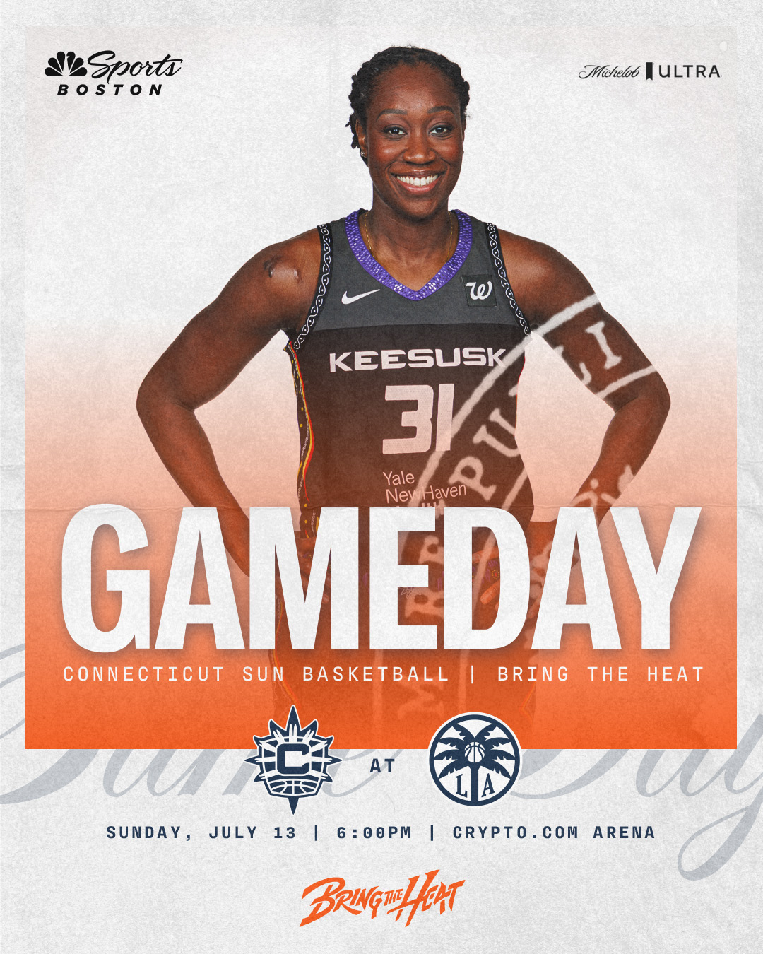
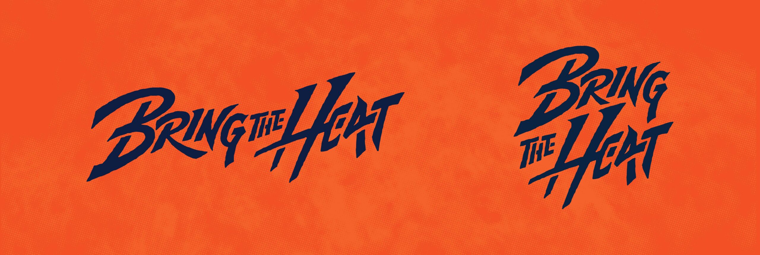
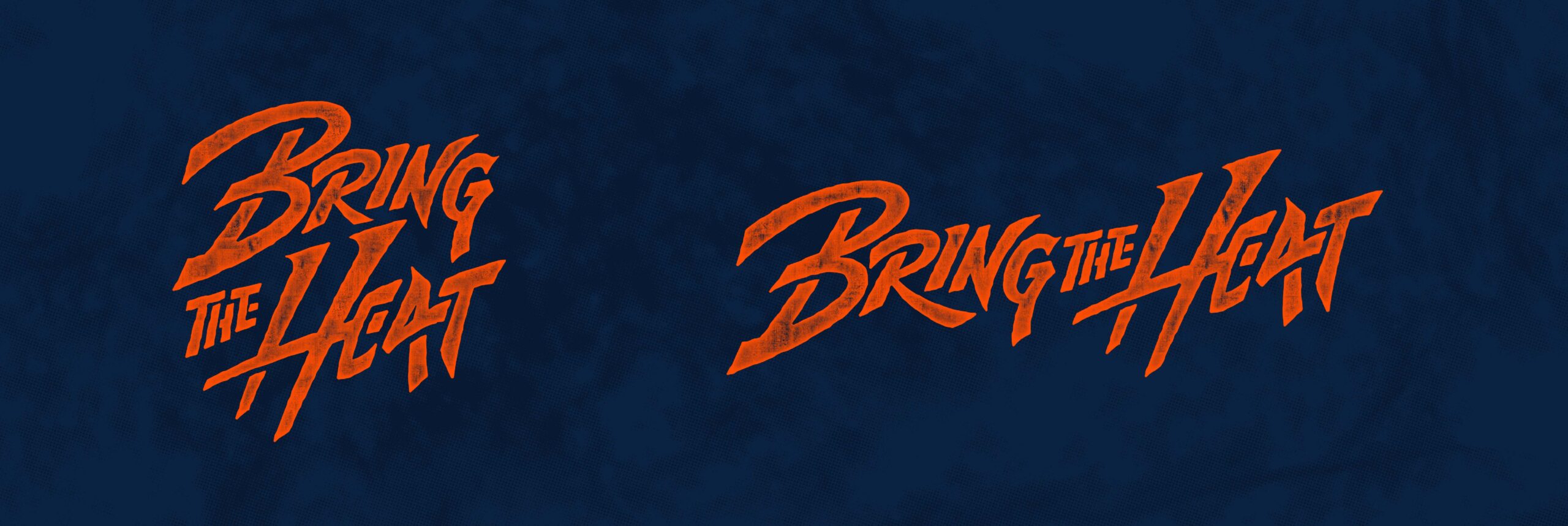
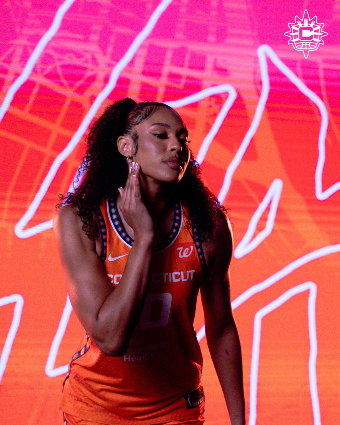
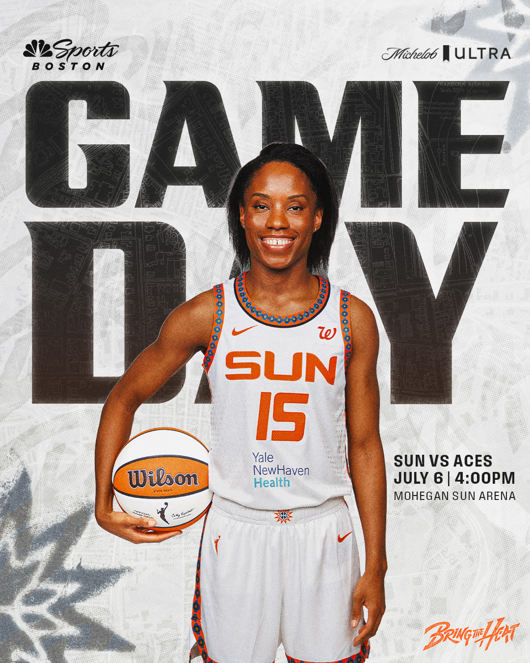
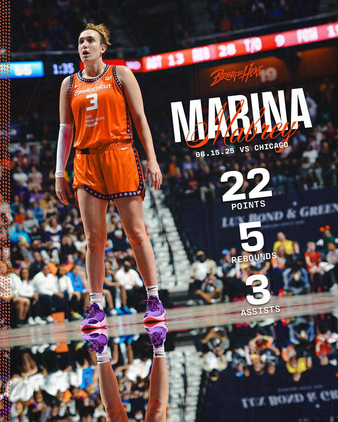
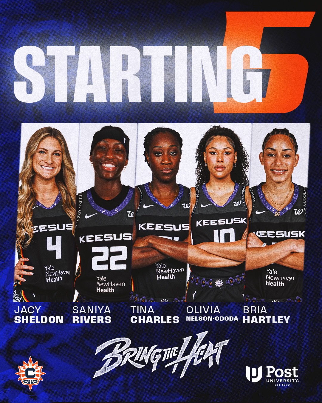
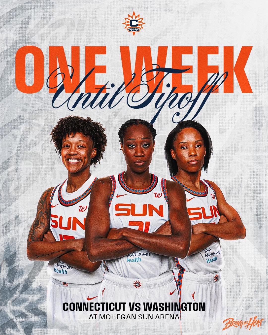
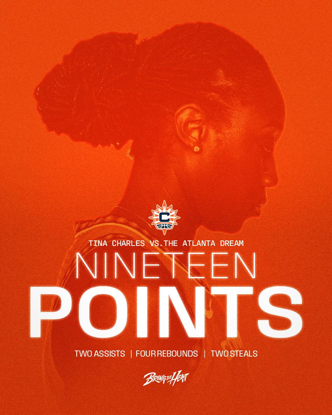
For the Connecticut Sun’s 2025 season, we partnered with the organization at a turning point. A new coach, a reshaped roster, and early draft momentum signaled a reawakening. Together, we set out to craft an art direction system that could match the energy of a franchise stepping boldly into a new era. It was time to create a campaign that amplified the emotion, elevated the visuals, and carved out a resonant identity for this new chapter. This is how we Bring the Heat.
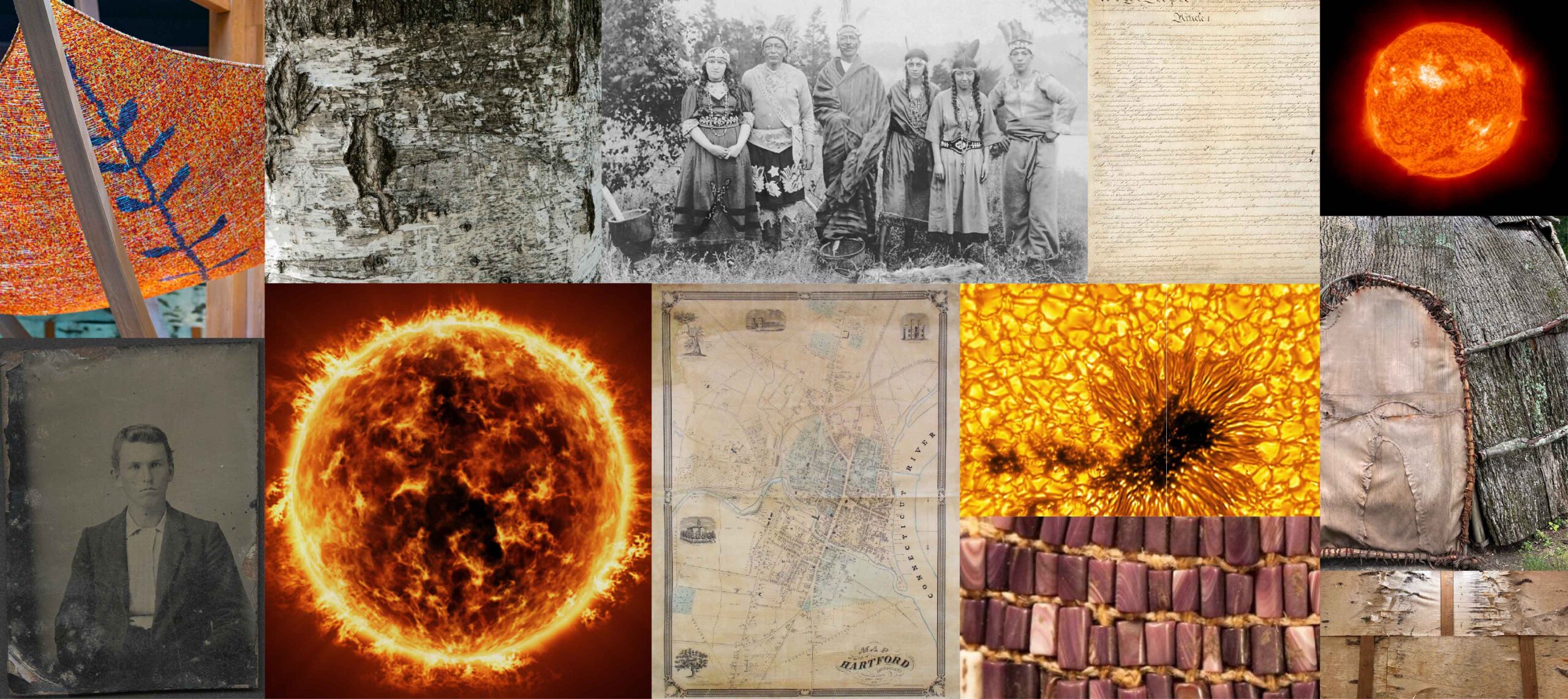
Drawing inspiration from the symbolism of heat, our team considered not only as a temperature, but as an expression of culture. Deeply rooted in native influence, we explored relevant colors, patterns, and textures that would reflect the Sun and its fans while honoring the history of the region. From the incorporation of the bold color palette to the practically relevant textures, our team developed a foundation and structure as diverse as its history.
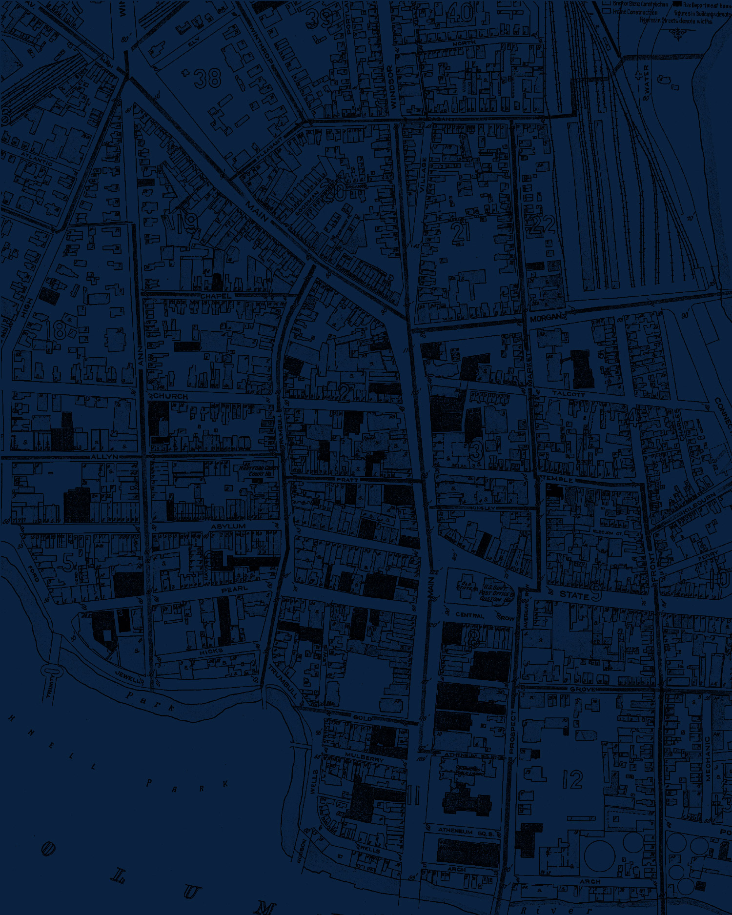
MAP OF HARTFORD
The vintage map texture depicts the state’s capital, Hartford. Use of the map texture demonstrates the team’s strong ties and love for the state.
BIRCH BARK
The Mohegan Tribe holds a deep cultural connection to birch trees. The birch bark texture symbolizes the strong link between the team and the tribe.

SUN’S SURFACE
The solar texture harnesses the fiery surface of the sun that represents the team’s intensity and passion for the game.
TIN TYPE
A tintype is an early photographic process used primarily in the mid-to-late 19th century. The tintype texture embodies an era where the state grew and transformed.

PARCHMENT
Connecticut boasts a rich and storied history within the United States. The parchment texture evokes the era when the foundations of our nation’s legacy were being written.

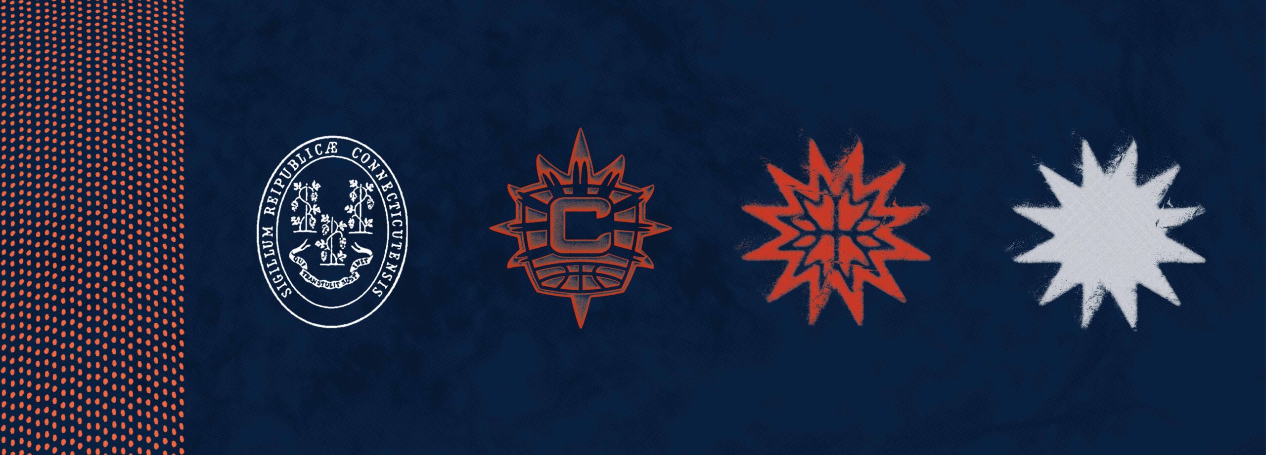
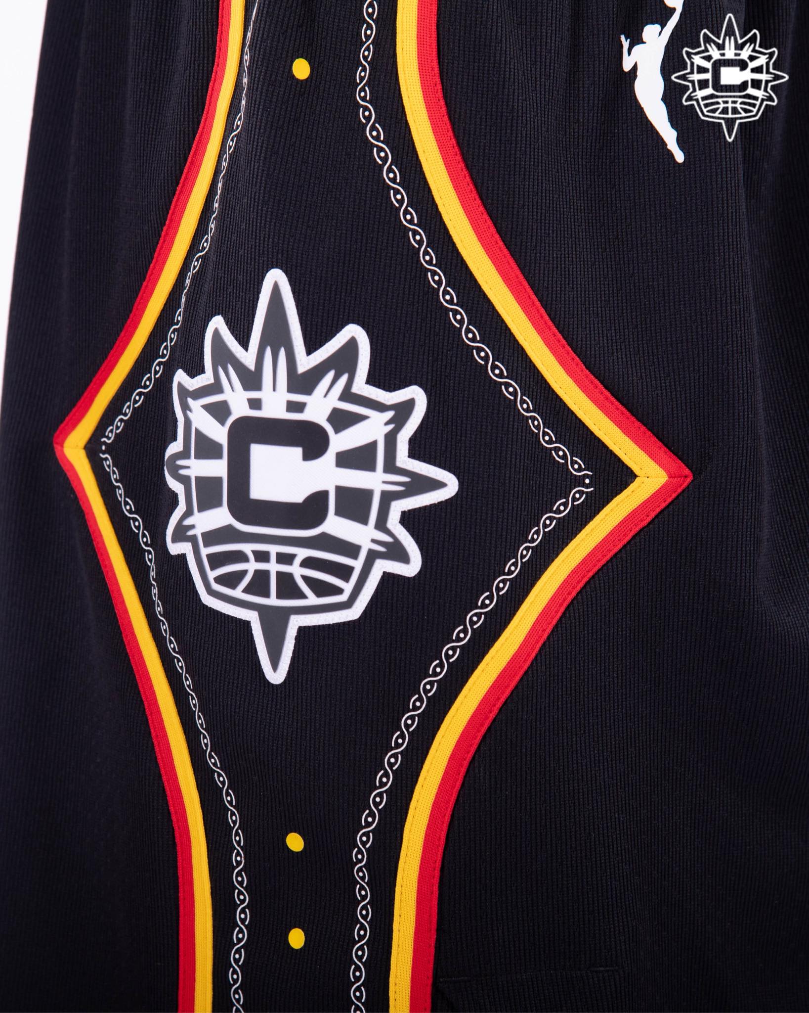
MOHEGAN BEADS
The bead graphic element honors the cultural heritage of the Mohegan Tribe and their exquisite tradition of beadwork.
GREAT SEAL OF CONNECTICUT
Incorporating the Great Seal of Connecticut as a graphic element showcases the team’s state pride and strong ties to the New England region.
RISOGRAPH PRIMARY LOGO
The risograph style graphic element adds a playful and artistic touch to the Sun’s primary icon.
DISTRESSED SUNBURST 1
The sunburst element is a distressed edition of the team’s secondary mark. The sunburst ties back to the team’s strong identity system in a fun way.
DISTRESSED SUNBURST 2
This version of the sunburst strips the secondary mark down to its simplest form. It represents the team’s energy and excitement for the game.
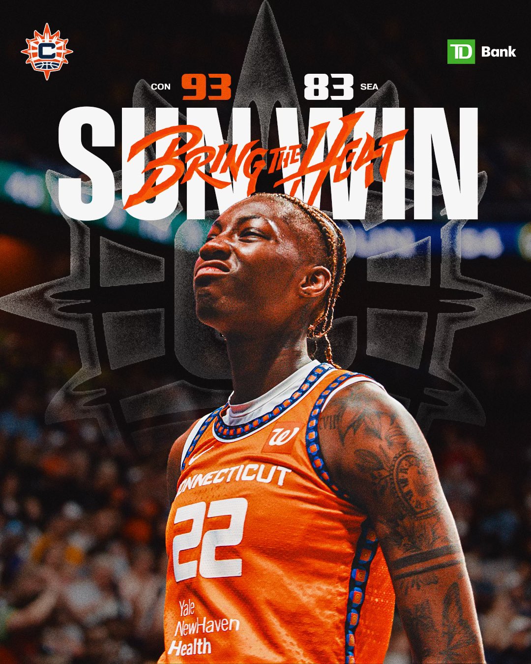
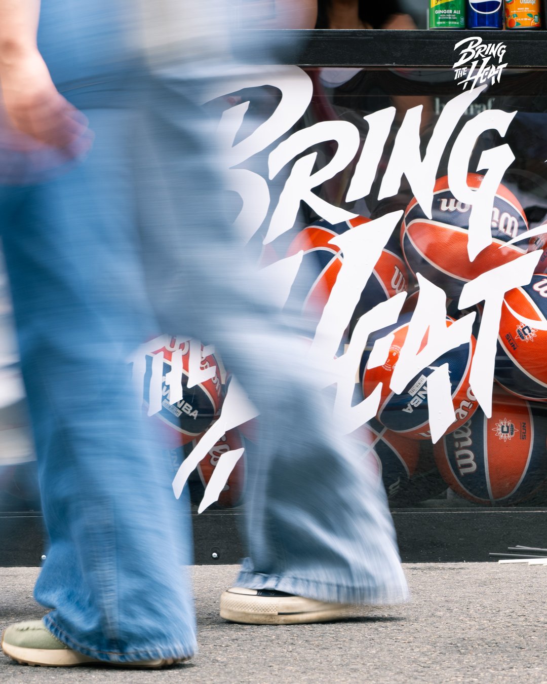
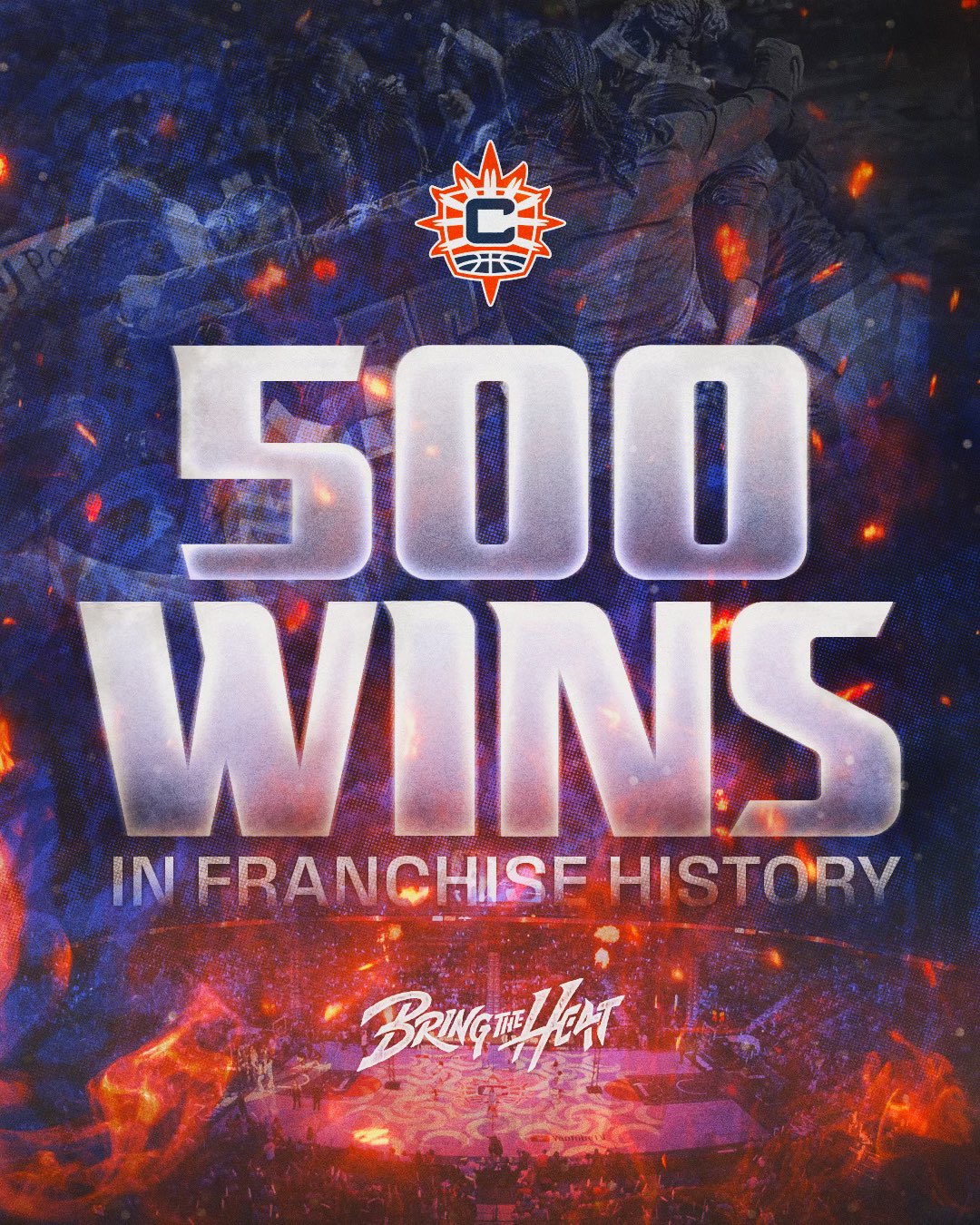
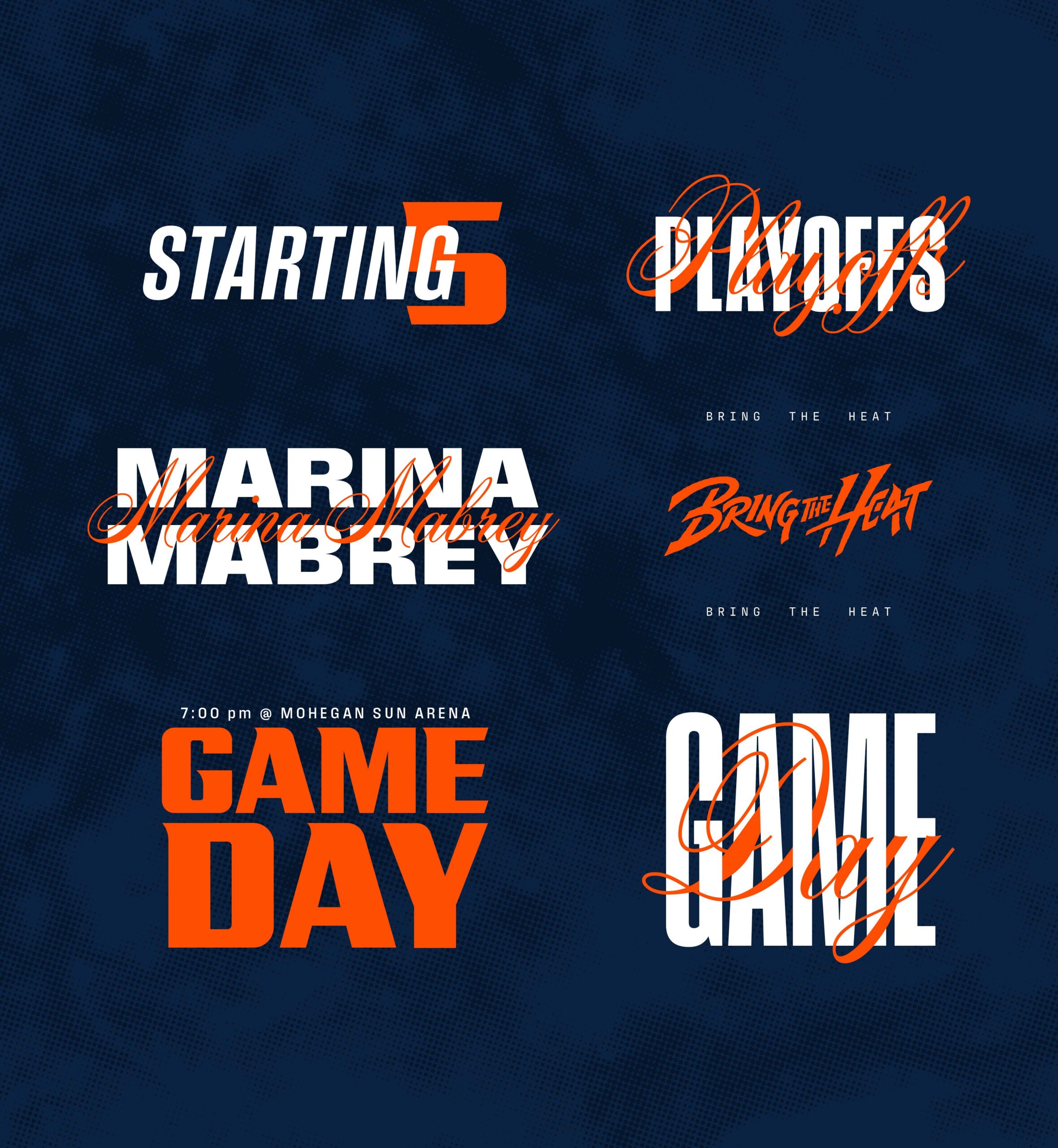
More than a tagline, “Bring the Heat” is a battlecry. It is a challenge to all that dare to brave the court against the Sun. It is a unifying anthem that rallies the hearts and minds of all Sun fans to perform and protect. It is relentless pressure and a fiery passion. Bringing this to life meant that our team had to move beyond thinking and strategizing to connecting and feeling.

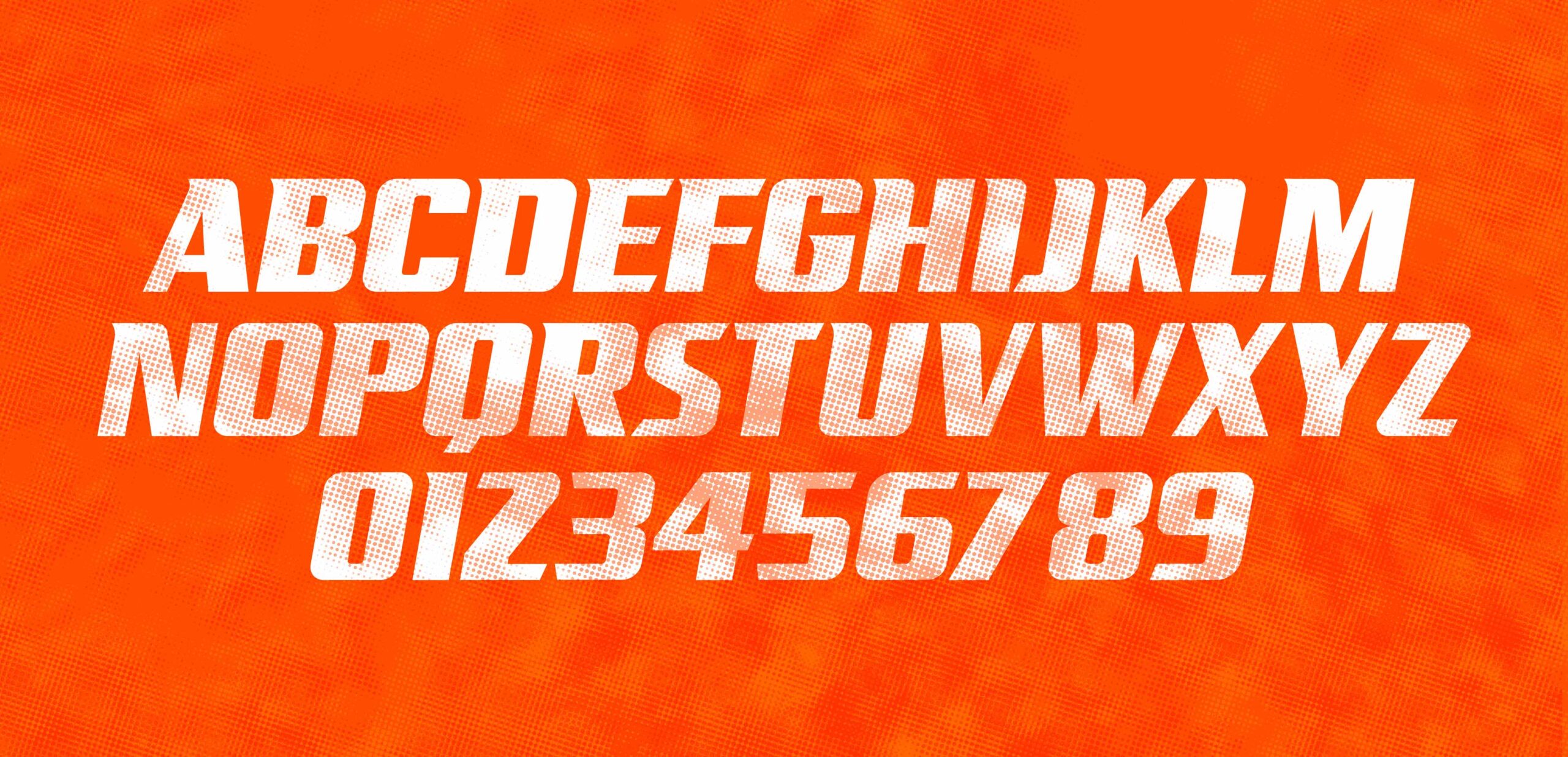
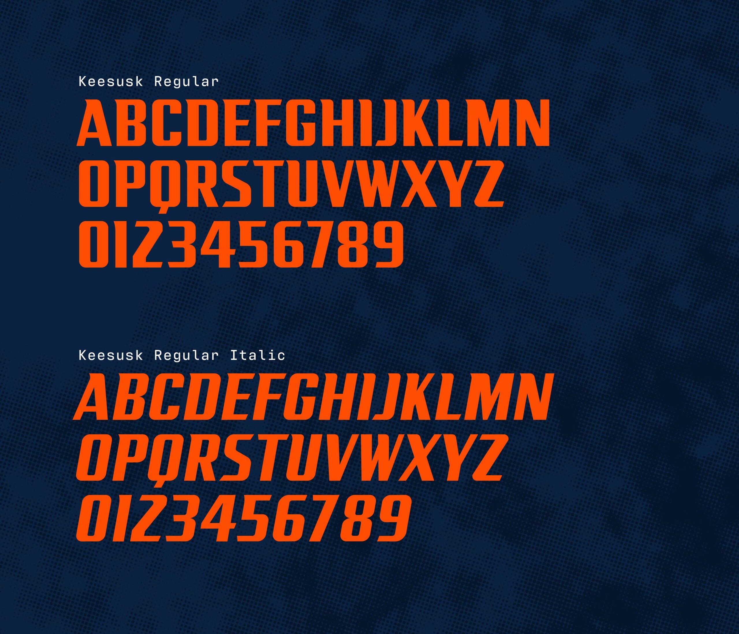
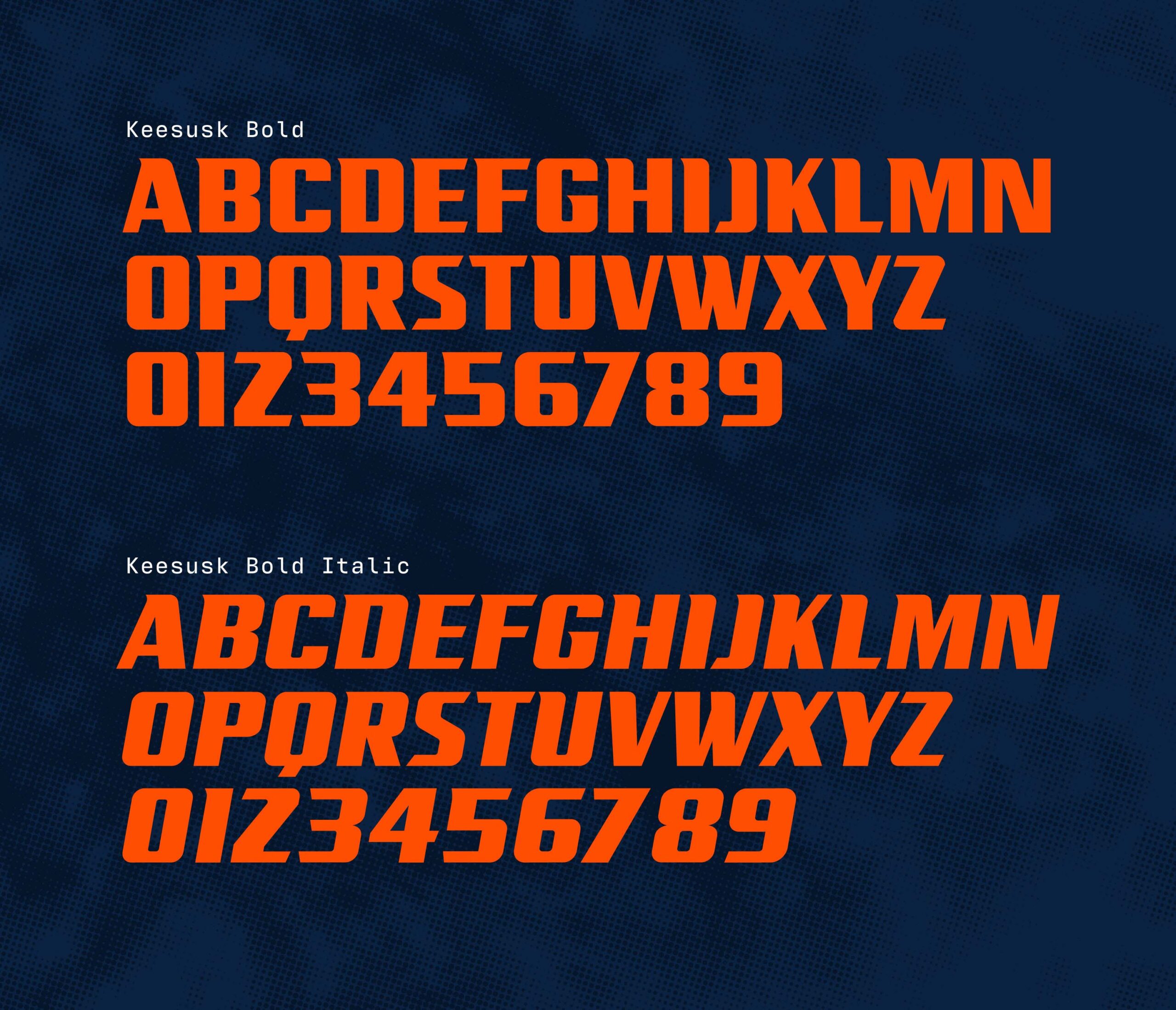
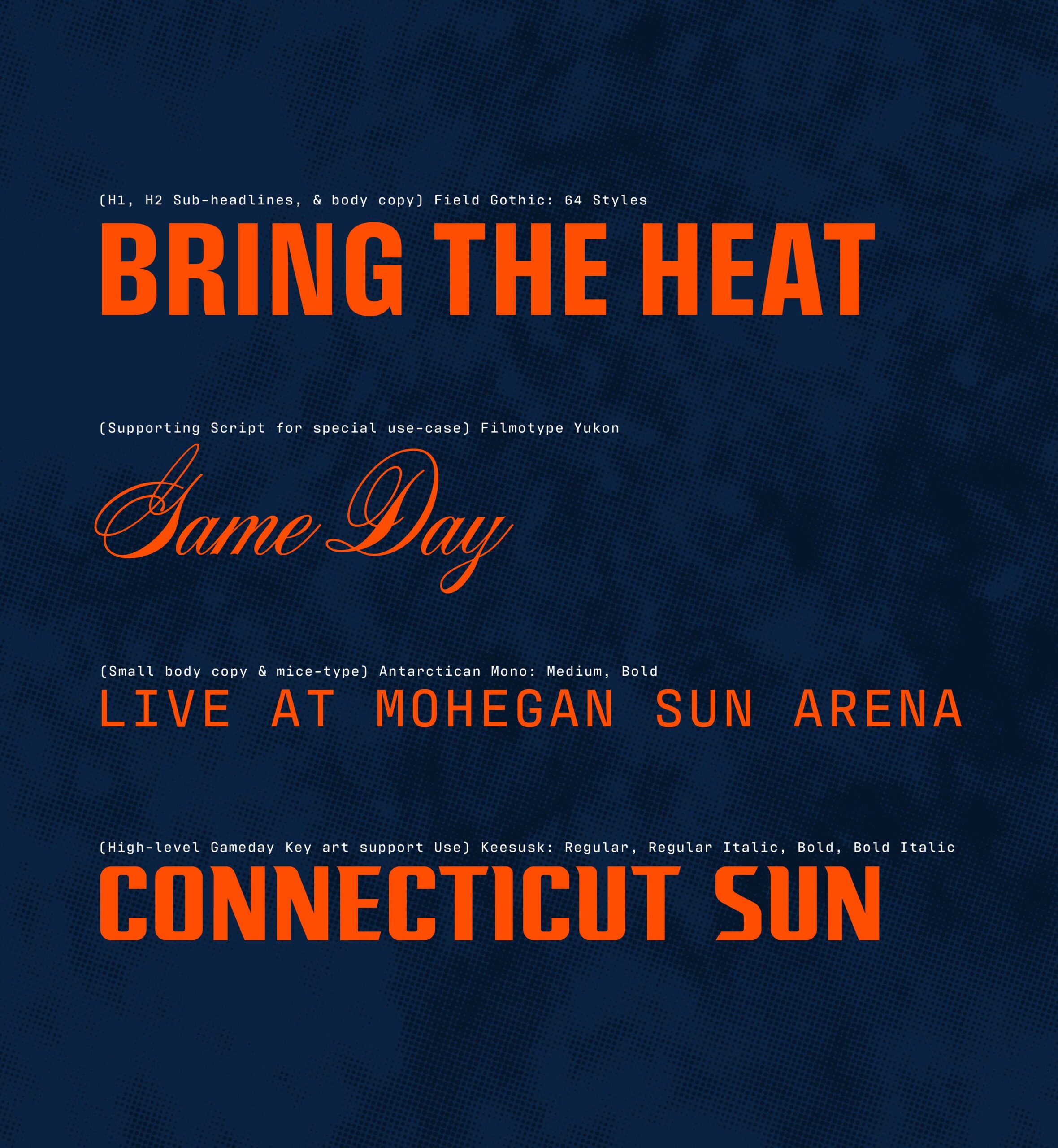
As part of the 2025 “Bring the Heat” campaign, the Connecticut Sun wanted us to develop unique graphic elements to elevate the overall campaign message. Together we created a custom typeface named Keesusk, the Mohegan word for Sun, to anchor the visual identity of the season. Keesusk is more than letterforms. It is movement, flame, and strength in motion. Every curve carries the speed of a fast break. Every terminal flickers with the shape of fire. Built to express endurance, passion, and power, this typeface reflects the relentless spirit of a franchise devoted to the game. Born from language. Made for impact.
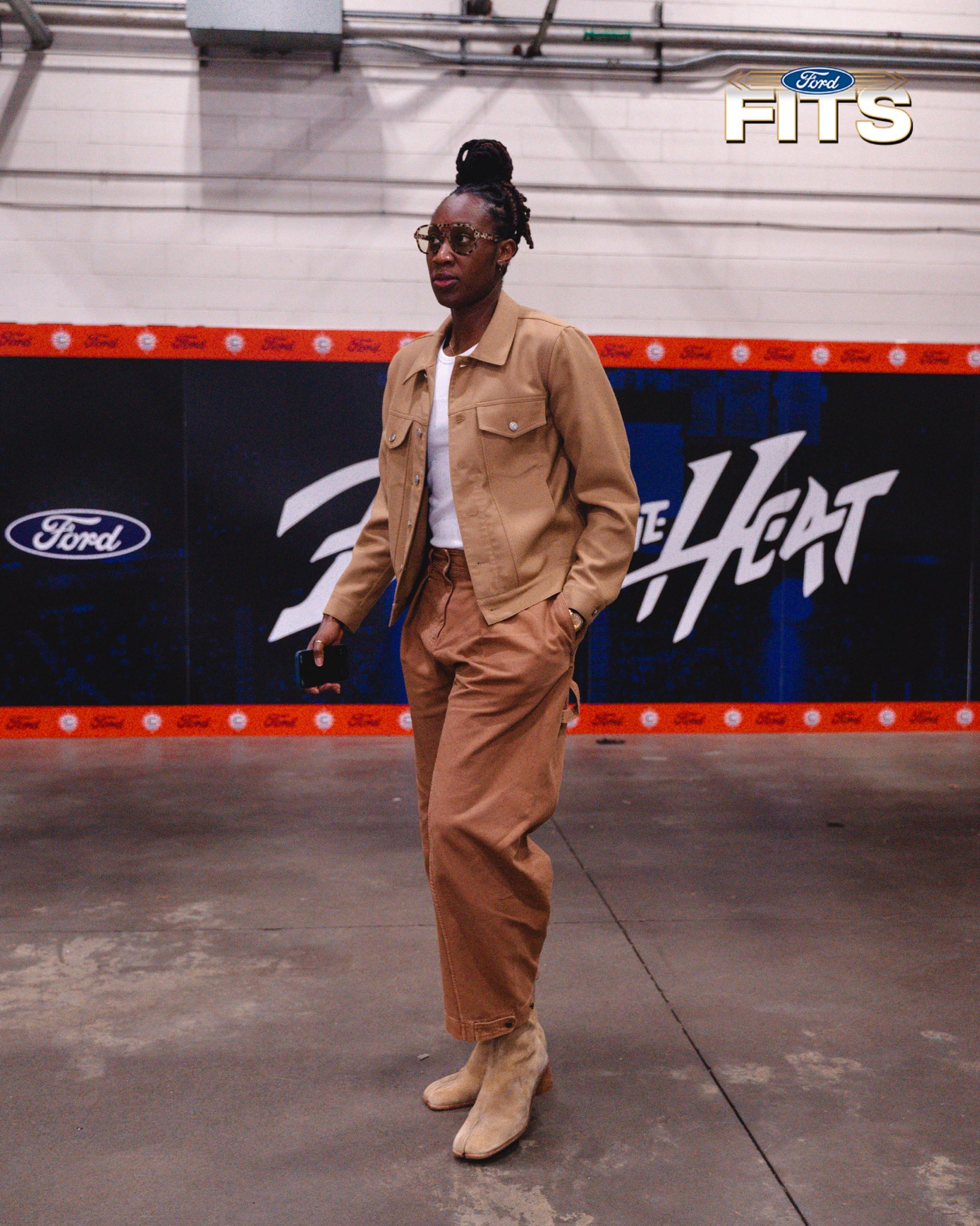
We curated a dynamic typographic system built to match the bold vision of a franchise on the rise. Each typeface was chosen with intention. This was not about playing it safe, but about positioning the Sun as a trailblazer within the WNBA. The typography needed to move with confidence, stand with conviction, and carry the weight of a team rewriting its narrative. Together, these typefaces form a visual voice that is modern, fearless, and made to lead for New England’s team.

As part of the 2025 seasonal campaign for the Connecticut Sun, we developed a comprehensive set of brand guidelines designed to carry the full weight and meaning of the team’s story. Built with intention and clarity, this guide does more than show how the brand looks. It defines what the brand stands for. Every page breaks down the values that fuel the organization, aligning visual language with cultural heritage, regional pride, and the unshakable passion this team brings to the court. We introduced a bold and new graphic system. Birch bark textures honor the Mohegan Tribe and their enduring legacy. Celestial graphics connect to the team’s blazing commitment to the game. Weathered parchment grounds the brand in its New England identity. Together, these assets form a cohesive visual system that is deep, authentic, and true to the Connecticut Sun.